Today I wanted to share with you some of my all time favorite boy and girl rooms. For the longest time I had been dreaming about a perfectly styled vintage baseball theme for my son, and the frilliest of frills in shabby chic for my daughter. However, that isn’t going to happen anytime soon. They are currently sharing a room, and will still for a while. So while their room was begging for an update, I decided to take on the challenge of combining both styles together for a neutral grown-up kid space.
 |
| via : RH baby&kids |
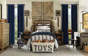
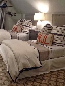
I love love love this space for a boy. Navy is my color of choice to begin with, and this room totally appealed to my love for navy. An easy transition space for anyone to grow into, with the perfect amount of vintage items, and a clean, masculine look.
 |
| via : Designer Lisa Luby Ryan |
 |
| via : Accessorize and Organize |
 |
| via : Cote De Texas |
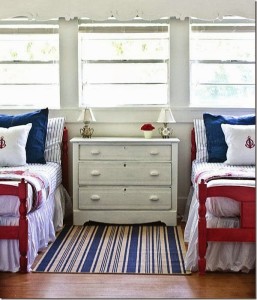
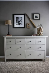
With patriotic colors of course! Nothing screams a true american sport like baseball, than red, white & navy, right?! These red bed frames were totally calling my name.
 |
| via : RH baby & child |
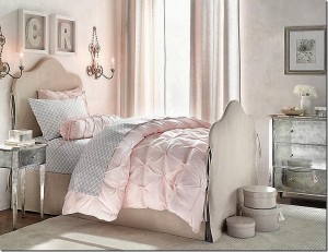
I really love the feminine yet not over the top girly spaces that RH baby & child comes up with. They all feel fresh, and pretty, while carrying a neutral theme through out the space. Like the above picture.
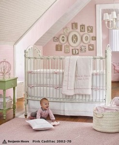 |
| via : Pottery Barn Kids |
I love vintage feel the above nursery has, and while we are out of the crib stage now, I still love the overall look of this room. And below the slip covered headboard is so soft and inviting.
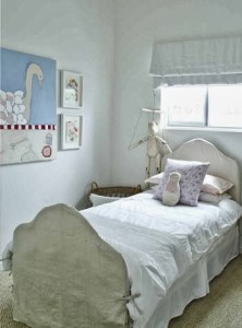 |
| via: Leibowitz and McLachlan |
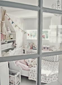
Feminine, but not screaming barbie, if you know what I mean 🙂 There is nothing wrong with that look, what-so-ever, but my personal taste is a bit more relaxed and toned down. I absolutely loved Emily’s little girls room (pictured below). To me, that is exactly what I was looking for.
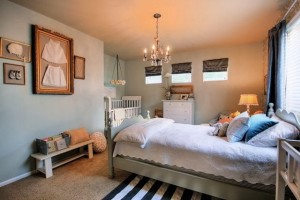 |
| via : Jones Design Company |
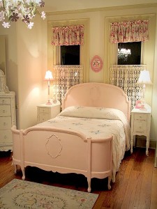 |
| via : Forever Pink Cottage Chic |
So the vintage feel and shabby chic mixed together, with more muted colors, and I wasn’t afraid to throw some soft shades of blue in their either. Like the ones in both of the photos below.
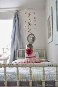 |
| via : The Handmade Home |
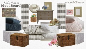
So giving up (FOR NOW) on the ideas of separate spaces for both, and coming up with a design idea for their joint space together. I came up with this mood board pulling together all of the design elements and feelings from the spaces in the pictures above. And created a space with a neutral grey background, plenty of white, and hints of Indigo for my boy, and petal pink for my girl.
I will be back tomorrow to share more details and sources from this mood board, along with progress the room has already taken. Hope you have a great monday!

Every last one of these photos is absolutely delicious. Makes me wish I still had children to design for!