I spent most of my free time in the summer working on transforming the kids room from a nursery to more of a kids space. I realize I don’t think I’ve ever really shared a full post on what their room fully looked like as a nursery, however I think you will get to see most of it with the before pictures I have taken. Today I wanted to share some inspiration photos with you that were really my jumping off point.
I love the dark, bold bed frames in the photos below.
The contrast with the neutral wall,
and the symmetry with the arrangement of furniture.
Even though they share a space, I wanted it to remain mostly neutral,
with a few pieces that were gender specific on their beds.
My kids are 2 and 4, so while they are still young,
I wanted a space they could grow into, and keeping things neutral allows the room to transition over time.
 |
| via: Pottery Barn |
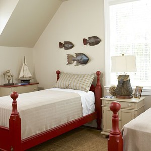 |
| via: Southern Living |
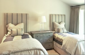 |
| via: Cote De Texas |
I know there are plenty of ways to blend a boys room and a girls room together, but I wanted the overall feel to be neutral, instead of a designated blue side, and a designated hot pink side.
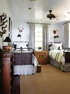 |
| via: House and Home |
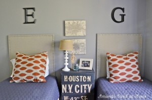 |
| via : Amanda Carol @ Home |
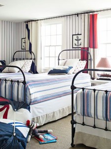 |
| Via : Country Living |
I started with these photos as my base, and began to put together a room design based off of key elements I liked in each of the spaces. Next I will share my girls room inspiration and boys room inspiration, and how I married the two together for their shared space. To see more bedroom inspiration, check our my Pinterest Board for Bedrooms.
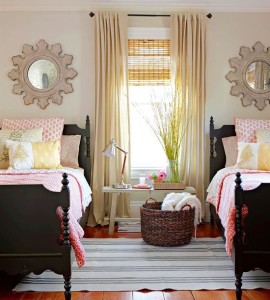
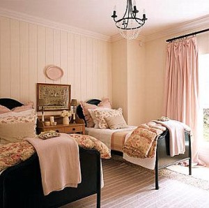

Loving them all!!! That first one is my go to pic for my girls room. I have so much to do….mainly get the youngest bean sleeping so I can move her in with her sis! Ha!! Thank you for the beautiful inspiration!! You have given me some ideas for G’s room! Can’t wait to see your designs!!!