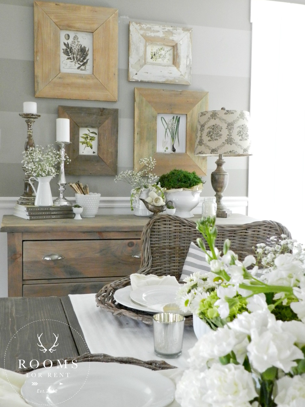
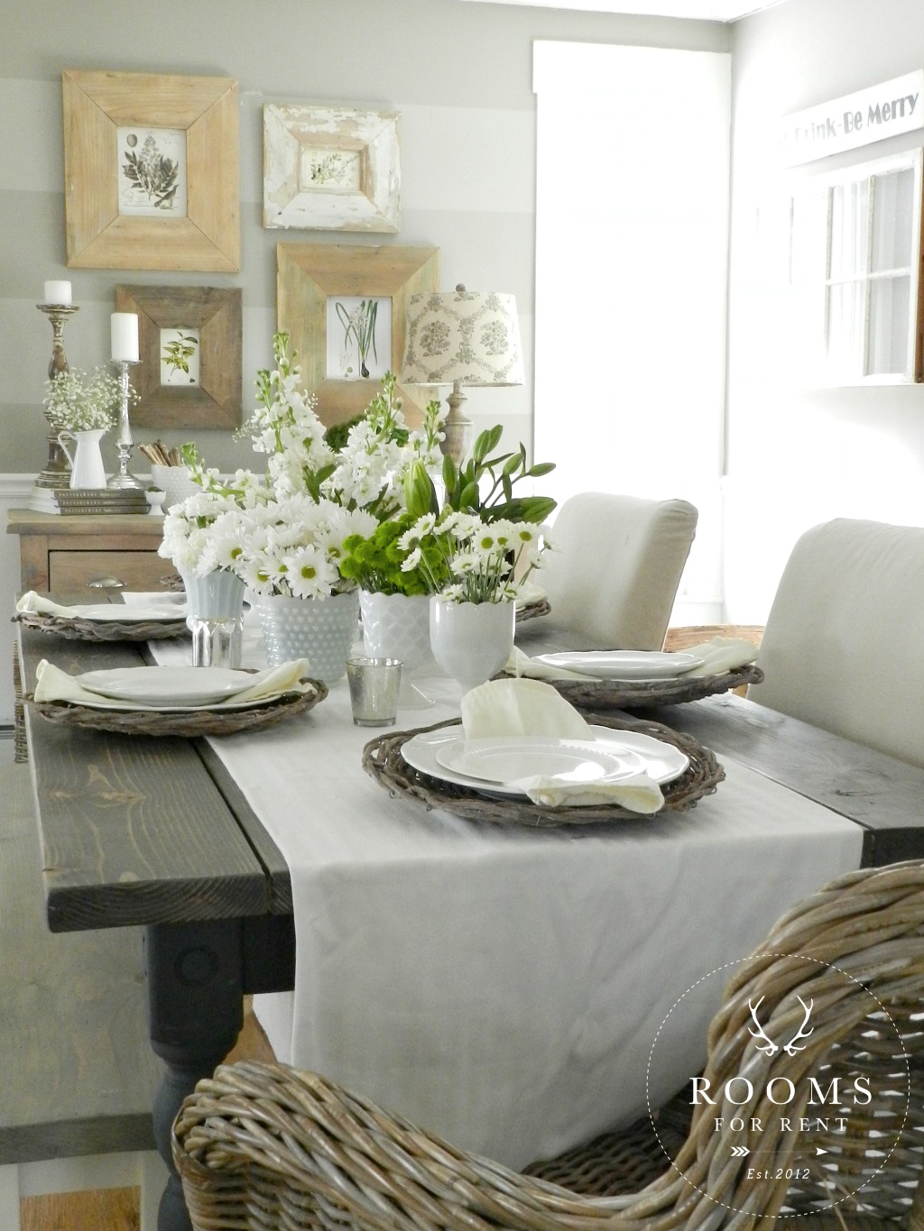
It was so much fun teaming up with some of my favorite gal pals on wednesday to share some of our spring decor with all of you! If you missed it, you can catch my post here along with the links to everyone else as well. I shared a milk glass tablescape, and bits of our dining room for spring this year, and have more spring home pics for you next week! In the meantime I promised I would share more about the new botanical prints and the refresh my striped wall in the dining room got. So today I’m going to share all those details with you!
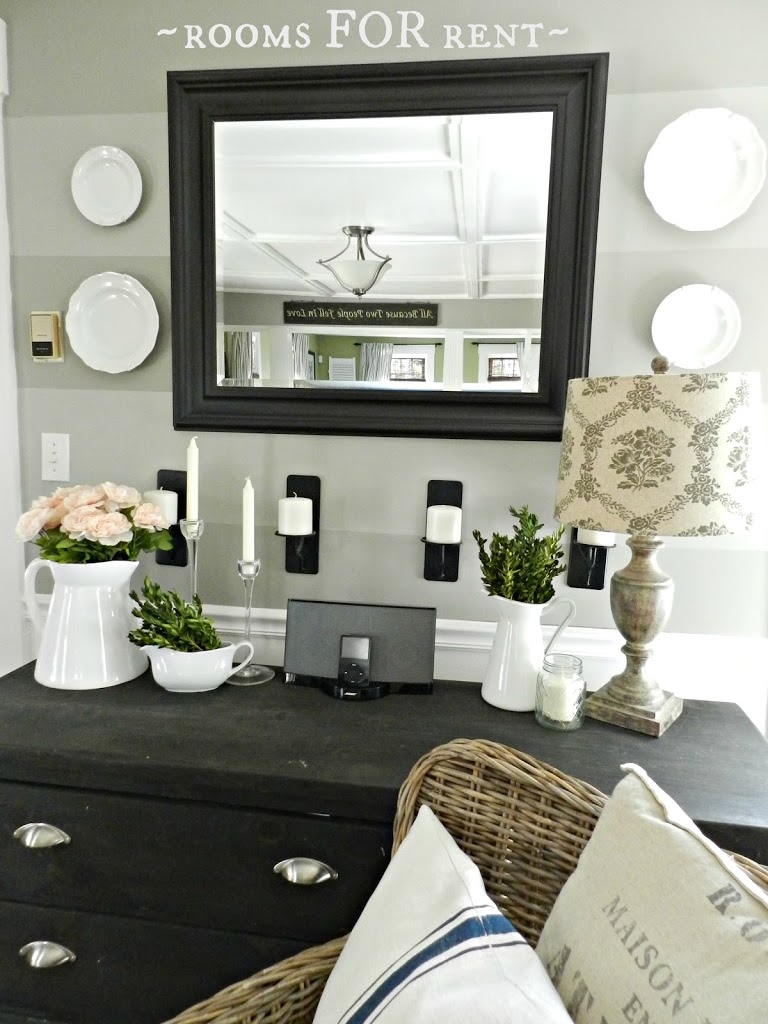
Things have slowly been changing up on this little wall for the past few months. Ever since I refinished the dresser, I’ve been wanting to swap out the mirror for one that had a similar weathered wood look. I saw one about a year ago at HomeGoods, loved it, should have bought it, didn’t, and now I’m SO wishing I had! Don’t you hate it when that happens?! Well onto plan B. I was still ready for a change, so instead of waiting until I found or made the perfect mirror for this wall, I decided to just go for something in the meantime. To remind you what it looked like before, here’s a quick pic of how this wall looked for a long time:
*You can see how I painted the stripes here, and to catch the tutorial on how I refinished the dresser, click here.*
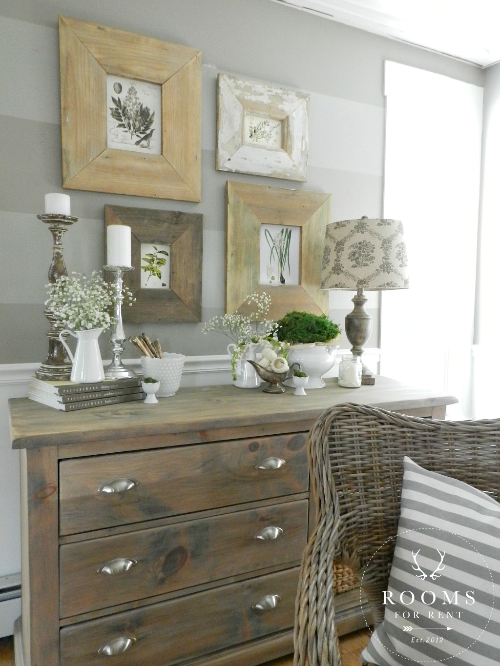
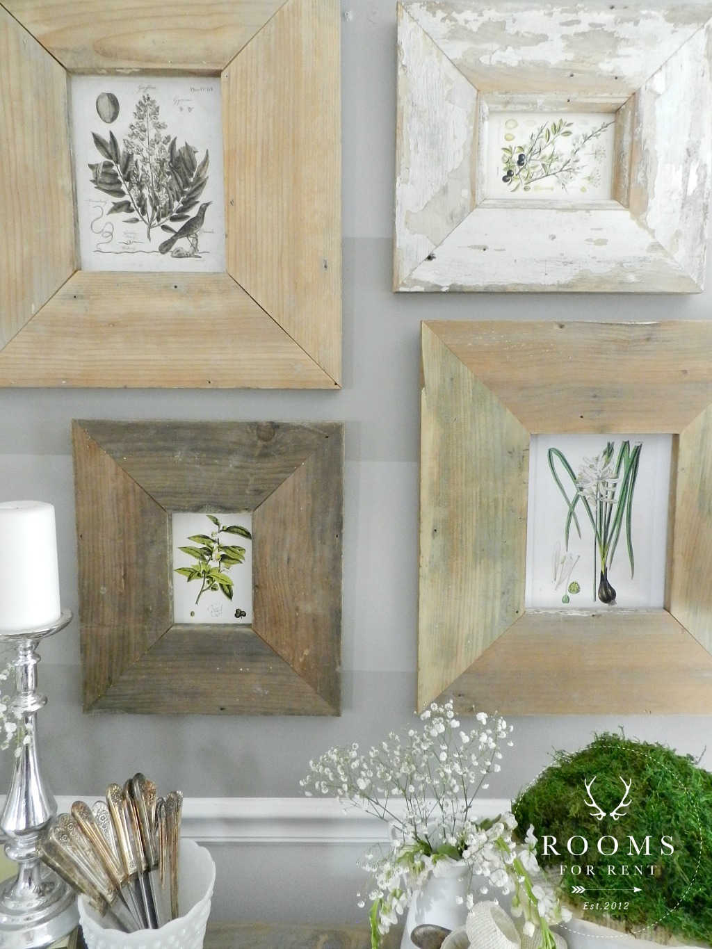
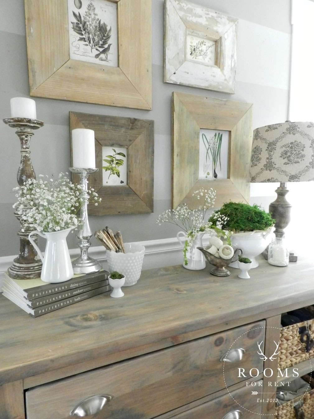
I had been crushing on botanical prints for a little while now, and thought they were perfect for spring. I found these ones here, and they are a free printable offered by The Graphics Fairy. I simply picked 4 I liked, and printed them out with my cheap-o printer on white card stock. That way they resembled more of a postcard look, instead of being glossy.
I hung them in frames that the hubby had made me last year out of old baseboard from our house. When we moved in the previous owners had replaced some of the baseboard and trim pieces after replacing the windows. We found the pile of the wood all taped up together in our shed, and I knew instantly what I wanted to do with them! Since I didn’t have 4 of the same size, I grouped them slightly staggered for a mini gallery wall look.
I filled some white farmhouse pitchers with left over baby’s breath from the table centerpiece, and layered candlesticks and other ironstone pieces in to complete the look.
I can’t wait to show you more of spring throughout our house next week! Hope you have a wonderful weekend 😉
Stay in touch!
Instagram / Pinterest / Facebook
Have a design question? Visit Doucette Design Co. for all your design needs!

Hi!
I love these prints and went and printed them out. However, it appears that yours printed with a white background instead of the yellowish one that is on the prints. Can you please tell me how you do that? Thanks so much! Also, I love the frames, could you share the stain technique please.
Angie
Hi Angie! I didn’t do anything different to the prints. The backgrounds on mine are a creamy/yellowish. I assume so it appears aged and more like vintage paper, rather than crisp new white paper. But as you can see in my photos it doesn’t really stand out 🙂
Those frames are everything. I want all 4 of them!! Gorgeous. I love everything about this room.
Love those frames!!
I’m with Shawnna, it’s all amazing!
That looks so good!! Love it!!
Hi Bre, I am so enjoying your posts. You sometimes list a source for a product you love and use. Is it possible to list more sources on your posts? Such as lamp and or shade, Maiaon pillow, your favorite white plates, etc…?
Thanks