I’m SO glad you all have been enjoying my Summer Home Tour this year! It’s been so much fun joining Gina’s Summer Tour of Homes, I feel so honored to be apart of it. And it’s been so nice to see a few new faces around here as well, I’m so glad you found me through the tour. In case you missed it, you can catch the tour here, and to go back to day one and catch up on the beginning of the tour you can click here. Tomorrow is the last day of the tour, and it’s been so fun seeing everybody’s house for summer, even though actually saying the word “summer” still feels a little foreign. I talked a little bit in my Summer Home Tour about some of the projects we’ve done around our house to not only make it work better for us, but also disguise some of the not so glamorous parts. We live in an 1846 Farmhouse, so there are bound to be some imperfections that no matter how much work goes into it you can’t change.
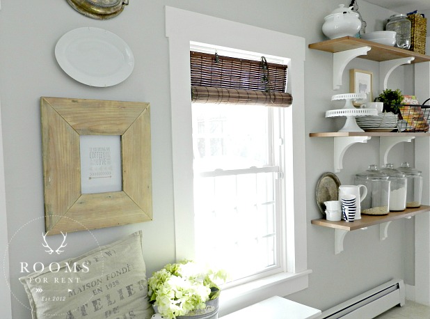
For instance our kitchen is updated, however due to the footprint of the house all the cabinets and appliances are on one wall. To balance the look of the kitchen, so it wasn’t so heavy visually on one side, and to help tie in the rest of the space, we added open shelves on the opposite wall.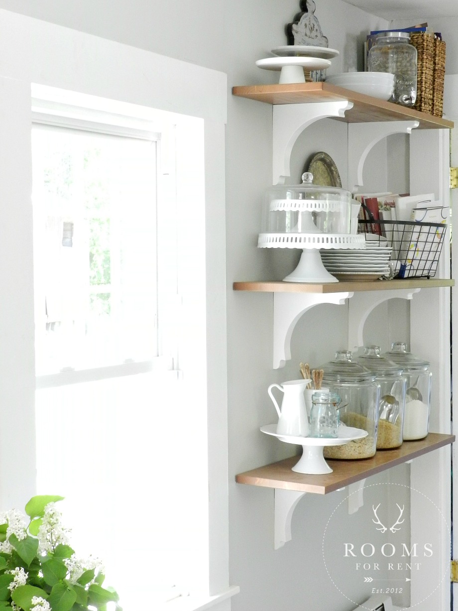 They help balance all the cabinets on the other side of the kitchen visually, while proving a place for cute storage! I say cute storage because I don’t use them to hold all my tupperware. They are fully functioning work shelves for me. They hold my prettier plates, and serve ware to easily grab when we are entertaining. As an added bonus they totally work as kitchen decor. So it’s a win win!
Another fun element in our house is we have no real mudroom. No place to drop your coats or bags, or backpacks (yay!), or shoes. And we all now how quickly shoes can pile up! Our front door has a bit of a landing space which you’ve seen at the bottom of our stairs, however we don’t use that as our main entry. It’s not even close to the side door we use that leads into our kitchen. SO we needed to create a space that would function well to meet all those needs.
If you have stuff that piles up no matter how clean your house gets, chances are you need to re-evaluate how things are set up and brainstorm solutions that will make those darn piles less easy to appear.
To avoid shoes from piling up, we got rid of our extra island (you can see the before and after here), and instead placed a simple bench underneath the windows, with antique crates underneath to hold all the shoes. 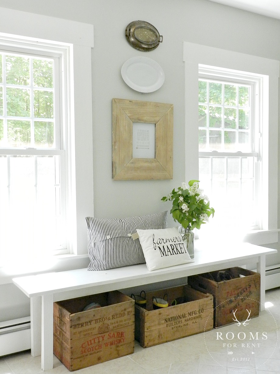 I could have used baskets, or we could have just piled the shoes under the bench. But putting thought into what I use for storage, not only makes this now functioning space a bit more prettier, it conceals the items from looking messy or disheveled. Functional decor at its best. The crates are working for me by keeping things tidy, and I also love looking at them (decor!). I still needed a space to hold all those coats and (ahem) bags! We have a back hallway just after our open shelves.
  It’s a tight narrow hallway, 7.5′ X 3′ to be exact. There is a tiny, and I mean tiny little closet on one side, but it wasn’t big enough to fully serve the need of holding all our coats. So to make the most use of the space, we added bead board paneling 3/4 of the way up the wall, trimmed off the top, and added two rows of coat hooks. That tiny closet I mentioned holds all of my husbands work gear, and our seasonal items like snow pants, and hats and gloves and boots. (You can see the before and after here.)
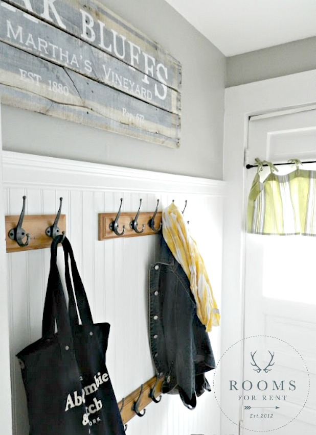 While our everyday stuff is hung on the coat racks. The top row is for adults and visiting guest, the bottom row is in perfect reach for tiny hands. That way from a young age I could teach my kids to put their items away, without needing much help from me, or adding more work for me. They can get their own jackets and backpacks, and put them away without the excuse of not being able to reach so things don’t pile up on the floor. Problem solved!
One of the last modifications we made in the kitchen was tackling that back wall of doors with a sloping ceiling. Everybody loves the charm and character old homes have, and for the most part you overlook some of the quirks, but this area in our kitchen had me running for the hills! It drove me nuts! We had 3 doors on one wall, in a row, and to top it off the ceiling slants so the small wall space above each door isn’t all the same. The small section of wall in between two of the doors didn’t allow enough room for shelves or narrow cabinets, because the island was too close to it, it would block anyone trying to walk by. So lots of thinking went into this one. Thinking and staring, and giving up, and back to thinking, and envisioning, and giving up. Two years of this process until I finally convinced the hubby to tackle this project.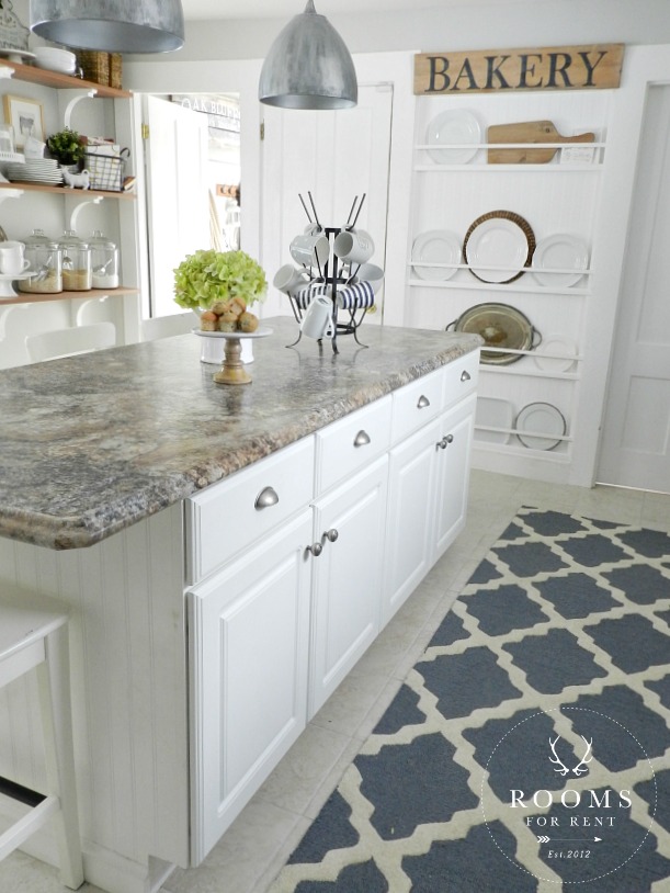 We tore down the wall in between the two doors, and inset between the trim a plate rack wall. It helped disguised the doors, the sloping ceiling, and gave me a place to display all my white serving platters for easy reach, and are you picking up on this now “decor”. (You can see the before and after here.)
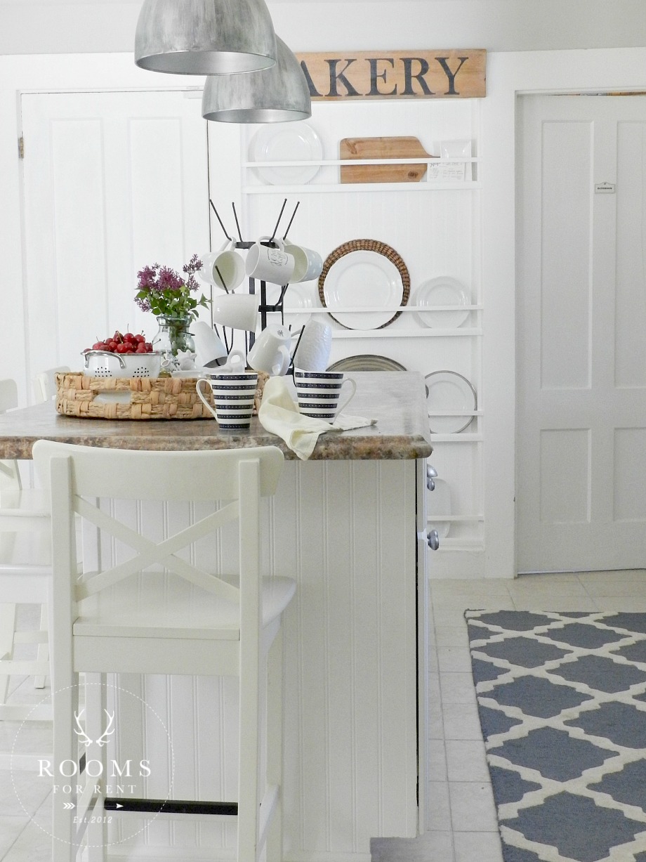 I know a lot of you have seen all of these pictures before, but looking past the nicely decorated spaces, its fun to see the thought process that went in behind the decor, and to know why we did certain things. I’m always telling my clients, it’s one thing to have a pretty space, but to have a pretty space that works well for you and serves your families needs the way you need it to, is true success in decor!
What about your space? Do you have a room, or a wall that just drives you batty? Is there a spot in your house where clutter piles up easily? Maybe it’s time to place musical chairs with some furniture and bring in a different piece you have somewhere else that will give you the storage you need. Maybe it’s going out and finally buying those baskets you keep thinking about for extra storage. Tip: Make sure your baskets aren’t too small. Buying smaller baskets because you don’t think you need the bigger one, or you don’t want to spend as much as the bigger ones cost, will only prove to be just as non-functional as not having those baskets is now. Buy the BIGGER baskets, and avoid overflowing items. Is it time to purge some? I’ll be talking about that next!
Stay in touch!
Instagram / Pinterest / Facebook
Have a design question? Visit Doucette Design Co. for all your design needs!

Your kitchen is beautiful! So fresh and bright! I was wondering if you have a tutorial on how you made your shelves? I have a bare spot in my kitchen and these will go perfect there! Also, where did you get the adorable wooden crates under your bench? Love!
Hi Britany! Unfortunately I don’t have a tutorial for the shelves. I will tell you this, we had to above and beyond when it came to securing them because of the amount of weight I wanted to put on the shelves. I eye-balled the placement of the corbels on the shelves, and we just measured each one to make sure they were even 🙂 The crates I got at a local antique sale I hit up frequently.
I adore your home and style!! Such clever solutions you have come up with as well!!:)
I love the natural wood frame in your kitchen over your bench!! May I ask where you got it?
Hi Donna, thanks so much 🙂 We made it with old trim boards from our house.
Great post! I love that these practical solutions are pretty and add to the decor too. So many things are driving me batty! Living in a small home with lots of ‘stuff’ being one. Looking forward to the purging post!
So interesting! (I love smart people.)
love your kitchen! ( I can barely read your blog because the print is so light. Just saying…..)
Hi!
I am a summer resident of NH and I think I have the same counters! My cabinets are black! In our new rebuilder we wanted easy care and gorgeous. Our secret as no one who comes into our house believes the counters! Your house I can only aspire to! Gorgeous!
Holly
Washington, NH and Spring, TX
Girl I just love your kitchen!! So pretty!!
I discovered your site through Instagram. I love your style! Great solutions for your kitchen and the end result is great.
Karen