It’s hard to believe that it’s been a few weeks since we completed the Lowe’s Fall Makeover. There was so much excitement and anticipation heading into this project. I shared with you HERE the mood board design plan we had for the space, and we all know that while these serve as great inspiration for completing a space, they don’t come out 100% like the mood board. I would say we came pretty close though. From Day 1 of working with the home owners it was so much fun to talk about their style and what they would like to see in the space. The moment they mentioned a farmhouse table, I knew we were going to hit it off right away! I loved transforming their space, with the help of Lowe’s, and taking their dreams and making it a reality. Or knocking it out of the park as they would say!
While the homeowners had already begun the renovation process before this project with Lowe’s had come along, they found themselves exhausted, out of resources, and in a time frame that was months longer than they originally anticipated. Coming in with Lowe’s was a breath of fresh air, and just the boost this hard working family needed during one of life’s hardest seasons. Before we got there, they had previously torn out their dated tile floors and installed these mocha wood looking tiles from Lowes. They also had recently repainted, and I thought the new color worked perfectly with new design plan. 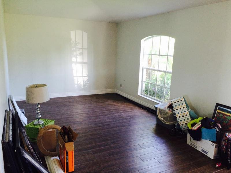
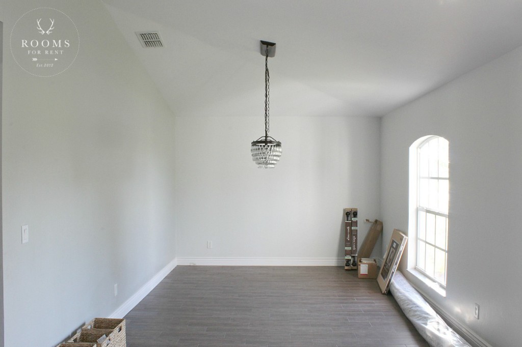
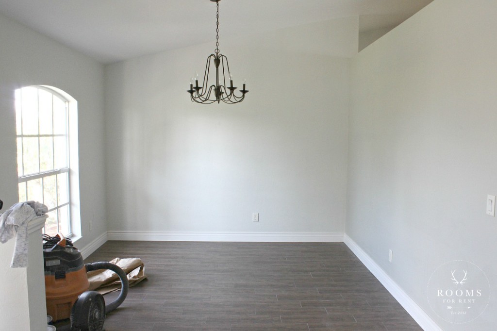
When you walk in the front door, their front room is actually on long room. Above you see to the right when you walk in the door, and we designated this spot for the dining room. To the left of the door, is a smaller sized space we designated as a sitting area, that will also act as an overflow space when they have friends and family over.
We had a lot of DIY projects planned, so right away, we set up stations outside to prep and stain the lumber we were going to use.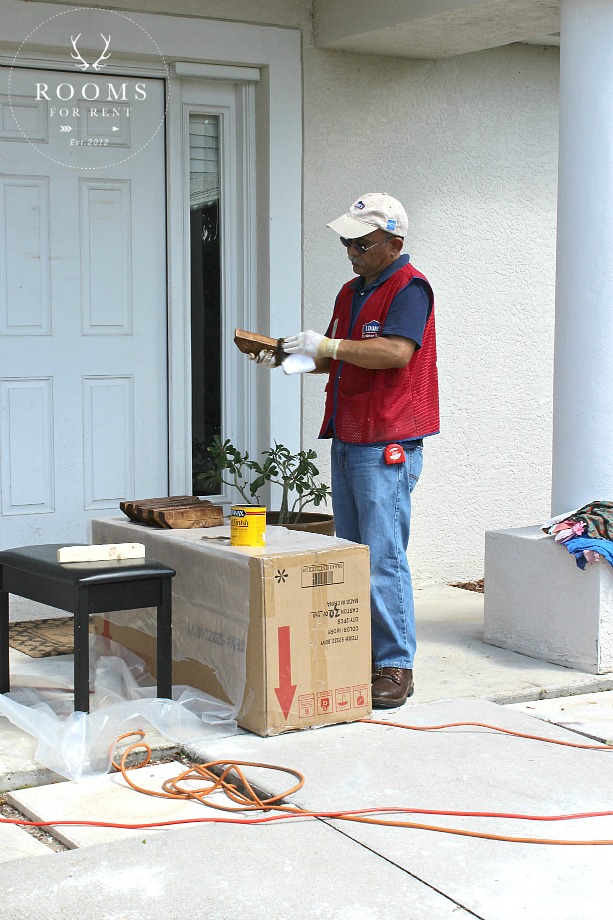
While all the lumber was getting prepped outside, we hung the chandeliers on both sides of the room inside, and began adding architectural details to the space to add some warmth and character to the room. Here you can see the new chandelier in the dining room:
And the new farmhouse chandelier, across the room, in the sitting room:
Once the chandeliers were hung, the hubby got started on building them their custom farmhouse table. I worked with some of the volunteers inside to start bringing life to some of the key design elements that will really bring this space to life.
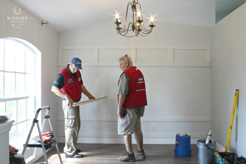
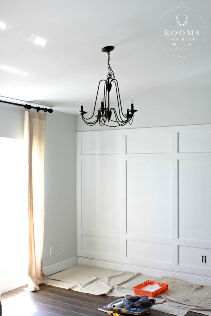
To anchor the sitting area, we added a board & batten treatment accent wall. Since the walls were in good condition, we just had added primed 1X4 boards, that were measured and cut for the space, and then we painted the entire treatment in HGTV by Sherwin Williams for Lowe’s Ovation interior paint with a primer built in. When you want a guess free white, I go with the paint right off the shelf. One thing is for sure, if the quality of the paint isn’t there, than it doesn’t matter what color you choose, it won’t hold up. So always make sure you have a good base 🙂
Are you ready to see the finished spaces?!?! Here is what the dining room looked like once more before we started implementing all the decor: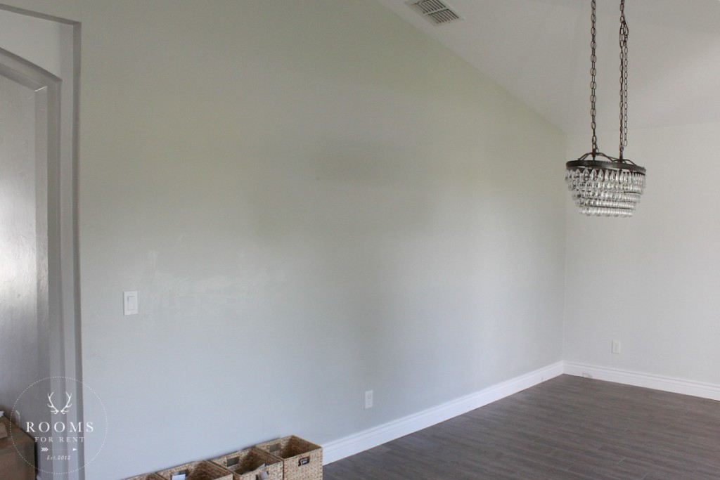
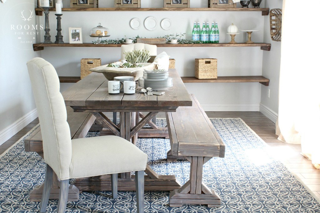
And here is the After :
First up the table :
We really wanted to build them a table that they wouldn’t just outgrow in a few years. One that would fit their needs for their weekly family dinners, but a table that also serves as a place to bless and serve their extended family and community. The home owners are pastors of their local church, and love to have members in their community over, but had no place to really “host” and spread love. Now with seating for up to 12, no one has to go without an invitation. 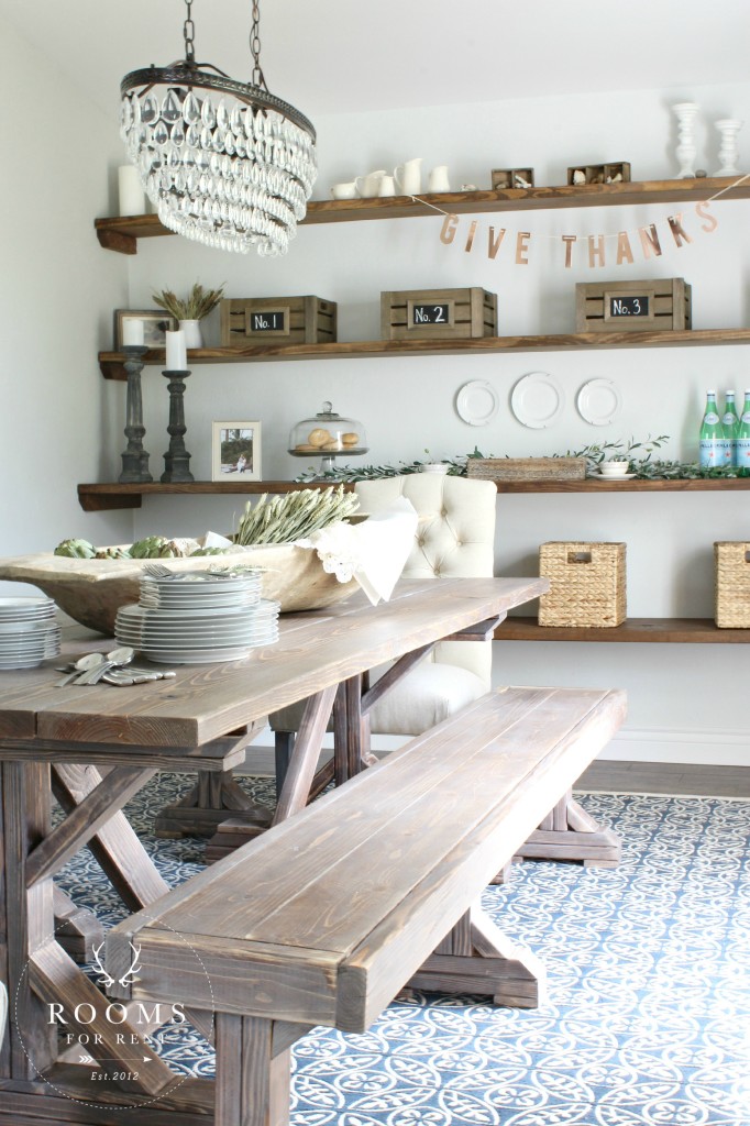
I will be sure to share a full tutorial on how we made the table and benches soon, you can also see the full plans HERE. Of course, if you are no stranger to the blog, you know my love for layering stains, especially gray toned ones, to get that worn in, distressed look. The homeowners were thrilled to get their hands dirty helping me with the process, to achieve this restoration hardware look. For the first layer we went with the classic “Special Walnut” from Minwax, and layered “Driftwood” by Rust-oleum on top. I will include a step by step process on how to achieve this look in a later post. We finished off the table and benches with with Minwax “Paste Finishing Wax” for a natural finish that still keeps it easy to wipe clean. 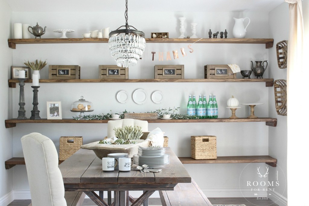
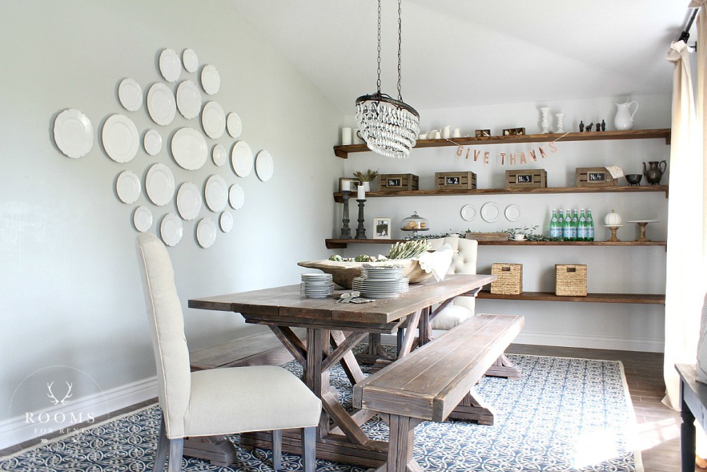
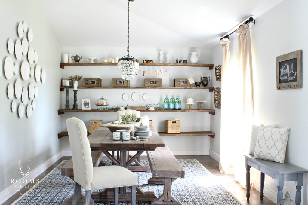
To anchor the dining room, one of my favorite decor elements we added were these rustic floating shelves, that ran the entire width of the room. Not only does it add character to the space, it also serves as function, providing storage and can multitask as a buffet to put food on when you are entertaining. 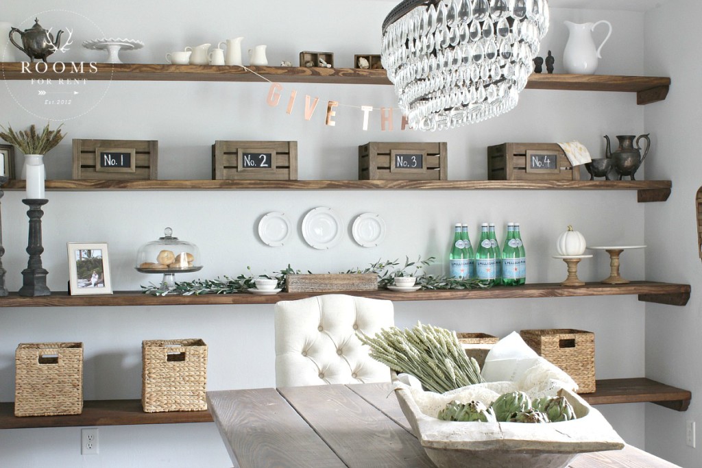
We used 2X12’s for the top two shelves, and two 2X10’s, side by side, for the bottom two shelves, and stained them the same “Special Walnut” by Minwax we used for the table. However we did not layer on the driftwood stain. I wanted the wood elements to flow in the room, but not be matchy-matchy. This also allows the table to stand out and feel more like a one of kind piece. 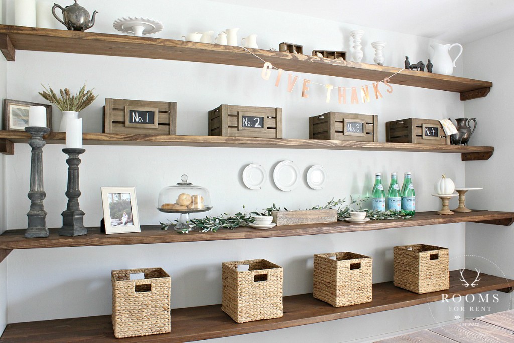
One of the ways we added practical storage to the shelves were with baskets and crates found at Lowe’s. They are great way to store items so the shelves stay “neat” looking and put together, and not cluttered. The homeowners do a lot of missions work and travel around the world, so it was fun to incorporate pieces from their travels that had been sitting in boxes, for all to see, and reflect their traveling. Of course, I also had to add in some of my signature look with pieces from my curated collection 🙂 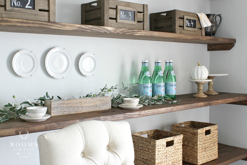
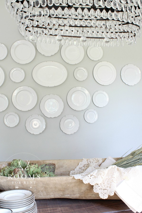
Hanging plates on the wall is probably one of my favorite design elements to add to a dining room. Its subtle, it’s classy, and it never goes out of style. Rarely though do I come across a home that has a wall big enough to do a large plate wall hanging. With vaulted ceilings in their home and minimal windows, wall space is one thing these home owners had plenty of. Sometimes the thought of decorating that wall space can be overwhelming, or costly depending on art tastes. As easy as it is to use mirrors, sometimes we crave a little bit more in the space. Something that will add some depth and interest.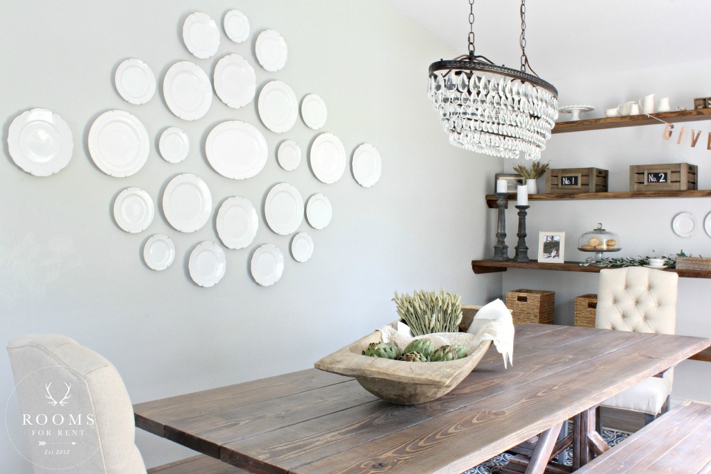
Did you know hanging plates on the wall is one of the easiest things to do. I avoided it for years because I never knew how, or where to look. There are a few different ways you can them, but my go -to is using a variety or THESE hangers. They come in a variety of sizes so you can hang anything from saucers to serving platters. And I love the way the chandelier sparkles up against them!
One of my favorite things to do when creating a space for people, is incorporating items that have meaning to them. I know you’ve heard me say this before but when we surround ourselves with the things we love, we love the space we are in! One of the most precious items in the space are these antique linens from the homeowners grandmother.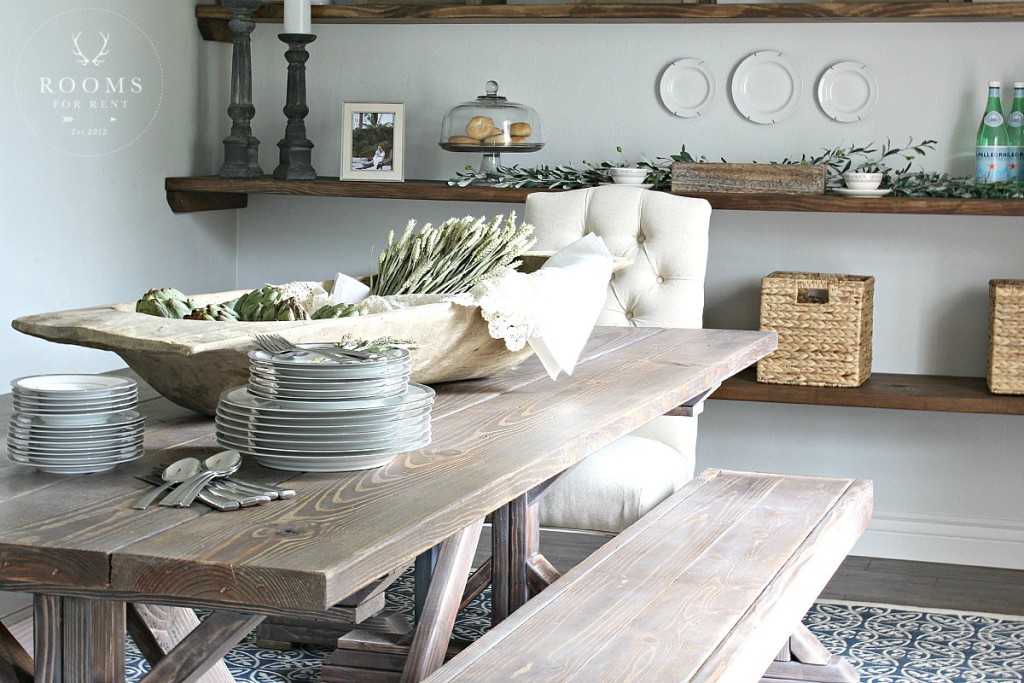
When we were filling the dough bowl with them, I loved hearing the memories of how they were used in the family for entertaining when she was a young girl, and now she gets to have them as part of her decor on her own table. 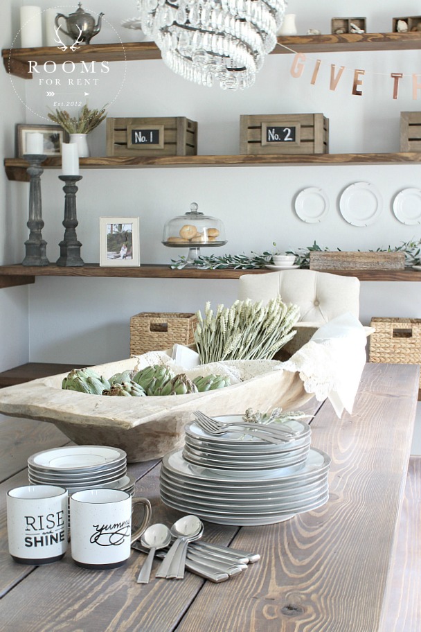
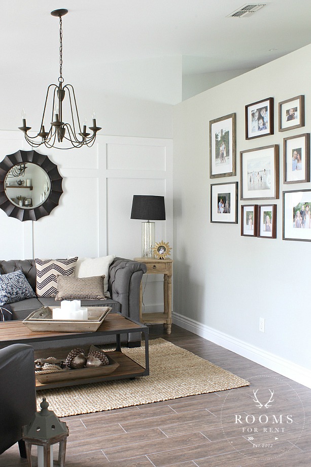
Now, remember how I told you we created a sitting room to the left when you walked in the front door?! Looking across the room, with those gorgeous open shelves now behind me, here is what the rest of the room looks like.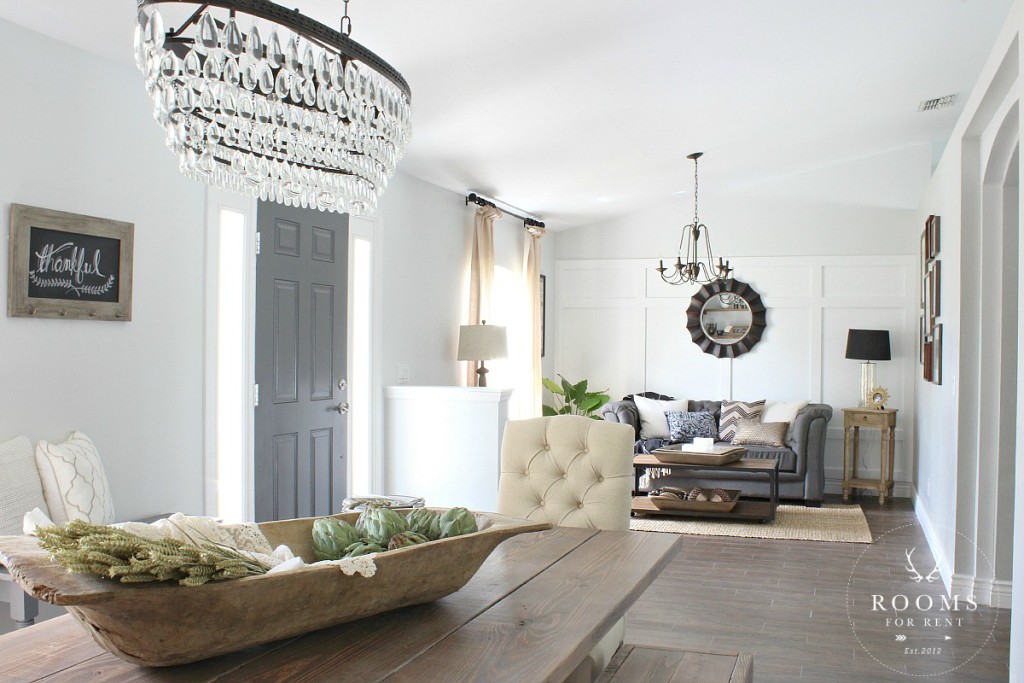
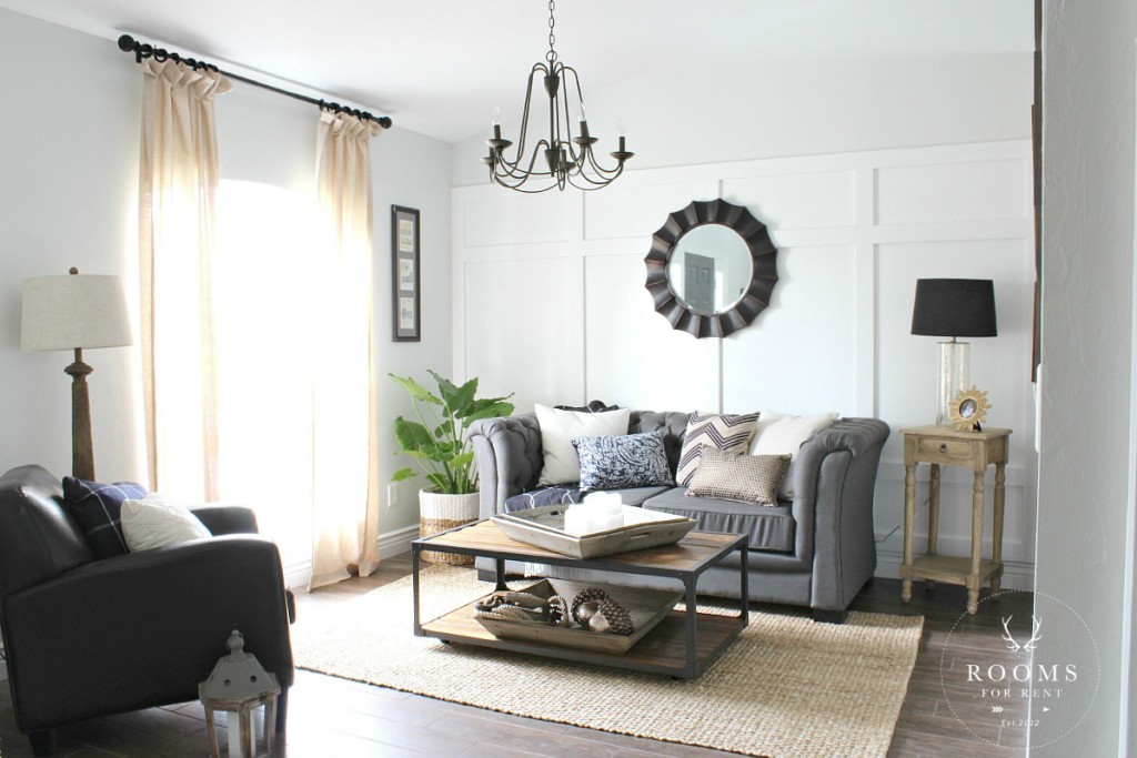
And just in case you need a reminder of what this side looked like before, here is a side by side shot for you.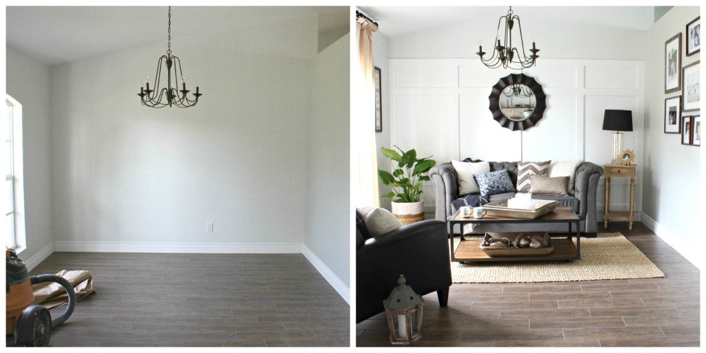 After talking about design ideas with the home owners, I really wanted their space to be warm and inviting and reflect their personality. They are such warm and inviting people, and really have a way of welcoming people, which we got to experience first hand, but I wanted people to feel that, as they entered into their home. Adding layers to any room is a great way to make it feel warm and inviting, and that’s just what we did here. Along with adding the board & batten treatment, I wanted the space to really reflect the family to anyone who came through their front door!
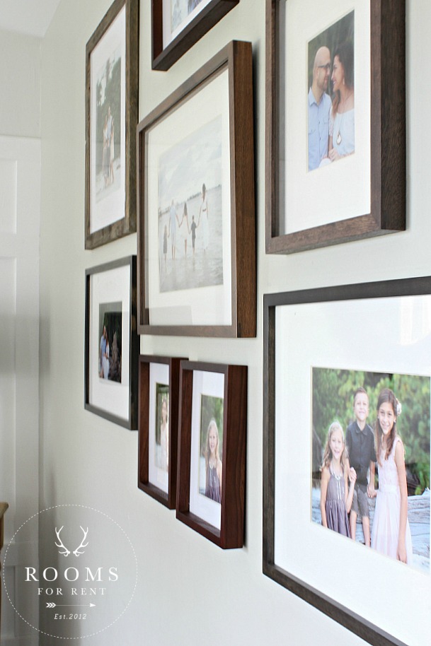
A gentle mix of frames, including THESE found at Lowe’s, showcases this young family, and the love the pour out.
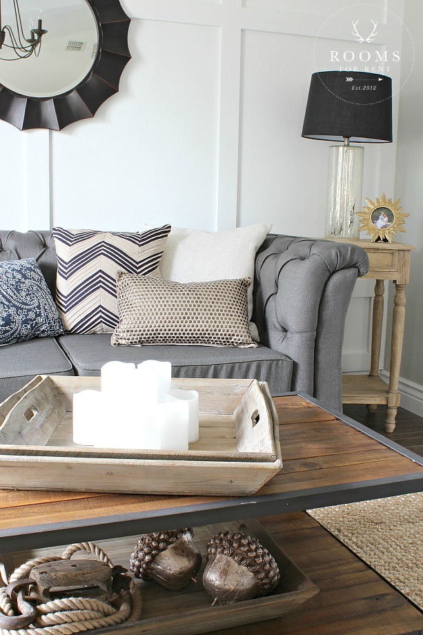
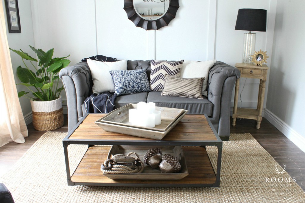
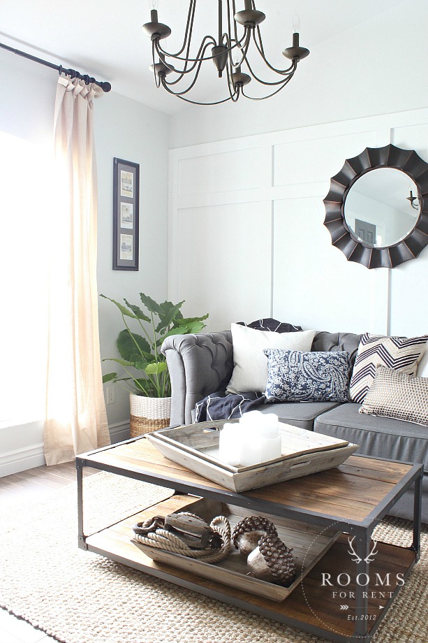
This beautiful tufted sofa takes centerstage. I love this style because while its charcoal fabric is kid, or should I say finger-print, friendly, its upholstered look has a more elegant feel that holds up in day-to-day activities. You can shop this sofa HERE.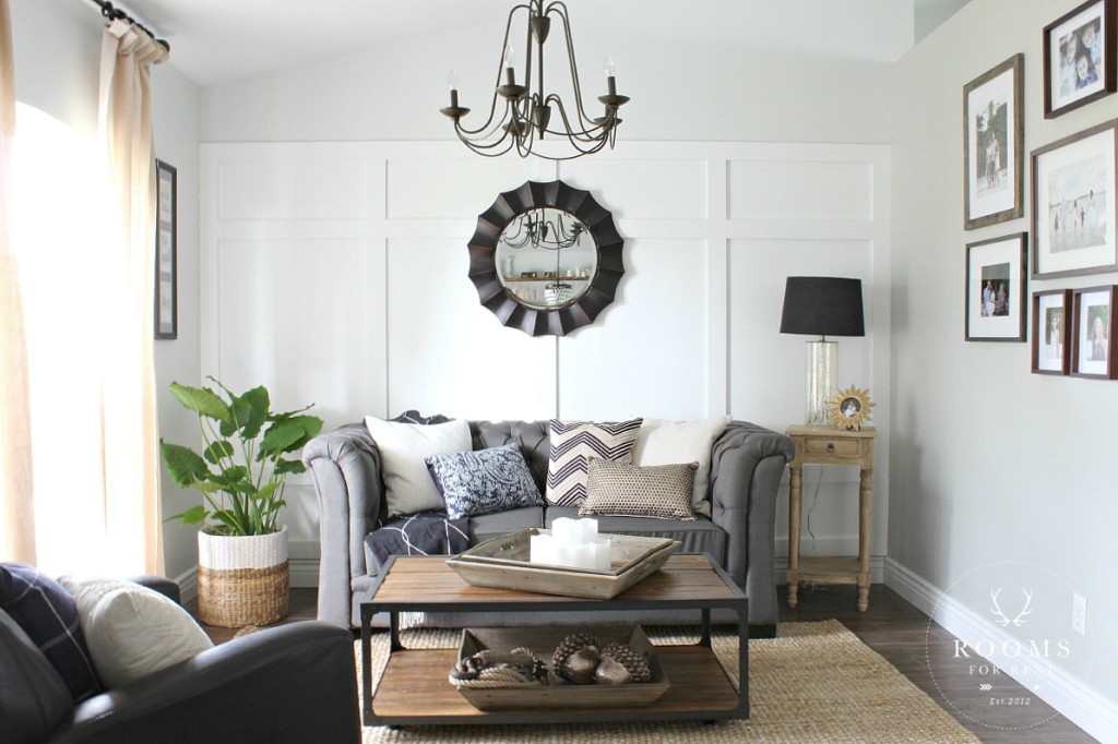
Also anchoring this side of the room, is the fun Allen + Roth accent mirror hung behind the sofa, found HERE. It keeps the room balanced, especially with those gorgeous open shelves on the opposite side. We added layers, with a soft jute rug and different sized throw pillows, in a variety of textures.
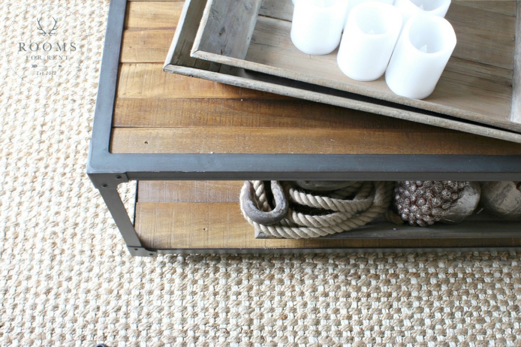
Simple coffee table decor, that also adds ambiance, are these great flammables candles by . When layered inside a tray, they are easy to move when board games come out, or appetizers when entertaining.
I loved the look of THIS industrial coffee table. It has a reclaimed wood look, and cute casters make it is to move, and add to the design.
To keep consistency in the entire front room, we used the same window treatments in both spaces. Even though we separated the room with two functions, it is one large space. To keep things feeling elegant, we went with neutral linen panels, hung at ceiling height for added drama.
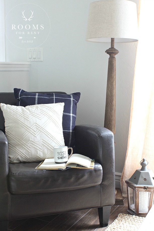
We created a cozy corner in the space by layering a chair they already had with cozy throw pillows, and placing a floor lamp tucked behind for soft lighting that creates the perfect atmosphere for conversation, or curling up with a great book.
Just behind this cozy little spot is a half-wall that greets you when you walk through the front door. A common question I get asked when there is no designated mudroom, or the entry to home delivers you right into the main living area, is “What do I do with the shoes that always pile up by the door?”. It’s a good questions, because if you don’t designate a spot, than no one knows where to put their things when they come through the door, and it leaves your guests guessing where they should put their things?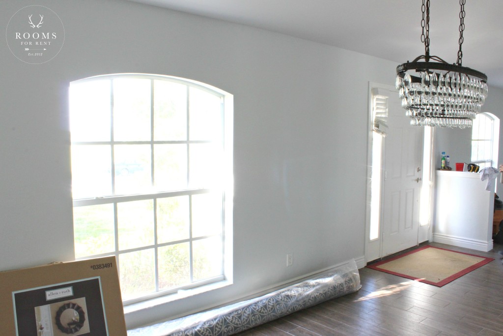 To tackle this issue for these homeowners, we made a custom sized bench that would fit in the area between the front door and the window. I think one of the keys to making a floating entryway work, is it has be functional, but it also has to have some decor incorporated as well. If it was only functional it would stick out in the space and seem awkward. But if we incorporate some decor in the design, it flows with the rest of the space around it. We started by painting both the inside and outside of the front door “Peppercorn” from HGTV by Sherwin Williams at Lowe’s.
 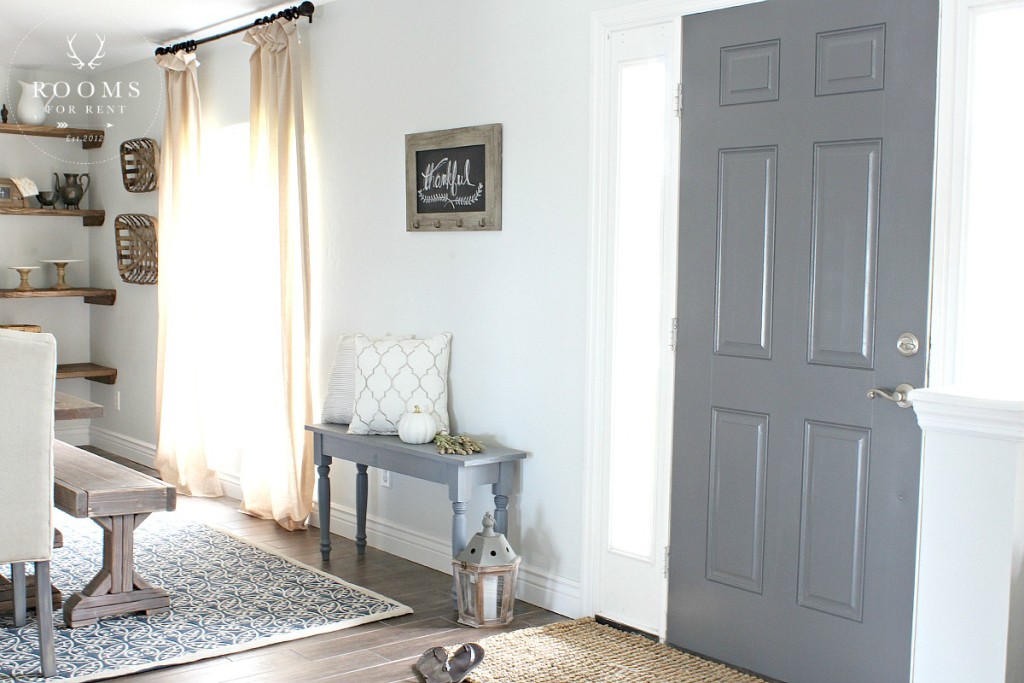 We replaced the worn out area rug, since these are smaller rugs don’t be afraid to replace them once a year. They get the most wear and tear, and are the first thing your guests see when they enter your house. We used THIS cute chalkboard from Allen + Roth to write a seasonal greeting on, but it also has hooks for guests to hang coats or scarves on. The bench provides a spot to sit down and put shoes on or take them off, while also providing a spot underneath to tuck shoes away.
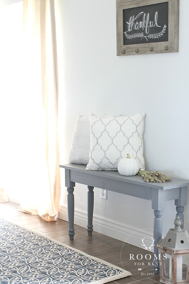
And of course, adding some small decor touches helps it flow with the rest of the space, and not seem awkwardly placed. With a lot of wood tones already in the space, I didn’t want to incorporate a fourth wood tone, so we used my favorite Rust-Oleum stain – Weathered Gray – it’s kind of a favorite around here.
Here’s one last look at their new completely spaces. 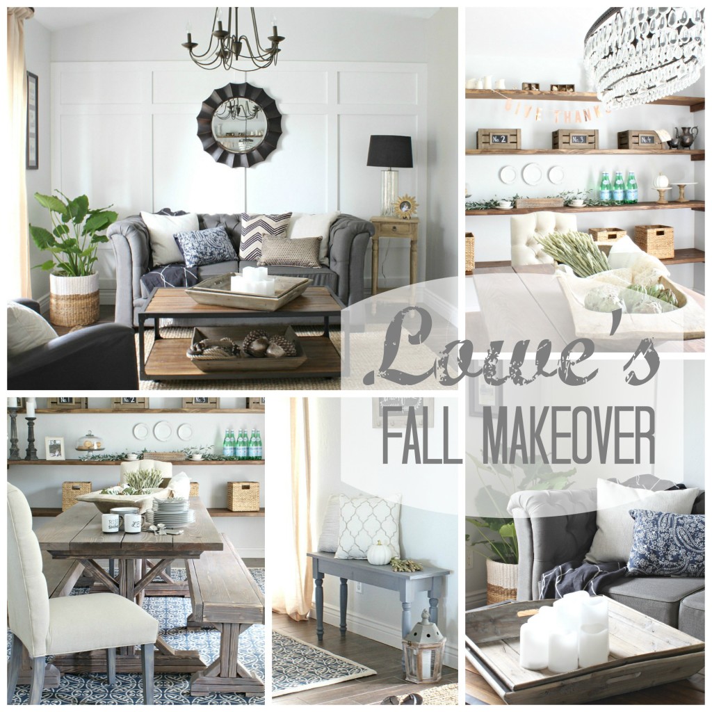
Listed below are links to all the products found at Lowe’s to make it easy to incorporate these looks in your own spaces.
Dining Room: Chandelier | Rug | Upholstered Chairs | Curtains | Curtain Rods | Baskets | Chalkboard Crates |
Living Room : Sofa | Coffee Table | Mirror | Chandelier | Curtains | Curtain Rods | Frames | Lamp | Candles |
Entryway : Chalkboard | Bench legs
Of course this makeover would not have been completed without the help of all the Lowe’s volunteers. I was so blessed by everyone who came. The store manager I worked with so happy to help, he even rallied in volunteers from an additional Lowe’s across town, and it was a beautiful portray of a team effort! And I have to say a special thank you to my husband! Without him there, their would be no beautiful table, and so many other little details he helps me complete, especially if I’m running low on steam. We make a great team, and I feel so blessed to be able to do this with him!
And a HUGE Thank You to Lowe’s and the team that worked with me to make this makeover happen!!
Stay in touch!
Instagram / Pinterest / Facebook
Have a design question? Visit Doucette Design Co. for all your design needs!


I wish, I wish my LR/DR looked like this. And it’s almost the same size. Ideas to keep for future. HOWEVER, I’m in love with the sofa which the website says is no longer carried by Lowe’s. Now what? Beautiful job, Bre!
It came out gorgeous, Bre! What a wonderful opportunity to create a space that these homeowners must love!
Bre this is absolutely amazing!! I love every inch of this space. It is fresh and inviting and that table is to die for!! Tremendous job!!
What a gorgeous space … both the living and dining areas. I need to scroll through the photos a few times to take it all in!!
This is amazing!!!! Such inspiration for some rooms I want to do something similar to as well! How do I become someone for you to come do a makeover for myself lol?! I’m in NH area as well! Near the seacoast!
I love this Bre! I’m pinning this for inspirations on our finished basement I hope to work on after the holidays!
Thank you SO much!! XO
This room is fantastic …love the neutrals . you did a wonderful job. One question or two actually 1) where did you get that dough bowl that is on the table 2) the small end table by the sofa in weathered wood where is it from.
I looked through the source list and could not find either of the above. Many thanks
This is stunning! Can you please share the wall color? I am choosing paint for the “new” farmhouse I’m buying and this wall color and door combination is perfect! Thank you so much!
BRE!!!! This turned out amazingly! So beautiful! 🙂
Can’t wait to see you tonight and hear all about it in person!