Thank you so much for all the sweet comments on our daughters Vintage Girls Room Reveal on Friday! It still feels so good to finally have her room finished. I never got to decorate a nursery for her, so in part, setting up her room now took place of that. I know I shared some sources that went into decorating her room in Friday’s post, but I there was so much that went into her space, I want to share more of the sources and details that went into decorating our girls bedroom makeover.
I shared on Friday how I piece together rooms throughout our house, and her bedroom was no different. I kind of have this unwritten rule for myself when it comes to decorating kids spaces, and it’s to make sure I have just as many “adult” pieces as I do “kid” pieces. And by pieces I mean, I don’t head to the “kid” section of a store when it comes to decorating. I will for a few things, but those are more the accent pieces. Maybe it goes hand in hand with my decorating with neutrals so I can easily change up our look without having to replace much. I think the same holds true for our kids rooms. A lot of the pieces in their room are “age neutral”. Meaning it doesn’t matter what age they are, those pieces will always work. 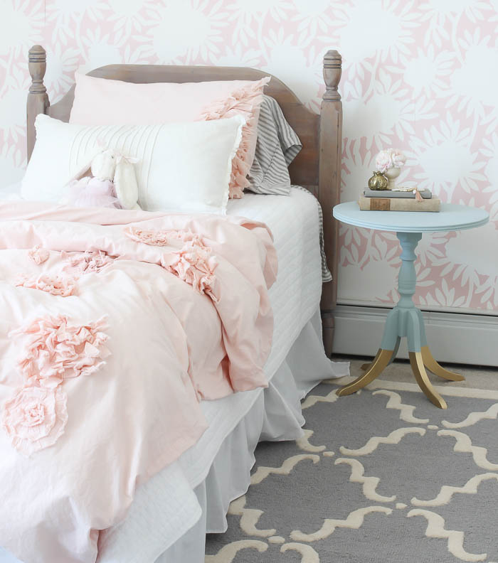
The base of our daughters bedroom is very neutral. A simple white bed skirt, gray and white ticking striped sheets (no longer available from Target), and a white pick stitch quilt from HomeGoods. 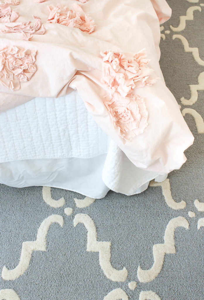 All of those items that will carry me through for years, because when she’s ready for a change I can swap out her duvet (TEARS – there will be tears the day that happens) and throw pillow for something that will suit her taste then. I also chose a grown up rug in soft colors, because even if it doesn’t go with her style down the road, it’s neutral enough I can use it in another room. You can find the rug HERE, from RugsUSA, and even though her room had wall to wall light beige carpet, layering a large area rug over her existing carpet added so much interest and depth to her space. I think this often gets over looked, especially when carpet is already in place, but layering in a fun area rug is a great way to add interest to a room in a subtle yet impactful way! Another item that made a huge impact in her room was swapping out her existing builder basic light, for a dainty chandelier.
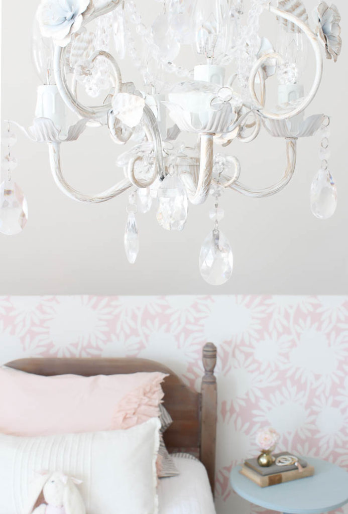
I could have chosen to over look her current light fixture, because it’s on the ceiling, and it wasn’t terribly ugly, and how often do people look up. But you guys, the moment this sweet little chandelier from Joss & Main went up, it was like the icing on the cake! You never realize how much of an impact it has, until it’s done. If I could stress one thing, it would be don’t over look your light fixtures. They will be just as impactful as curtains are to a space. If you’ve ever added, or changed curtains in your room than you know just how true this is!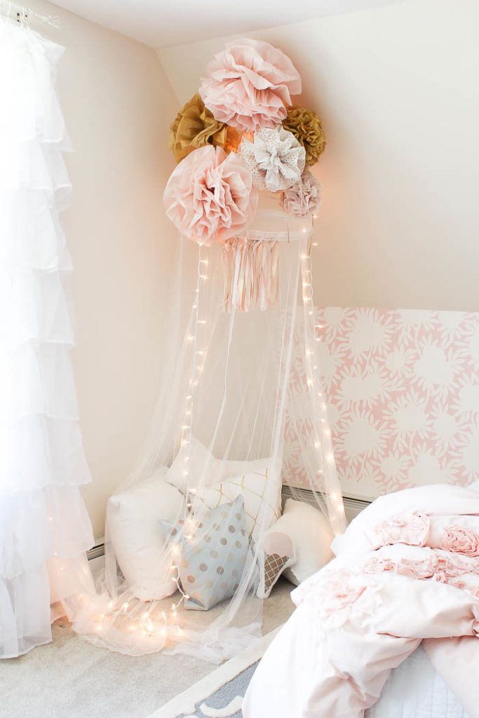
One of our favorite spaces to create in her room was this cozy reading corner. An inexpensive mesh canopy, a few DIY’s, twinkle lights, and cozy throw pillows create this cozy corner she not only loves to thumb through books in, but she loves to play under it as well. 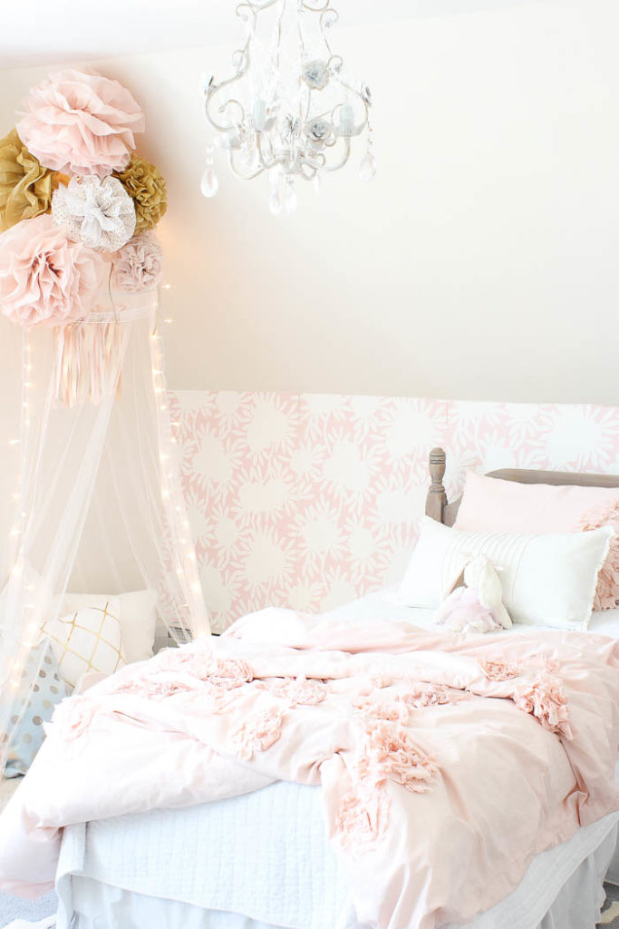
On the other side of her bed, we created a fun gallery wall. I’ve shared a glimpse of this before, HERE, shortly after I painted her walls Opal by Benjamin Moore. 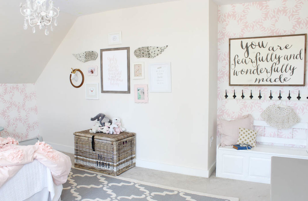
It’s a very light pinky-peach, that’s more white than anything else, but it has the softest undertones that make the other pink accents in her room pop. 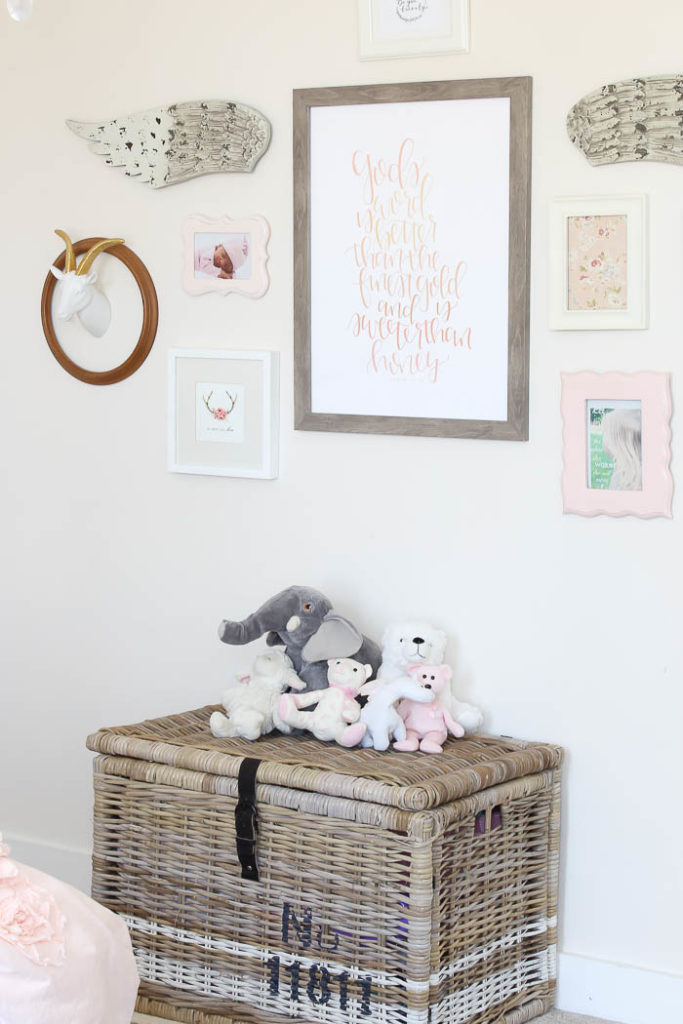
Her wicker trunk was from Ikea a few years ago, and I shared HERE how I painted the stripes to give it a vintage feel.
When it comes to creating any space, there are a few key tips I think make all the difference in the world.
- Piecing together a room, instead of buying a “completed set” takes longer, but the outcome is a room that feels put together with extra love and attention to detail, and gives you an heirloom feel, which no store can provide.
- Not over looking pieces that will make a huge impact on the space. The right sized area rug, and lighting with character make a bigger impact than you think.
- Always incorporate at least on DIY. Our daughters room was put together with a mix of yard sale finds, DIY’s and finished with sophisticated touches.
I hope these tips help you create a space you not only love to look at but love to be in! A complete list of all the sources for her room are included below:
Headboard – yard sale find with a DIY re-finish
Paint Color – Opal by: Benjamin Moore
Wall paper – Silhouette in Blush by: Caitlin Wilson Design
Chandelier – Joss & Main
Bedding – Duvet Cover from The Land of Nod / White Quilt – HomeGoods / Ticking Stripe Sheets – Target
Reading Nook Canopy – Amazon
Ruffle Curtains – Amazon
Wooden Sign – Between You & Me
Paper Fan wall decor (shown in room reveal post HERE) – Save on Crafts
Painted Blue side table – $10 Yard sale find
Rug – Rugs USA
Throw Pillows – Joss & Main (sources included in reveal post HERE)
Wicker Trunk – Ikea
Stay in touch!
Instagram / Pinterest / Facebook
Have a design question? Visit Doucette Design Co. for all your design needs!

Hello!
Would you mind sharing the paint color of the baseboards? Your daughter’s room is gorgeous!!
Hi Kala, The trim / baseboard color is just white paint in the can off the shelf 🙂
Hi Bre, your daughter’s room is adorable! I was wondering if you would comment or post about the best way to paint a room with angled ceilings. My husband and I just bought our first home-a cape. I would love your thoughts on if you would paint some of the angled ceiling with the wall color or all of it with the white ceiling paint. Hope that makes sense…
Thanks, Judy
You got it Judy! And thank you so much!!
Beautiful! Love everything about this room!
hey girl- I have to tell you again, I just love your daughter’s room! So pretty!! Love it!