Hello Friends! If you caught my Goals post last week, than you know we are gearing up to tackle our master bathroom. If you’ve been following the blog for awhile, well heck even since the beginning than you may be thinking to yourself you don’t recall seeing our master bathroom, and you’re right! I’ve never shared it with you, because of it’s blah boring state, and quite honestly it has been on the very bottom of our to-do list. I’ll explain more about it’s current state when I share the before pictures with all of you, but in the meantime I wanted to share the design plan for the space.
They say the devil is in the details, and I have always been one to fully believe that the difference is in the details. Details can make or break your design. In any event, whether you are decorating a room, hosting an event, or in this case renovating a bathroom. The details are what makes the difference of things going from nice to WOW. And trust me it doesn’t have to be a budget breaker either. It’s all about knowing where to splurge, what to look for, and knowing where to be thrifty.
As I mentioned our bathroom is very blah, lacking any charm, and a VERY beige state as well lol. This past week I’ve been browsing and narrowing down my ideas, and finalizing all the details. I’m happy to report that everything has been finalized, and it’s on it’s way. So I put together a mood board with the selections I’ve made, and wanted to give you a little insight as to why I chose what I did.
Here is the design plan I put together.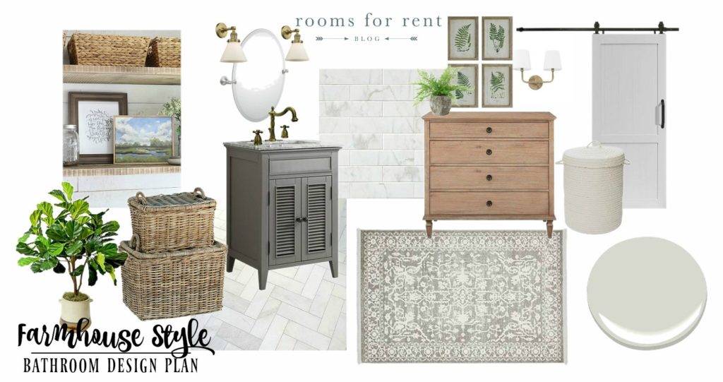
*This post contains affiliate links for your convenience, which means I make a tiny portion of the sale with no additional cost to you whatsoever.*
As you can see it has a neutral color palette, but the details are what will make it feel anything but boring. Honestly, I cannot wait to see this design plan come to life. I’m itching to get started. I’ll explain more of the room layout when I share the “before” photos with you, but one of the things we are doing before we can get started on any of the fun details, is we will be taking out a wall that conceals an old, unused chimney in our master bathroom to open the room up to be more of a full square.
We plan on tearing up the current tile floor, and replacing it with THIS tile in a herringbone pattern, similar to the look below: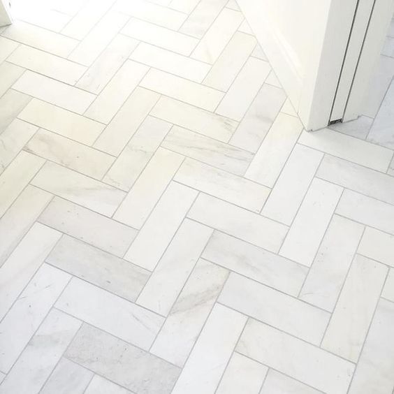
Then we will use the same tile in a subway pattern half way up on the walls and install a chair rail molding to cap it off to give it a spa like feel. 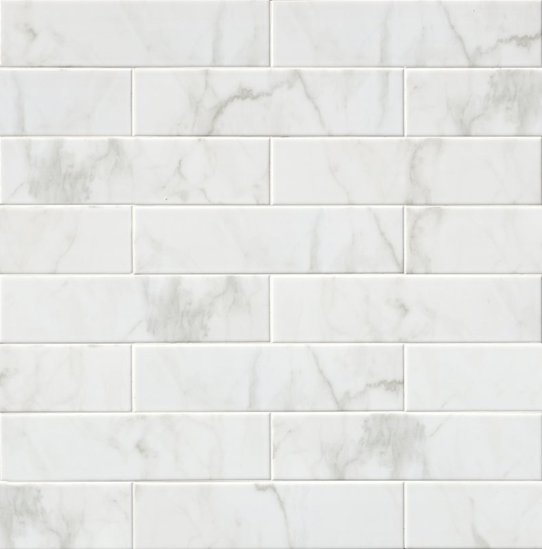
I contemplated a lot with different styles of tile. I knew I really wanted a marble look, and I wanted to do the tile half way up on the wall to have a spa like feel. However if I went with my first choice tile, I would have spent our entire budget on just tile. And I knew I couldn’t do that. These 4×16″ ceramic tiles were a fraction of the price of my first choice carrara marble, and honestly once they are all installed I don’t think I will miss that they aren’t real marble at all.
Another way I helped stay in our budget was I originally wanted to add hexagon marble tile to the floor. Which I absolutely love the look of. You can see an example below: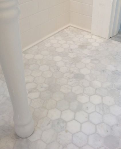
However, if I went that route, I would have to cut other things out of the design plan. Which I was willing to do, but instead, I opted for the less expensive tile, and installing it in a herringbone pattern will still give me plenty of interest and design factor on the floor.
Once my tile choices were secure it was time to pick a vanity. Since we are keeping the original footprint of our bathroom in place, and not moving any of the plumbing, this limited my vanity options drastically. We currently have a 30″ single vanity with sink, and it’s just stock cabinetry. However the previous owners who installed it wedged it into place, that honestly a 30″ vanity is about 3/4″ too big. Trust me, I have measured and measured again, and the current one looks poorly installed, because they tried to make it work. So we decided to go down a size, so that it looks like it fits better into the space. I chose THIS 24″ vanity, with shutter style doors.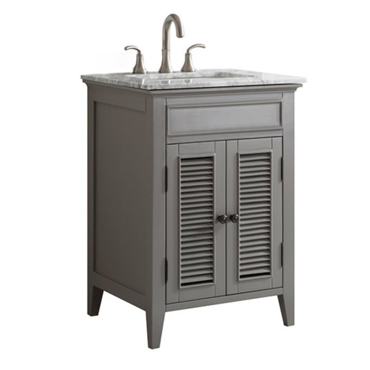
It has a white carrara marble top (see I still get my marble!), which has more of a high end feel, and the shutter style doors add so much charm. Making this vanity not only functional but a huge plus when it comes to adding character. Even though it comes with a countertop and undermount sink, it does not include a faucet. Which was another detail I could choose that would add character.
I love the faucets that have a vintage flair to them. However they can get somewhat pricey. I found one that I loved, but it was over $300. I was willing to spend that simply for the detail alone, because again the details are what make the difference in design. However, I found THIS similar one for under $200, and that option was much more budget friendly without having to sacrifice on looks. I was willing to splurge, but in the end didn’t have to compromise on look and found one that would still give me room in my budget. 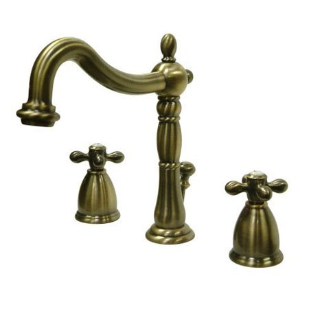
Because of the savings in my faucet, I was able to splurge a little on my sconce lighting. Our bathroom is so poorly lit, and it has one tiny window, that only lets late afternoon light in. Adding more lighting was a must! There are so many great sconce lighting options out there now, but I resisted picking something super trendy, because I wanted our bathroom to be updated but still go with the era of our 1846 farmhouse. 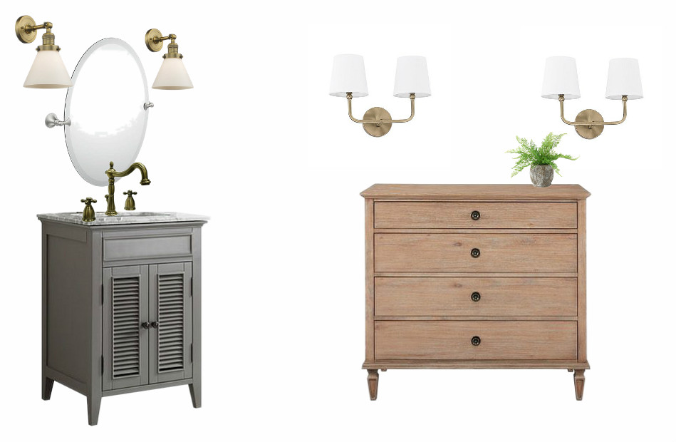
Since we only have room for one sink, we will be renovating our current vanity area with the look to the left in the photo above. I chose more of a vintage looking sconce for that station. We will also be creating another make-shift vanity area (where we plan to knock that wall down and remove the old chimney), i.e. a space for me to get ready. That will look like the station on the right in the photo above, with two sets of double light sconces. The new dresser will add more storage for extra linens, and the top two drawers will hold all of my hair tools and products. The dresser was another choice I made with the main focus being on adding character. The warm wood tone adds character to the bathroom, and will stand out nicely against the white tile walls.
Next to our shower, we currently have some open shelves that hold towels and toiletries. However they are your standard white wire shelving, so we plan on replacing those with some reclaimed wood that we have, just like the shelves we created in our laundry room.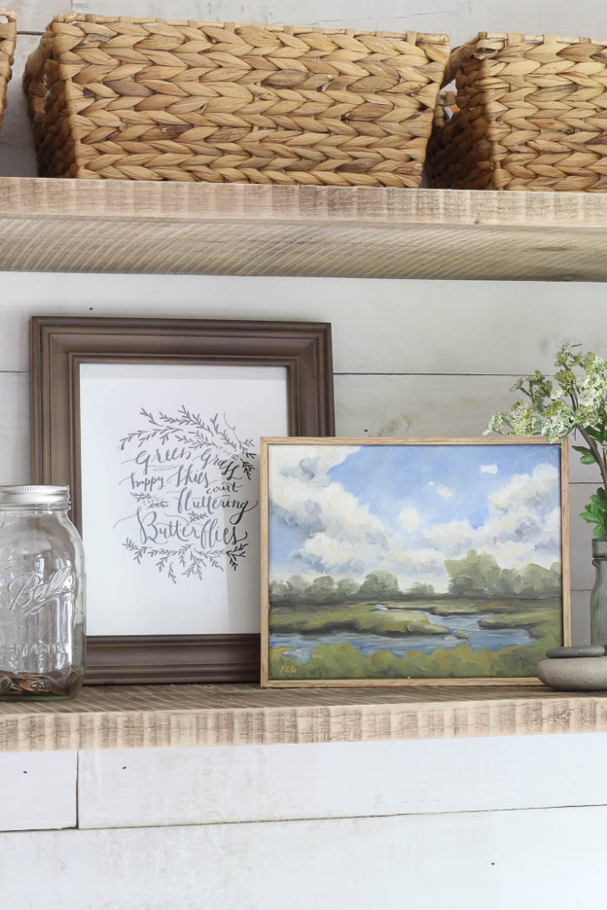
Then below the shelves I will place the stacked lidded baskets you saw in the mood board above. 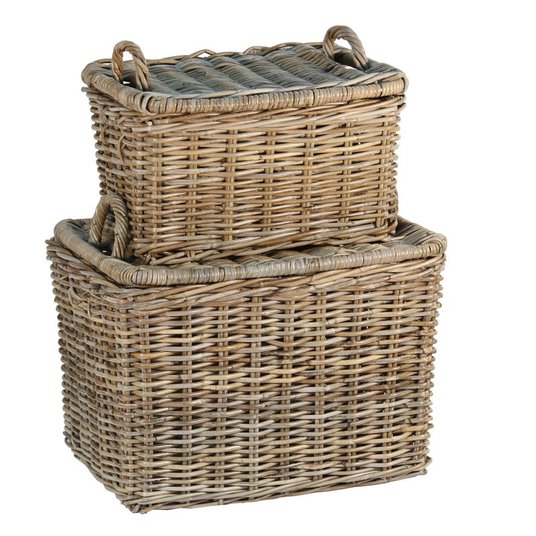
These will also help store additional linens and towels that we don’t use on an everyday basis. I chose to incorporate the baskets as additional storage because they will also be an element that is functional in use, but help add a lot of character to the space.
To save on space, we are taking out the existing door and replacing it with THIS sliding barn door. That way we don’t have to account for space the door will take up when it’s open. We will not be replacing the tub or toilet in this makeover, like we did in our downstairs bathroom makeover last year. They are only about six years old, and white, so there is no need to replace them.
Below you can find all the sources for the items we will be using in our master bathroom makeover found at Wayfair.com :
This makeover is sponsored by Wayfair part of their #Wayfair1RoomReno challenge to complete a bathroom reno in 60 days!
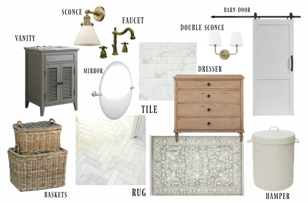
VANITY | TILE | FAUCET | SINK SCONCES | RUG | STACKED BASKETS | MIRROR
BARN DOOR | DOUBLE SCONCE | HAMPER | DRESSER
AND … you can check out my BATHROOM board on Pinterest where I’ve been pinning TONS of bathroom makeover inspiration: 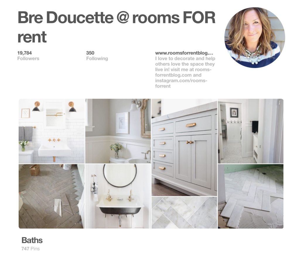
Stay in touch!
