Hello Friends!!
I can’t believe that we have been in our new home for six months now! I still get that pinch me feeling when I pull in our driveway, just in awe that this home is really ours. There are so many things that we love about being here, but I can honestly tell you for me it’s not having to wonder anymore about what our forever home will be like. There is a deep sense of being rooted here, and knowing that this not a temporary home for our family, that gives me so much contentment I don’t know if I can fully explain it. I mentioned in my Fall Home Tour that I needed to share more about the progress that has taken place in our dining room, so today I’m showing you just what we’ve done so far, including that new paint color and layout this room has taken.
Come and see~
Here is what the dining room look like when we first moved in. The view below is if I’m standing in the dining room with my back to the wall with the bay window, as I’m looking back into the kitchen.
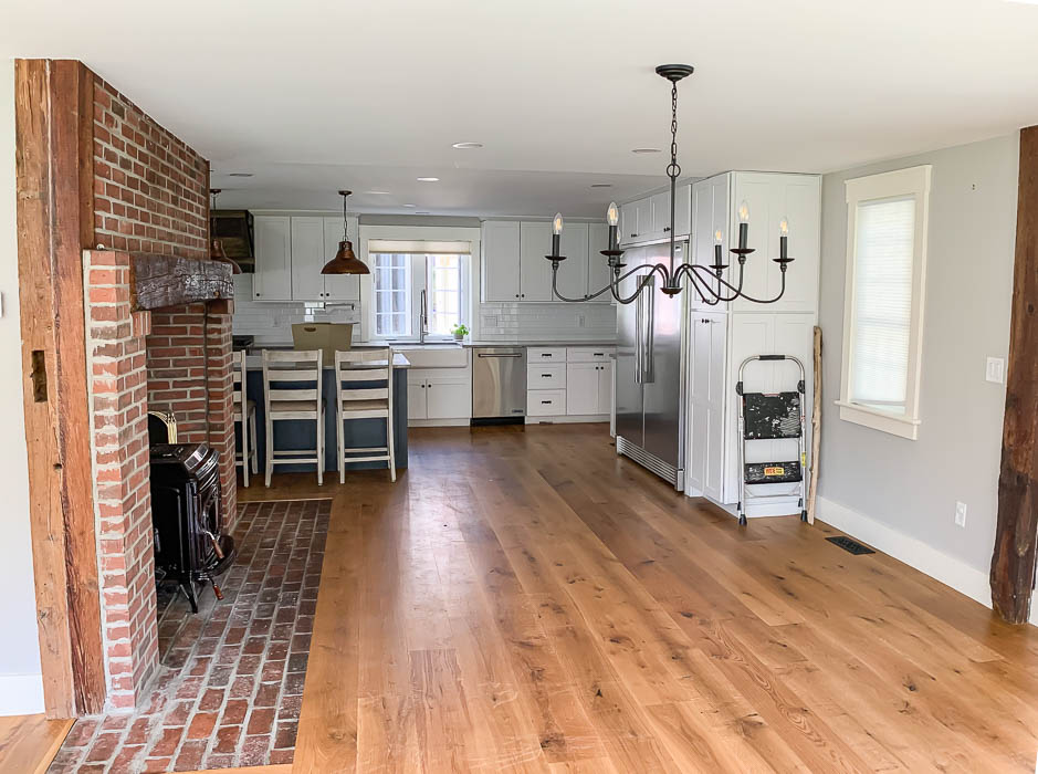
There was a chandelier hung slightly more towards in front of the fireplace area, but not centered in front of the fireplace. The previous owners placed to their table parallel with the fireplace, and then used the area in front of the bay window (pictured below) as a morning sitting room.
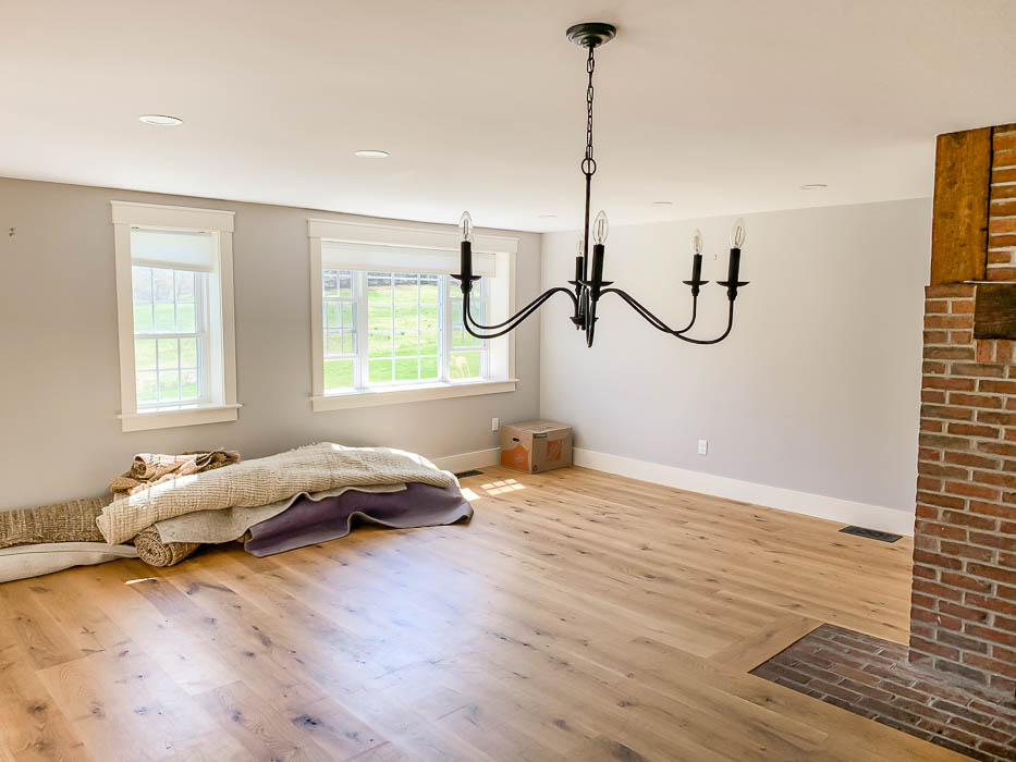
To the left of that view above, is the sliding doors that lead out onto our screened in porch. Eventually I would love to replace the sliding doors with french doors that open up onto this back porch so that in the warmer months it feels like our dining room is open to the outside.
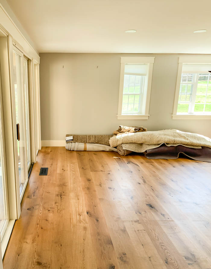
I knew that I wanted to reconfigure the layout of how we used this space from how it was previously set up. I wanted to move the chandelier, and place our dining room table to instead run the length of the dining room, parallel to the wall with windows on it. This would then open up the space in front of our massive center chimney, which we plan to give a makeover to later this winter, and turn this spot into a seating area with some cozy chairs and a round coffee table.
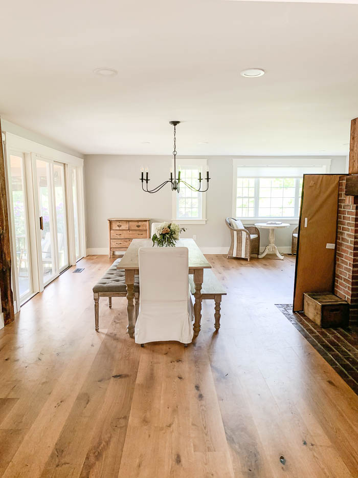
Our dining room looked like this for a few months after we moved in. First we actually needed the space to move all of our living room furniture into while we refinished our living room floors. So you can imagine how thankful I was for a space that was big enough to hold all of our living room furniture while we tackled that project.
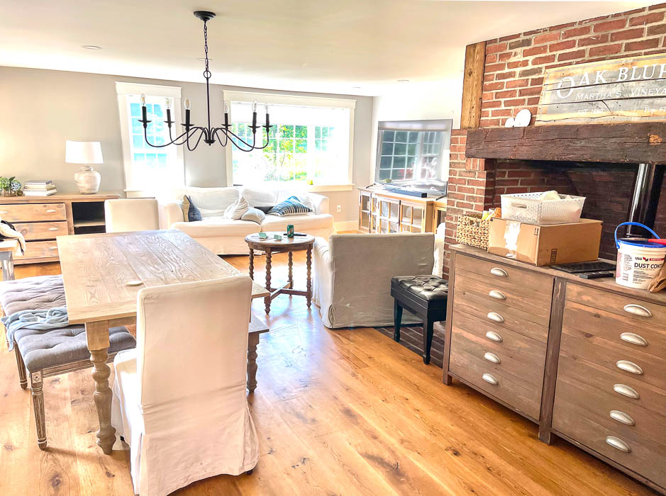
Once we finished our living room floors, the furniture in our dining room looked like this. We couldn’t move our table until the chandelier came down, because otherwise you would just walk right into it. With the table still in front of the fireplace the rest of this room just felt like a wide open space. For the meantime I had set up our round side table (previously in our living room at the old house), and my favorite two wicker chairs under the bay window. Eventually I want to use this furniture set up in our kitchen in between the front two windows, once we remove the built in desk area. It makes a great landing spot to enjoy your morning coffee.
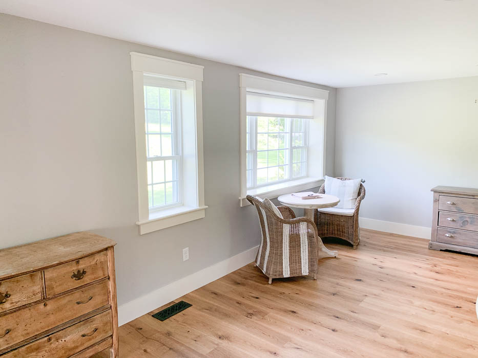
Our previous dining room dresser turned buffet rested on the back wall, where I knew I eventually wanted my hutch to go.
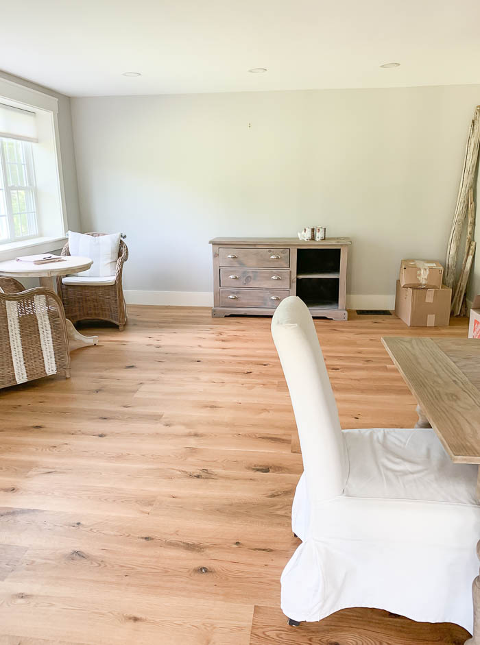
Once I had finished giving this FB Marketplace hutch a makeover (you can read more about that HERE), it was all the motivation we needed to move the rest of our dining room furniture into the layout I wanted.
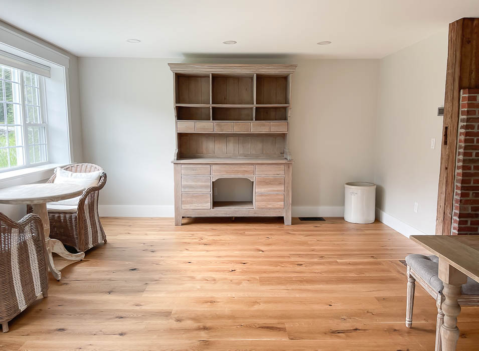
Since this back wall is quite long, eventually I would love to find or build a hutch that is wider than my current one, really filling up the space. But until we have the time or the resources to do that, I hung some artwork on either side of the hutch, and placed two chairs on either side, flanking the hutch to help it visually fill the wall a bit better.
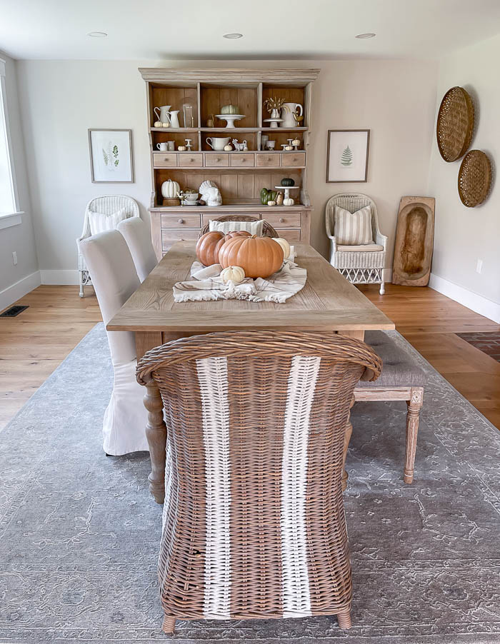
With the new hutch placed on the back wall, at the head of the table, we moved our dresser over to the left of the windows. This creates a focal point when you first walk into the space, which also gives me additional storage to hold all my table linens. Eventually, I want to replace the windows on this wall with one grouping of windows, that our centered, so that they frame the table better.
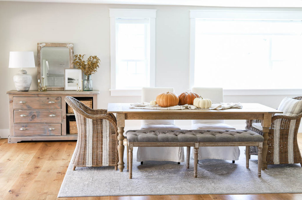
Since our new dining room is quite a bit bigger, we do plan on making a larger dining room table that will seat 12. Once the new table is built, then we will hang a new chandelier, but for now we are just enjoying this space in phases, and using it as we can along the way.
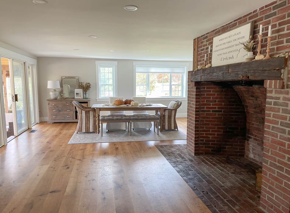
Below you can see a Before & After of the new layout no that the chandelier has been removed.
Before ~

After~
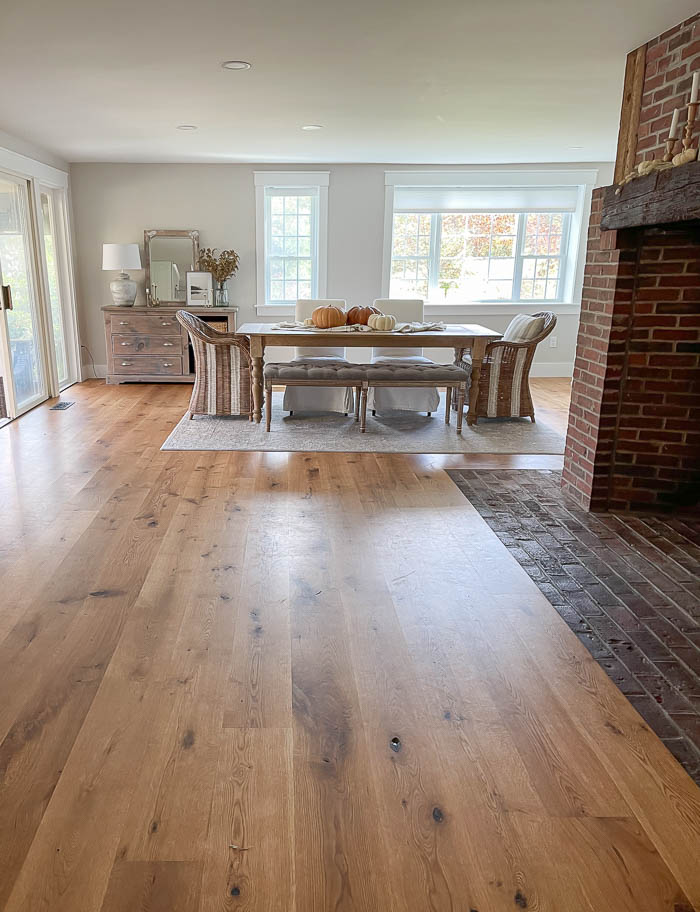
Next up, make the space in front of the fireplace cozy. We removed the wood stove that was inserted into the fireplace. Since the house is well insulated, and wood stoves put off a lot of heat, we decided to take the wood stove out, and instead convert this back to an original fireplace. I love the idea of sitting a cozy chair in front of the fireplace while it’s going, and we plan to tackle this area in phases in the new year. We have big plans for a dramatic makeover for this original fireplace, so I will be sure to share all the details on it as we prepare to get started.
