Hello Friends!!
It is crazy to think that we are just two short weeks away from Thanksgiving. I get giddy with excitement this time of year as I start to dream up ideas for my Thanksgiving table. I’m not fully sure why, but for me the holidays feel like the one time where I can go all out. Lighting candles, using my inherited china set, as I set the table so each one of my family members knows they have a seat at the table. One of the key elements I think about when I’m brainstorming tablescape ideas is color. Color is a great way to emphasize the mood you wish to create for your gathering, so today I’m sharing a round-up of different Thanksgiving Table Color Schemes, as we start to plan our Thanksgiving Tables.
Let’s Set the Table Together ~
Of course, if you are a long time reader, then you know I am a neutral loving girl, especially when it comes to fall, and fall themed tables. So while I can’t split the tables that I have created right down the middle between cool-toned tablescapes and warm-toned tablescapes, I can point out what the three main colors are I used for each table, and how I coordinated those colors throughout to create an overall color scheme.
Ready. Set. Here We Go!
Green. Brown. Tan
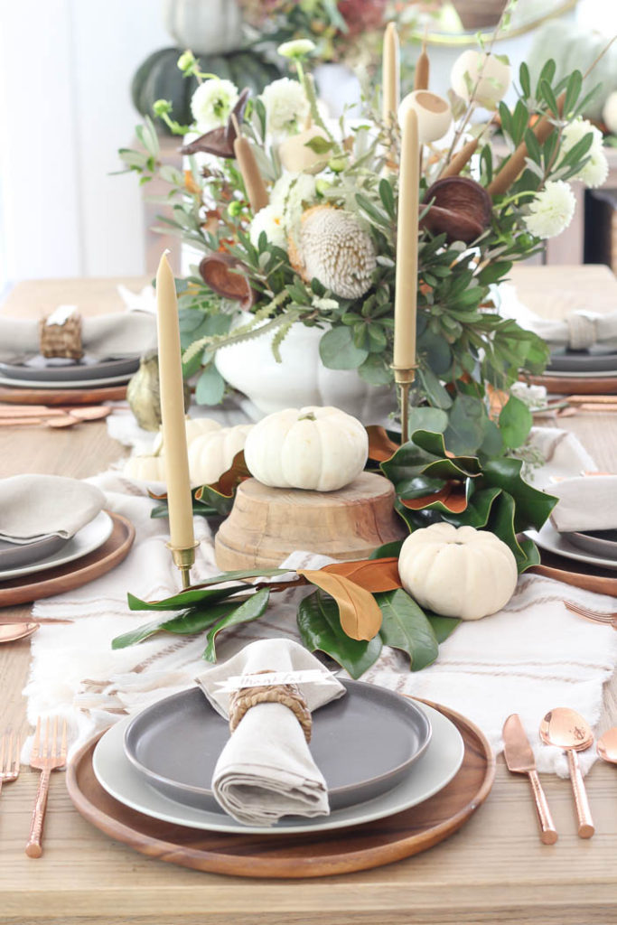
In the fall, I like warm, rich colors. Colors that mirror what’s taking place in nature outside my windows. My best advice is to choose and stick with three colors for a pleasing and cohesive table decor. Sticking to three colors keeps things from looking too busy, and will help you choose your other tablescape pieces like plates, glasses, or napkins easier.
Cream, Green, Copper
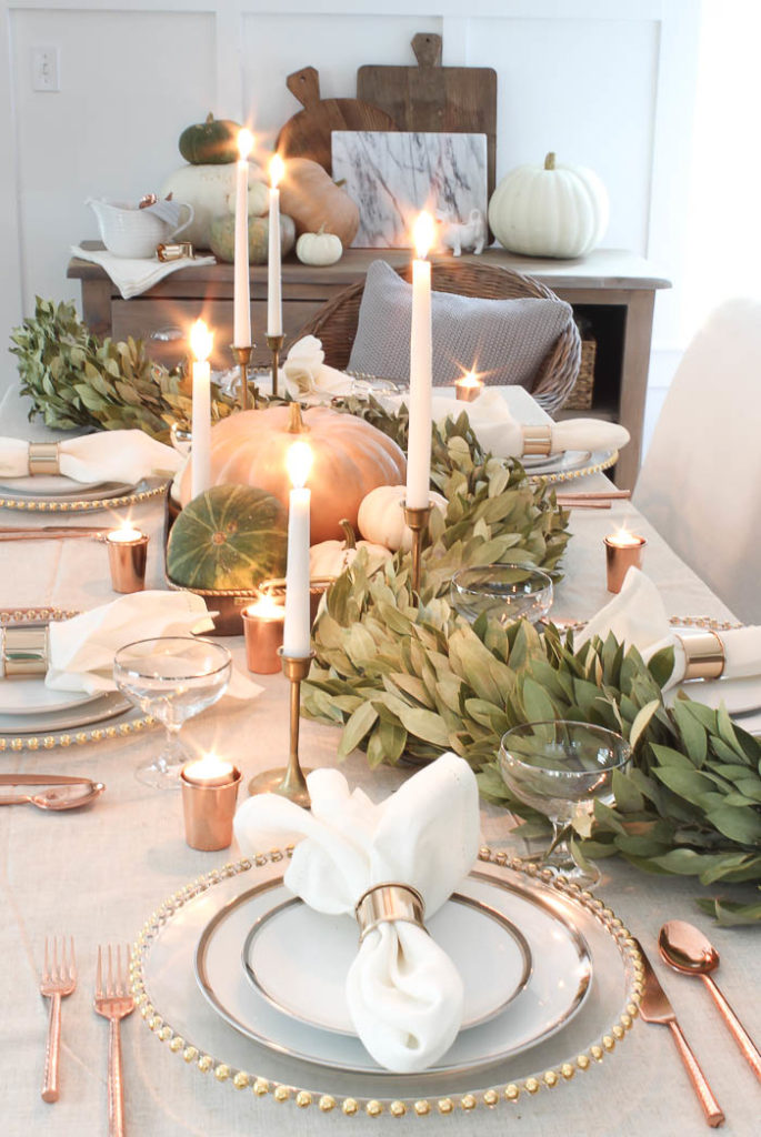
In just about every tablescape I’ve rounded up for today you will notice my use of antique brass, copper, or rose gold. I love that warm toned metal especially in fall, because it reminds me of the golden colors you see on the trees this time of year. Think outside of the box when it comes to how you incorporate your color choices throughout your tablescape. While I might not use bright orange or yellow, I can substitute a different type of metal in its’ place. Pick colors that you gravitate towards naturally, or that catch your eye, and plan your other tablescape details around it.
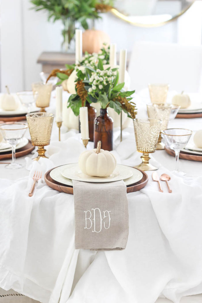
Amber, Cream, Green
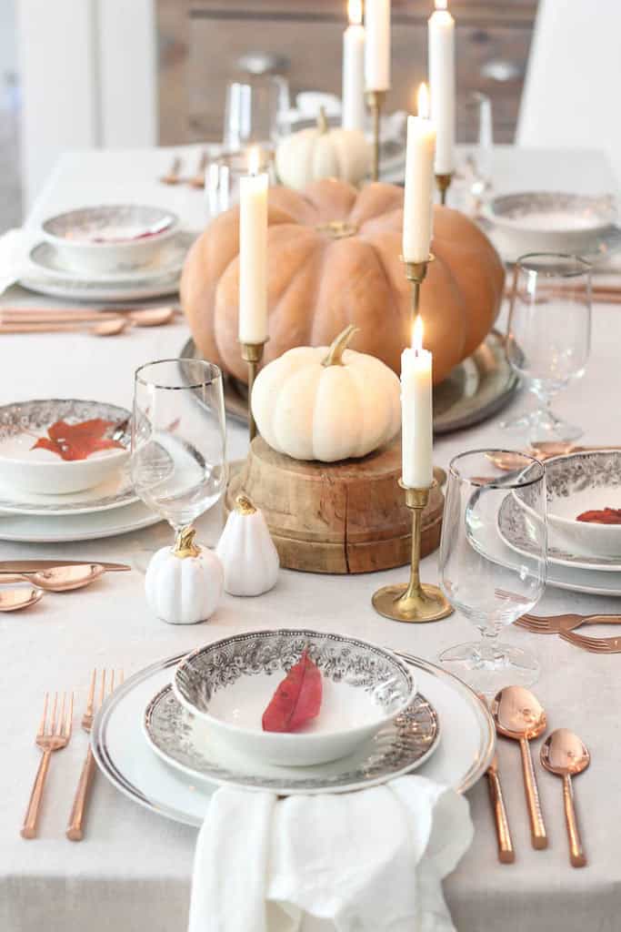
Beige, Orange, White
For this table, I wanted the soft tone of the orange to be stand out, but subtly. Meaning I didn’t want the soft orange hue to be the predominant color of this table, but just one subtle pop. So I used a beige linen tablecloth to set the foundation. Simple plate settings, nothing to fussy or ornate in detail, and mostly white. This allows my single heirloom pumpkin placed as the centerpiece to take center stage.
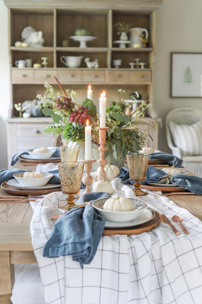
Green, Blue, Champagne
For this color scheme, I knew I wanted to used a Cinderella pumpkin, which are usually a blend between light blue and pale green. I played off the hues of the pumpkin by bringing in my blue linen napkins, which I draped over the side of the plates instead of neatly folding them, so they would stand out more in my table. I then made sure to use mostly green stems in my floral arrangement so that it would also pick up some of the pale green tones in the pumpkin as well. I brought in some champagne tones in the napkin rings, and shimmery glasses.
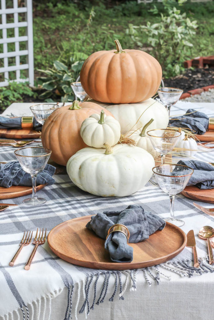
Orange, White, Blue
When I first created this tablescape a few years ago, it felt like a stretch to me. I had never really seen this color combo on a table before, but had seen it in decor, so I figured why not try it out. I couldn’t have been more pleased with the outcome of this blend between warm orange tones, and cool blue found in my napkins and flannel blanket turned tablecloth. If you ever get stuck trying out a new color scheme, just remind yourself to keep repeating the colors throughout every detail you add to the table. The warm orange tones show up not only in the pumpkins, but can also be found in the silverware and napkin rings as well.
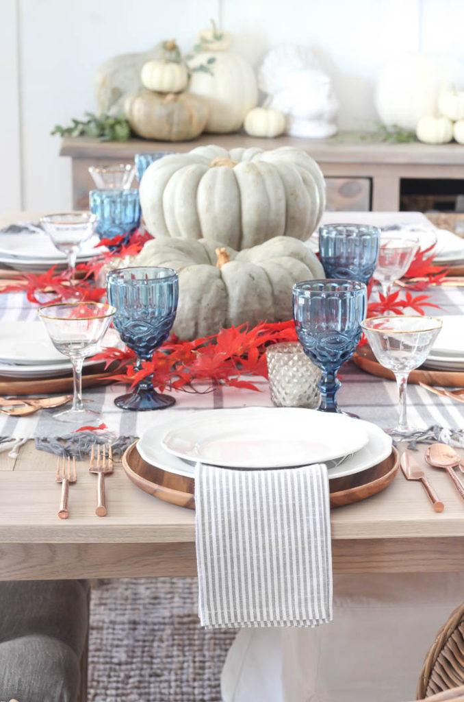
Blue, Red, White
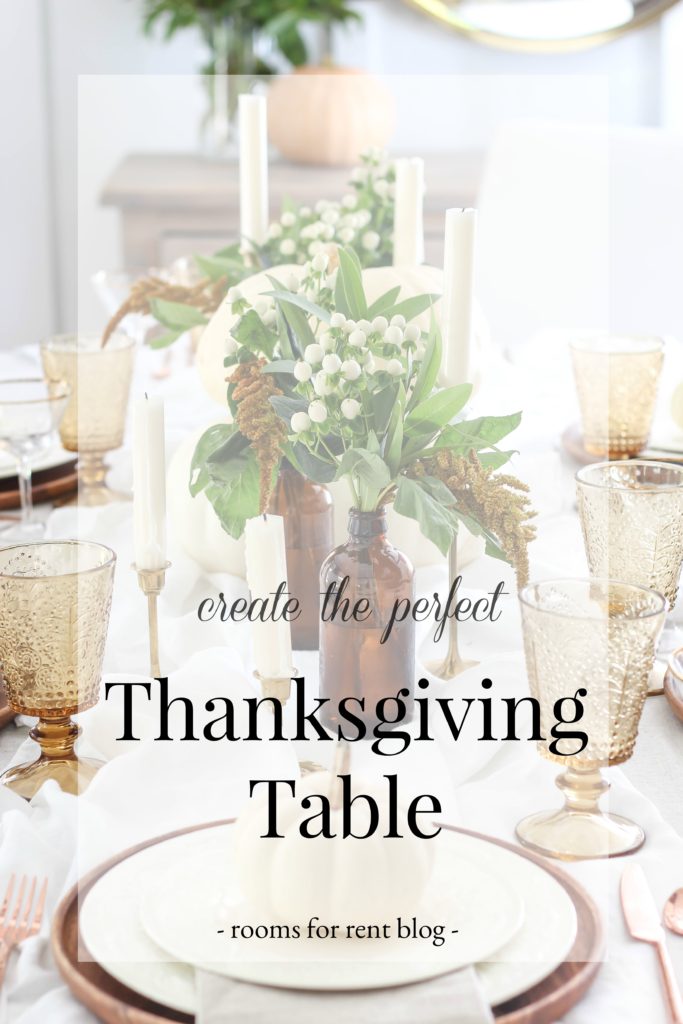
Also, if you enjoyed todays post, be sure to check out this one for more tips on creating a Thanksgiving table.
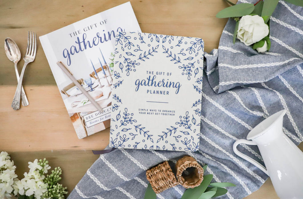
Grab my planner today, to help you plan your next gathering – HERE.
So many lovely tables and now to pick one?!!