Hello Friends!!
When it comes to hanging things on the walls in our homes there is nothing I love more than creating gallery walls. I sometimes wonder if it speaks to my teenage years where I would cover the walls in my room with giant collages of cut out pictures from magazines. There are many different ways you can create a gallery wall, and styles depending on the frames you choose and how you group them. I recently added a new gallery wall in our living room, so today I’m going to share my process with you in how I go about choosing art to create a gallery wall.
Let’s dive in ~
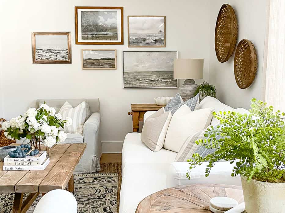
This wall in our living room sat blank for many months, and was the last to be filled. I tell you this because over those many months I would sit and stare at it and imagine what would look best to fill it. It’s a rather long wall, so I had to be thoughtful in what I chose for photos and the size of frames to make sure that it would fit the scale of the room.
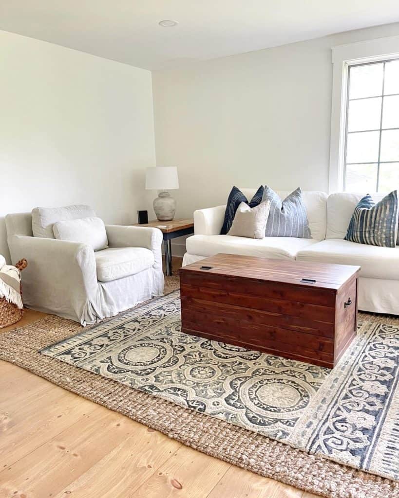
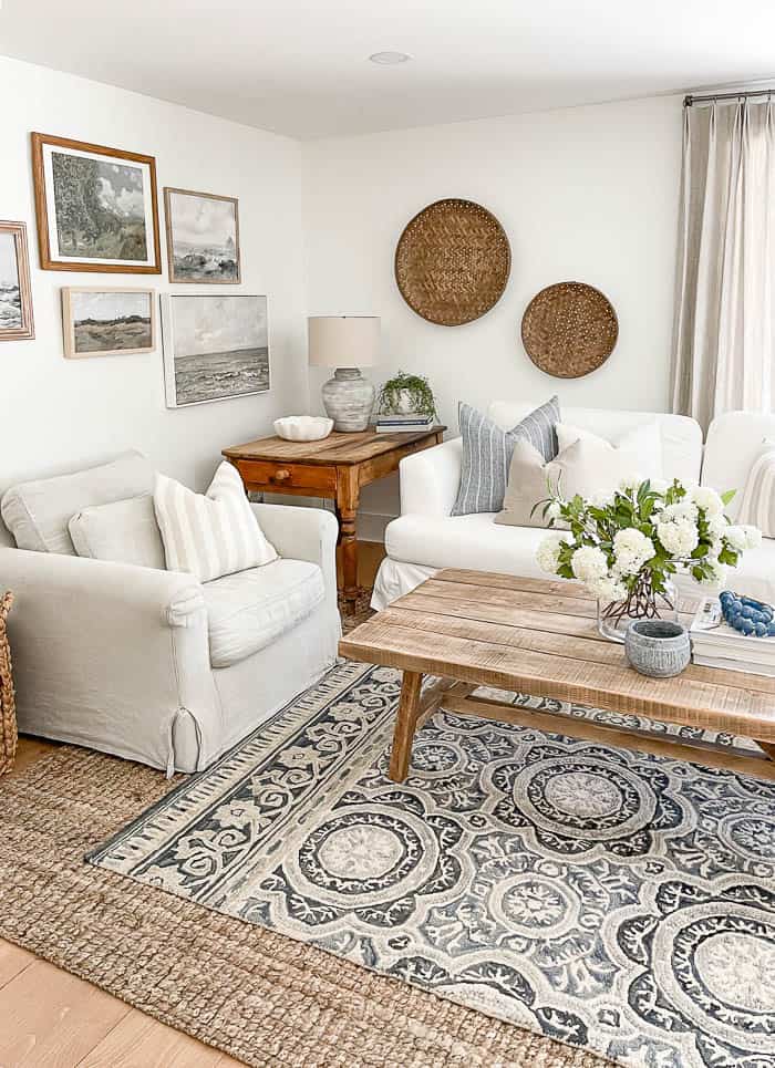
Since I already had a grouping of large family portraits on the opposite wall (above our console table), I knew I wanted to incorporate artwork instead of more family photos. I’ve always loved the look vintage landscape art, either of land or the see, so I started there.
I already have a few prints from Collection Prints, so I started my online searching there. I saved every picture I liked. This helped me narrow down my choices, so I could get a clearer idea of what grouping to hang. I took a screenshot of each print and then uploaded them to PicMonkey, which is a free online photo editing site.
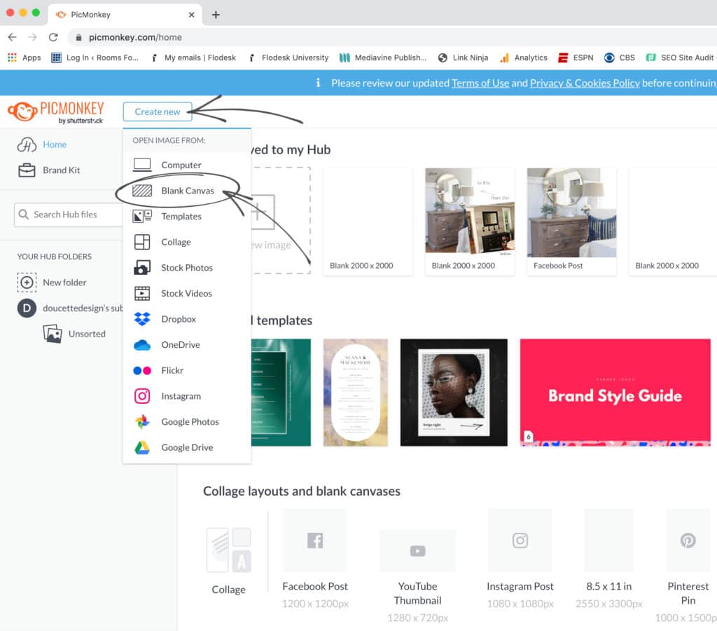
On their site I chose to create a new project, and chose blank canvas. Then under the camera icon on the left, I chose to upload a picture, and one by one uploaded the screenshots I had saved of the art prints I liked. Once everything was uploaded I began by arranging the artwork in groupings on the blank canvas. I knew I wanted a larger art piece on the bottom right, because that’s where our side table is, so I started there, with my largest piece first.
I was able to drag and drop different art prints into my blank canvas to get a feel for how they would look hanging next to each other. This helped me pick out which art prints that were maybe too dark for the space, and which ones looked best next to each other.
This is the mockup I came up with ~
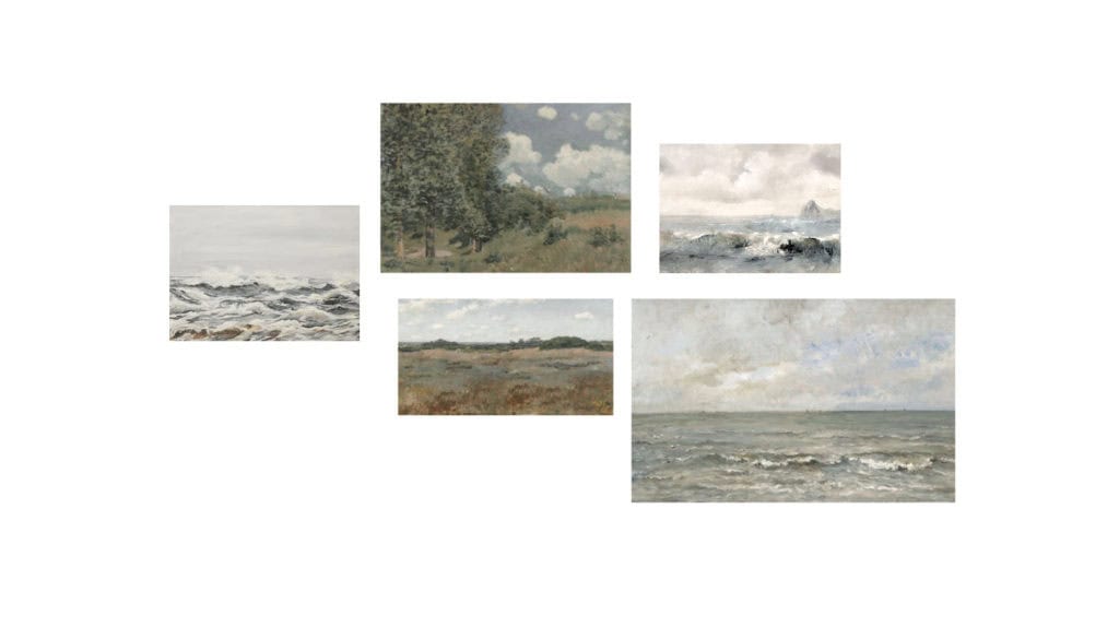
I knew I wanted to keep the frames slightly above the furniture so I then measured the height of the wall space I had from there. Knowing the height and width of the wall space I was looking to cover, helped me figure out what size frames I needed to get. I grabbed similar sized picture frames I already had on hand and laid them out on the floor in the grouping I came up with on the computer. You could also do this by cutting out pieces of cardboard or poster board, but this method helped me make sure the size of the prints I was ordering would fit the wall correctly.
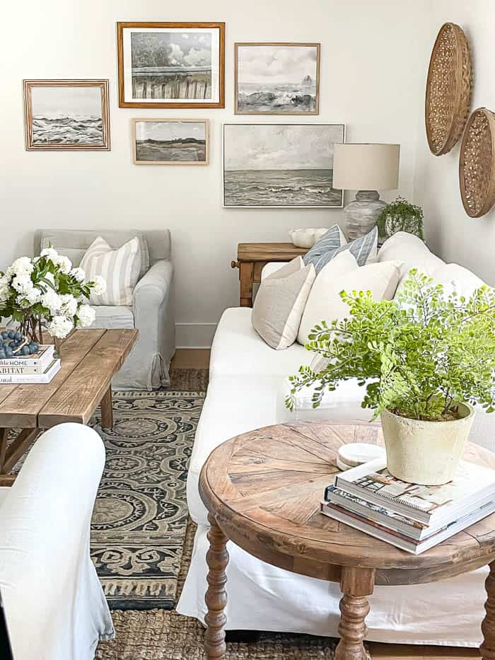
Once my prints arrived, I arranged them in different frames for a more eclectic, pieced together look. I hung them on the wall starting with my largest frame first, just like draft I made on the blank canvas in PicMonkey. Once I hung the largest frame, on the bottom right, I then hung the next picture directly above it, and worked my way from right to left.
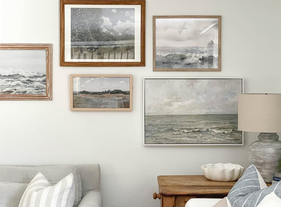
Whenever I’m getting ready to hang a gallery wall I always do a dry run on the floor. I gather all my frames and lay them out on the floor. This way I can visualize exactly how I want hang my frames on the wall. It takes the guess work out once you start, and also helps minimize the amount of holes you put in the wall if you were to try out each frame.
Since I was most concerned about the frames not being too low, on top of the furniture, I focused more on making sure my height above the furniture was correct, and adjusted the frames on the top to accommodate.
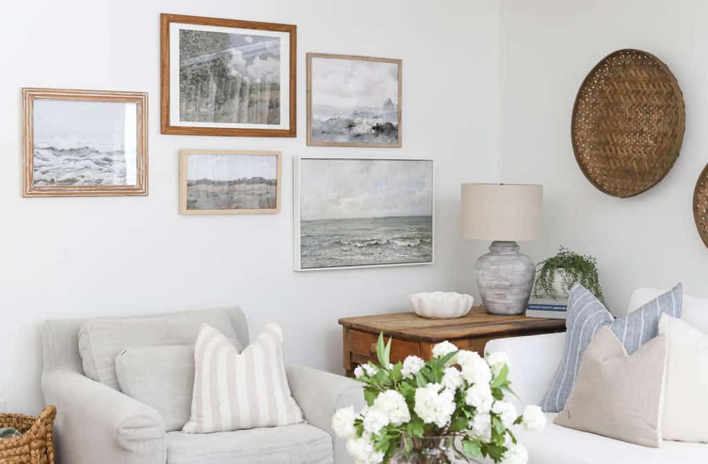
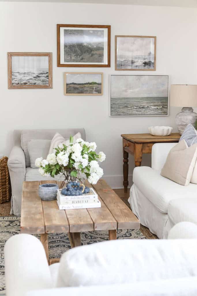
Here are the prints I got from Collection Prints:
- Bottom Right – Waves
- Top Right – Oceanside
- Bottom Middle – Coastal Prairie
- Top Middle – The Field
- Left – Waves 2
How much space you put in between each from is really up to personal preference. I just try to keep the spacing as consistent as I can throughout the whole grouping. Knowing that sometimes thats not always possible when you are mixing smaller and larger frames together, but consistently spaced from left to right is a good rule of thumb when hanging a gallery wall.
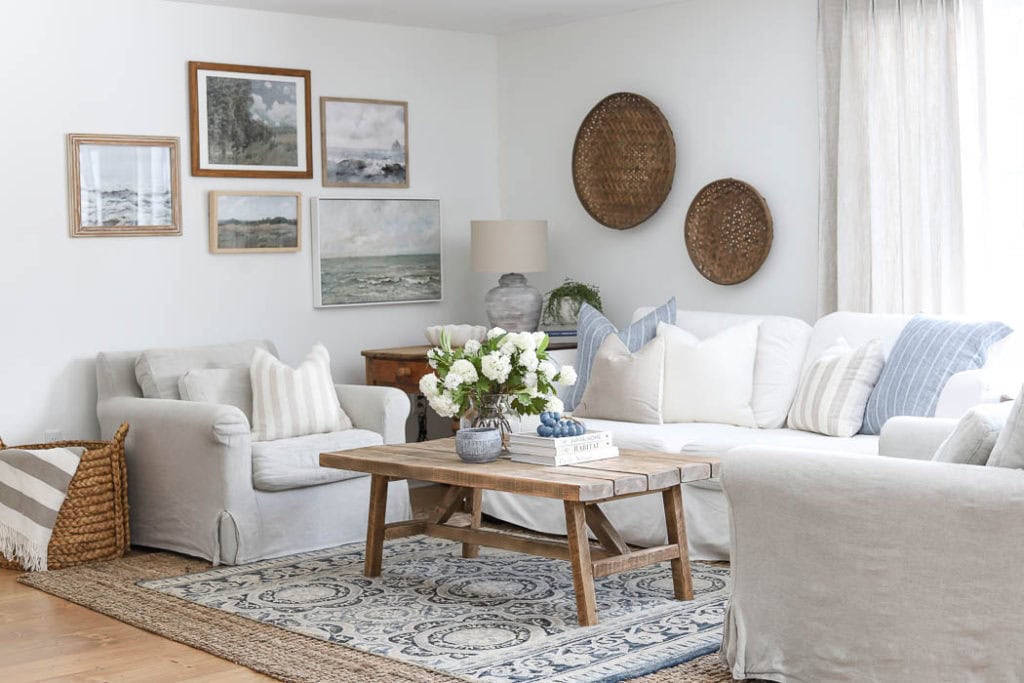
The fun thing about gallery walls is you can add on to them, or tweak them as the mood strikes. You can swap out the prints for new prints, and even change things up seasonally if you want. Now that I’ve had this gallery wall hung, I can already see where I want to add on and incorporate a few more pieces. So Stay Tuned!!
Find More Great Design Advice in my New Book below ~

Oh, wonderful! It’s so attractive. I love the simple wood design. Can’t imagine who I’d get to build it for me, but I’ll be looking for the tutorial, anyway. You never know, someone might come along with the needed skills! Thanks for the info.
The gallery wall looks great, Bre. I have a wall behind my couch in my LR where I want to do a gallery wall and just haven’t figured out what I want there yet but your process gives me some ideas. Also, I really like your coffee table. So you have information on where you found it that you would be willing to share?
Thanks for the gallery wall tutorial. Very helpful.
Thank you so much Naomi 🙂 Our coffee table is one that my husband and I built. Hoping to get a tutorial together for it soon.