Hi Friend!
After recently sharing our fireplace makeover with you, I realized I haven’t shared the updates that have taken place in our dining room. It’s probably because these updates happened slowly over the course of a year. One little update at a time our dining room is starting to take shape, and look more and more like the space I envisioned. Of course, I still have things I want to do in the space to add more warmth and character. But after looking back at where we started, and how bare our dining room sat for awhile, I’m excited to share the most recent updates our dining room has had. It’s a great reminder that progress can be made, if it is in the form of one tiny step after another.
Come and see ~
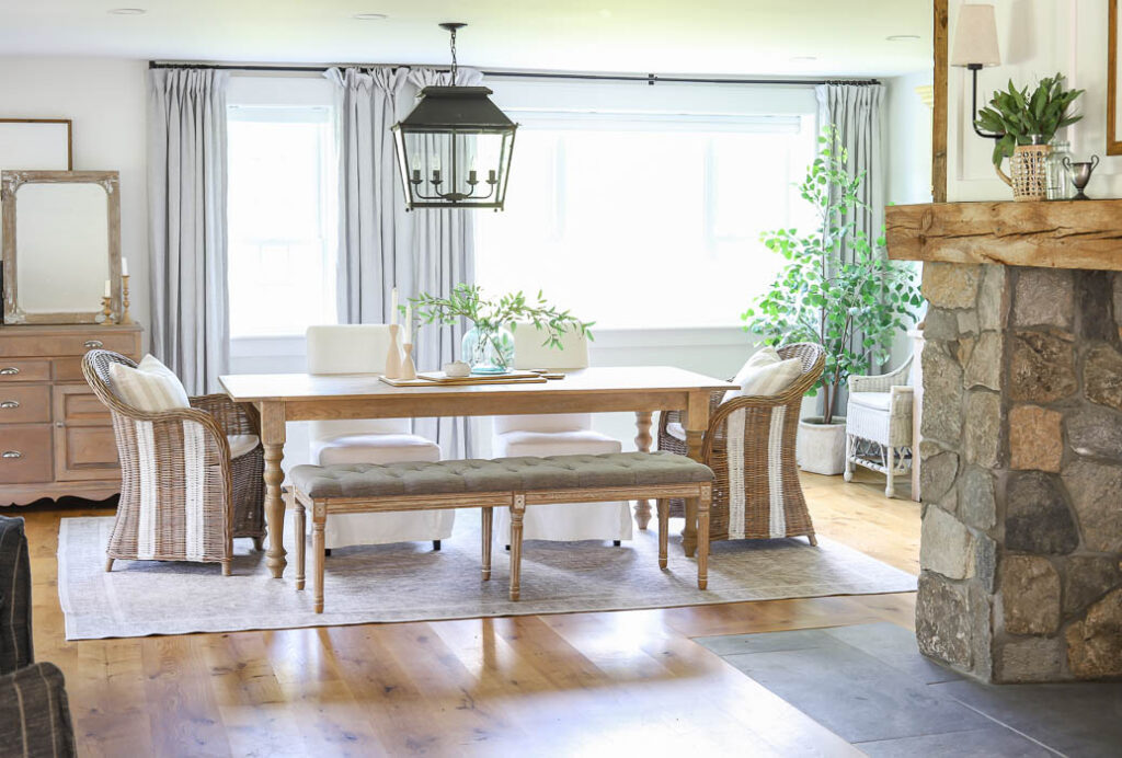
Our dining room is located just past our newly renovated fireplace. When we first moved in there was a chandelier hanging in front of the fireplace, where the previous owners had placed their dining room table.
When we first moved in, things looked like this.
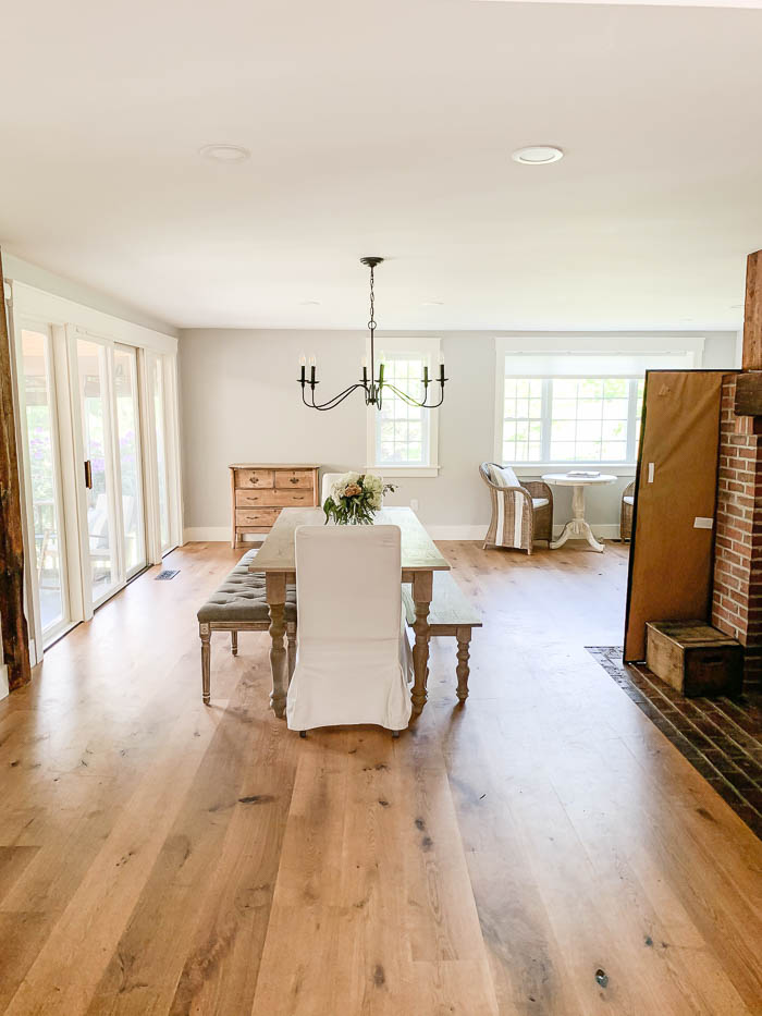
You can see more photos of our dining room when we moved in HERE, and see what the layout of the space looked like before we switched things around. I was longing to create a cozy seating area, more like a “keeping room” in front of our large fireplace, so we removed the chandelier, and moved the dining room table down further, and placed it in the opposite direction.
Slowly over the past year, I’ve been working on adding more character to our dining room. I repainted the walls White Heron by Benjamin Moore, to help our lighter wood toned furniture stand out a bit more. We hung curtains, added in a new rug, and for Christmas my husband got me a new chandelier. Which brings to how our dining room looks today.
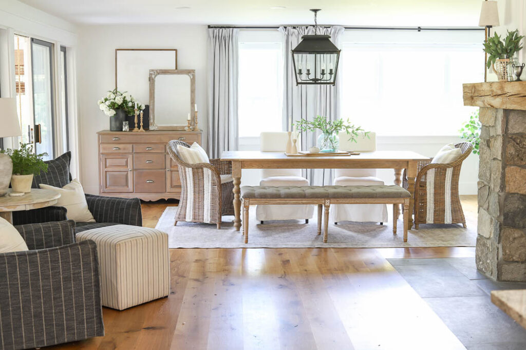
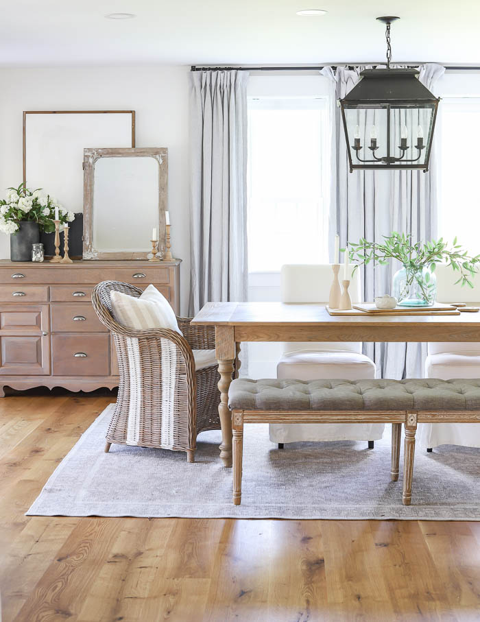
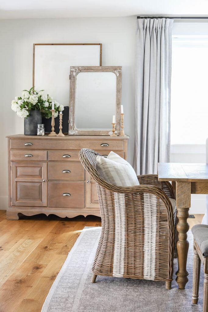
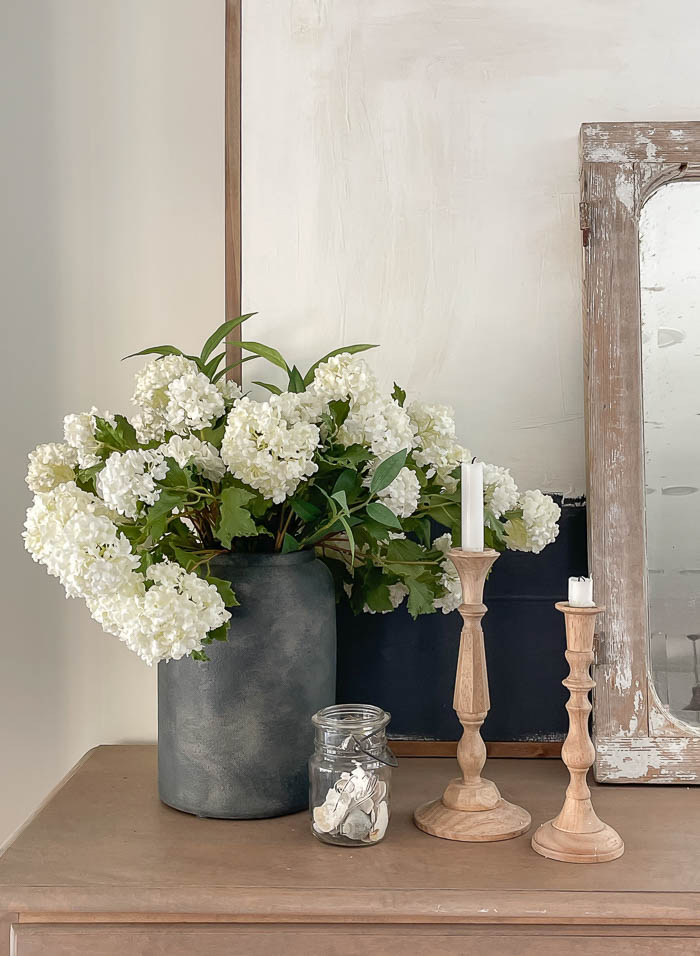
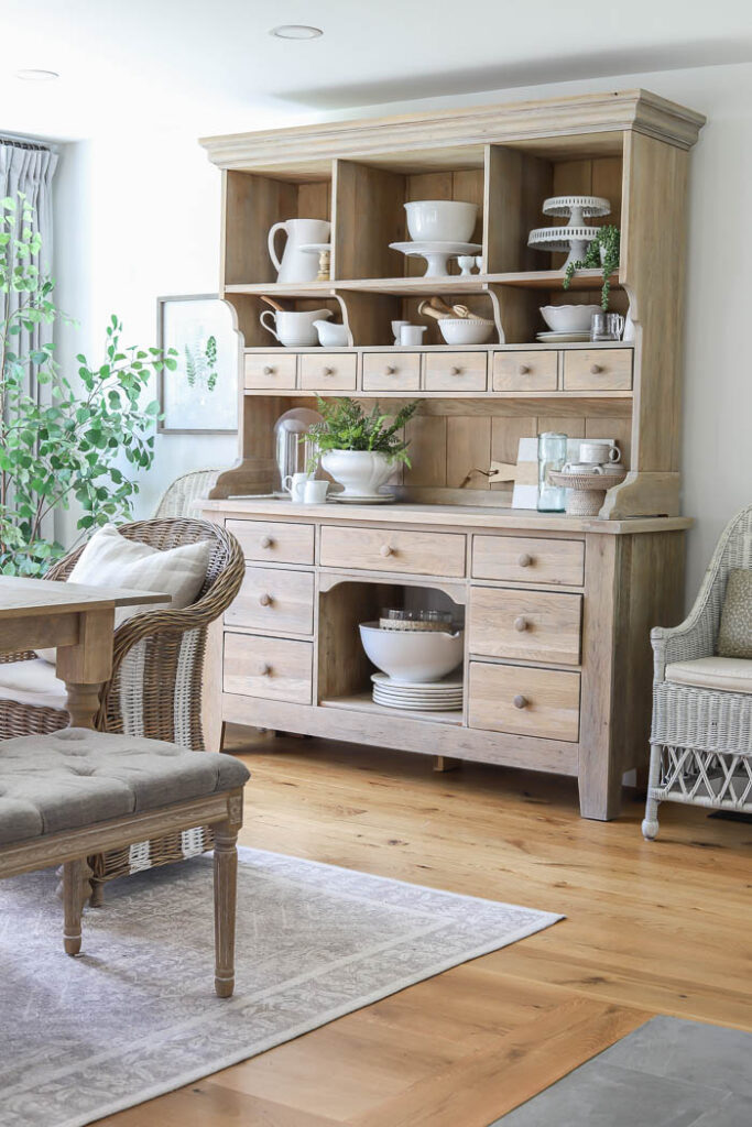
While most of our main furniture pieces have stayed the same, last summer I received this “new to me” antique buffet from a family friend. The piece is much larger, and has more storage than the previous dresser I had there before, so I was happy to bring it home and refinish it to work better with the other furniture in our dining room.
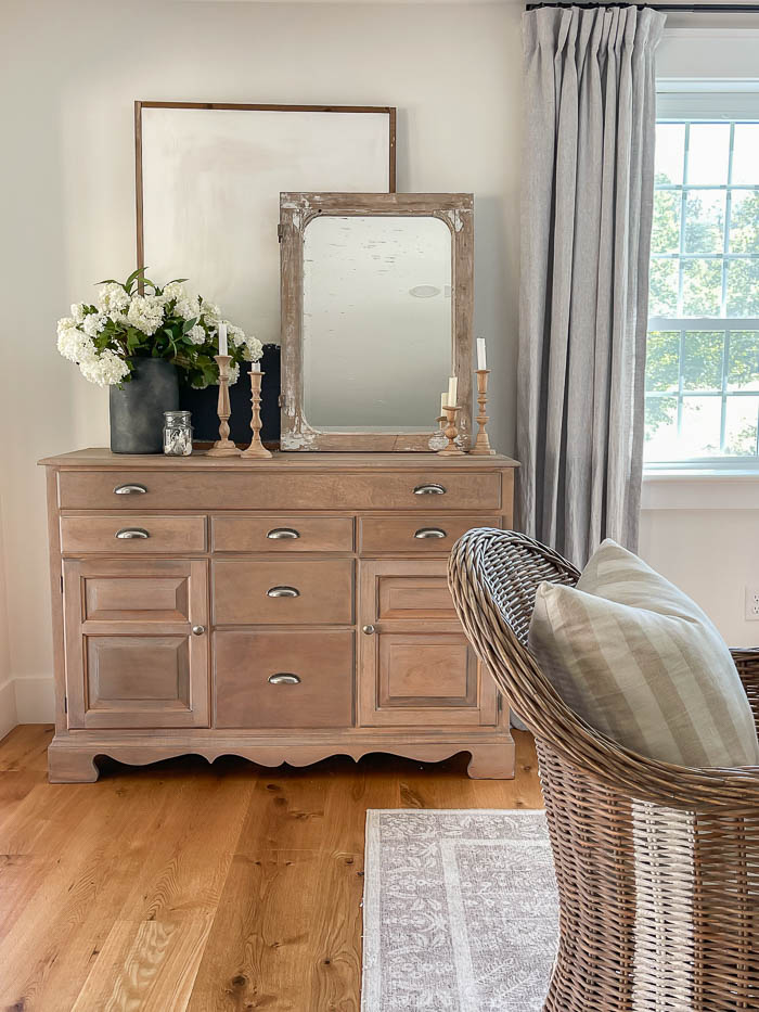
Below you can see more of the pattern on our new dining room rug. I had been eyeing this one from Rifle Paper Co. for awhile. I love that it has a vintage feel to it, but is very low pile, making it easy for our chairs to push out from the table.
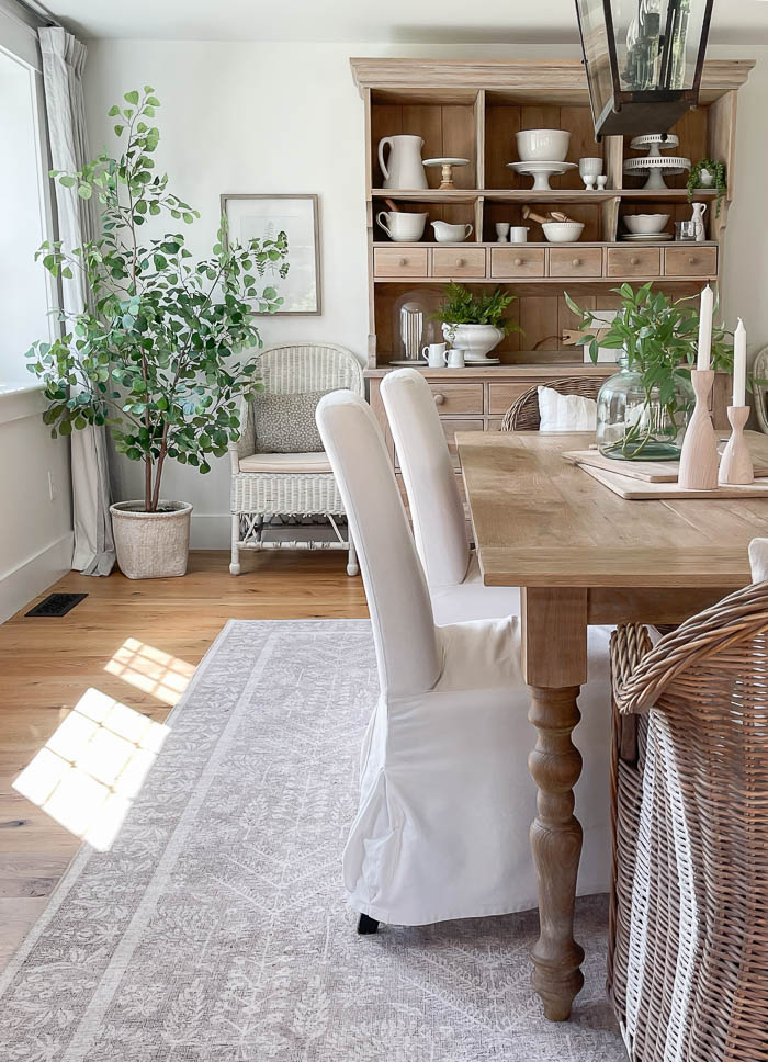
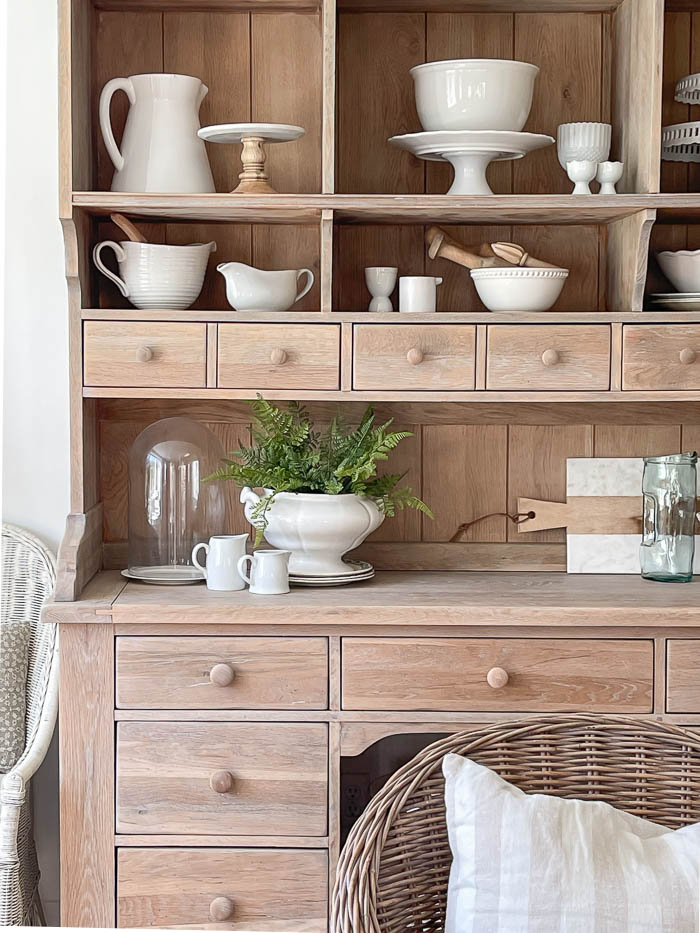
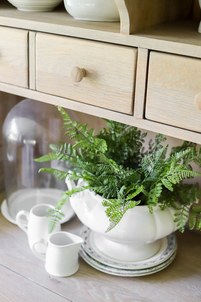
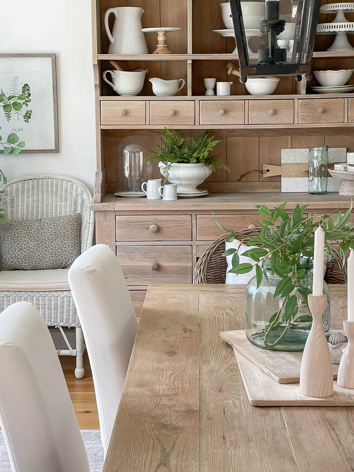
At the other end of our dining room is the wall that our hutch sits on. I love using it to display some of my favorite white serving pieces, old and new ones that I add to my collection.
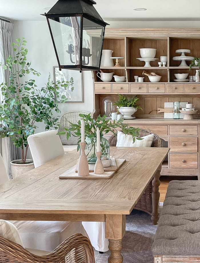
Dining Room Sources :
- Table – DIY
- Bench – Wayfair
- White Slipcovered chairs – IKEA, similar ones found HERE.
- Striped Wicker Chairs – Target
- Hutch – FB Marketplace
- Chandelier – Home Depot
- Rug – Wayfair
- Faux Tree – Target – no longer available
- White Wicker Chairs – Overstock
- Buffet – Secondhand
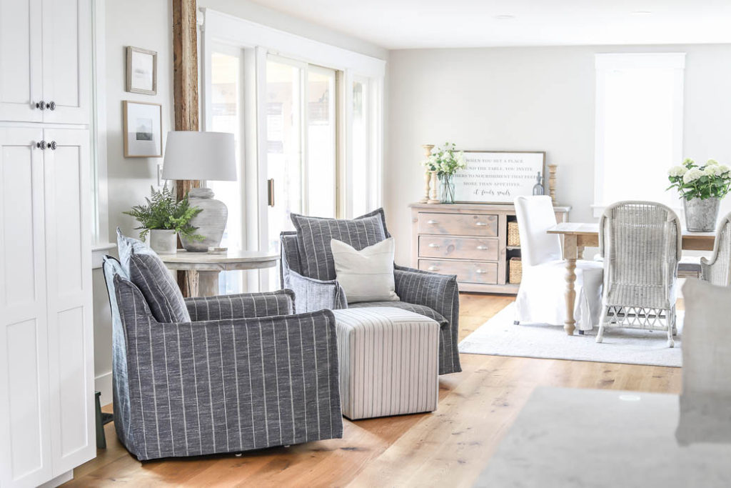
- Navy Blue Chairs (seating area) – Grandin Road
You can see below the last time I shared this view, and how our dining room looked before we put up curtains, and hung the chandelier.
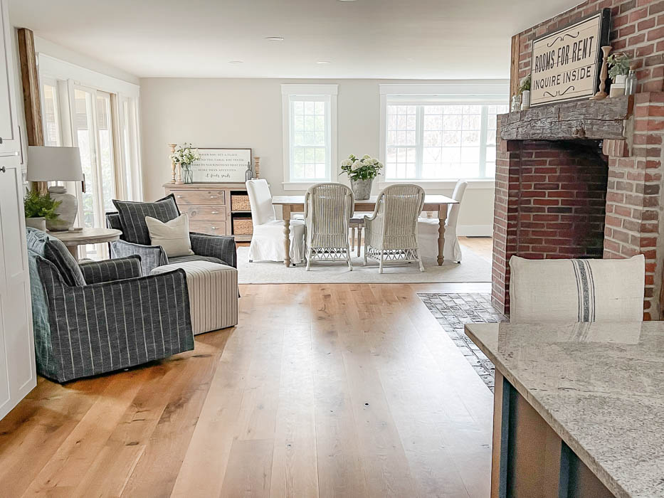
And what a difference they make being in the space now.
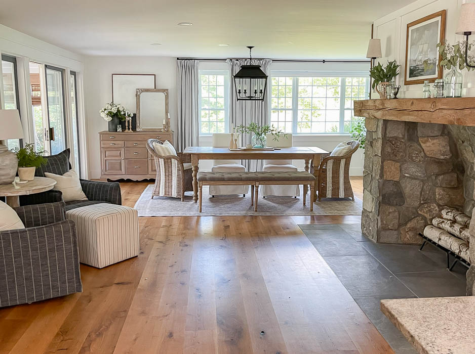
Read all about our Fireplace Makeover HERE.
Read more about our Cozy Fireplace Seating Area Here.


“Dining Room Updates | 2023” is a design enthusiast’s dream come true! Your blog is a treasure trove of fresh ideas and trends that elevate the dining experience. The before-and-after visuals showcase your keen eye for detail, turning an ordinary space into a stylish and inviting haven. Thank you for the inspiration!
I love your new dining room area, looks so pretty with the rug, curtains, and light fixture. I love what you’re doing in your new home.
Your new fireplace set’s everything off so beautifully…..and it makes your dining room look PERFECT! I love it all!
Thank you Toni!!
So beautiful. Love the fixture and the curtains. Makes a big difference.
Thank you Becky!! I love how much the curtains warm up the dining room 🙂