Hello Friends!
There is nothing like kicking off the new year with a little room refresh am I right? I put a pause on house projects during the holiday season, because I knew it would give me something to look forward to once all the Christmas decorations were put away. I love the sense of having a fresh start that the new year brings, and with our house in sort of a clean slate state, with minimal decor out, now is the perfect time to dream up some new inspiration. So today I’m sharing the mudroom inspiration I’ve gathered, and the vision I have for this space.
Come and see ~
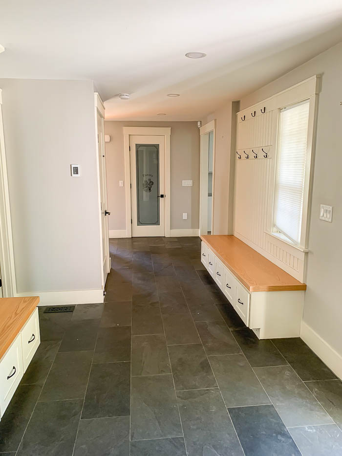
When you walk into our home, you enter into the mudroom. There is a coat closet on one end, and built in cubbies and drawers that make concealing hats and gloves a whole lot easier.
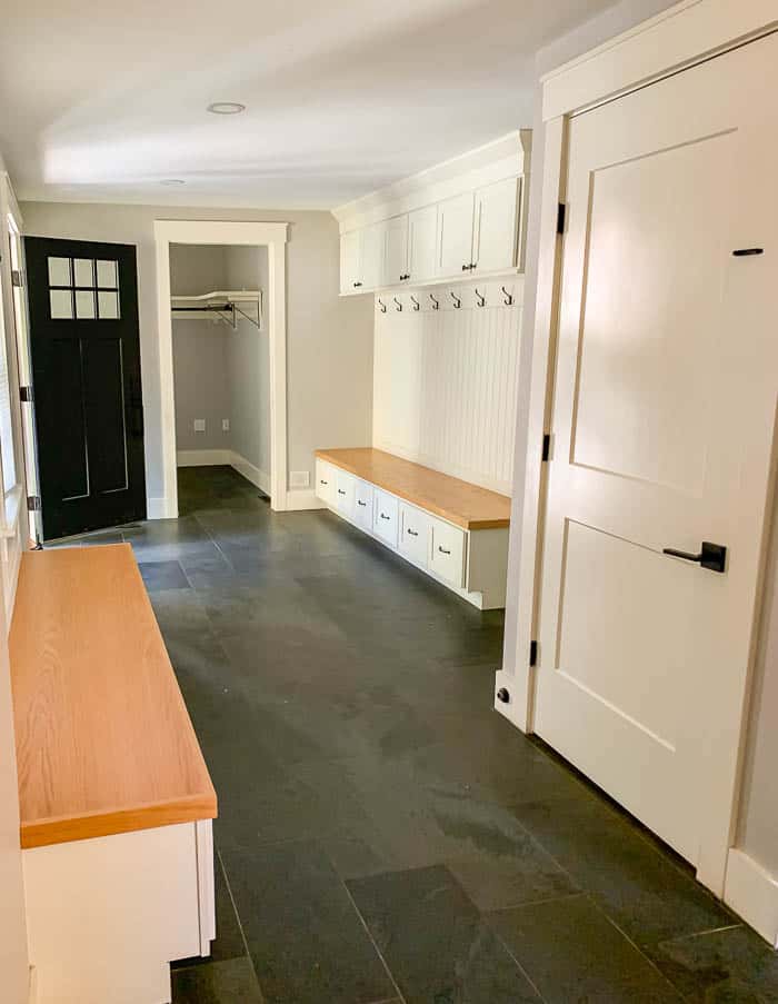
Diagonally across on the opposite wall are more hooks, with another built in bench and more drawers below. Our entryway has this beautiful Slate looking tile (found HERE), which I love. There isn’t a whole lot that needs to be done, but a few simple cosmetic tweaks to get this room to be where I would like it to be.
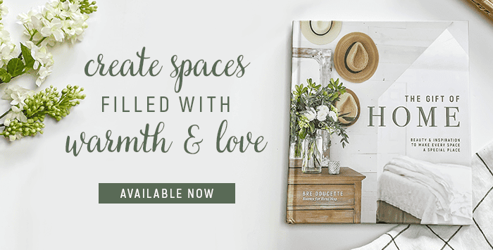
I share in my new book, The Gift of Home, one of my go-to tips before I start any project or room makeover. It may sound quite simple, but in all actuality this could be your most important step.
Tip : Gather Inspiration Photos.
Remember back in the day when home design shows were all we had. Designers would show up to the clients house, see the space in need of design help, and then come up with these beautiful displayed inspiration boards showcasing their proposed design ideas. I start by saving a handful of inspiration photos that give me clear vision for what I want to do in the space. Not only does this help me point out what details might be in common throughout my inspiration photos, this also helps me stay on track when I feel stuck or am halfway through the project and not sure what details I may be missing.
I will go back and look over my inspiration photos, and look for any other details that I might want to include in my makeover, or sometimes they give me fresh ideas not shown in the photos, but it helps get my creative ideas flowing. Now with Pinterest at our fingertips it’s easy to save ideas we like, this is usually the first place I head. But I have been totally known to go retro and cute out images of magazines and even store catalogues that I find inspiring so I can save them for later.
I’ve collected a few inspiration photos for our mudroom, and am sharing them with you below, along with my thought process of what I like in each one ~
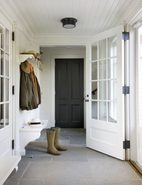
This first photo, in essence, feels very similar to the layout of our mudroom. It has a similar floor color tile, and I love the look of the all white walls. One detail in this photo that I love, is the planked ceiling. One thing I’ve learned when working with all white on the walls, having architectural details like a moldings, or in this case shiplap on the ceiling adds warmth back into the space. I also love the dark painted door, which gives me an idea to paint the doors dark in our mudroom.
My second inspiration photo below is also very similar to the look of the first one. Everything painted white. Architectural details like bead board and a planked ceiling. It even has darker tile floors like mine. I love how this space adds in some warmth with a wooden bench and cabinet too.
What I take away from the photo above, is again reinforcing my love for the planked ceiling, and while our mudroom has some bead board on the walls, I like how the wainscotting wraps around the entire room on all the walls. One thing I would like to do in our mudroom is continue the existing bead board that’s above the built ins to cover all the walls. This architectural detail also feels like it would be typically found in antique colonial which also compliments the era our home was built in.
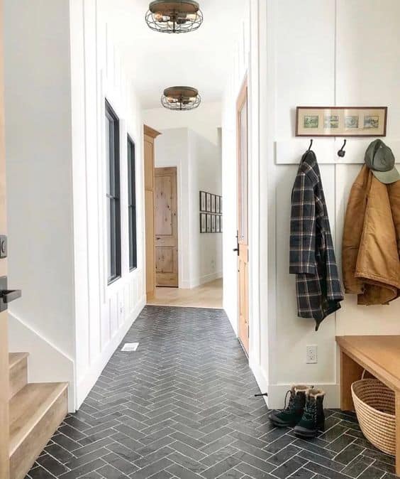
My third inspiration photo is very similar to the first two in color scheme. I love how the wood doors and staircase pop against the all white backdrop. And the black shows up in accents like flooring and in the windows. This photo makes me consider possibly painting just the windows dark, while the walls and all the millwork get painted white.
Choosing inspiration photos can be so helpful in defining the look you truly love. They don’t always have to look similar to your space either. Saving photos you love is a great way to help you identify the designs and style you do like, which can also help you identify the colors and textures you are drawn too. I have seen plenty of mudroom inspiration that I like. Some with dark painted walls and built ins. Others where the built ins are painted a different color than the walls. There is no wrong choice to make, the key is picking one that fits your style best. And for me, it’s definitely similar to the style you see in the photos above.

How I Plan to Get Started ~
- First, I want to sand the wood on the bench seats. The stain color feels a little more golden to me than I like, so I plan to sand them down and re-stain them in a shade that feels more true to my style.
- Then I will paint start by painting everything white. Walls, trim, and bead board. Once I have everything painted white, then I can determine if I want to paint the interior doors or window frames dark, like in my inspiration photos.
- When the budget allows, then we will work on adding in more architectural details like adding more bead board to the walls, and planking the ceiling.
- I’ll finish off the space with a few minimal pieces of artwork and perhaps a little greenery to complete the look.
I hope sharing my thought process is helpful, as I explain a little bit more on how I go about refreshing a space, or where to start with a room makeover. For more Mudroom Inspiration be sure to check out my ‘Mudroom” Board on Pinterest as well, click HERE.
I have a whole chapter in my New Book all about Utility Spaces and how to make them serve your family well ~


This was really helpful. I used to gather photos when doing major changes (kitchen remodel etc.) You have reminded me to do it with little changes I might want to make too. After living in our house 30+ years I’m only into little tweaks these days.
Hi Terry, I’m so glad this post was inspiring and a helpful reminder 😉 I feel like little changes are my best friend, that change doesn’t always have to mean a total renovation, and you will be surprised at just how much those tiny changes can make an impact! Have a great day!
What welcoming entryway! Anxious to see what you do to make it better!🤷♀️ I look forward to seeing the change you make in the stained benches! We have a wood table that looks “orange” but am not sure how to correct it. Your suggestions are always spot-on and appreciated! Thank you for sharing your life and style with us!