Hello Friends!!
I can’t even tell you how excited I was to read all of your sweet comments about the progress that has happened in our new Living Room. I’m still referring to it as our “new” living room, because well compared to our previous living room, this one still feels new! I shared in my previous post how when we first moved into our new home, the living room area definitely had me stumped. But I knew that if I focused on the things I could change, rather than the things that I couldn’t – like the off centered windows, or weird layout, that I could create a space that I loved. And it showed! You all agreed after seeing the progression at how much the progress made in our living room really transformed the space. Even though I used pretty much everything we had from our previous living room, there were still a couple new things we brought into the space, so today I’m sharing the sources from our “new” living room.
Come and see ~
All Sources Listed at the bottom of the post.
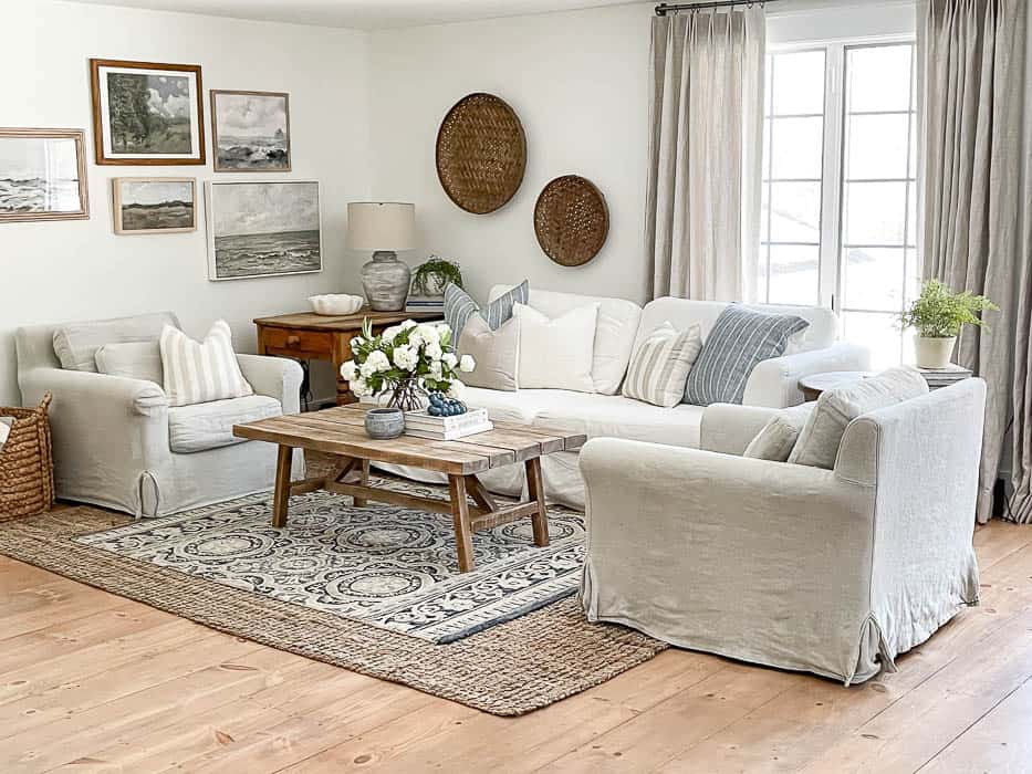
I mentioned in the post about the progress in our living room that one of the first things we did was sand down and refinish the floors. While I have yet to share that process with you in a details post, I did want to share the color of stain that we used. Below you can see the test sample area we did, sanding down a small square in the floors, with the original color next to it.
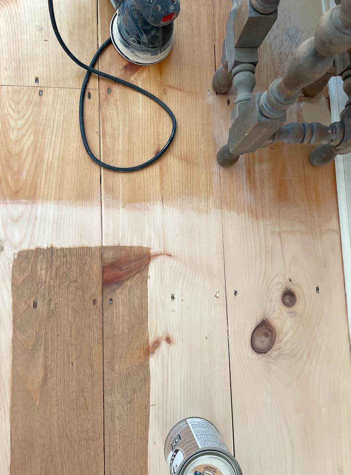
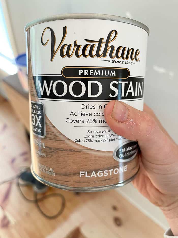
We stained the floors Flagstone, by Varathene. I chose this color because the hardwood floors in the rest of our house are a warm, medium oak color, and I didn’t want our living room floors to feel harshly different in color or tone. Flagstone is a nice medium, warm wood tone, with hint a touch of gray undertones.
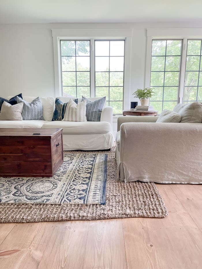
I painted all the walls and the trim White Heron, by Benjamin Moore. This was the same white I used in our previous living room, so I already knew I liked the color, since painting white can be tricky. I know that technically trim paint should be done in a higher sheen, but since we did this right after we finished the floors, and we’re in a bit of a time crunch to put the living room back together, it all went on from the same can. I can tell you this – I don’t even notice it, lol.
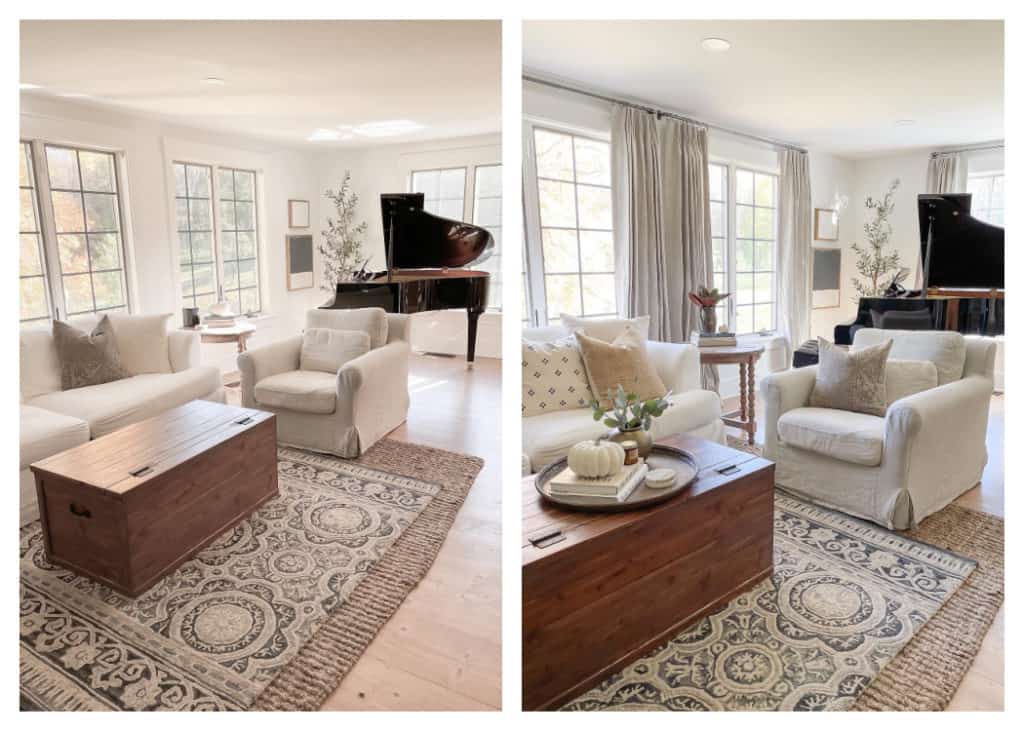
The next big transformation was adding the curtains. You can read all about our curtains, and how we hung them HERE. I went with an Oatmeal Linen Drape, with a Euro Pleat from Wovn Home. I chose a french style curtain rod, which I found at Target, in Gray. I liked that the curved ends had more of a European flair, and that they look more expensive than they really are 🙂
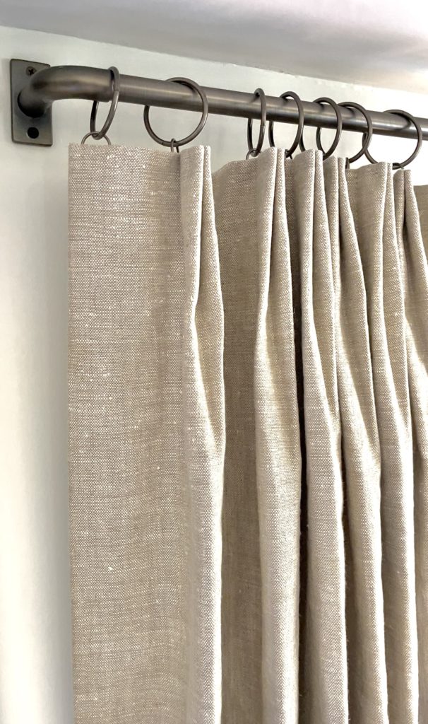
One thing I learned in hanging our curtains was to use curtain rings with eyelets – NOT CLIPS! Curtain rings with clips are meant for hanging curtains or fabric by clipping them at the top. Curtain rings with eyelets allow you to hang curtains with drapery pins, which mine have always had, but nobody ever explained that to me before. So in case you didn’t know, now you don’t have to be left in the dark either 🙂
Once the curtains were hung, I could focus more on the empty walls. Knowing that I would want to hang some of our family photos in a grouping, I first focused on this large empty wall that is located right as we begin walking into our living room, but is more like a nook.
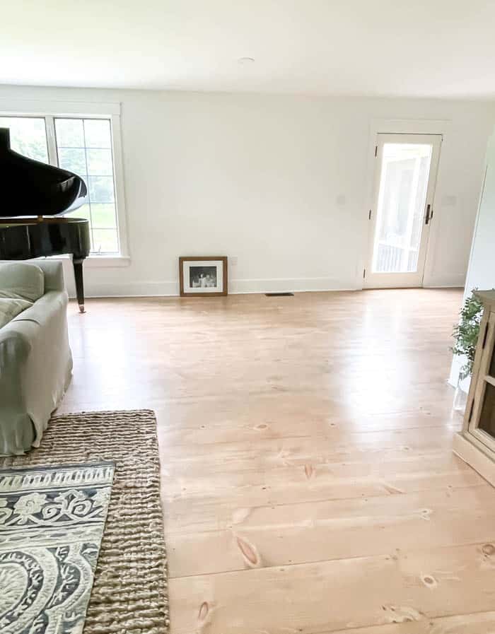
Using some reclaimed barn wood we have had in our inventory for quite a few years, we took measurements of the wall, and I drew out the design to the scale we would need. The structure of the table is quite simple in looks, but really helps to fill the space, and add some warmth with the wood tones.
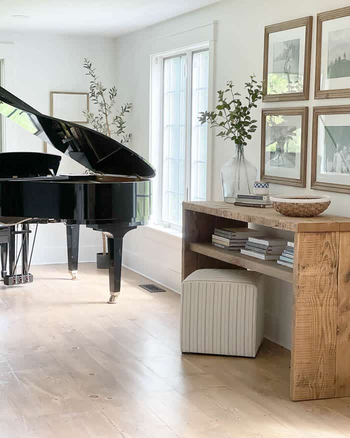
Then it was time to focus on the walls in the main seating part of our living room.

I started first with these wall hanging baskets. Again to bring in some texture and warmth to help balance out all the white. They come in a grouping of three, and I have the largest and smallest size hung together.
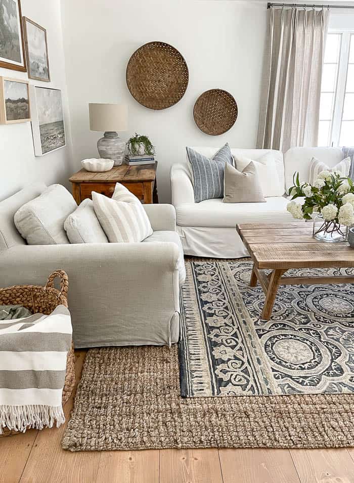
I knew for the last remaining blank wall I didn’t want to use more objects. The wall was quite long, so I needed to hang something that could fill it to scale, and wouldn’t leave the space feeling empty. I had always loved the look of vintage landscape art, so I decided to do a grouping of landscape prints hung in a gallery wall.
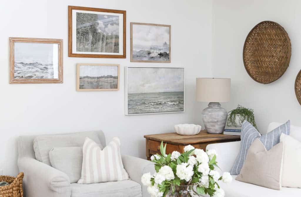
All the prints are from Collection Prints, which I will be sharing a full tutorial on how I hung them soon. What helped me decide on what prints to choose was the actual colors in the art. I love incorporating different shades of blues, and grays, and some muted greens, so I chose prints that already had those colors in them. This helped me tie in the rest of my accessories.
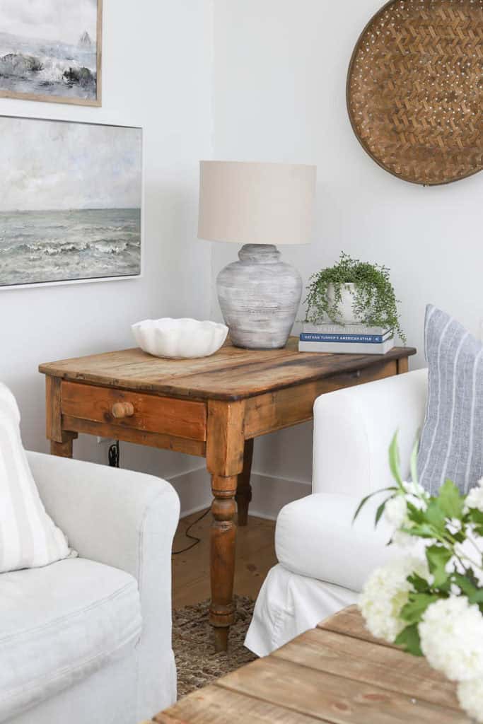
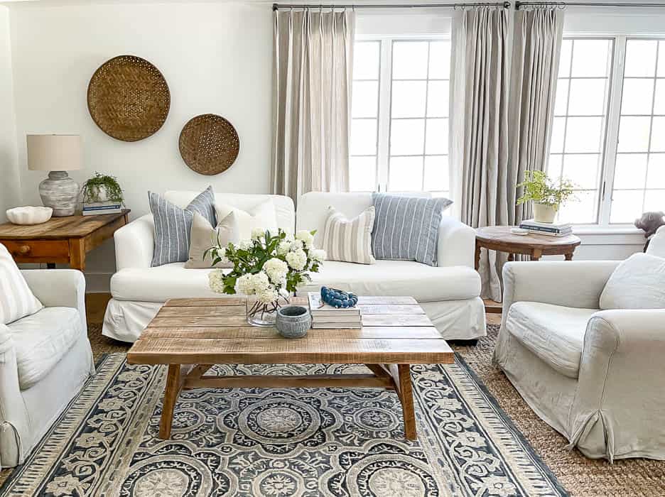
Since most of my accessories I already had on hand, they were a little hard to source. Some decor is no longer available, like my favorite white snowball hydrangeas, but I did my best to source some similar options. If I notice certain things do come back in stock, I will be sure to update the post.
Living Room Sources
- Sofa – Wayfair | Slipcovers – Comfort Works, you can read more about the slipcovers HERE.
- Arm Chairs, Medium weight Linen in Jasmine Rice – Sixpenny, you can read more about them HERE.
- Round, Turned leg Side Table – Amazon
- Coffee Table – DIY
- Tall, rectangle side table – FaceBook Marketplace
- 8X10 Jute Rug, color : Gray – Amazon
- 5X7 Patterned Rug – Target
- Curtains – Wovn Home
- Curtain Rods – Target
- Curtain Rings w/ eyelets – Amazon, in Pewter
- Round Hanging Baskets – Amazon
- Landscape Gallery Art – Collection Prints – 1, 2, 3, 4, 5
- Lamp – DIY, tutorial shown HERE.
- Scalloped Bowl – Target
- Hydrangea flowers – Afloral – currently unavailable, similar one found HERE.
- Small stone bowl – McGee & Co. no longer available, similar one found HERE.
- Blue glass bead strand – Etsy
- Blue Throw Pillow Covers – With Lavender & Grace, currently unavailable, similar one found HERE.
- Taupe + White Striped Pillow Covers – With Lavender & Grace, similar style
- Stripe Pillow Covers – With Lavender & Grace, similar style
Find more Decorating Advice & Ideas in my New Book!
