One of the main pieces that can ground a room, and make it feel complete, can also be the most over looked – Adding a Focal Point. When we don’t add a focal point in our design, we miss out on a big chance to share our uniqueness with everyone who comes into that space. Think of it as a free pass to share your creative style with those around you. Not only is adding a focal point a great way to share your style with everyone, it’s also a great way to complete a space. I remember when I was in the process of re-vamping our living room the first time, and as I looked around our space I thought a lot about what kind of accessories I wanted to bring into the space that would truly reflect me, and my style.
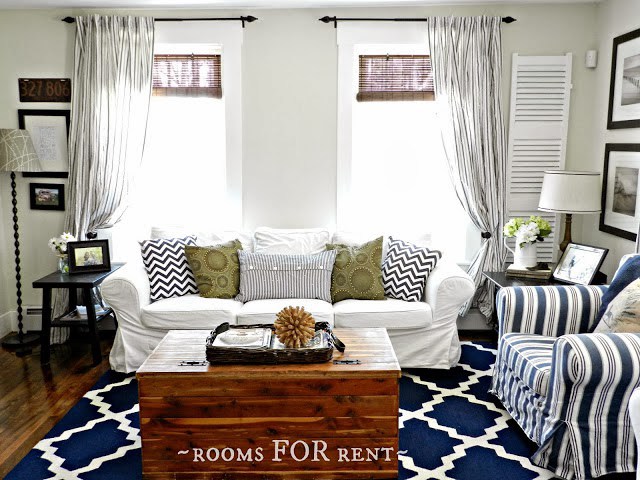
Other than loving white, I love anything with distressed wood. So as I was working on my living room I knew that was something I wanted to make sure I incorporated into the space. Here was what our living room looked like before I added the focal point.
This was the beginning of creating a neutral space. As you can see once I had painted our walls Halo from Wasabi Powder green, all of my bold patterns felt overboard. I’ve shared before how sometimes we get caught up in trends, even though we like them, they really don’t do us any justice when we are trying to define our style. I sold the bold patterned rug, and swapped out the bright pillows for more subtle ones. What pops in the photo above are bold patterns, and that wasn’t truly me. Once I removed those distractions from the space, I could add my focal point, a piece that would truly stand out, and not get lost in all the noise. 
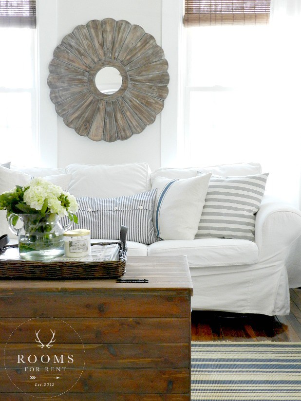
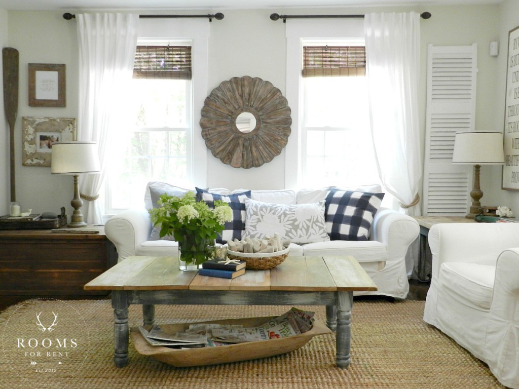
With the surrounding space in the room now quieted I was able to add my favorite piece without it feeling more chaotic. I choice a weathered wood mirror from HomeGoods and hung it between the two windows above our sofa. This was a huge risk, because technically it didn’t “fit” the space. It overlaps on the window trim, but I loved it so much. Not only does it add layers and warmth to the space, it remains a great focal point. When taking risks in design, usually the ideas that scare us the most are our best ideas. You know those ones we keep pushing aside because they seem crazy, but keep re-surfacing no matter how hard we try. 
With this risk I had to do a little bargaining. My husband was not a fan at first. Trying to win our husbands over can sometimes be the most daunting task. Men think practically. They don’t follow their emotions or “feelings” when it comes to decorating the house. They see a problem and they come up with a solution to fix it, that is just how most of their brains work. Now don’t confuse me, I’m not saying they are insensitive. They just aren’t going to explore decor based off of something that just “feels right”. And that is perfectly ok. We need to allow them to be our Mr. Fix-it’s. Even if your man isn’t handy, I’m sure he is great at solving some of your problems, or finding solutions to those dilemma’s. Because I am fully aware of how literal men think, I made this deal with my husband. He wasn’t a fan of the mirror at first, but I pleaded with him to allow the mirror to stay there for 30 days. I said after 30 days if it still bugs you I will take it down. Notice I didn’t say “If you don’t like it”, that’s just giving him an out to get rid of the mirror. But I said “If it still bugs you” I will take it down. You know what happened, after 2 weeks he didn’t even notice it. And I did hold true to my bargain, I asked in 30 days if it bugged him, and he shrugged it off with a “no, not really”, so it was a win for me in my book. You will always have a nay-sayer in your circle, but remember you aren’t decorating their house, you are decorating your house. At the end of the day you have to live with it, not them. And if it’s something you love, than go for it! And if you are unsure, remember risks aren’t always going to make you want to jump into a commitment with both feet right away. Otherwise they wouldn’t be called risks! Give yourself the 30-day deal. At the end of 30-days if still are unsure than maybe that piece isn’t the perfect fit, but you are on the right track to finding one that is.
Just to re-cap a focal point is something in your space that grabs your attention. It’s usually the thing that grabs your eye first. It adds “WOW” to your room, and character to any space. It could be a piece of artwork, an architectural piece, a bold accent wall, even a fun piece of furniture. Remember this is your free pass to add a little pizazz to your space without throwing your room completely off. It usually involves taking a risk, but one that is most rewarding.
Stay in touch!
Instagram / Pinterest / Facebook
Have a design question? Visit Doucette Design Co. for all your design needs!

Love your style….
I love that it’s oversized and the weathered wood fits perfectly into the space