You guys the day is finally here! Our master bathroom reveal, part of the #wayfair1roomreno is up! EEK! I’m so excited for you to see this dramatic transformation. If you’ve been following along, then you know we tore down some walls and demoed a chimney. Then we started to put the room back together, and finally we added the tile. In case you missed my post about adding in the tile, I shared how much of impact the tile really did make to transform this space, and a valuable lesson in doing home renovations. I case you missed it, I encourage you to read that post first, HERE, it will help show you how this whole space came together.
I’ll share a few BEFORE photos throughout the post just for reference, but I’ll be back tomorrow with more details of the progression and share more Before & Afters. In the meantime welcome to our newly renovated master bathroom.
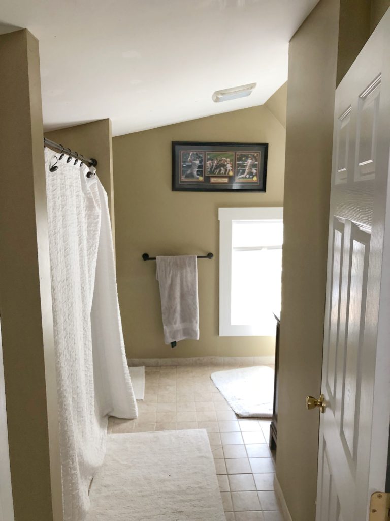
Before, we had a cramped space, with a bump out wall that housed a tiny unused closet and concealed a non-working chimney.
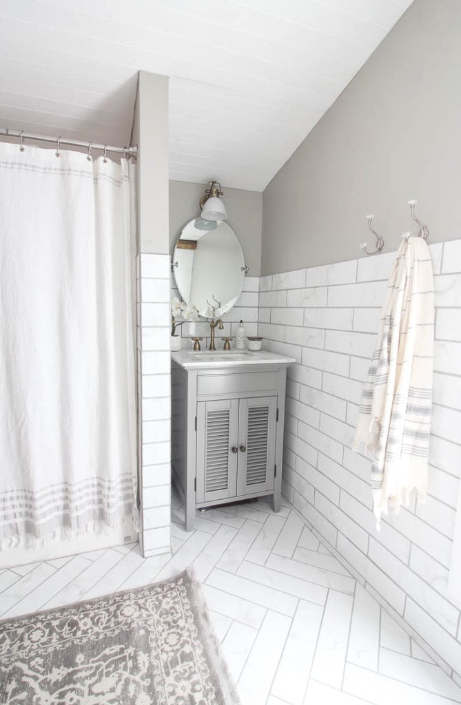
After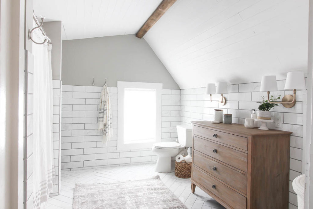
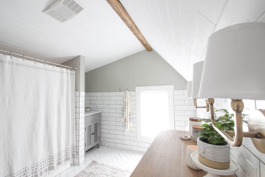
Now our bathroom feels open and airy, and not cramped at all. 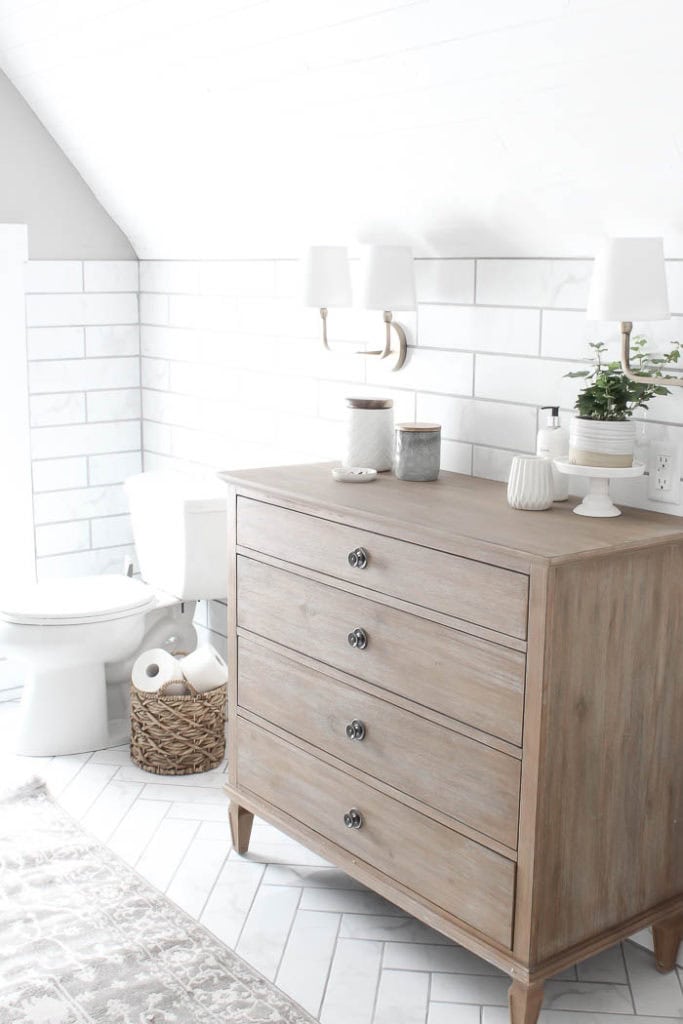
I created a make shift vanity space, by adding this french style dresser from Wayfair, that not only gives me a space to get ready, it provides additional storage as well. 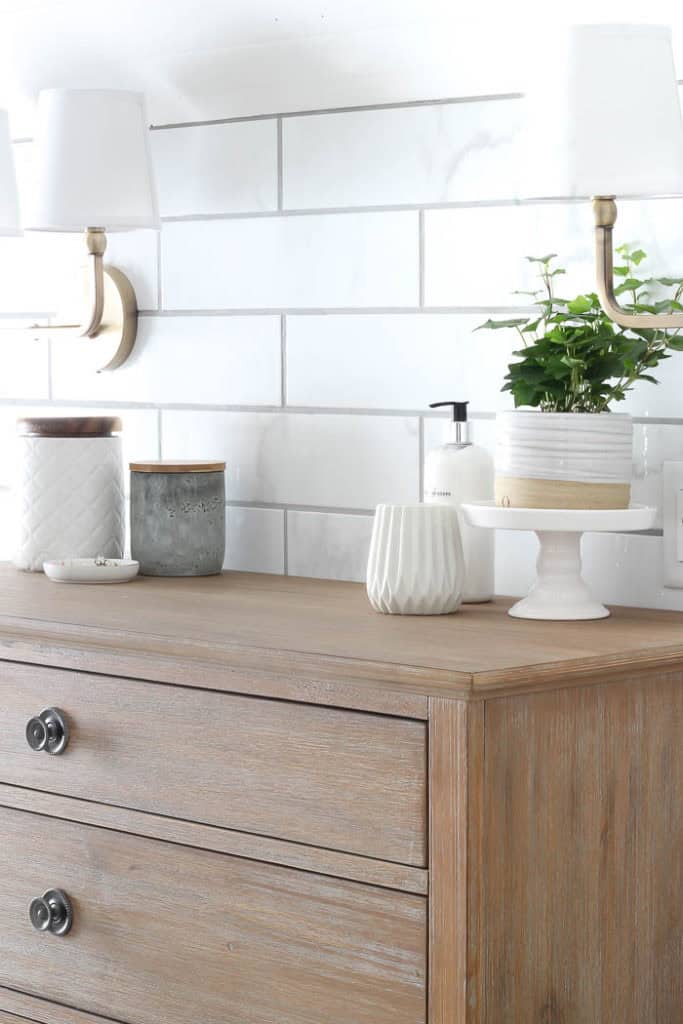
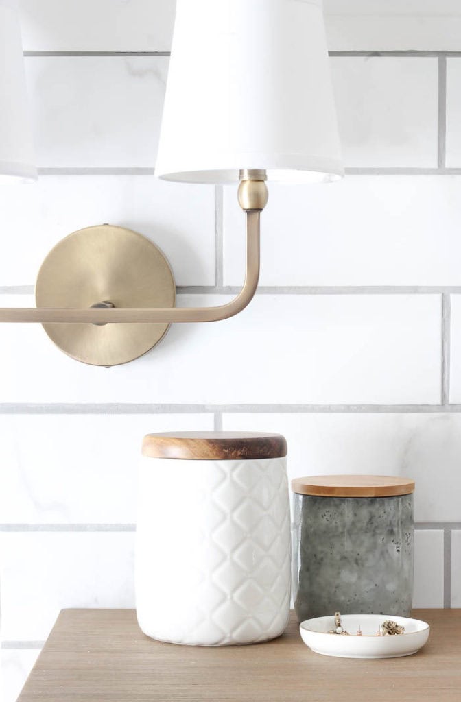

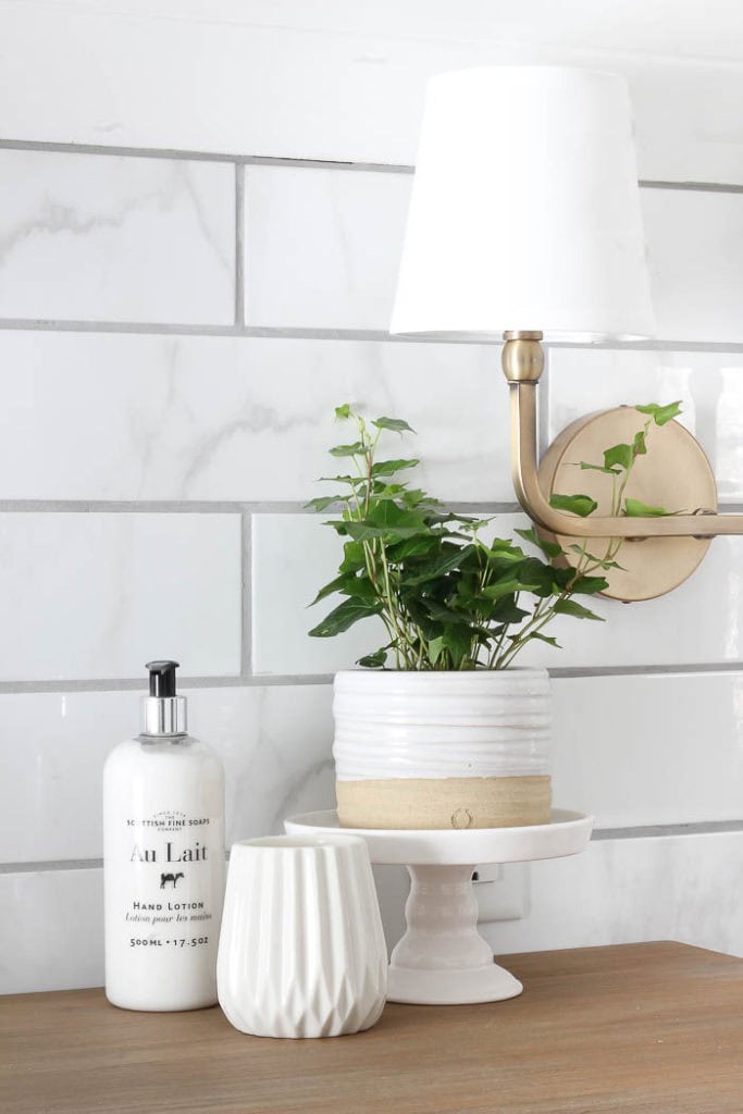
Adding task lighting, I have to say really made a huge impact. Our bathroom before was very poorly lit. Which made it frustrating to get ready, or find anything for that matter. So we added these sconce lights over the dresser, which really lights up the entire room.


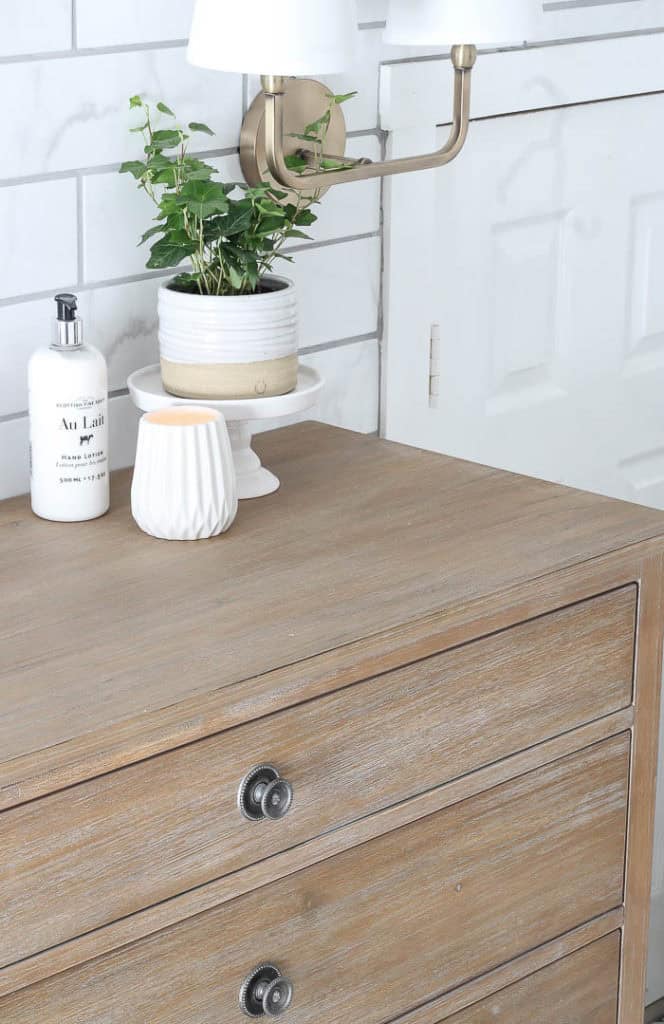
You might remember me mentioning we added tongue and groove wooden planks to the ceiling, but a last minute decision was to incorporate this reclaimed beam at the peak. I’ll share a few more details about that in tomorrows post, but once we installed it, it felt like the cherry on top.
Before, our vanity was made out of stock cabinetry that they forced into the tiny opening.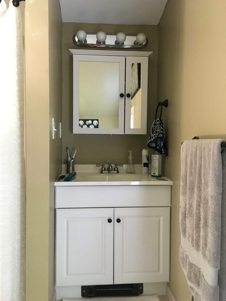
Even though it might seem silly to downsize when it comes to vanity space, I really wanted it to feel purposeful, add character, and not look like an afterthought. Choosing the right size, even if it means something a little smaller is not always a bad thing, especially when it means picking something that is more proportionate to the space.
After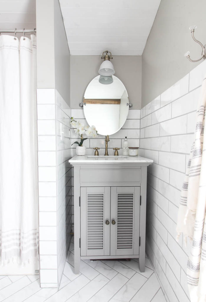
I chose THIS shutter style vanity for the space, because I loved the detail of the legs, and that it looked more like a piece of furniture. And of course the added charm from the shutter-style doors.


I also chose this pivoting mirror from Wayfair, which really makes the space feel bigger, and adjusts easily.
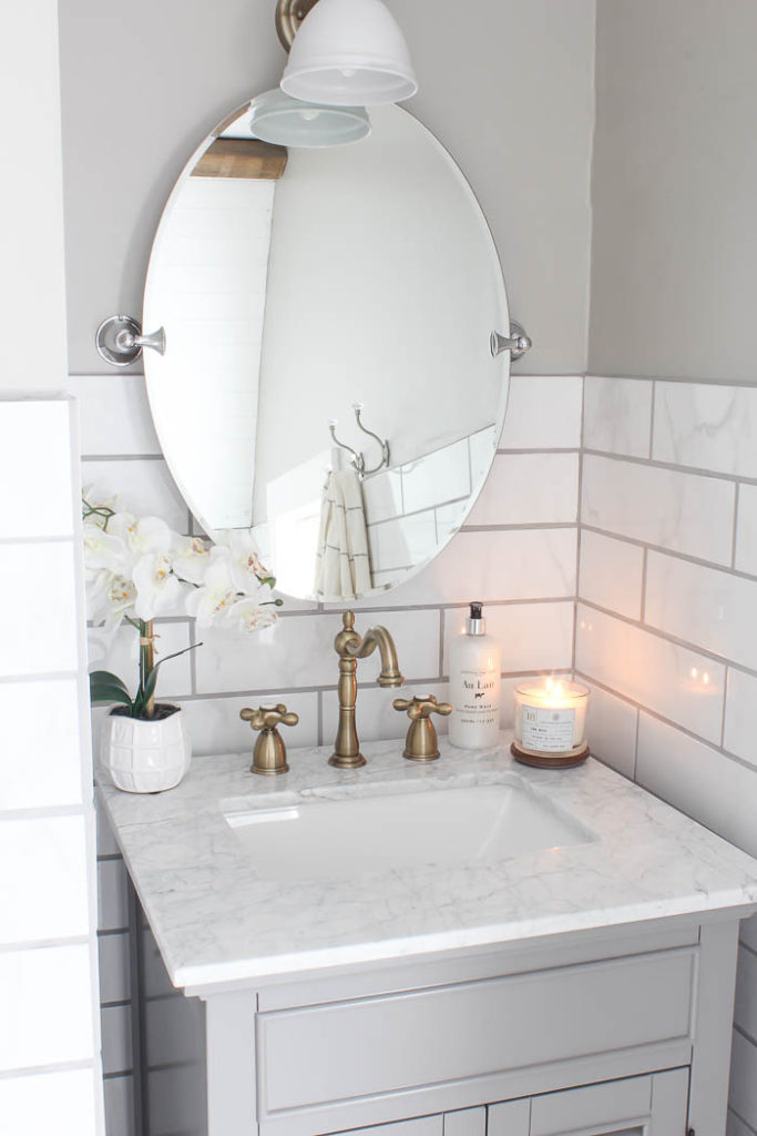
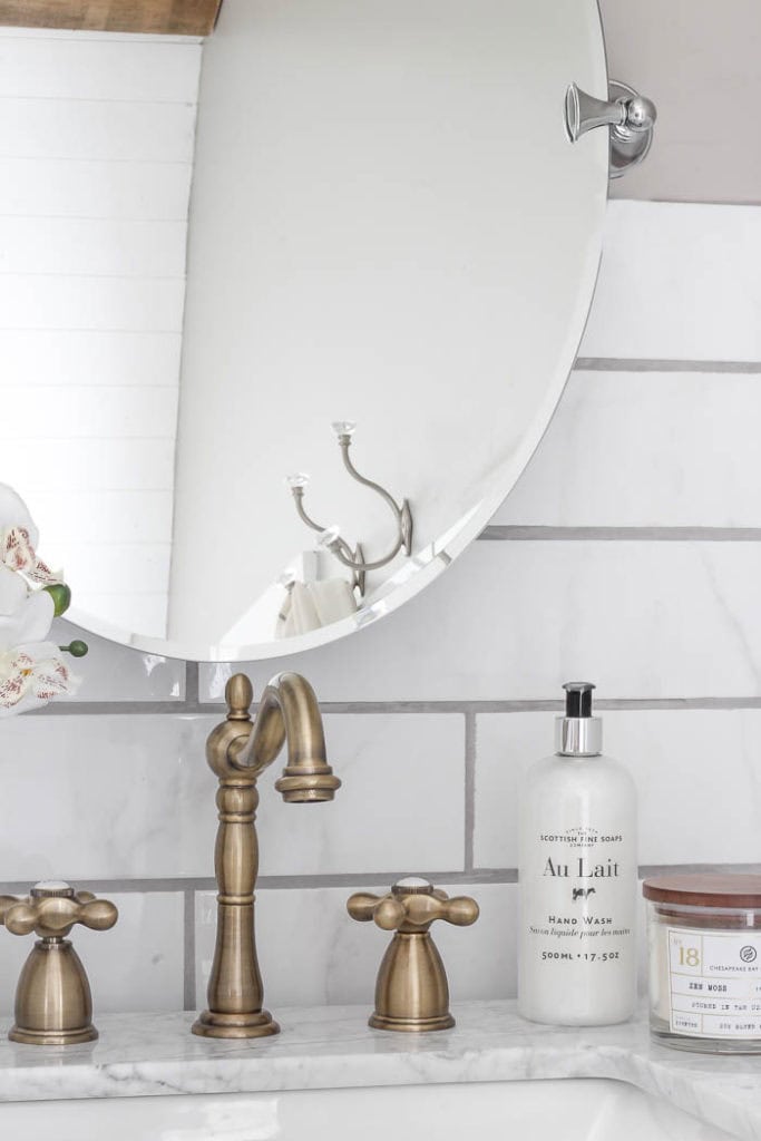
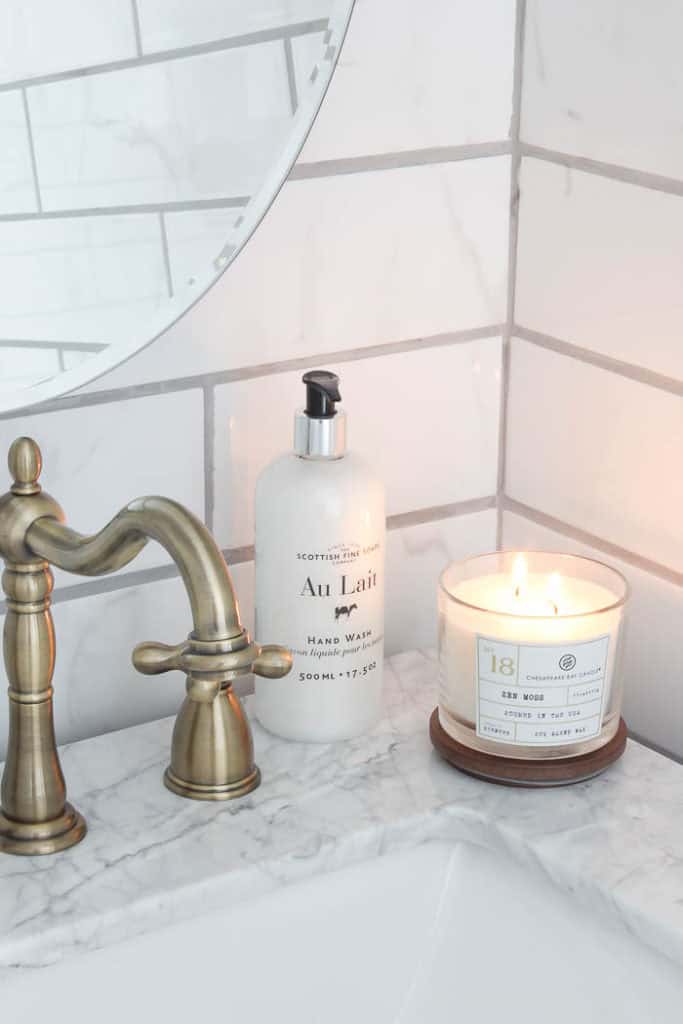
The faucet was one of my favorite details. I love the vintage look it has with it’s gooseneck design, and of course the “hot” and “cold” on top of each handle. Since we live in a farmhouse that was built in 1846, it feels like it was part of the original design of the house.

Even though I picked it strictly on looks, one of the things I was most impressed with was the quality of the faucet when we unpackaged it. It’s a budget friendly option for this particular design coming in at under $200, however it looks and feels top of the line.

Our shelves…. oh the shelves. I can’t tell you how many times I have wanted to rip out the previous wire shelves and put something else up instead. But it was always that project that I know once I started taking those down I would want to tackle the whole space, so I waited. Very impatiently I might add.
Before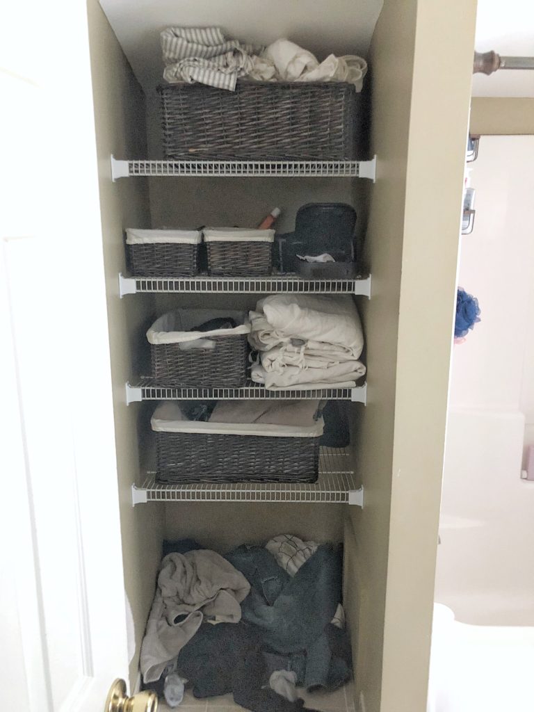
After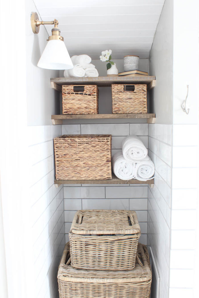
We used the same reclaimed wood from that we used in our laundry room makeover, and it added so much character to this tiny alcove. 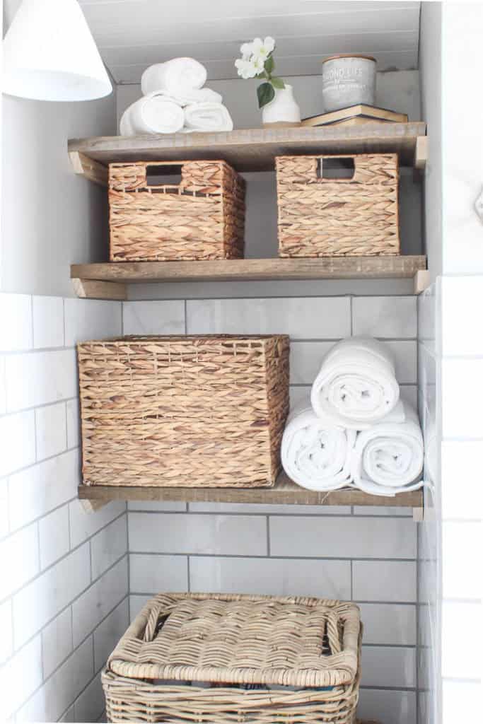
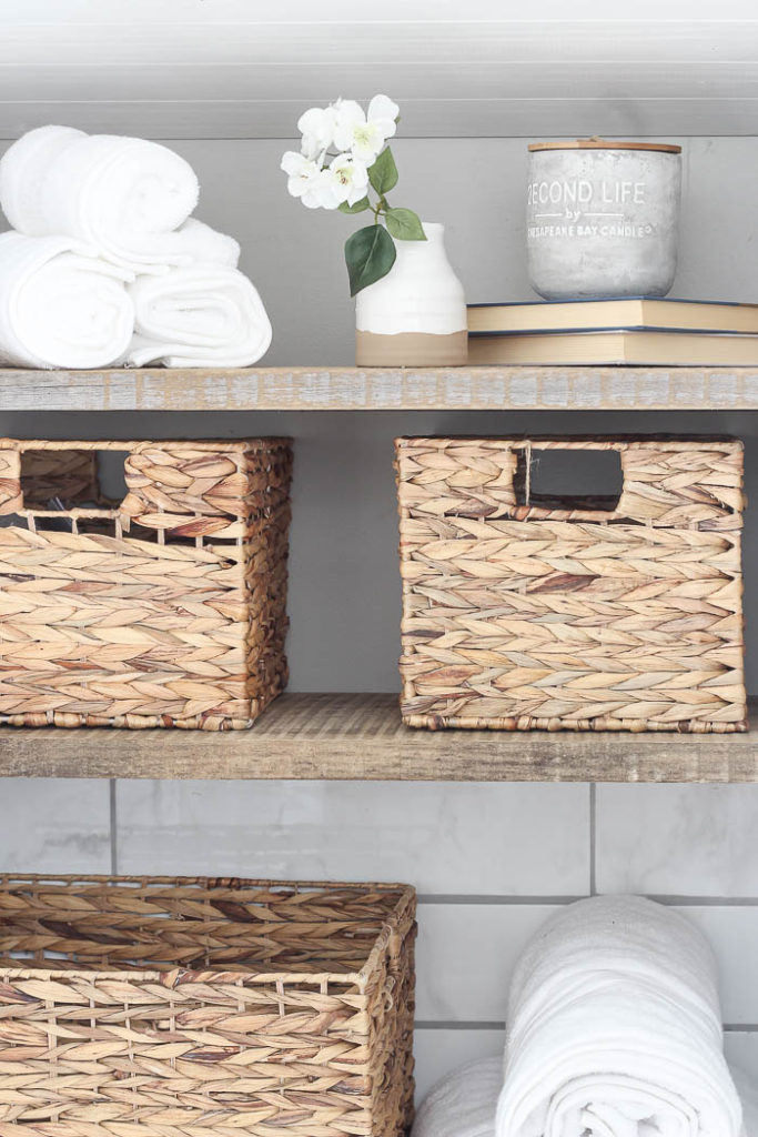
There were a few things we added that really made this tiny nook successful! First new baskets. Our previous ones were about 13 years old, and not the best quality, so sometimes I forget that after years of wear and tear, just simply replacing them really freshens up the space. Second – lighting!
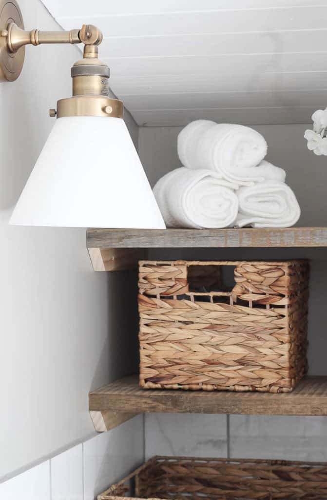
I mentioned before how poorly lit our bathroom was, so we added THIS vintage industrial sconce light over the shelving, and now everything is brightly lit, and easy to find.
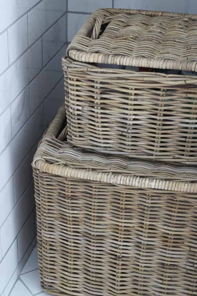
I also added more storage with THESE stacked baskets from Wayfair. I was so impressed with how sturdy they are, and how much stuff they hold. I seriously want to get a set for every room in my house, lol!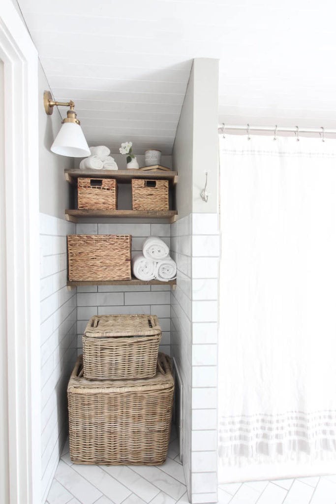
With the walls torn down, our bathroom was now a nice open room, so one of the ways I added character was by incorporating this vintage style area rug, instead of using traditional bath mats.

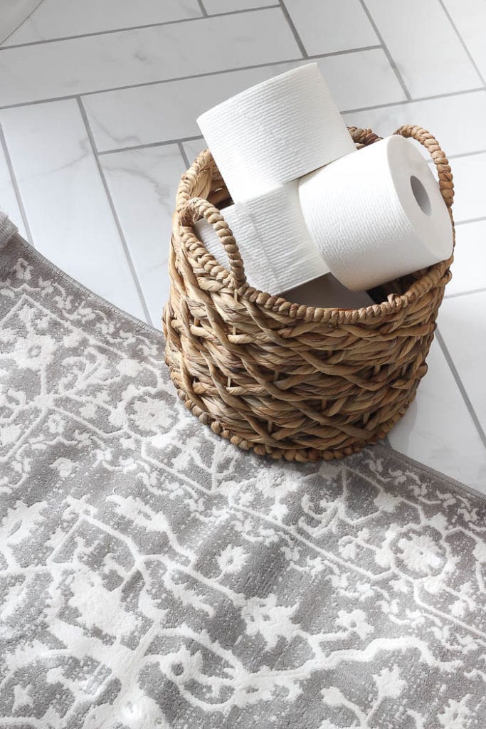
I shared in my Design Plan post, that it really was all about the details with this space that would give it the charm and character it needed. And now seeing how it all came together, really has shown me just how important those details can be. 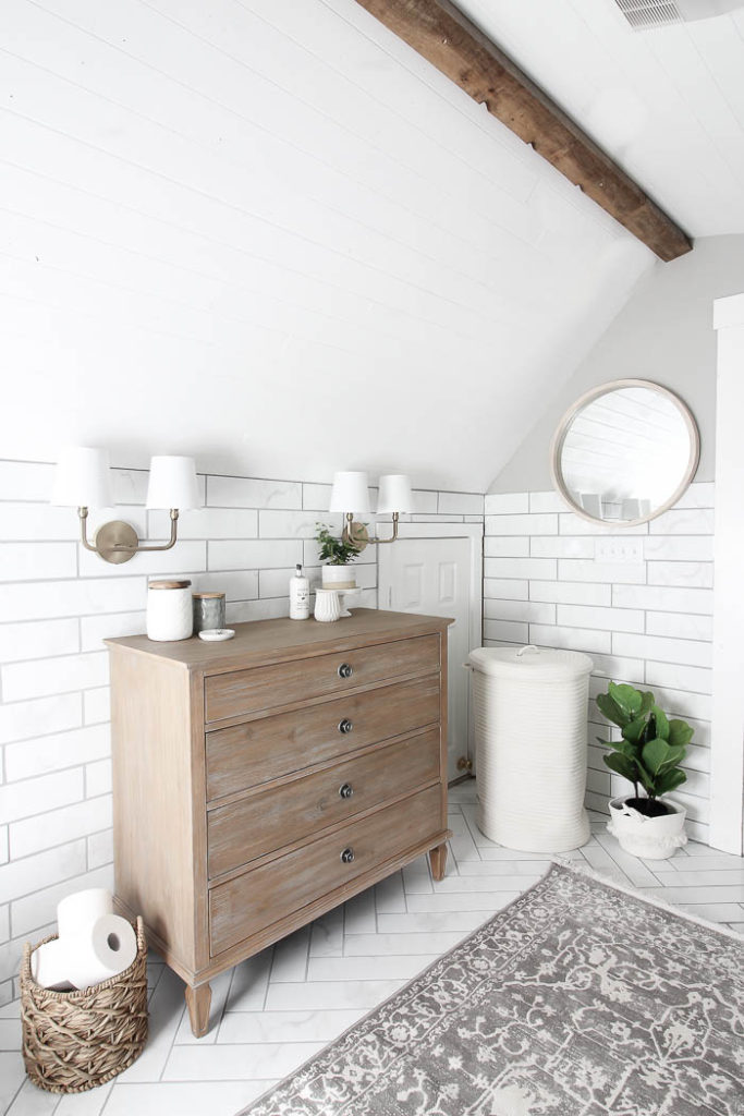
This back corner was where the bump out wall used to be. I utilized it by hanging a large mirror that I can get ready with, and this new hamper from Wayfair, hides all that unsightly dirty laundry. 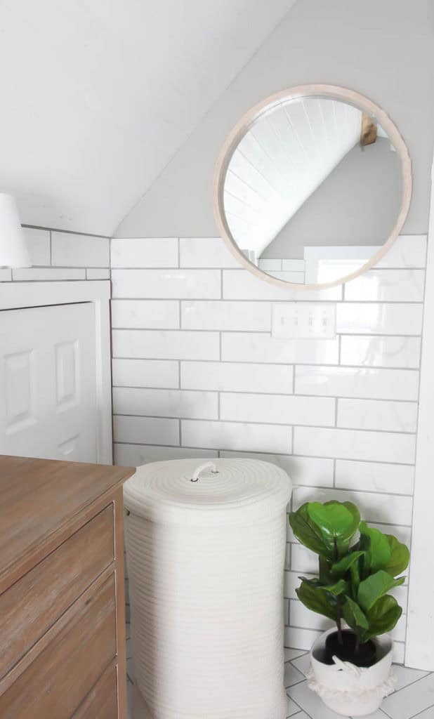
Not only is our bathroom functioning at high capacity now. With smart storage, everything has a place, so it actually looks clean all the time too, even though I’m not cleaning it anymore than I was before! 
A huge thank you to Wayfair for sponsoring this project. Below is a complete list of sources used in the space from Wayfair.
Other Sources in this space –
Wall Color – Mindful Gray by: Sherwin Williams
Ceiling Color – True White by: Kilz | Magnolia Home Collection*Paint was provided by Kilz for this project.*
Towel Hooks – Amazon
Turkish Towel – Amazon
All other baskets and accessories shown, including the shower curtain, are from HomeGoods & Marshalls.
Stay in touch!
Instagram / Pinterest / Facebook

This is a beautiful space. Like what you did with the shelving area, lots of texture. The dresser was a perfect touch for you to have room to get ready which every girl needs.
The faucet is beautiful too. Super outcome
Cindy
Thank you Cindy!! It really feels like a dream come true 🙂
It has great light from that window, since opening it up. What a beautiful space and know you are enjoying it.
For sure Marlene 😉
Such a beautiful transformation, Bre! I love every detail from the tile to the tongue and groove ceiling to the gold accents! Good job, my friend!👏
Thank you so much Lisa 😉 xo
Kuddos to you & your hubby, beautiful space, great job. I love everything you’ve done. Btw I’ve wanted to use a throw rug in my bathroom as well, I’ve hesitated because I worried about wool & the damp environment. Is your rug wool? It’s gorgeous and perfect coloring for your new bathroom.
You really did a lovely job!
Hi Janet!! Thank you so much for asking. So the rug is actually synthetic, which usually I shy away from. I usually only get wool, or jute, but since the rug was going in the bathroom I figure the synthetic had a better chance of holding up. I will keep you posted on how it handles, but so far there has been no issue 😉
wow what a transformation, Bre!! I love it!
Thanks Kellie 🙂 xo
Gorgeous. It looks like a spa. You did a great job in the colors and elements that you chose to put together. You are going to enjoy that space. Thank you for sharing the final product.
Wow! Your transformation is absolutely stunning! Your choices give a sense of calmness right from the initial view. The dresser with the sconces, and the beam, are my favorite elements. I love it all, though. I’m currently tackling a small linen closet, and I just took out the wire shelves. Your space is a good inspirational photo. Thanks for your detailed post. Enjoy your beautiful space!
Ohh thank you so much Heather!!! I feel the same exact way, ha ha. Good luck with your linen closet, and congrats on getting rid of the wire shelves, lol 🙂
So it looks like the vanity is no longer available. I need one that size for a garage apartment.
Hi Lori, I think the link I had was broken. I just found it here – https://rstyle.me/n/c3d5zrzdwn, so sorry for the confusion. Let me know if it still doesn’t pull up for you 🙂