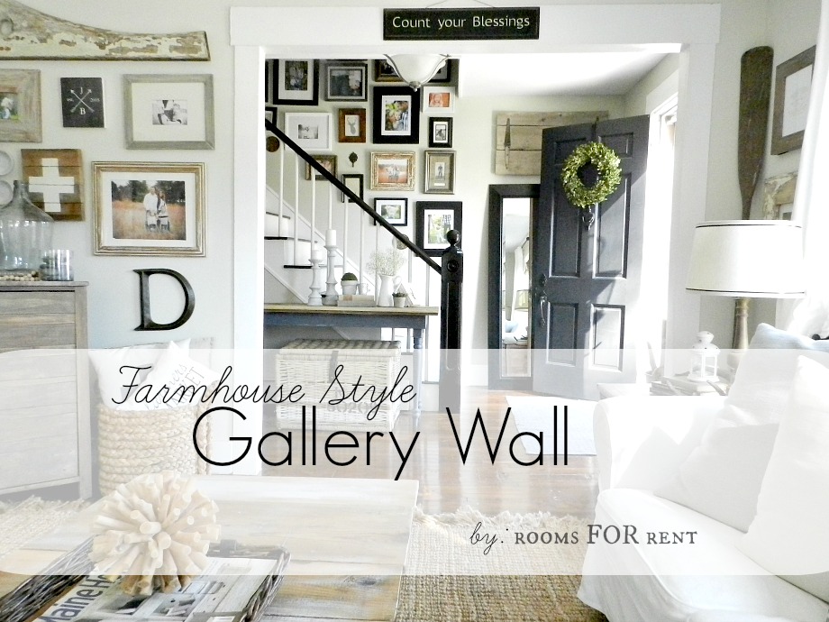
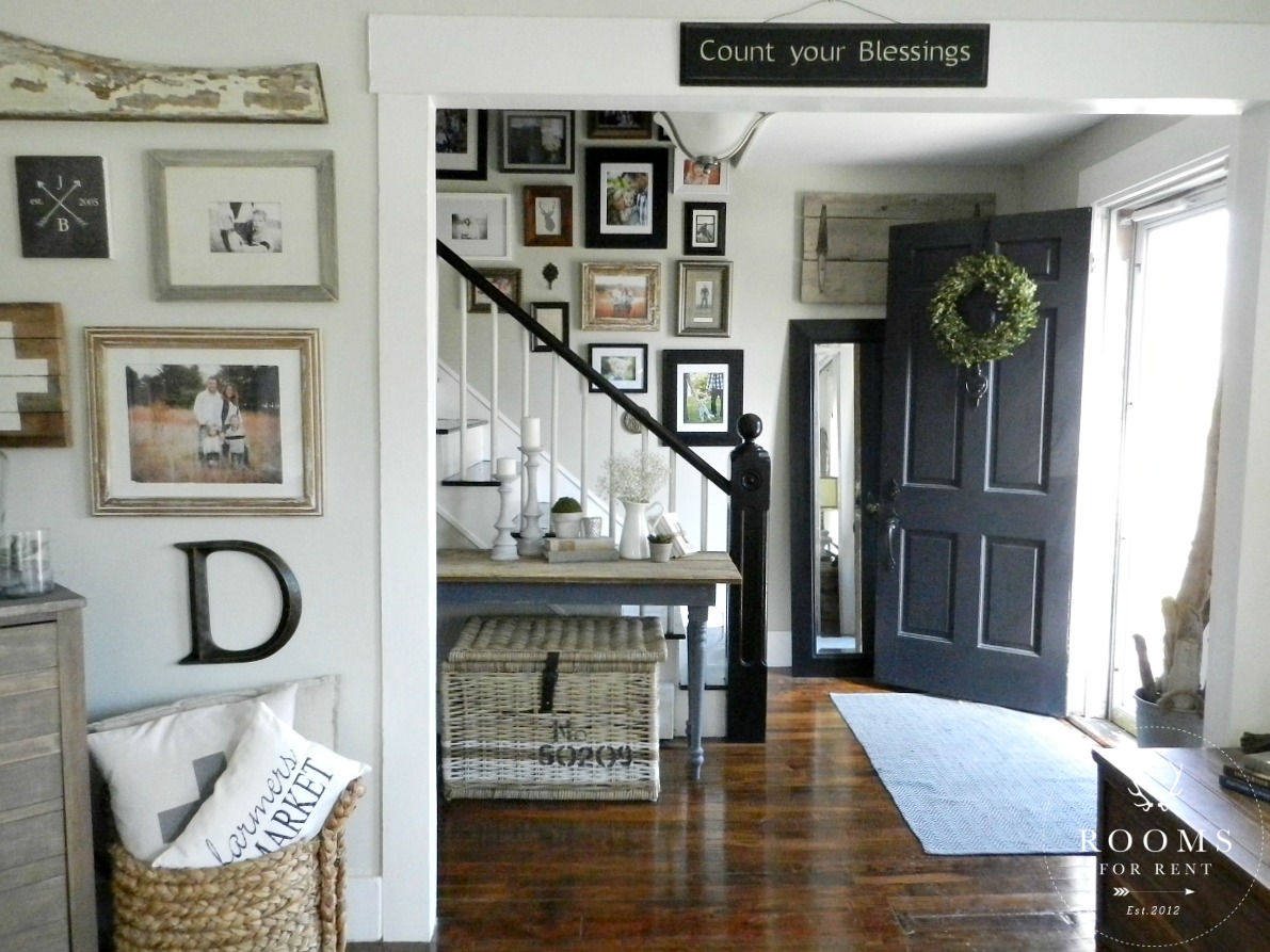
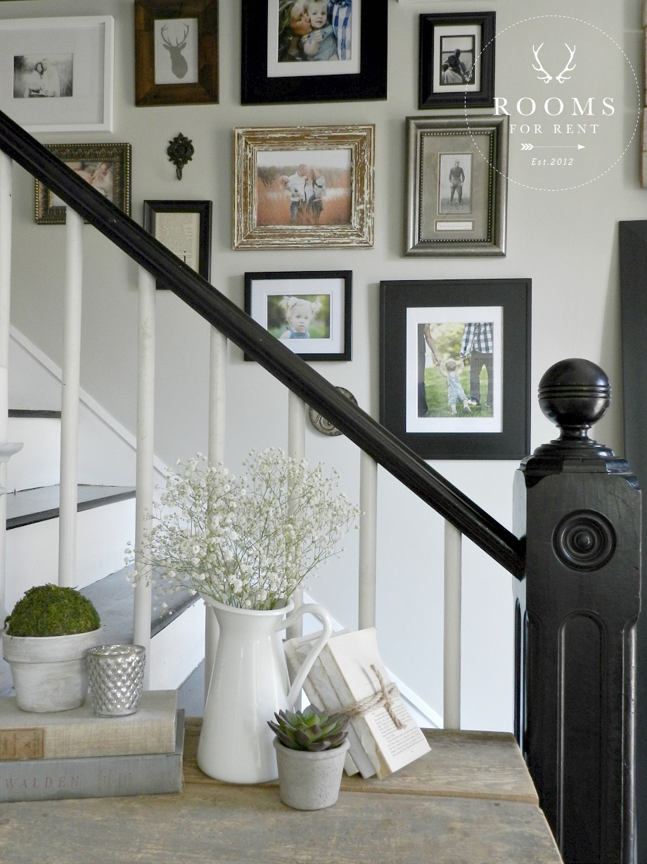
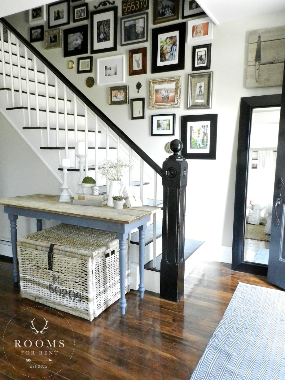
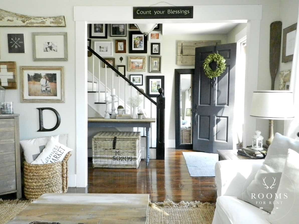
After all of the painting was done, the gallery wall in our front hallway was the first of the frames to go up on our walls after we moved in. So why now 4 years later am I just getting around to showing you? If you follow me on Instagram, you’ve seen peaks along the way, and you got a glimpse of it in my Summer Home Tour last year, but I’ve never dedicated a post just to our gallery wall.
Our front hall has always been the most difficult area to photograph. Primarily because it has absolutely no natural light. There are no windows anywhere in the hallway, or around our solid wood front door. It wasn’t always painted this color. Last winter I decided that while adding windows wasn’t a project anytime in the near future, the next thing I could do was paint it a lighter color.
So I did just that. While our living room is painted Halo by Benjamin Moore, I went 2 shades darker and painted our hallway Hazy Skies by Benjamin Moore. It’s actually the same color that is in our bedroom too! It is a very light kaki-beige, with a slight gray undertone to it, but I will show you more before & afters of our front hallway soon. For now lets just focus on the gallery wall.
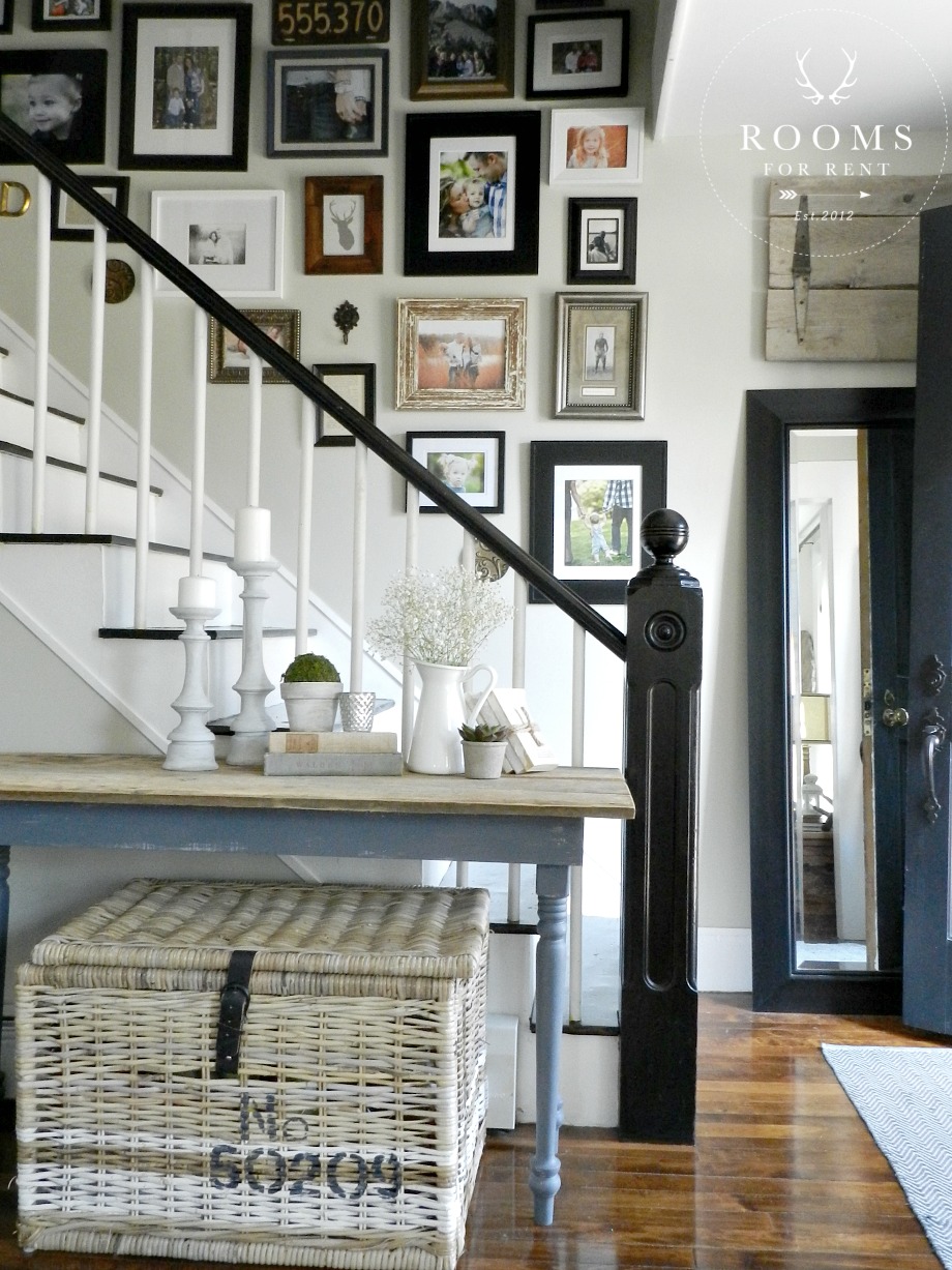
When we moved in, the original floors had just been refinished, and we were lucky enough that the did the stair case too. The banister was painted black, with white spindles so to highlight it, the first thing I envisioned in the space was the floor length mirror with the black frame. Luckily I found that at HomeGoods right away.
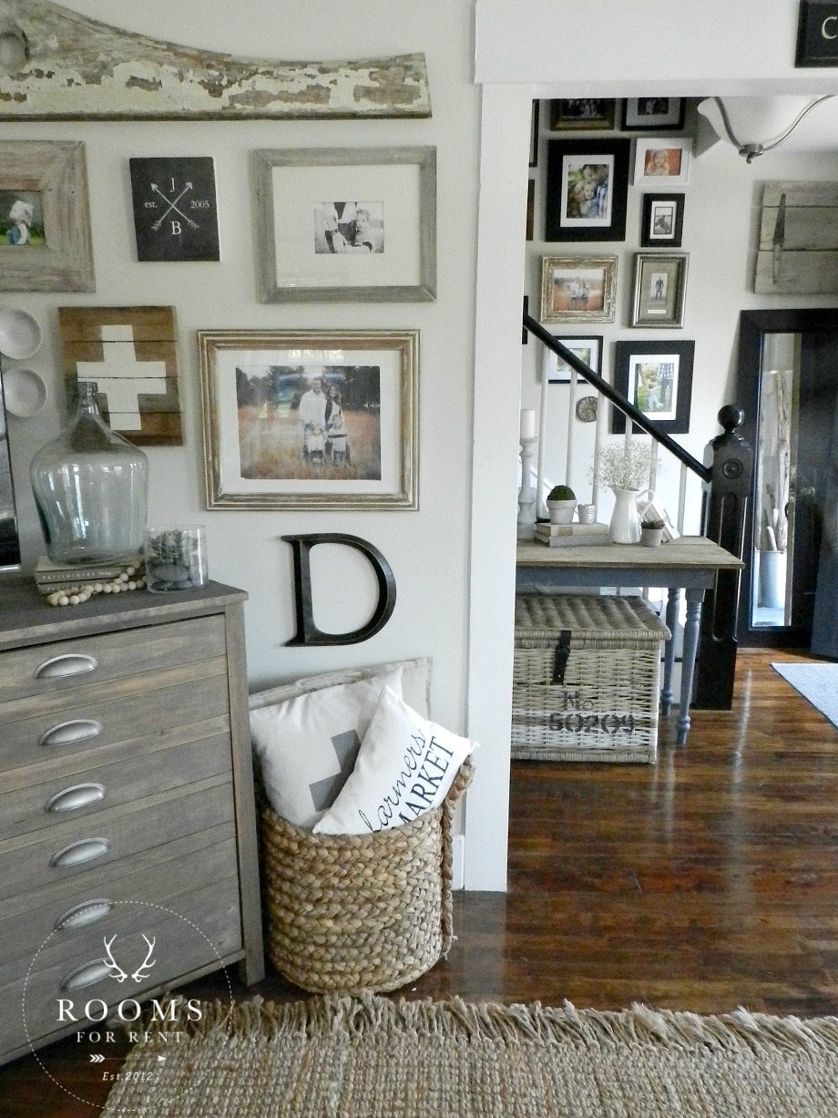
While I love all black frames with black and white photos, I didn’t want anything to feel to modern in our 1846 Farmhouse. In my next post I’ll share with you my original inspiration photo, it was eclectic with a mix of frames and objects throughout. So off I set to buy any frames I could find from the clearance section.
We have a wide variety of frames, and while they aren’t all from the clearance section, about 50% of them are. My frames are all from HomeGoods, Marshalls, Target, Ikea, even Walmart. To break up the frames, I would add abjects, mostly found at Hobby Lobby, and a few antiques to add to the mix.
The small console table we made repurposing antique table legs, and I will be sharing more details on that soon too! The wicker trunk underneath it is also from Ikea, and I showed you how I painted the stripes on it here. I love them because they are so versatile – they’re cute, and hold a tone of storage.
The barn wood piece above the mirror, we make and sell to local clients. We use old pieces of barn wood, and antique hinges to add some architectural interest. Our front door is painted Dark Kettle Black which is found at Lowes, and the boxwood wreath is from HomeGoods. I feel like there are so many little details I didn’t even cover, so feel free to send my any other questions, and I will try to answer them all in my next post showing the before and after with the new paint color!
Stay in touch!
Instagram / Pinterest / Facebook
Have a design question? Visit Doucette Design Co. for all your design needs!

I am curious as to what “rules” you used when creating your gallery wall. How do you use so many different frames and pictures and still make it look cohesive?
Hi Jenn! Check out my new blog post (Hallway Before & After), I tried answering your question in it 🙂 Basic rule of thumb, let it flow! I know it’s not really a rule, but I don’t follow any formulas, I just try to keep it balanced 🙂 Thanks!
Bre, your entry is gorgeous and built much like mine–I would love to see a shot of what your hallway looks like from the front door. I’m trying to figure out what to do there. Thanks for the inspiration!
Hi Mary ann I just recently shared a post showing the angle I think you are wanting of our hallway. Hope that helps 🙂 https://roomsforrentblog.com/2015/05/board-batten-tutorial-a-giveaway/
It’s like it tells a beautiful story of your family… All without words 🙂 SOOOOO beautiful!!! <3
It’s just beautiful! I have the basics on my stair wall now. Hoping to add in the smaller accent pieces this summer. I love photography (I’m a photography director for a publishing company) and I think photographs are the best art in any home. Thank you for the inspiraton!
This wall is perfection. It fits your home so well and I love how the living room wall almost feels like a part of the staircase wall. It’s also what introduced me to your blog after spotting it on Pinterest. 🙂 Beautiful!
Where did you get that cute farmers market pillow? Thanks! Your house is beautiful!
Hi Carolyn! I got it from an Etsy shop called Shabby by Melissa, but unfortunately she has since closed 🙁