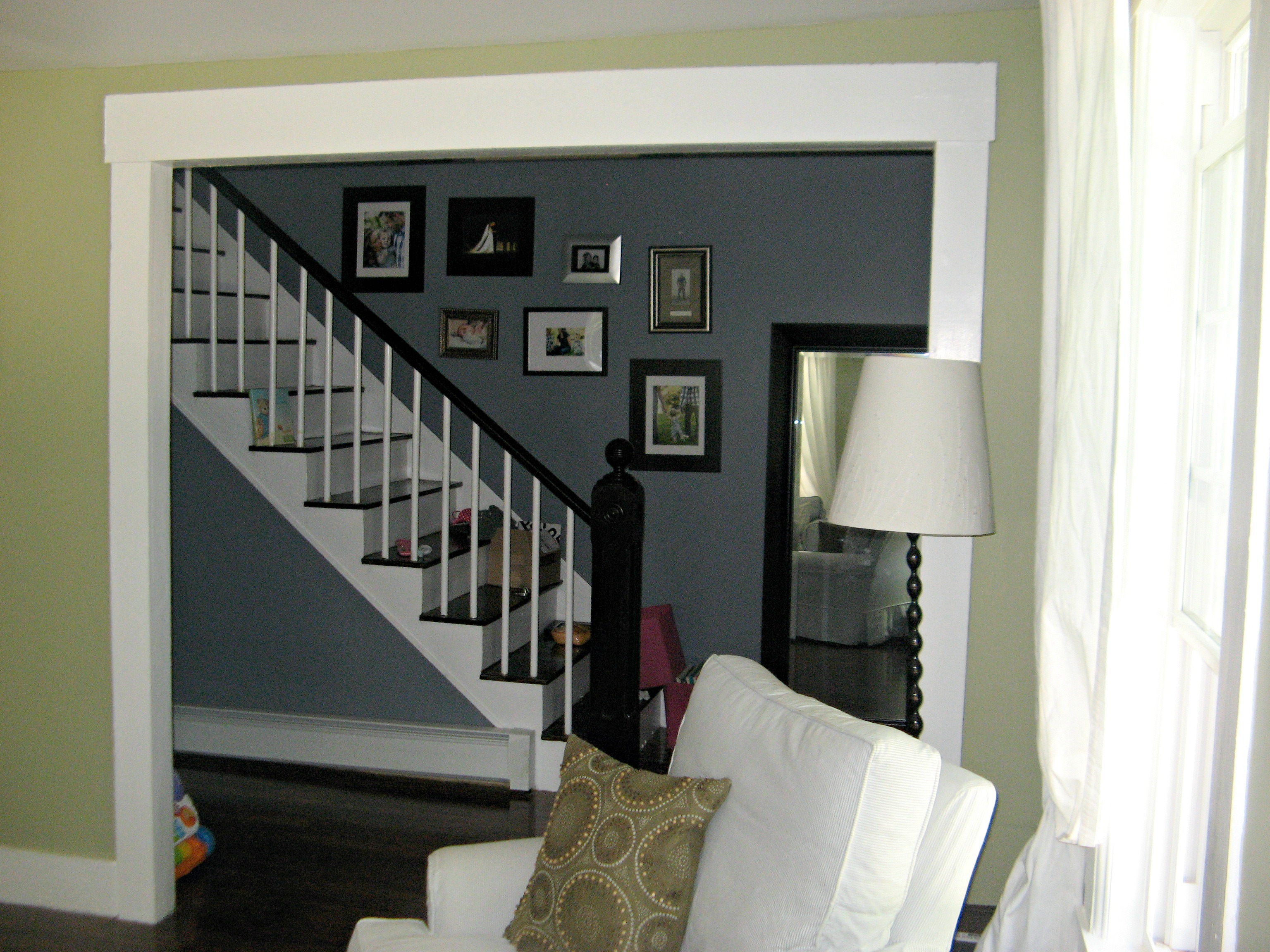
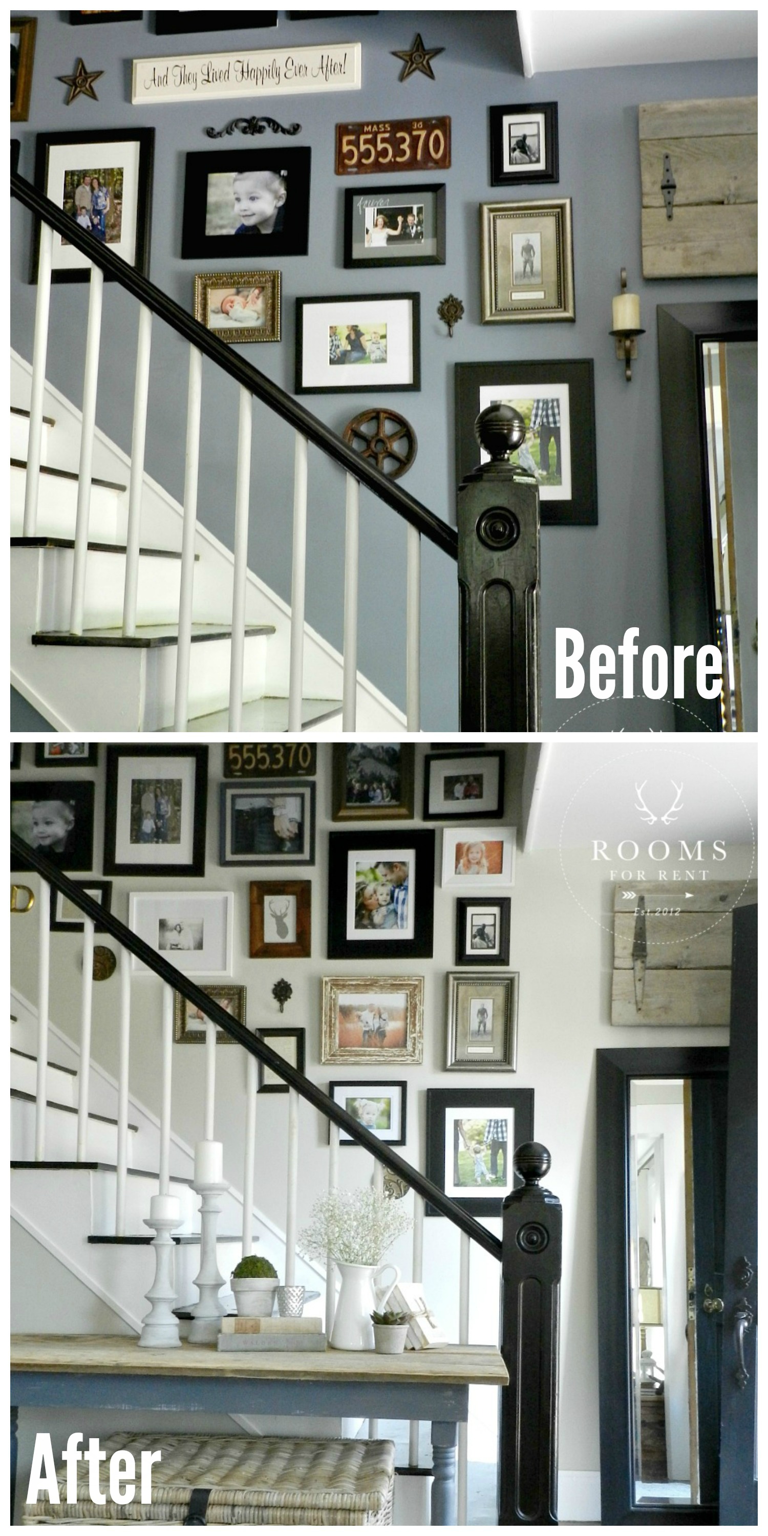
Last week I shared our front staircase and gallery wall. I mentioned in that post why it had taken me so long to share our front hallway, because the lighting was never good, with no windows or direct sunlight in that hallway, it always made for poor picture taking. Not to mention no matter how much I loved the color we painted the hallway when we first moved in, it just made matters worse. So today I’m going to share with you some before & after pictures, because who doesn’t like a good before & after?!
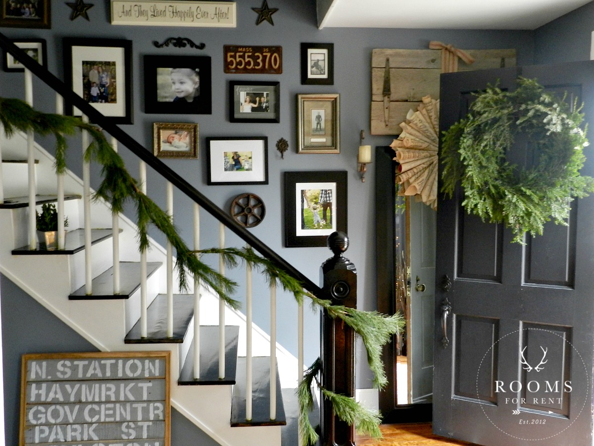
See what I mean. The lighting was/is terrible. I loved this grey/blue color, but it was just a case of the wrong color picked for this spot. Anyone else probably wouldn’t have even thought about it, but living with it day after day, it just always felt like this front part of our house was in a shadow. But you can see the start of my gallery wall. Yes those 7 frames is what I started with.
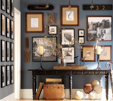
This was my inspiration picture! I remember tearing out of a Pottery Barn catalogue and treasuring it forever. I loved their mix of frames, that it wasn’t an identical layout on both sides, and they added other objects in there as well. And I loved the wall color. I never did find out the exact color name, but I ended up finding a close one. So I went with Stormcloud by Sherwin Williams, and started collecting frames wherever I found a good deal.
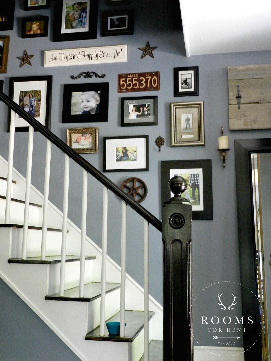
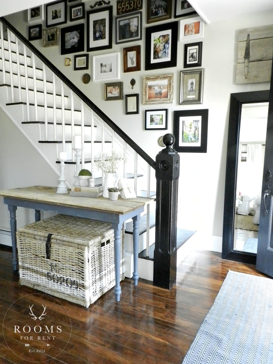
Slowly the frame collection grew, along with adding other objects in there. I already had the antique license plate, the other metal objects came from Hobby Lobby, and the white sign I got at a cute little shop near the beach. The barn wood piece we made to fit perfectly over the black frames mirror, I told you was a HomeGoods find. It felt full, completed, but after a few years I finally came to the conclusion that not having any natural light was starting to bug me.
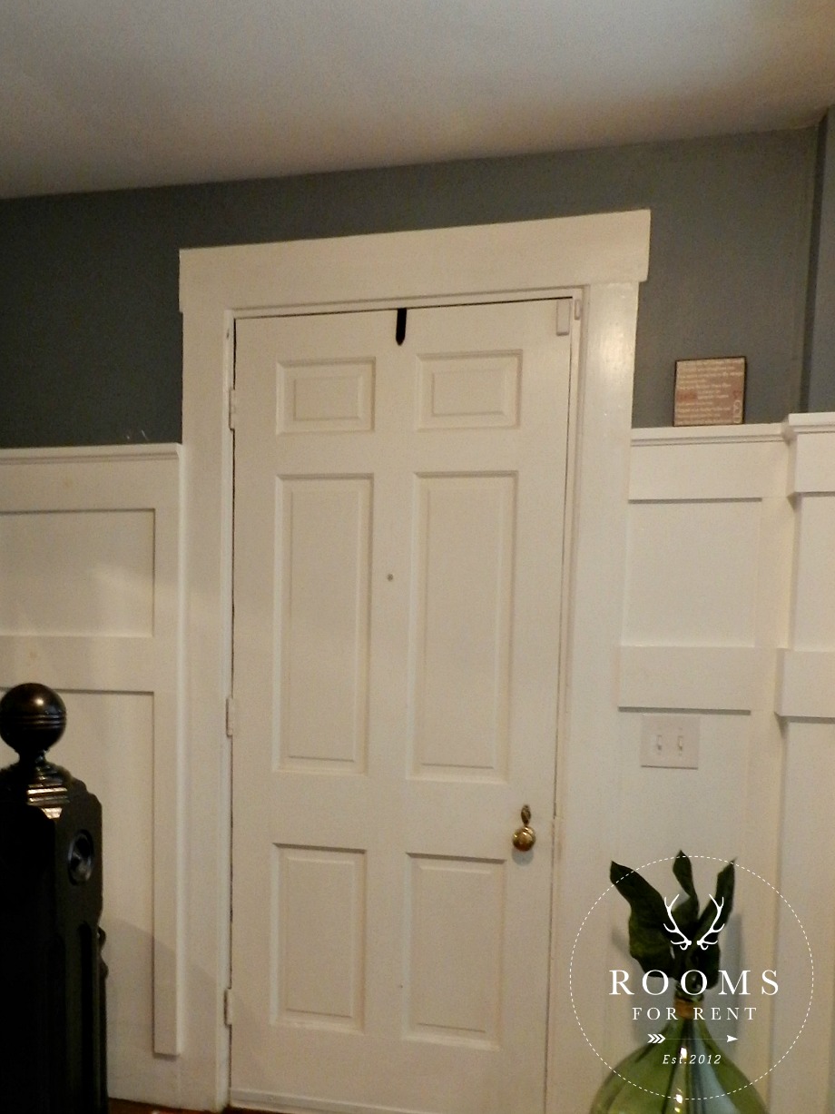
We added board and batten to the opposite side of the hallway (which you can currently see), and around the front door, hoping it help lighten things up a bit.
I will share more on how we added the board and batten soon, but in the end it still wasn’t enough for me to not be bothered by things feeling dark. Once we painted the living room a light color, it was all over after that.
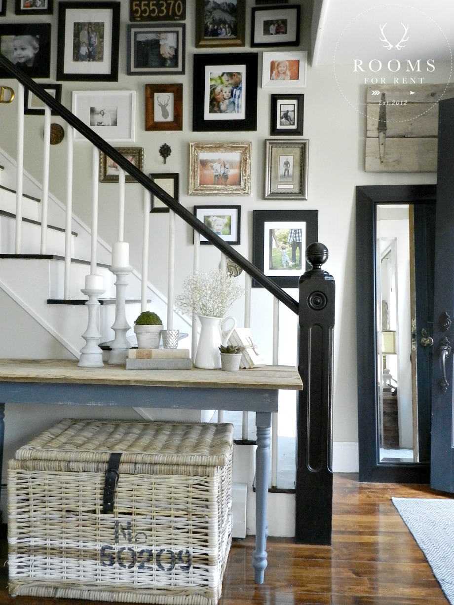
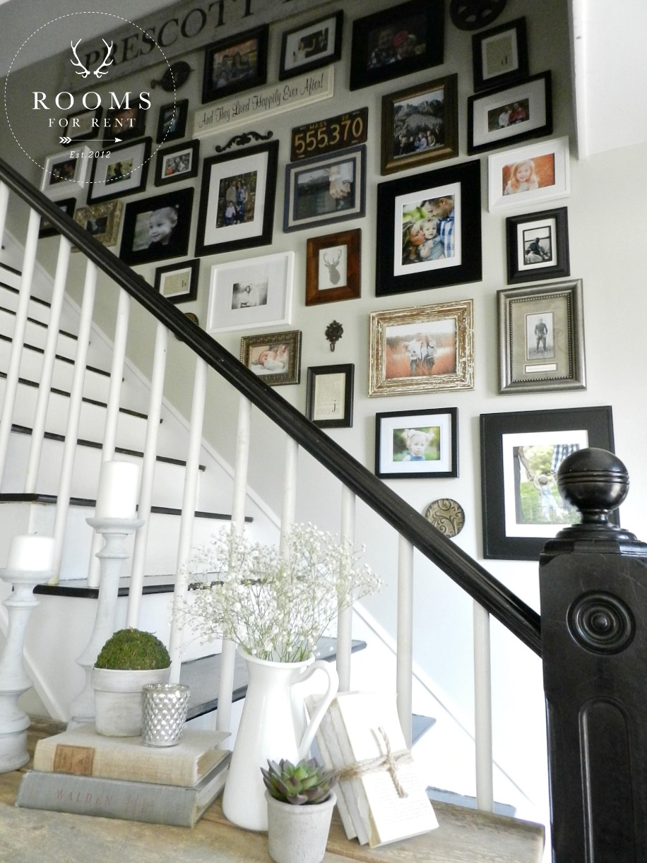
I chose Hazy Skies by Benjamin Moore, and it’s a nice light tan with a lot of gray undertones to it. It’s also the same color we painted our Master bedroom too! I just kept going once I hit the top of the stairs! Now regardless of the weather outside, and who knows when and if we will ever install some windows in the hallway, things always feel lighter.
As you can see I almost did the exact same layout for our gallery wall as before. I was totally lazy and didn’t bother filling in any of the nail holes from before, thinking I would probably just use the same ones, but I didn’t. You can’t really tell, I think I’m the only one that will ever know, which is good in the husband department (will let that be our little secret). I only shifted things slightly when I started hanging them again, and swapped out some older frames I got real cheap, for some newer distressed wood ones I found at HomeGoods.
One of the questions that a few of you asked after I shared this gallery wall last week, was “What were some of the rules I followed, or measured for placement, when hanging the frames?”. Well let me fill you in on the most freeing answer there is to this. Are you ready?!?! There are no rules! I don’t have a specific order, or system I use when hanging a gallery wall. I start with 1-3 frames, and begin holding them up to the wall to see which one fits the space better. Once I find a frame I like it goes up, and then I just start building off of that. No templates, no laying it all out before hand. I’ve tried those methods and it just ends up causing me to over think the process to much, I get too scared to commit. I think to myself “Well what if this one would look better there, or what if I want to go this route instead?” and on and on and on until I overwhelm myself before I even start. Sometimes you just have to start before knowing how it will all turn out, it’s during the process that you find out what you really ldike. So to avoid over thinking it, I just start. No rhyme no reason, I don’t measure, I don’t have things all planned out. I just start with one or two frames, and begin building off of it, like a painter with brush strokes on a blank canvas. Don’t be afraid of the process, and don’t over think it. 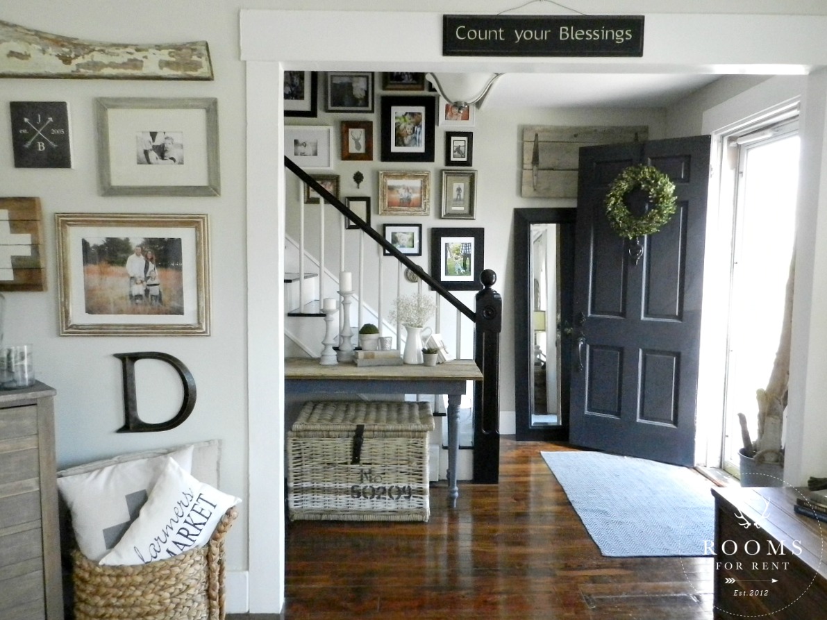
Another tip, is unless I’m creating a gallery wall with all the same frames, add objects in to mix it up. Initials, architectural pieces, little starburst mirrors. While I do have frames that match, when you are mixing frames, as long as you have two that are apart of the same family to help things feel consistent, you really can’t go wrong. So in my gallery wall, I have at least two white frames, black frames, wood frames, metal frames – they might not be identical, but they are the same material. It provides a warm eclectic mix that will add interest into any space. Next I will show you our board & batten before and after.
Stay in touch!
Instagram / Pinterest / Facebook
Have a design question? Visit Doucette Design Co. for all your design needs!

I can SO relate to your PB inspiration picture with the bluish/gray wall. I think that particular gallery wall has become an icon for gallery walls everywhere! I enjoyed seeing your before pictures. I’ve been reading your blog for awhile now and always see your home so light and bright ~ it’s fun to be reminded from where we all came! 🙂
I love your hallway! It’s so bright and inviting. The gallery wall is beautiful and so interesting with the extra bits that aren’t frames. Funny this picture was my inspiration too. I adore it! I still have it in my phone and look at it all the time. I too went for the lighter paint choice.
What a drastic difference color makes! Wall is brighter and pics stand out! Great transformation!
WOW…what a difference the color change made! It really looks great! And believe it or not, adding that table with a few accessories also makes a big difference!
Oh Bre I LOVE your style!! Yours is one of the few blogs I can’t wait to see a new post! I really love your gallery wall. It’s such a nice mix of all manner of object de art. can’t wait to see what you do next!!!
Thank you so much Cheri!! That really means so much 🙂
Your hallway is fantastic! I do have a suggestion. Your font color is so light that I have a hard time reading your posts, Have you thought about using black?
Hey girl That looks oh so good!! I love the entryway! It does look better painted a different color! It brightens up the room!! Great job! And the pics look so good to!