One of the contributing factors to the clutter in our living room was our built-ins. Those gorgeous half walls in between our living room and dining room. They are so nice to have, until you have to decorate them! It takes time to find just the right pieces, or the right sized knick knacks, but before you know it they can start to feel cluttered, and more of a distraction, than a pretty architectural element in the space. If you are new here, or visiting for the first time, I started the process of Simplifying our Living Room in the beginning of the year. I had shared how lots of elements in the space just started to make it feel like the walls were closing in, and I was craving a simpler feel. It’s a hard balance to find when you aren’t quite a minimalist but don’t want to be the queen of “collectives” either 🙂
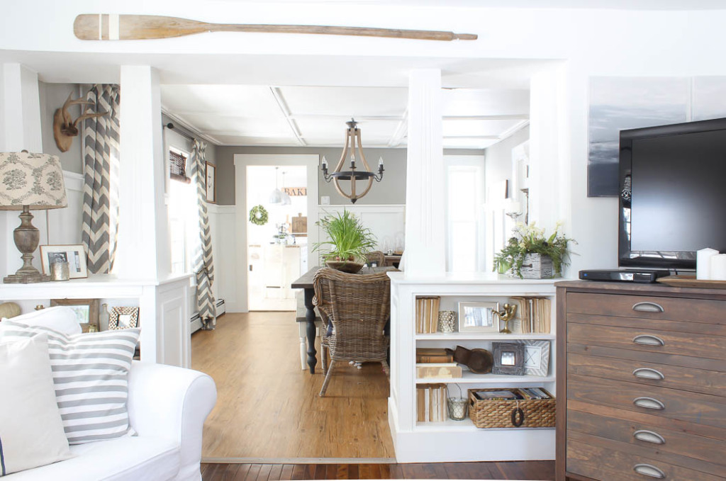 I made some fun DIY Abstract Art to help calm the walls down, and today I’m going to show you more of the built-ins between our living room and dining room. With shelves on both sides, I wanted them to feel in unison but still neutral.
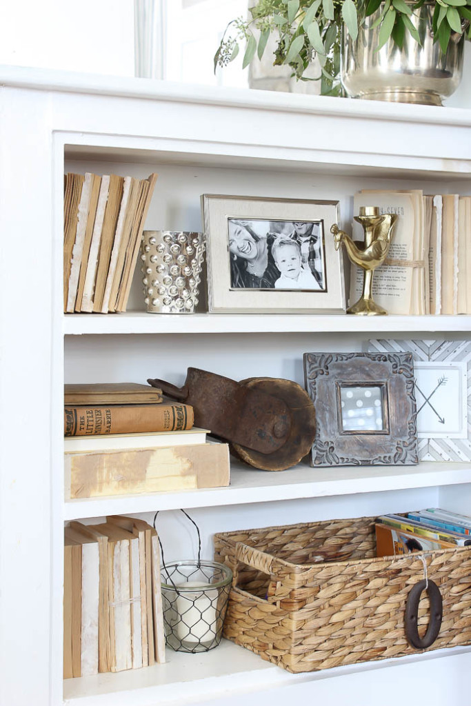
I had mentioned in our Living Room Refresh, that one of the new elements I wanted to add to the space was mixing metals. I love the look of aged brass and gold, those were top on my lists of elements to add. I picked up these fun candlestick holders on clearance at Target, and they added the perfect pop to our built-ins.
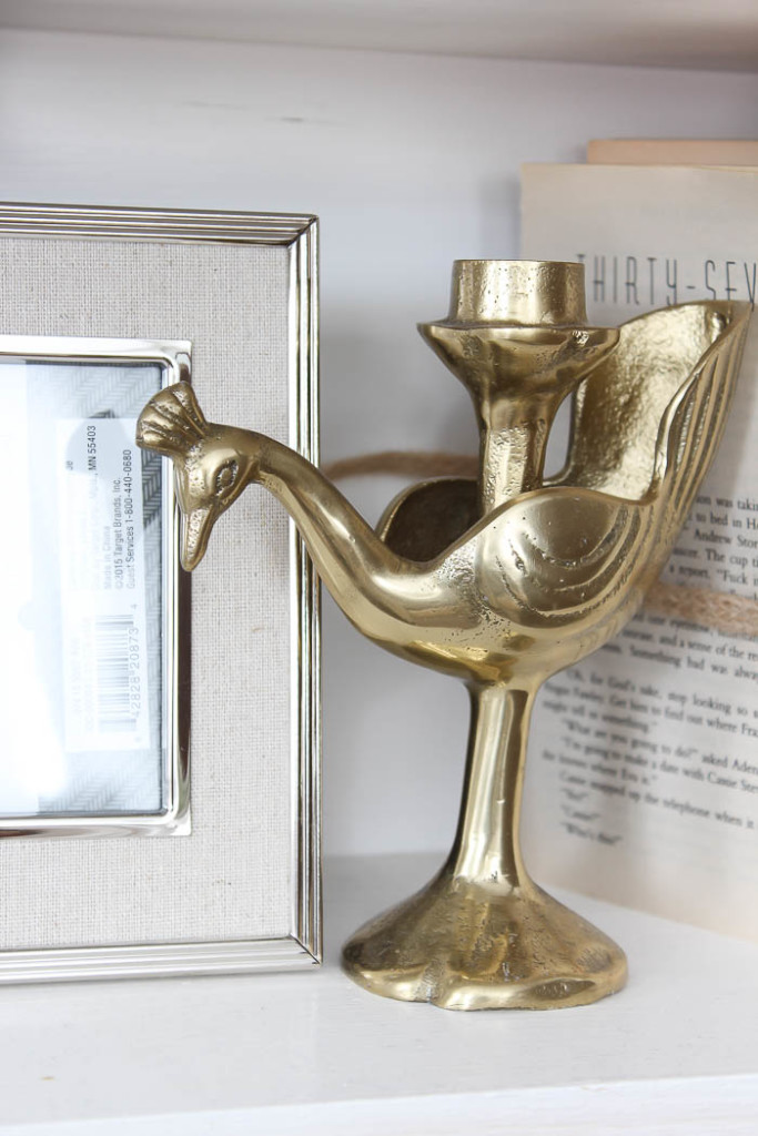 Mixing metals is such an easy way to incorporate more warmth to a space, without making it feel too fussy when everything is matchy-matchy it can sometimes feel too formal or stuffy.Try relaxing your look by swapping out one piece for something new that has a different look or vibe to it. There’s no perfect way of doing this, or rule that says it has to be just so, so don’t worry about messing it up. If it feels off to you, than it probably isn’t the right fit. But keep in mind everyone’s taste is different, and when it comes to decorating your own home, I always tell my clients ” You are the one that has to live with it, so I want to make sure you are the one that likes it, not just me”. Mixing metals can feel weird at first, or out of place, depending on what generation you are decorating from, but I love the relaxed vibe it adds to the space, but also a touch of class.
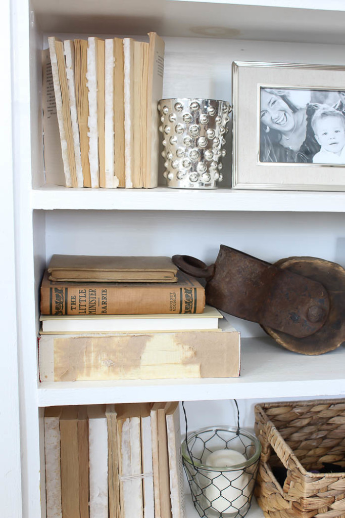
Deconstructed books are such a great way to texture and interest to your bookshelves. They add a unison feel, but also keep things neutral, so they don’t visually feel like they are taking up too much space. It was just the breathing room our built-ins needed.
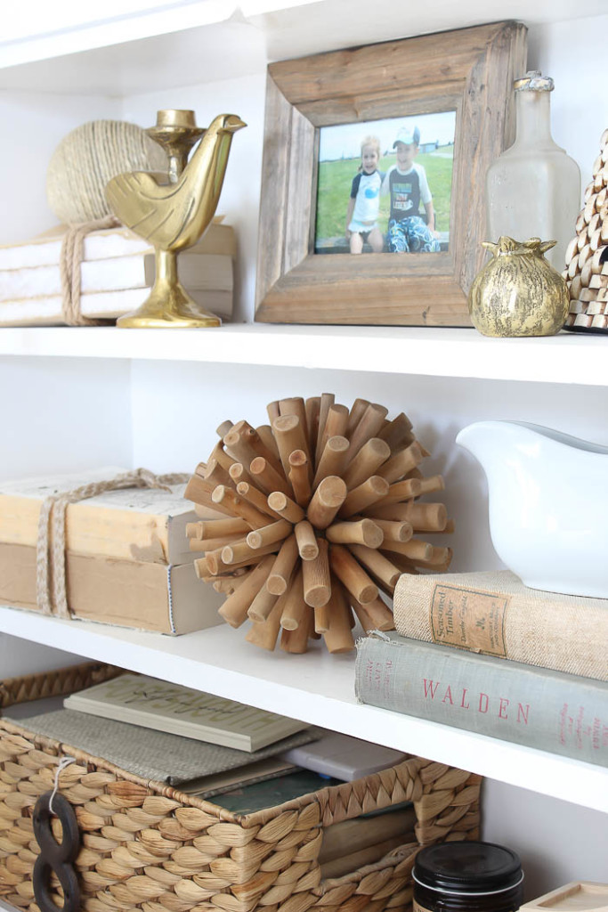 For the left side of the built-ins, I wanted to keep the look and feel cohesive. I brought in the same elements but arranged them slightly different based off of what I had to work with.
A few new brass knick knack’s, more deconstructed books, neutral wood tones, and a touch of white. Keeping things a neutral color scheme, not only allow my new brass knick knacks to stand out, but they keep the space feeling calm and not cluttered.
I shared HERE one of the best places to go for inexpensive books to deconstruct, and most of the books you see in our built-ins are just that. If you already have a bunch of books but want a more unison look, try turning them all around so the bindings are facing inwards, or grouping them together in like colors. This will help soften their look.
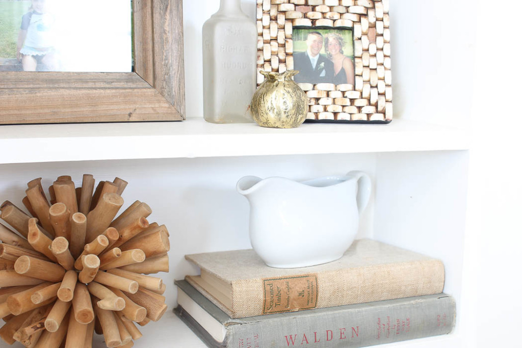
I know you wouldn’t typically think of putting a gravy boat on your bookcases in your living room, however like I mentioned in the beginning of the post, finding the right sized objects can sometimes prove to be tricky. Don’t be afraid to think outside the box when looking for pieces to accent your shelves or bookcases. Sometimes it’s those out of the box items that help add the most interest to a space. 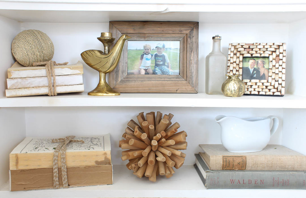
Over all our built-ins feel less cluttered, and more like they were styled on purpose. Keeping things neutral helps add to our living room decor, without over taking the space. To see the process of how our Living Room was simplified you can catch up with these posts:
A Simpler Look for the New Year
Stay in touch!
Instagram / Pinterest / Facebook
Have a design question? Visit Doucette Design Co. for all your design needs!

I love how you decorated them, Bre!