So I had been toying with updating our kitchen island for a while. I feel like I have been debating for over a year, and finally decided to pull the trigger. Because what’s the worse that can happen, I don’t like it and I can paint it back white, RIGHT?! So I finally decided to take the plunge and update our kitchen island, by painting it a bold color, and it was so easy.
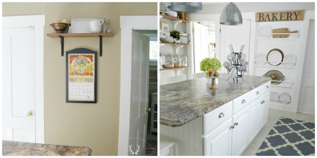
We have taken many strides in updating our kitchen to make it feel like ours, and add that farmhouse flair that we love so much! You can see HERE just how we transformed our kitchen without doing a major renovation. 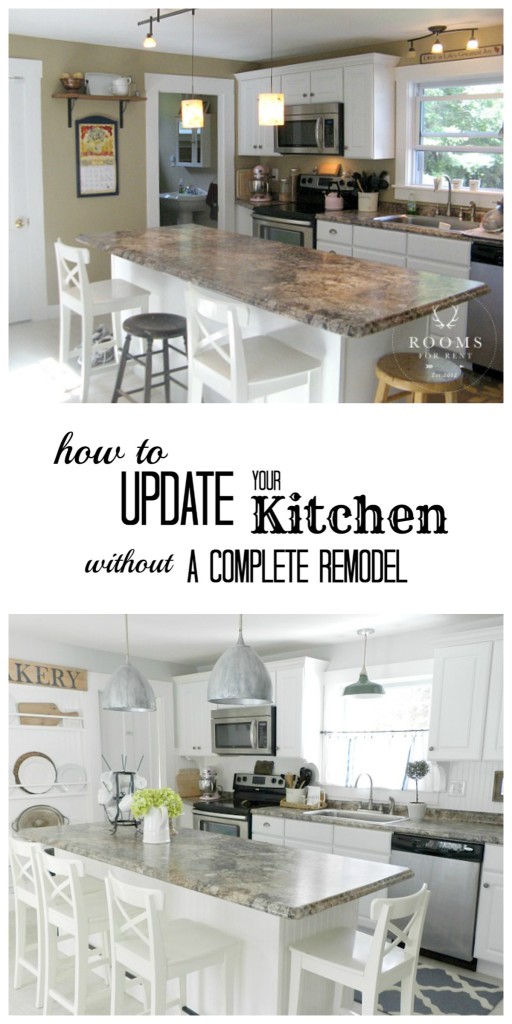 With the help of paint, and cosmetic upgrades, we turned this blah beige kitchen into our farmhouse dreams. Of course there are still some things I would like to do in here to update it a bit more, but I’d say we made quite a bit of progress.
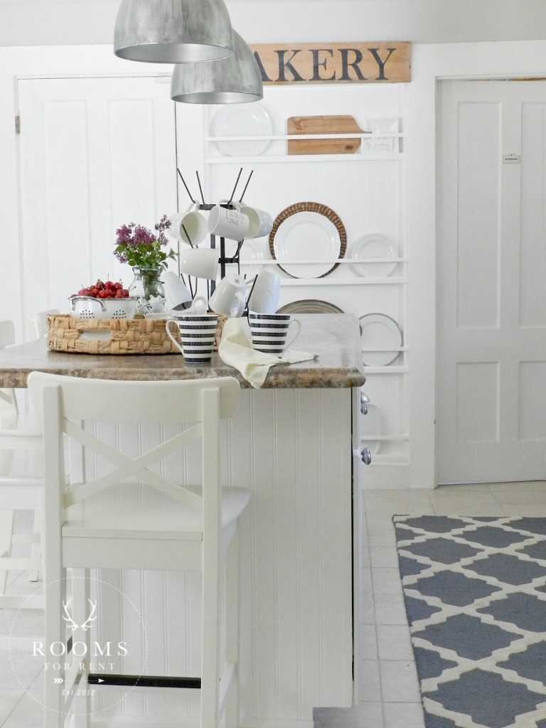
So one night around dinner time, because that’s when projects seem to strike, I grabbed my paintbrush, and my favorite chalk paint color and got to work. Or so I thought. I hesitated at first painting such a dark color, because I was afraid it was going to undo all my hard work to lighten everything up in our kitchen. So I second guessed myself, which by the way – nothing good can ever come from that. In design there are risks, and if I’ve learned anything from taking risks in design, the higher the risk – the higher the reward.
So instead of opening my favorite chalk paint can, Graphite, I paused and grabbed a can of taupe gray called French Linen, by Annie Sloan. I started painting, and like any project you start painting, you know it doesn’t always look pretty at first, but you need to give it some time to come to fruition. 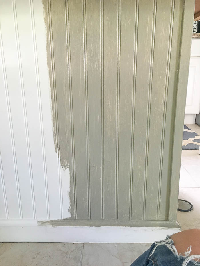
It was ok, but I was starting to notice something. The taupe in this warm gray was starting to make my countertops more brown! YUCK! That was not what I was wanting. As I stood back the color just seemed to conflict with all the other colors I had going on in the space. So I decided in the moment, that what could it hurt to at least try out the color I was originally wanting to paint the island, Graphite. 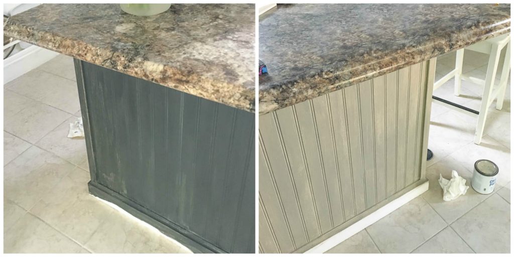
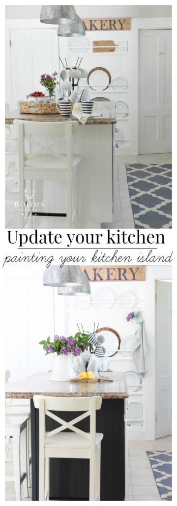
While it’s hard to see in this photo, especially because our countertops look more brown on the left than the right, the darker color was exactly what was needed. And you know what, even after just the first coat, heck the first couple of brush strokes, I was instantly happier. So I put the taupey-gray away, and moved forward with Graphite, from Annie Sloan’s chalk paint line. And two coats later I was so happy I trusted my gut, took the risk, and moved forward with the darker color.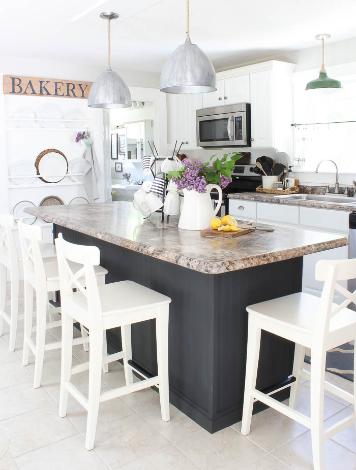
Even though in some photos it appears darker, almost black, Graphite has the slightest hint of navy to it’s charcoal gray color palette. You get a better feel for the color in the photo below, and I’ve used this color consistently throughout our home.
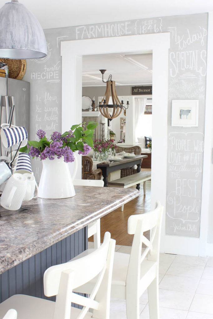
Even better, these faux granite countertops I loathe, don’t bother me as much anymore. I plan to paint the cabinet doors on the other side, but for now this makes me happy, and I feel more content with this space. Here is a side by side before and after: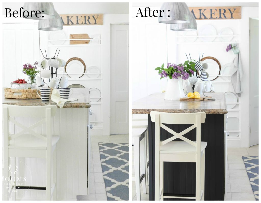 I’ll be back next week with Part 2 of our Summer Home Tour, and can’t wait to share more of our outdoor spaces with you, and how we utilized them for full enjoyment this summer!
Stay in touch!
Instagram / Pinterest / Facebook
Have a design question? Visit Doucette Design Co. for all your design needs!

It grounds all the light and bright elements in the room- beautiful!!
Wow nice updated kitchen Bre, I enjoy your blog, It’s looks awesome, Thanks for sharing. Have a nice time with your family.
I like to say that I’m in my Black Zone right now. I love, love love how your island turned out. I just painted a mismatched cabinet in my kitchen black and I really like it. Adding new hardware give it a updated look.
One of my favorite place at home is the kitchen because I love to cook and I love entertaining visitors there rather than in the dining area. It’s just fun to cook while talking to some groups of people who are close to you. This is the reason why we have a kitchen island in the kitchen too so visitors will have a comfortable stay also. This is a good inspiration for a kitchen island actually. I hope I can update mine too.
I love it. I just painted my island black and like you, when I started I got a little scared, but it looks great. Yours is amazing, great makeover.
Hey Bre – it looks really great! It’s a nice surprise to the room. Here is a thought: maybe you can paint the light over your sink the same color? I saw that on another blog and it looks really nice.
I enjoy your blog a lot! Have a great Summer with your family.
At first I was thinking “eeeek” so dark but I have to say it really ties other elements in well. I would never have thought to paint it that color. It looks wonderful.
Well at first I wasn’t sure but, it does look fabulous! I really like that color.
love the way it turned out! i love graphite too. thanks for sharing. xo- maryjo
Bre,
Hi, I’m a 60 year old that has a heart for your paint colors and your wonderful redesigns, especially in your kitchen. I love the new contract color on the island! I’m remodeling my 1920s mill-house kitchen in North Carolina and I’d like to know what your flooring is….is it tile?.. what color?..source?
Thank you.
Terry
Hi Terry! Our flooring is tile. Unfortunately it was already installed when we bought the house, so I’m not sure of the exact name or color. But they did use a lot of materials from Lowes, like our countertops, so I wouldn’t be surprised if the tile was from there as well 🙂 Good luck with your remodel! ~Bre
hey girl great job! The island looks really good!
Looks great, sounds like me with my island bench it was pine, kept looking at it for a year….finally got the white chalk paint out…much better, wish I had done it sooner, love your blog…all the way from NZ..
This turned out beautifully, Bre!!! I love the difference and how it really pops!!! Great brand seminar too… I had to finish it the next morning b/c I had to keep getting up with Drew.
Oh, you could get me into BIG trouble here as this is just what I want to do! And chalkpaint makes it sound easier than regular paint, too.
Couple of questions……do you think this paint will hold up to being kicked by kids? I just know that can happen and not sure I want to touch it up or worry all the time. But I love the difference made in your room and notice how the counter top looks so pretty at the same time, too.
Would it be horrible if you did not paint the side with doors? That was my biggest question when I read this….how did you get it all done in a night if there were doors/drawers to paint, too? My island is set up the same way, so the side not painted faces the side it matches…..and I get totally lazy when I think about the work involved with those. BUT if it will not look right, gee….makes no sense to do something half way.
HE HE too funny Patty! So I still haven’t gotten around to painting the side with the doors, and honestly I don’t know if I ever will. I’m sure I’d love the result, but waaaaaaaay to lazy to go through all the work. So far it’s held up beautifully. I will say putting a coat of poly on after has helped with the kick marks, and makes it easier to wipe down, since the chalk paint is more of a rough surface instead of a smooth finish 🙂 I say GO FOR IT!
I love how your island pops!
Great choice.
I absolutely love how you have maximized your space, and decorating with words is super important to me. Very inspired by your chalk wall on the perfect color of gray.