I shared earlier this week that it was 6 years ago on March 28th that we signed on our first home! To celebrate that milestone I’m sharing how different rooms in our house have progressed over the past 6 years. Yesterday I shared all of our Dining Room before and afters. If you haven’t had a chance to see it yet, you can click HERE to see the transformation! There are lots of fun before and progress pictures I’m sure you will enjoy! Today I’m sharing our Living Room Progression, and how this room has evolved over the past 6 years. It’s undergone quite the transformation as I discovered my true style and really established what I love in my home.
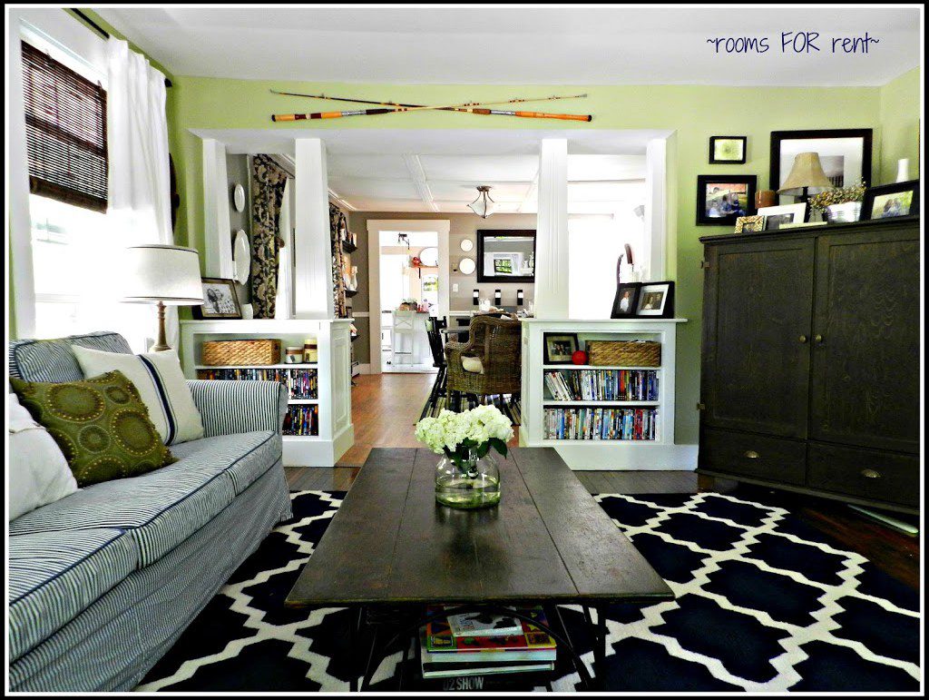
I shared yesterday that when we bought our home the rooms inside were every shade of yellow you can think of. From bright sunny yellow to golden yellow to mustard yellow to a shade that ended up looking like baby poop! Yes for real it looked just like baby poop. 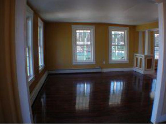
You kind of get a feel for what I’m talking about in the photo above, specifically the half walls with the columns. I don’t know what possessed them to paint to match all the coordinating shades of yellow, but it had to go. I couldn’t paint those white fast enough!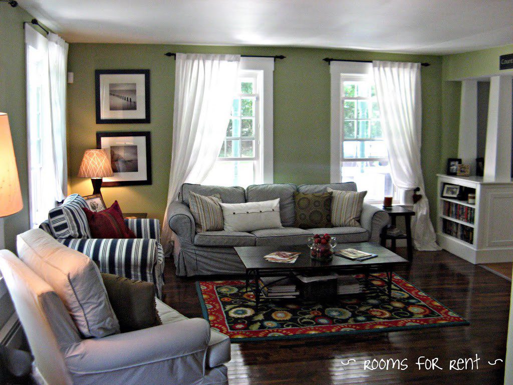
I painted the half walls with columns, and then we decided to make built ins on the living room side to store all of our dvds. I painted our living room Wasabi Powder, and all the furniture and accessories you see is what came with us from our apartment. At the time I was believing the lie that you can’t have white furniture with small kids, so my white slip covers were all sitting in storage bins in our basement. Trying to embrace this navy and white and green theme I then purchased a way-too-bold rug.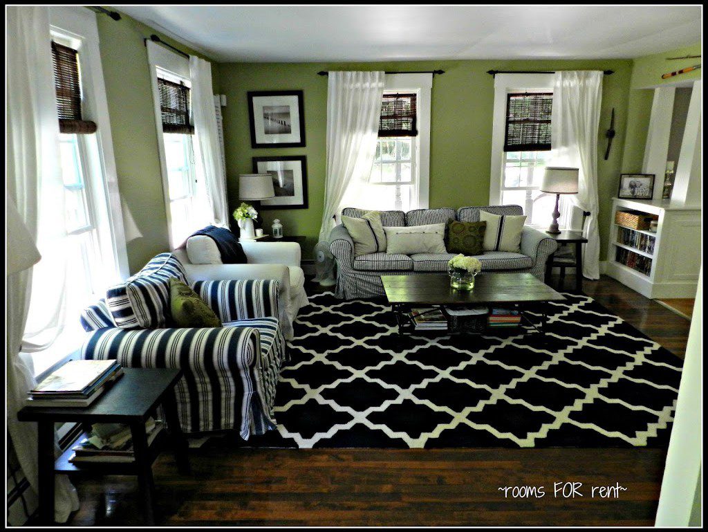
Everything matched color scheme wise at the time, but I think the bold patterned rug was really my wake up call as to why I wasn’t happy in our space. I had to learn that lesson so it would cause me to really start digging deep into discovering what my style really was. 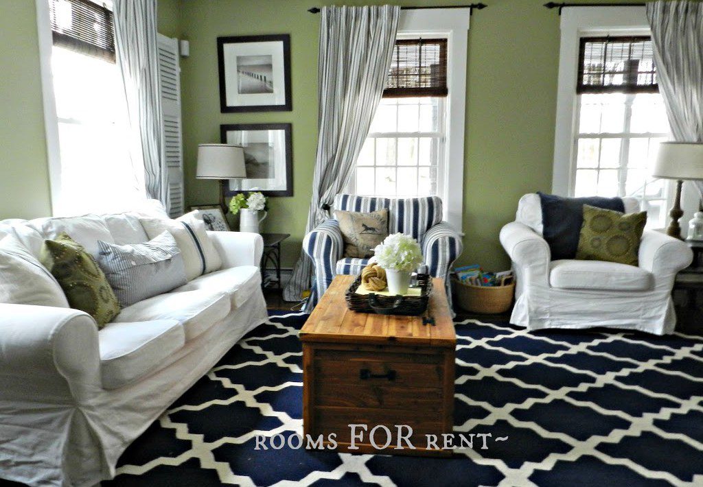 After moving furniture around one Christmas to make room for our tree, I began the process of softening up the space. I brought my white slip covers out of storage, and instantly felt better. I learned that it didn’t really matter what color my furniture was, if it was slip covered it was kid approved. Next I painted the walls an almost white color – Halo by Benjamin Moore, because I was too chicken to go stark white.
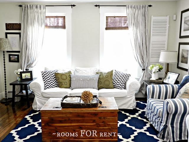
But that didn’t really fix my problem. If anything it just made those loud bold patterns jump out at me even more. So I went back to inspiration photos I had of spaces I truly loved. I studied them, took notes on what they had in common. I sold the too-loud-for-our-space rug to a friend, and began to swap out accessories.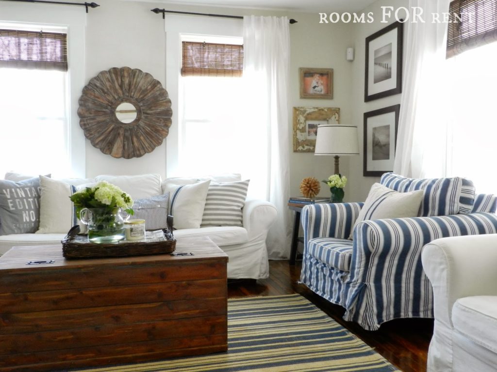
I brought the rug in from our dining room, replaced the bold patterned throw pillows with more neutral colored ones, and once the space was softened up enough I brought in texture – like the infamous round weathered mirror hung above our sofa. I still get so many questions about it. I found it at HomeGoods one year, and looking back I would have bought more just to have “in stock” for others who have been looking for the exact same one!{Old source list found HERE}
Now I was once again happy in our space. When our old worn out rug had seen better days, I replaced it with a neutral jute rug, because I had learned that for me the bigger pieces in my space needed to be neutral. Last January we got a new white couch to replace our 10 yr old IKEA sofa, but still stayed true to my design style. Since our sofa is one of my most photographed spaces I thought it would be fun to show you how many looks it’s had in chronological order.
Spring 2013

Summer 2014
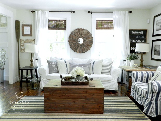
Spring 2015
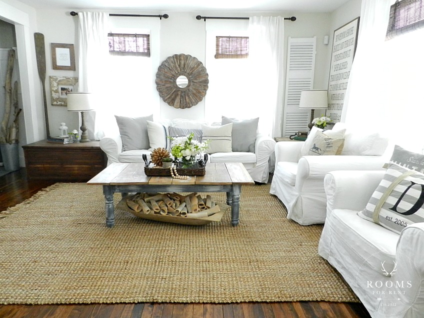
Summer 2015
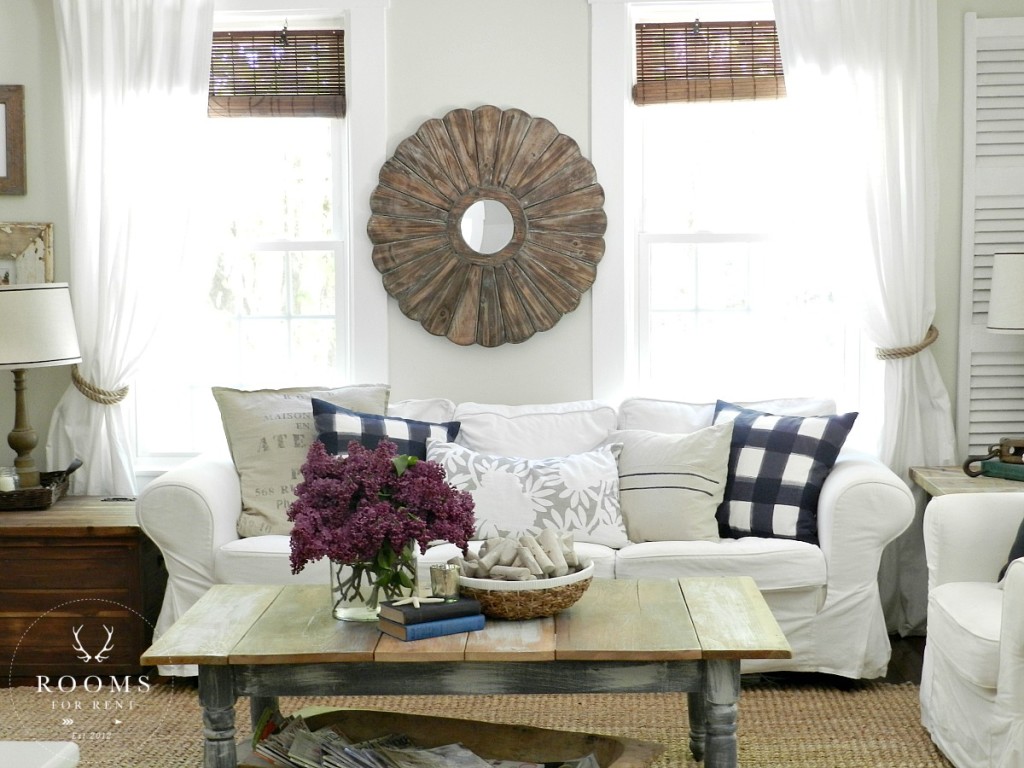
Winter 2016
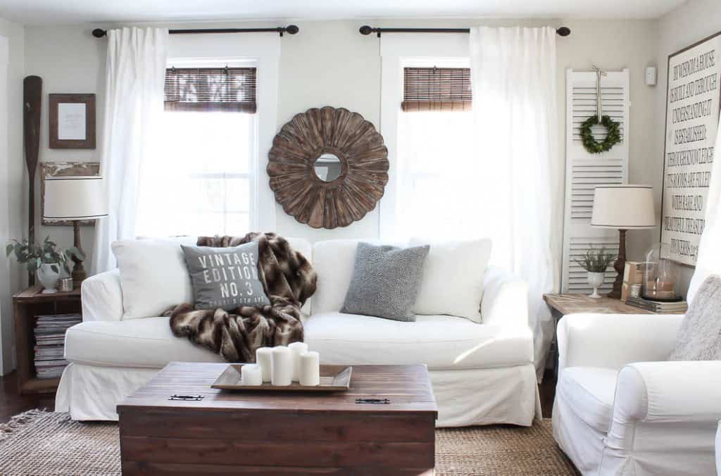
Spring 2016
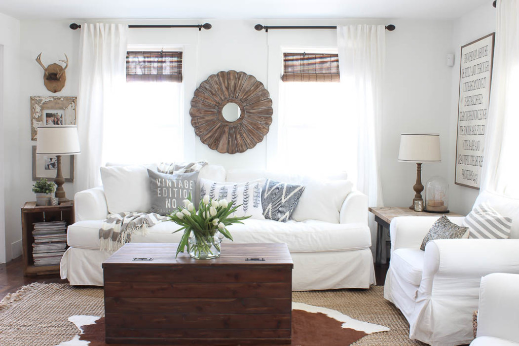
Summer 2016
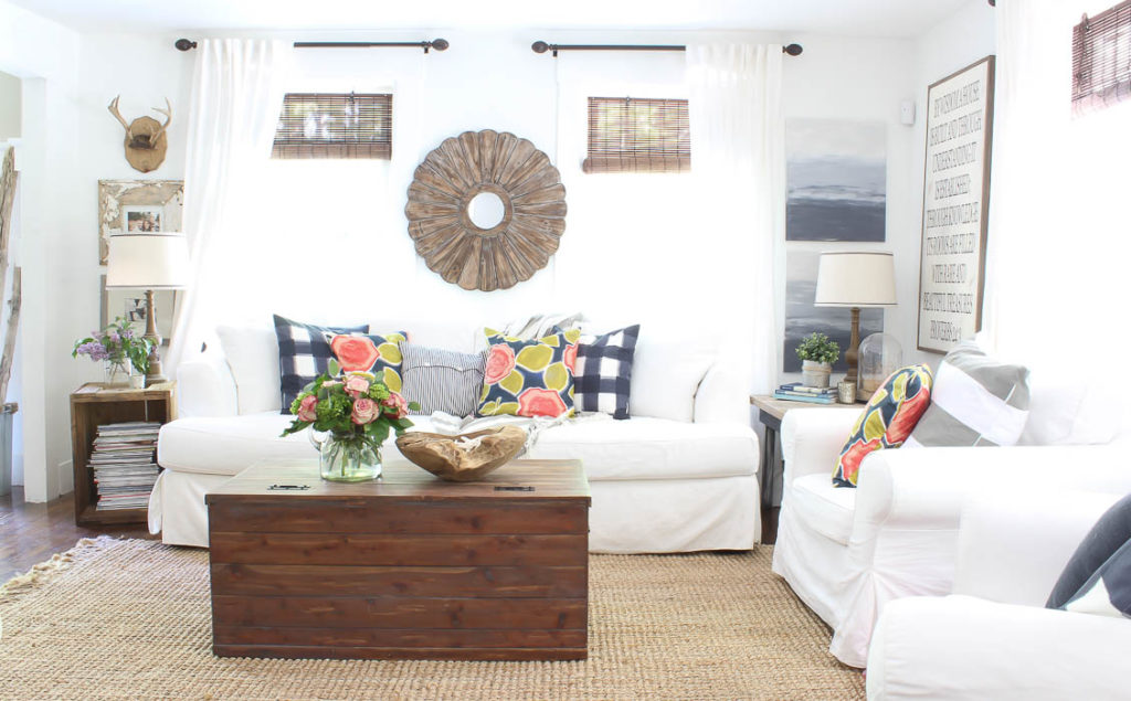
2016
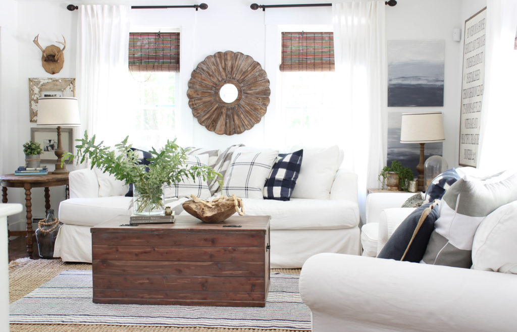
2017
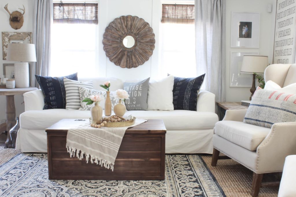
Here are some more before & afters of our living room.
Before:
Progress:
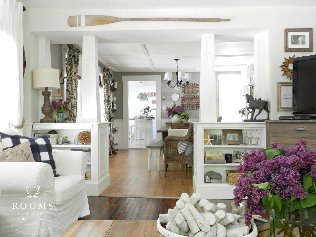
After: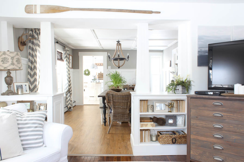
Before : 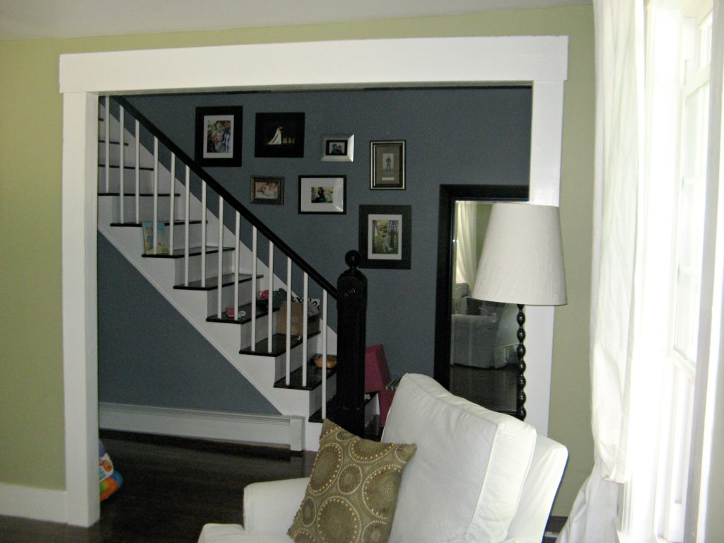
Progress: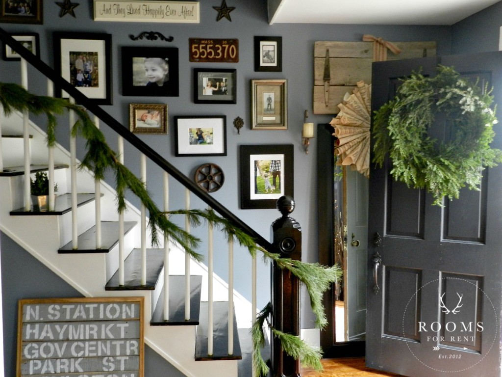
After: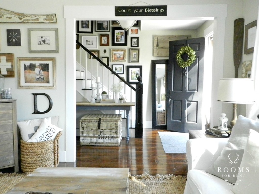
Before:
After:
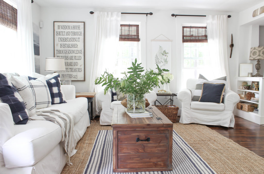
What a transformation our living room has taken since we moved in. My husband jokes that the house feels “finished”, but I sometimes ask myself if it every truly is?! I can say this, I have no big plans to do anything to this space anytime soon. I think that also attributes to absolutely loving the things in this space, and that makes me feel very content!
Stay in touch!
Instagram / Pinterest / Facebook
Have a design question? Visit Doucette Design Co. for all your design needs!

What a post on living room progression !!!! I think this decoration process just awesome.I liked it. Thanks Bre for posting a wonderful post about living room decoration.
Your living room looks so inviting and comfortable …. it reminds me of summer with a nice fresh warm breeze blowing thru.
Everything is just lovely! I like the the white sofa & chairs, Would LOVE to have them in my home!!
You took a not so pretty duckling and turn it into a swan. Fabulous!!!
Thank you!!!
I enjoyed that walk through all your changes. From 2001 to 2012 when i retired and changed things but never had it right and i am very thankful to have found you and a few others to help me. I am finally loving my rooms.
Looks great! I love how much lighter it is. Feels warm and cozy. Love the canvas blue prints in the summer 2016. Source? Thank you
Thank you so much Stacy 🙂 The blue canvas were a DIY, and I shared the tutorial under “DIY abstract art”. Seriously SO easy! You will love it 😉
I enjoyed looking at all the pictures of your living room as it evolved. I’ve been going through the same thing with my decor. I just switched a busy rug in my living room to a neutral one and I love it so much. The last change has to be a chair much like yours with the slip covers, but I still enjoy a touch of red here and there 🙂
where did you get the woven blinds
The bamboo blinds are from Lowe’s 🙂
Nice. Neat to see all the different ways you have decorated. Just FYI.. there is an add for State farm insurance that popped up on every photo, taking up the whole bottom. The worst case of in your face add yet. I went faster just to try to avoid it, but it was impossible.
I’m so sorry, the adds are totally random. But there is always a little “X” in the right hand corner of the add image so you can close it, and not have to scroll faster to avoid it 🙂