Over the next month or so I’m in the process of updating all the sources and Main home tour for the blog. It’s been seriously neglected, and I’m embarrassed to say that the last “official” Home Tour I have on the blog is from 2015! Yikes!! So I’ve been working on categories, and this is the next step. One of the most frequent inquiries I get is about the paint colors in our home. I will be creating a separate page just for the paint colors in our home, and be sure to tell you once it’s up and where it is located, but in the meantime I wanted to give you an updated post of paint colors around our home, for anyone that has been curious.
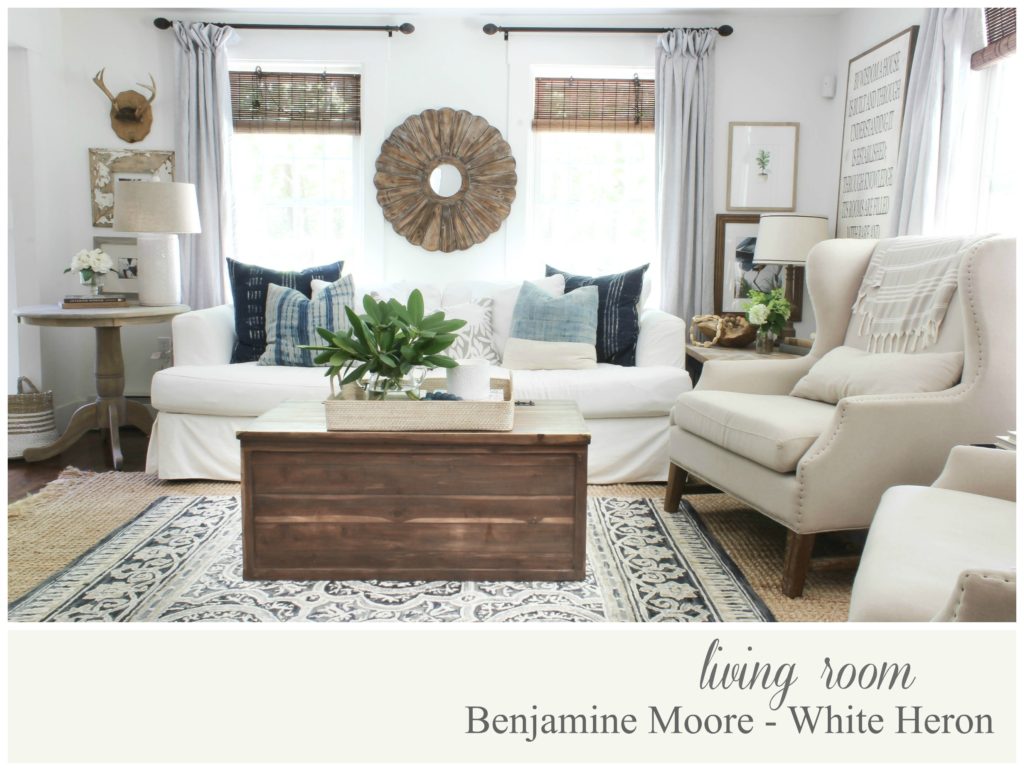
You can read HERE all about how I came to choosing Benjamin Moore’s White Heron for our living room. I tested out quite a few popular white paint colors, and they all had a weird undertone, except for this one! Read about my White Paint Fail HERE.
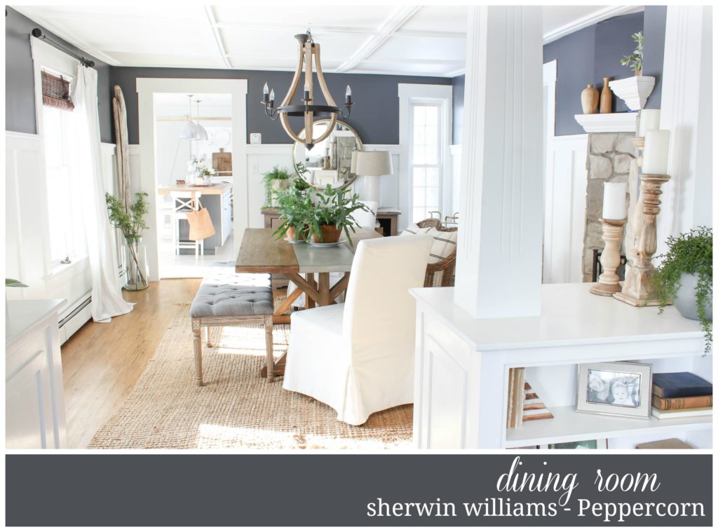
Above you can see the newer paint color, and read HERE all about how I came to the decision to go with Peppercorn by Sherwin Williams.
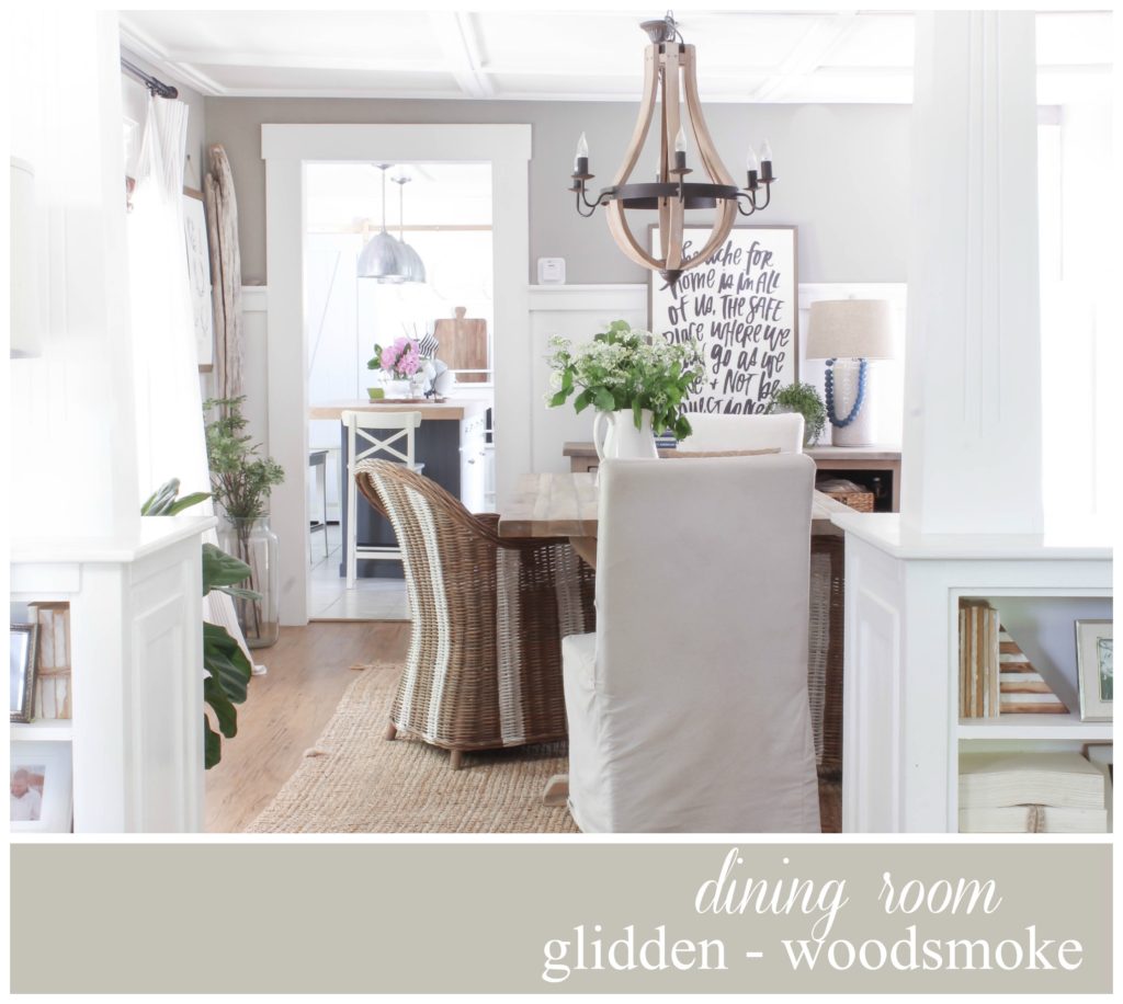
And below, I had to include our previous dining room paint color as well, because it is the #1 gray paint color in our house I get asked about 🙂
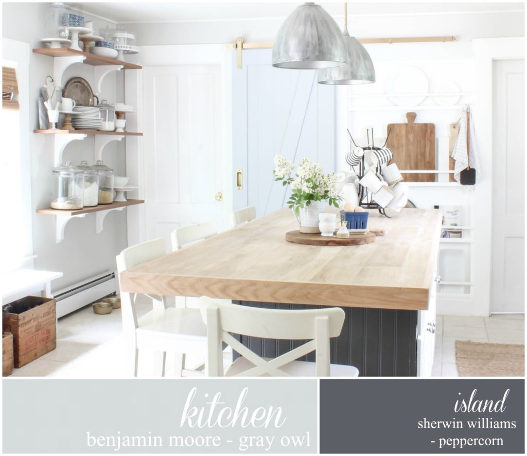
You can see our kitchen’s original transformation HERE. And a few years after I painted it Gray Owl by Ben Moore, I decided to give the island a darker paint color, which you can read about HERE.
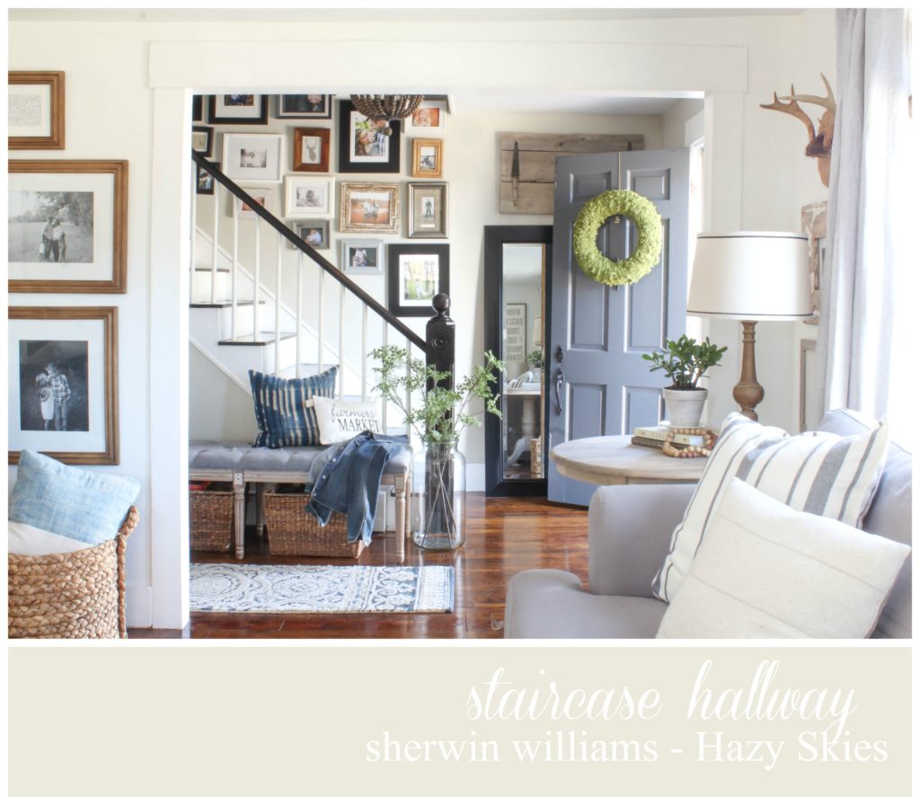
Believe it or not, our front staircase hallway wasn’t always this pretty off-white with tan and grey undertones. Nope the first color we painted it when we bought the house was much darker. But after living with it for a few years, I decided to repaint it a much lighter color since that side of our house has no windows providing natural light. See the transformation HERE.
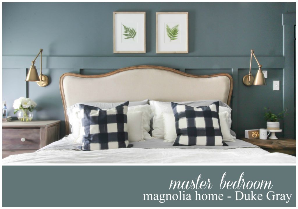
Last spring I gave our Master Bedroom a mini makeover. I like to call it the hazard of making over our Master Bathroom, sort of like a ripple effect if you will, but a fresh paint color from Magnolia Home with Kilz did just the trick! You can see the entire makeover HERE.
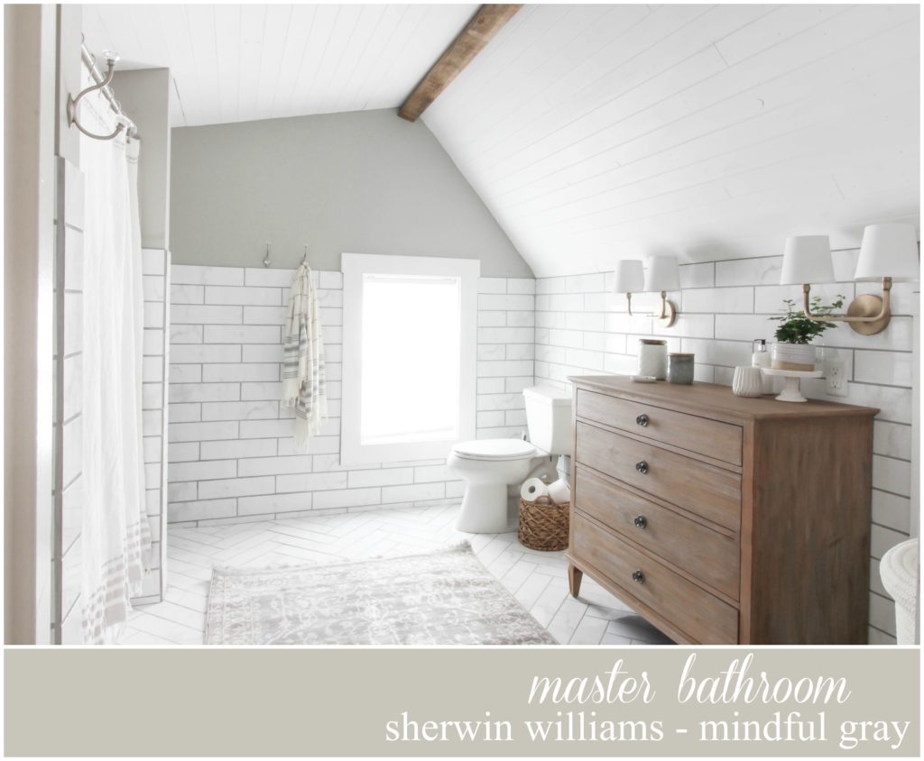
Believe it or not, this subtle gray was not the first color I had picked for our master bathroom renovation we did last year. I actually painted it the Duke Gray you not see in our master bedroom, but it just didn’t seem to quite fit the space right. Sometimes it’s about what’s going to work right in the space, not so much us trying to force a color to work. That was certainly the case here, because the moment I started cutting the trim with Mindful gray, I knew this was the color for our space. See the entire space HERE.

This is very helpful!
Please tell me where I can buy the wooden signs? Details please.
ALso, how do you hang them?
I’m so glad you found this helpful!! I’m not sure exactly which wood signs you are wanting to know about, so if you could tell me which ones you are referring to, I’d be happy to let you know 🙂