Hello Friends!! Today I thought it would be fun to take a look at just how different real estate photos can be vs. the style of photos I take, or magazines take to share our home. It’s always so funny to me that pictures showing the same room can look so different. As we got closer to putting our house on the market, the one thing I kept wondering about was how the real estate listing photos would look, and would they really be that different from the photos I take and share of our home.
Come and take a look ~
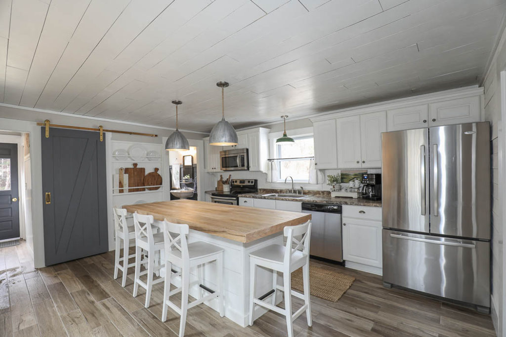
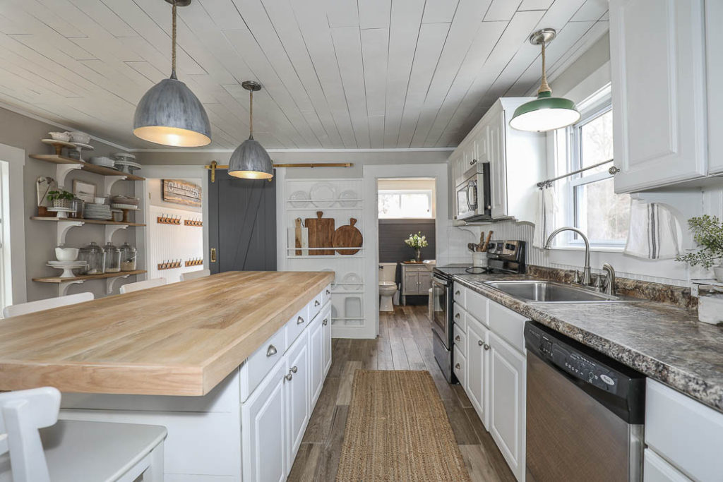
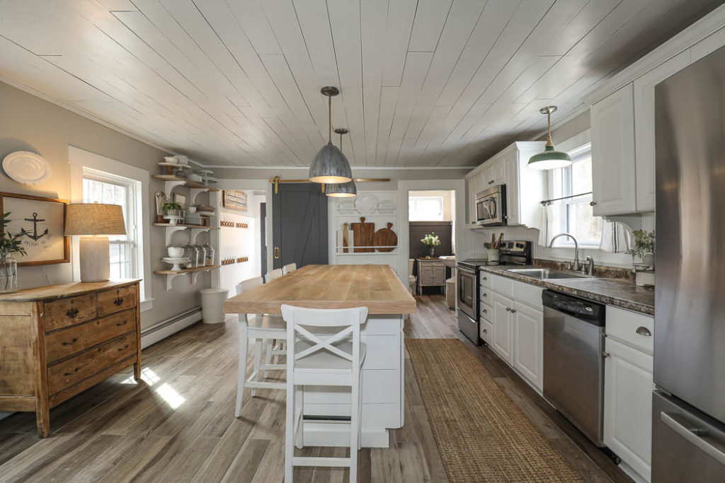
Kitchen
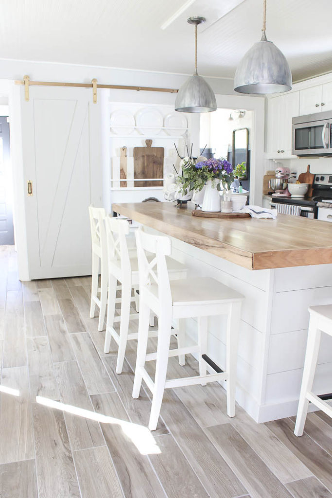
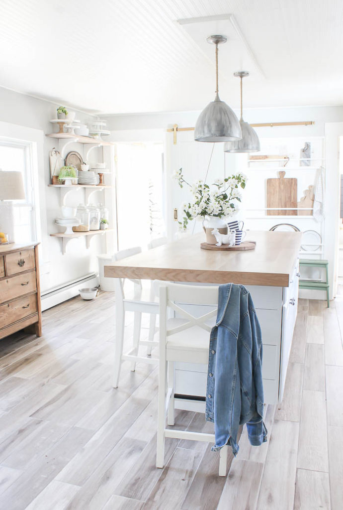
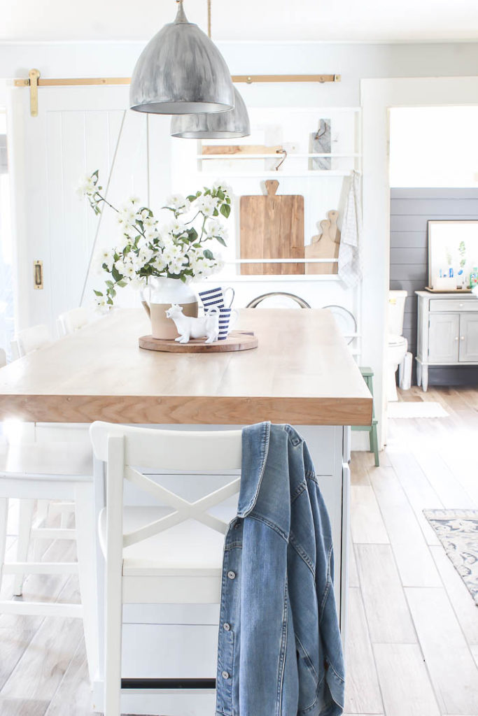
My Photos ~
There’s nothing I loved more then when the sunlight would come pouring into our kitchen. I loved how light and airy it would feel, and would always try to capture when I would take photos around our kitchen.
First Floor Bath
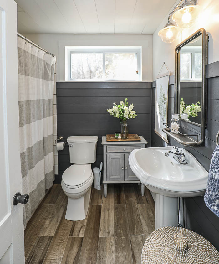
My Photo ~
I never got around to taking any photos of our downstairs bath once we had replaced the kitchen floors which run into this space. When we did the floors the bead board wall paper got damaged at the bottom, so we ended up just covering it up with faux shiplap and painting it the same Peppercorn color as before. I did share how I added more faux shiplap to the ceiling in the bathroom HERE, to cover up another DIY gone wrong, but that was it.
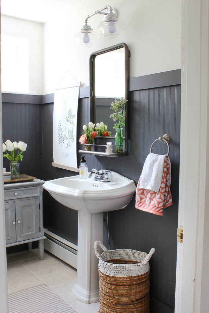
Click HERE to see our Downstairs Bathroom renovation.
Dining Room
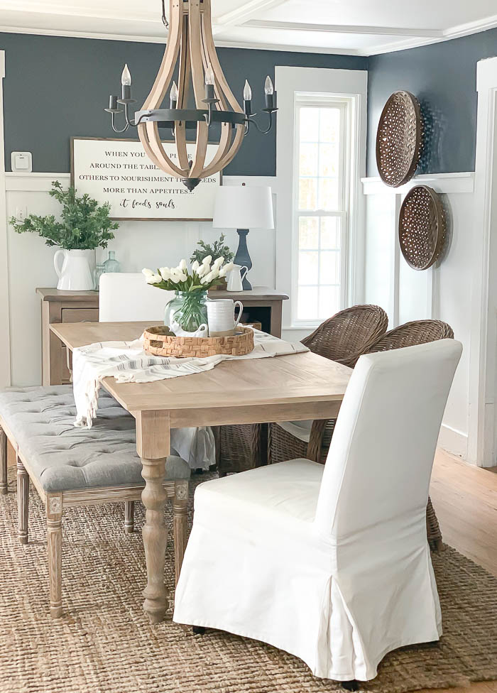
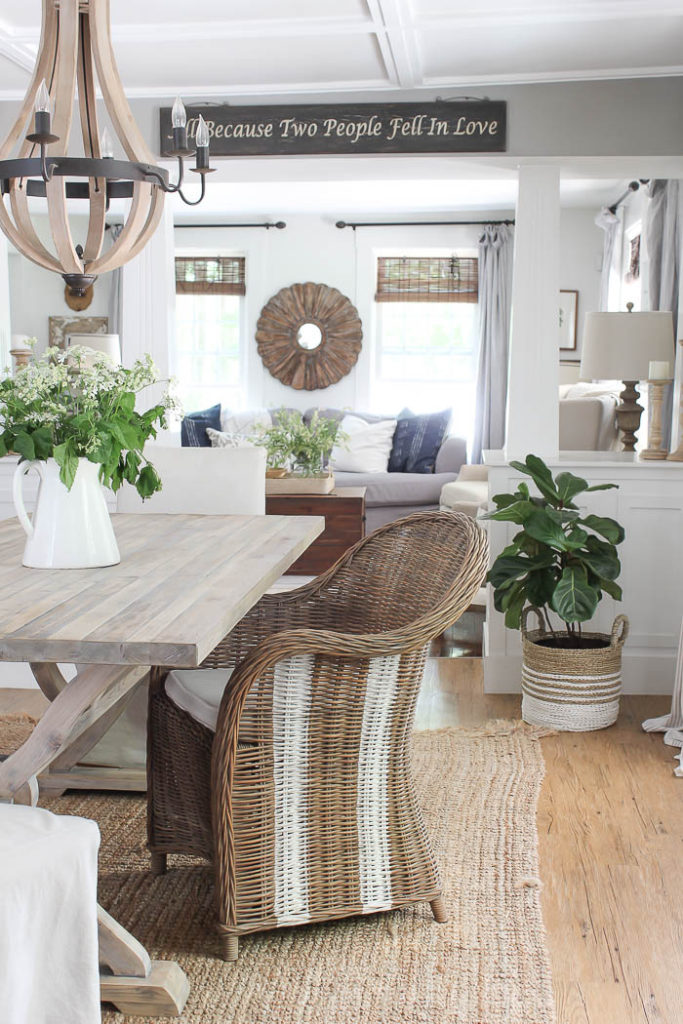
My Photo ~
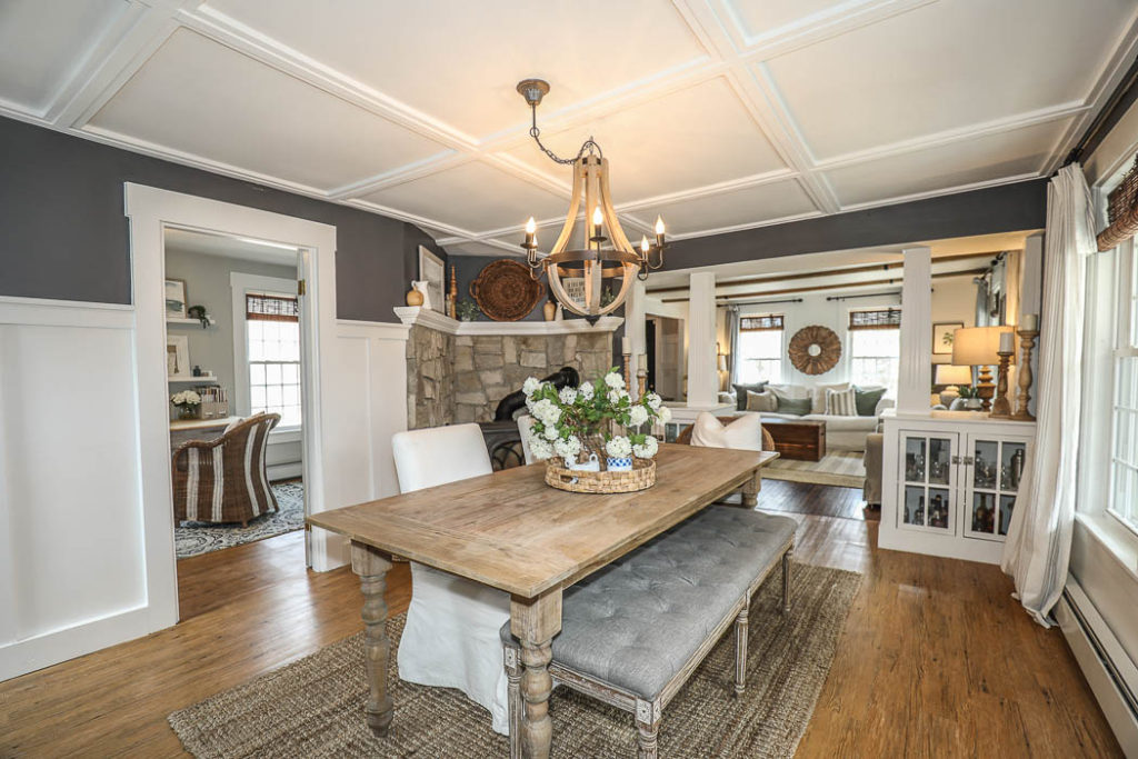
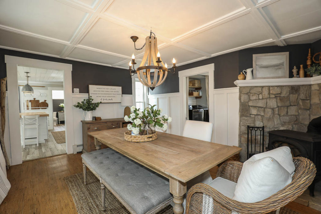
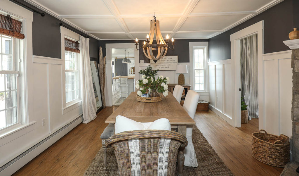
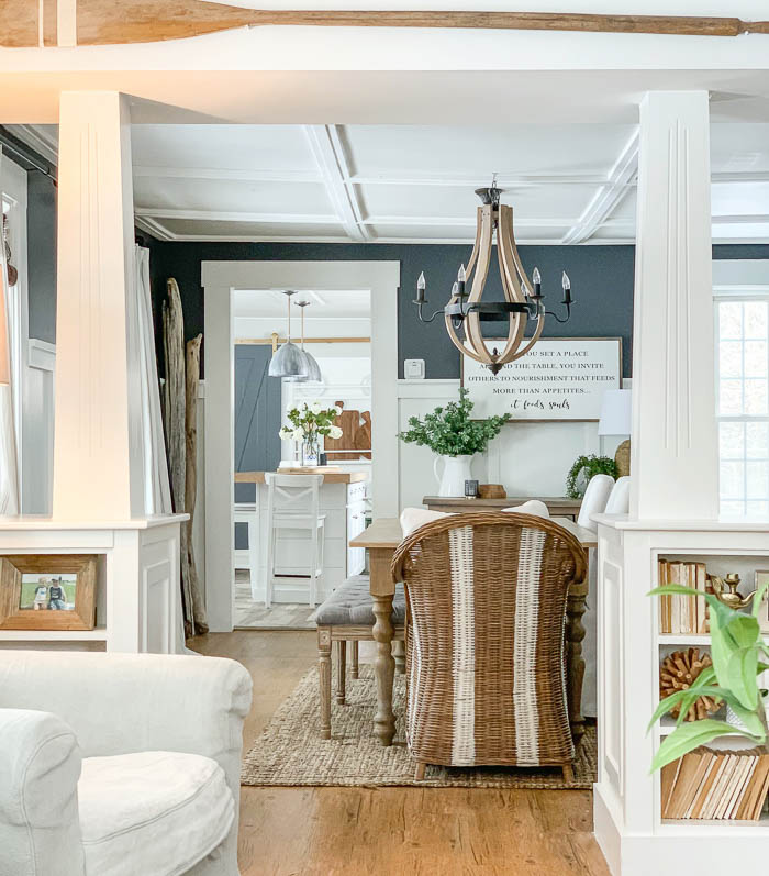
Our dining room was right in the middle of our house. You have to walk through it to get from the living room to the kitchen, or from the kitchen to get upstairs. One of my favorite features when we bought this house was the half walls with columns that separated the dining and living room space.
Living Room
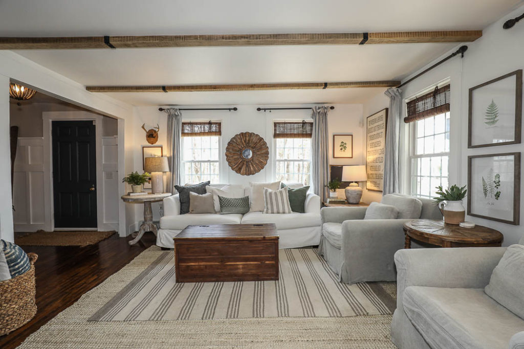
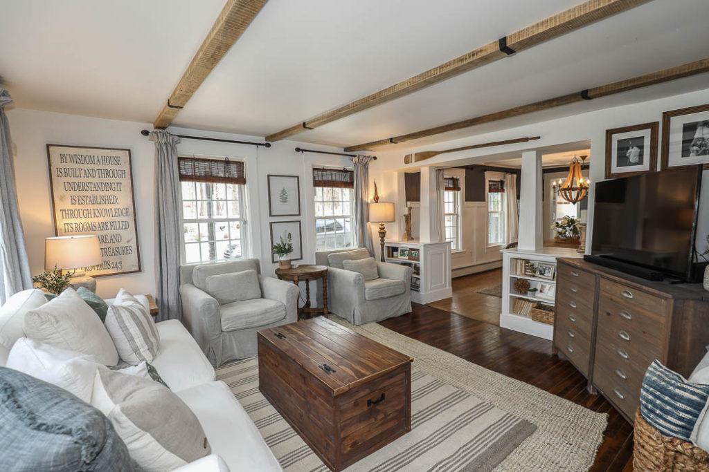
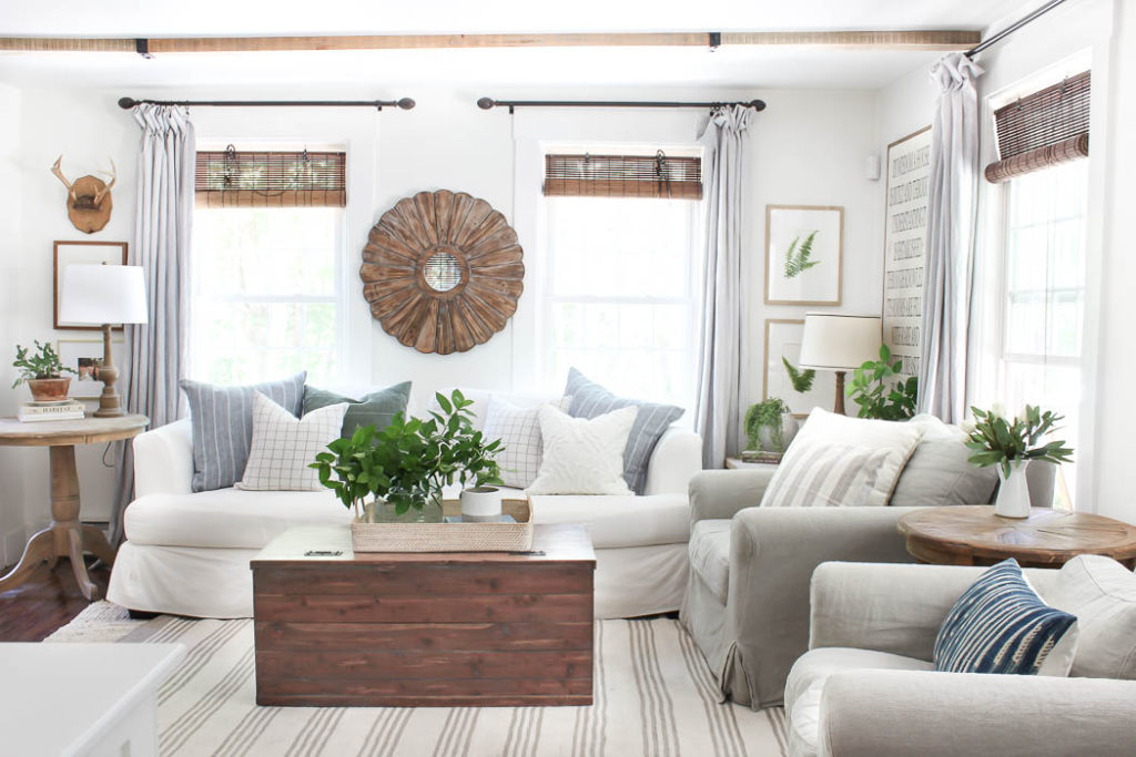
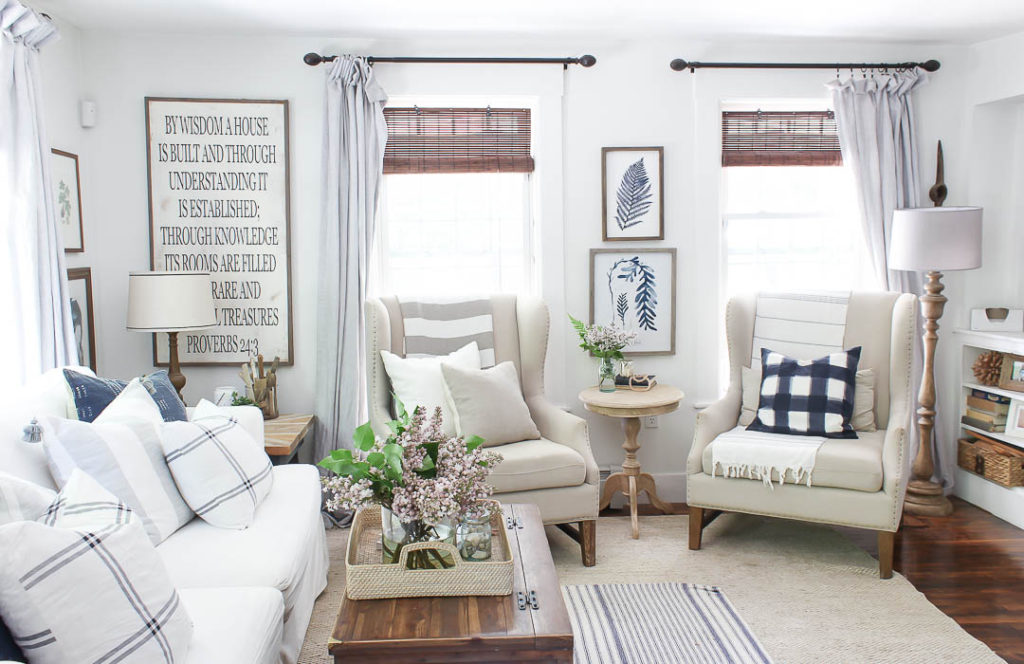
My Photo ~
Just like in our kitchen, I loved the way the sunlight would pour into our living room. The large windows that ran all along the first floor were such a selling point for me. Jesse (my husband) teases that I could live in a glass house because of how much I love big windows, and he’s probably right. One of my biggest struggles when photographing our living room was always the slanted ceilings. Our house slants towards the middle, where the chimney is, because it was built in 1846. At this point the only way to fix that would be to take everything down to the studs and level out the floor joists. I didn’t mind it’s quirky charm, but as I grew in my photography skills it definitely proved to be a challenge. None-the-less, I got pretty good at finding just the right angle to make things look as straight as possible 🙂
Staircase | Gallery Wall
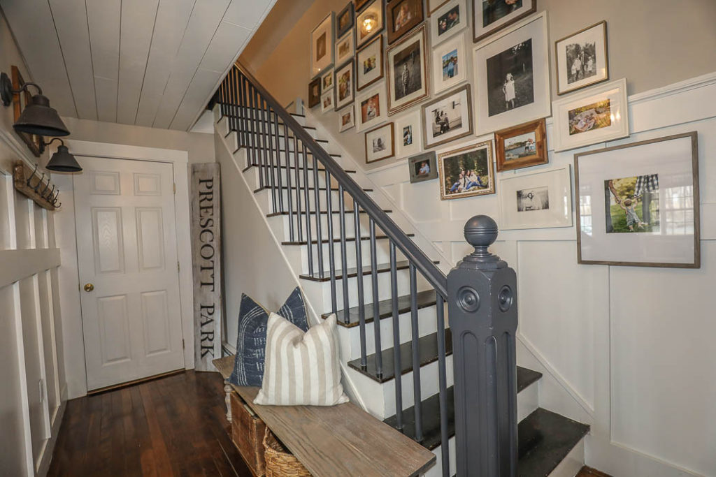
My Photo ~
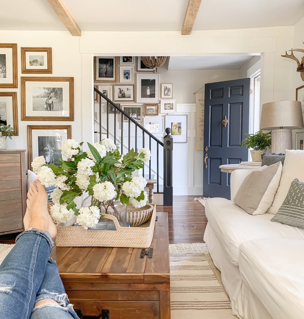
I always loved to share our gallery wall going up our staircase. My favorite shot was the one where I would be sitting on the chairs in our living room looking directly across at it. It was a view I could stare at all day.
Office | Laundry Room
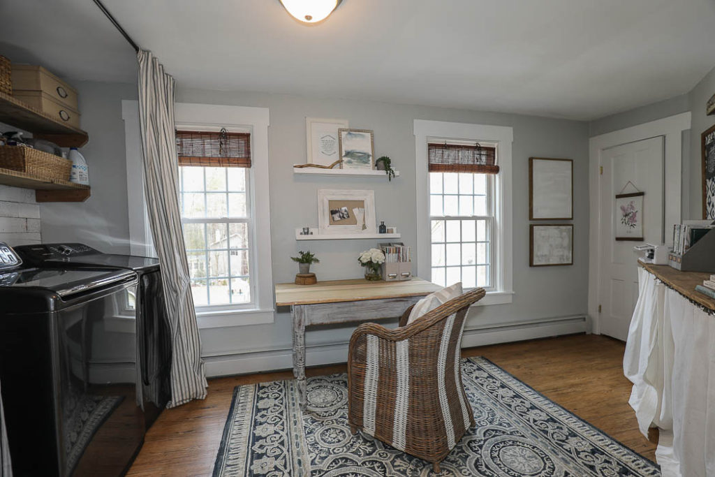
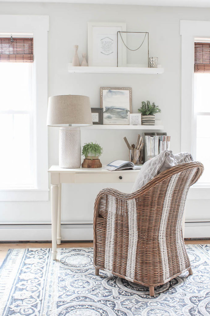
I loved turning this little awkward shaped room off of our dining room into a workable space for me. Yes it also doubled as our laundry room (shown HERE), but during the last couple of years it really felt like a little retreat sitting in here working at my desk, looking out the windows. Because of the small, and awkward shape of the room I always just took close up shots of my desk area, seen in the photo below.
My Photo ~
Click HERE to see how I decorated my office for Christmas one year.
Bedroom #1 | Daughters Room
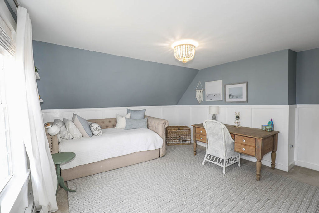
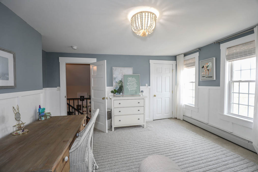
My Photo ~
One of the questions I got asked the most when we announced that we were selling was why did we do all the work to my daughters room if we weren’t going to stay. The reality is we actually did her room makeover in between Thanksgiving and Christmas last fall, and while we didn’t know we were moving then – I had a hunch that change was coming. I just sensed that we wouldn’t be in this house much longer, and knew that when it was time to put our house on the market I would need to neutralize her room. Luckily it also happened to align with the bedroom makeover she’s always wanted, so it was a win-win in my book!
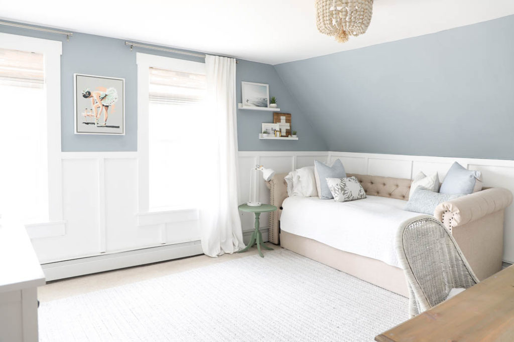
Tween Girl Bedroom Makeover – click HERE
Bedroom #2 | Sons Room
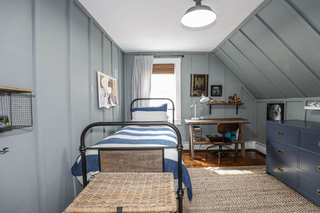
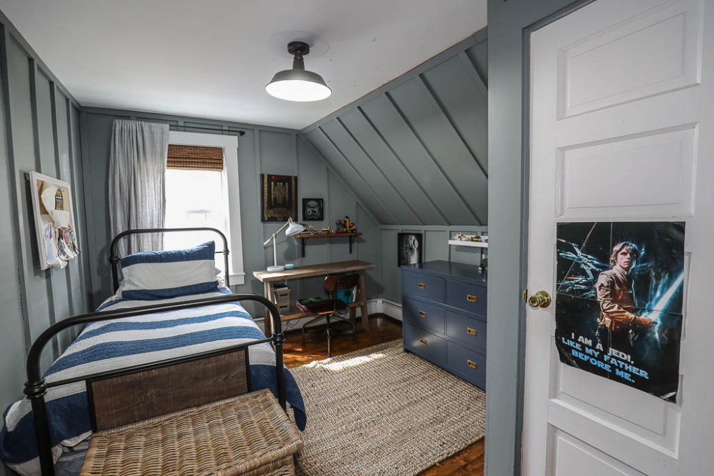
My Photo ~
The last time I shared my sons bedroom was when we gave it a makeover – HERE. Other than rearranging his room once since the makeover it pretty much stayed the exact same. He doesn’t need change, unlike his sister, and was pretty content in his room – and probably would have kept it like this until he graduated high school if we had stayed in this house.
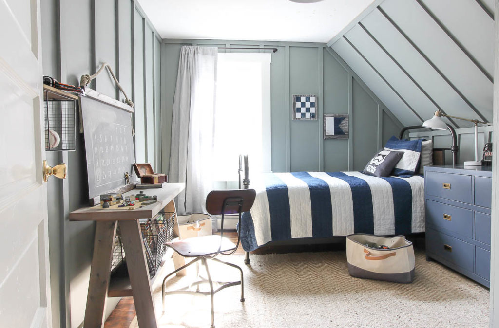
Hallway Upstairs
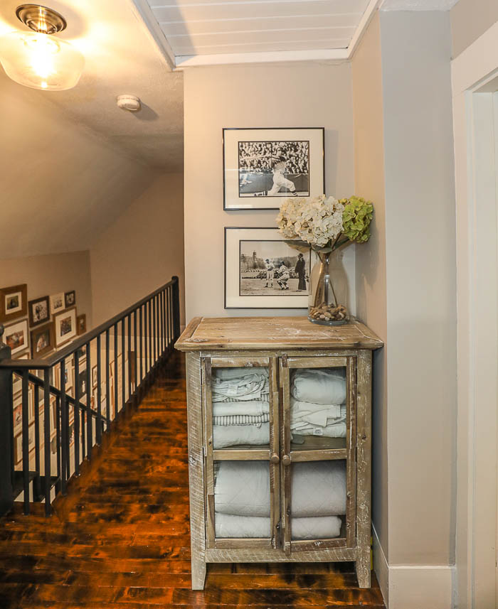
We have a tiny hallway upstairs connecting all three bedrooms, which was one of our desires to having a little bit more space as the kids grew. Right outside our sons bedroom, with our master door (barely) seen to the right was this tiny little nook, that housed a cabinet I used to store bedding, because we had no linen closet.
Master Bedroom
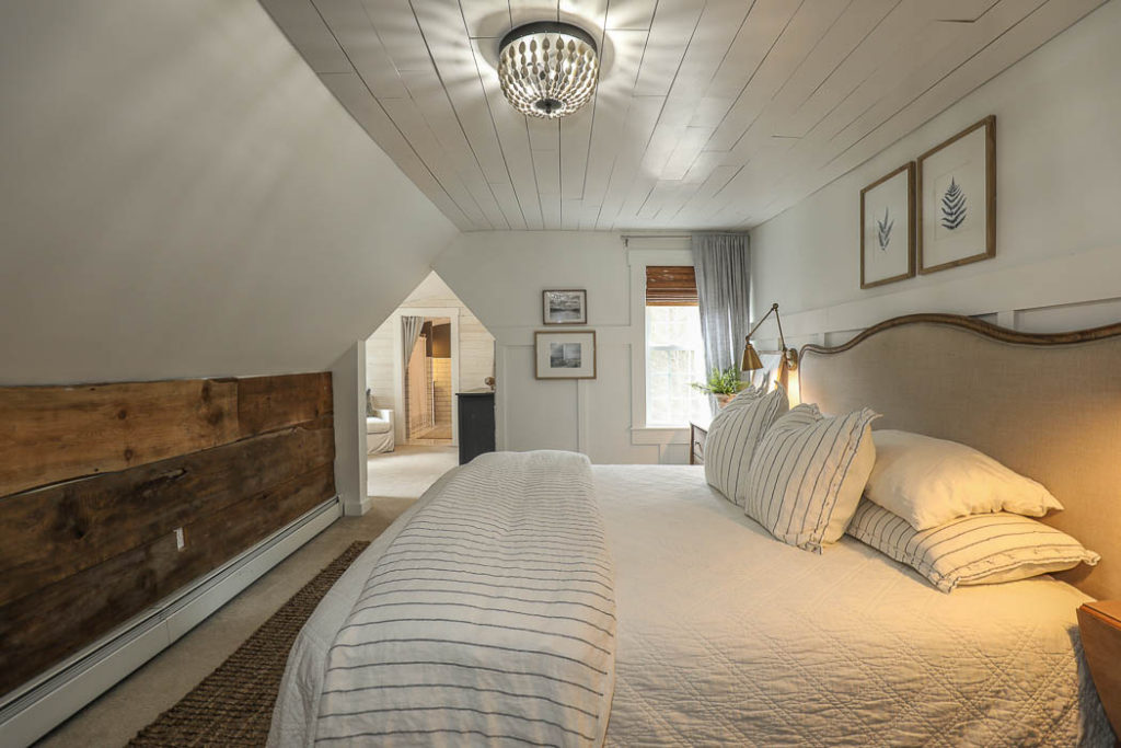
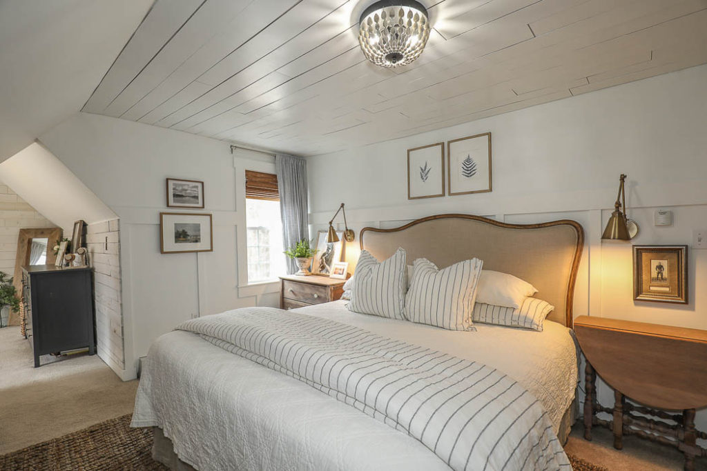
Our bedroom has seen many different looks, and been rearranged multiple times. The sloped ceiling, and half cut-out doorway to our sitting room always made it tricky to photograph. Not to mention it’s size. Our master bedroom was a 14×10, so it’s narrow length always made it tricky to photograph unless using a wide angled lens (which are not my personal favorite). So I resulted in taking more close up shots, rather than tying to capture the whole room.
My Photo ~
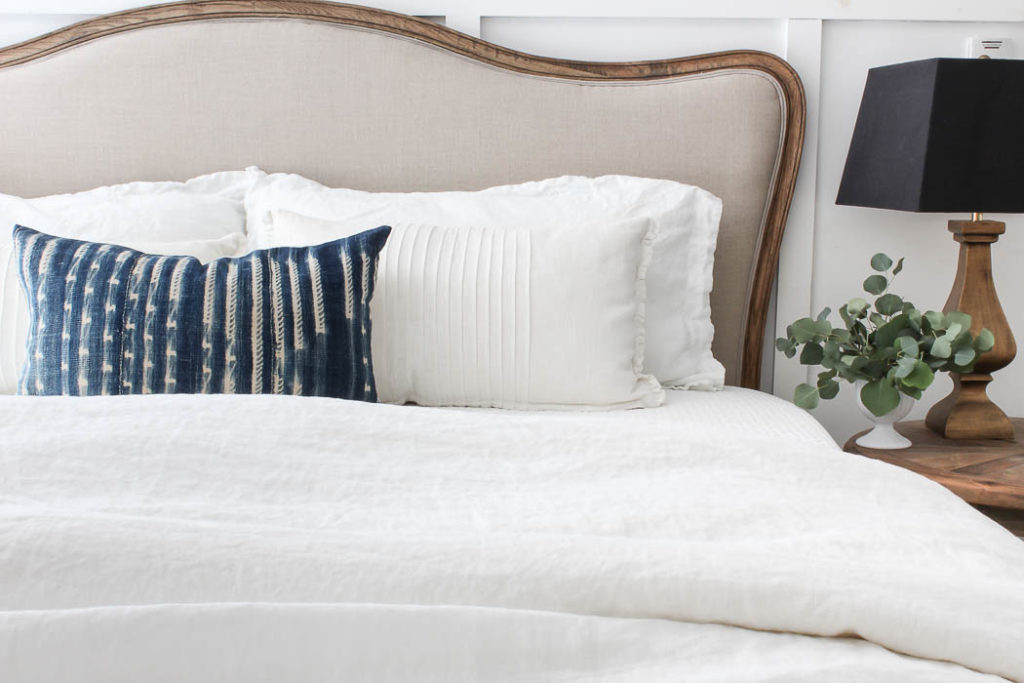
It wasn’t until last summer that I finally put the finishing touches on our bedroom. I had tried multiple paint colors, and non of them felt just right until I finally painted it the same white that was in our Living Room – White Heron by Benjamin Moore. My motivation was to finish it in time so I could photograph it for my upcoming book, but I never shared the After! So that will be coming NEXT! In the meantime here’s how it looked decorated for Christmas last year.
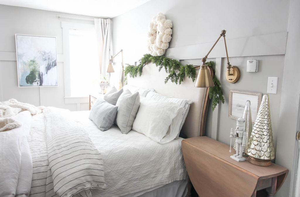
Master Bedroom Christmas Tour – click HERE.
Sitting Room | Mom Cave
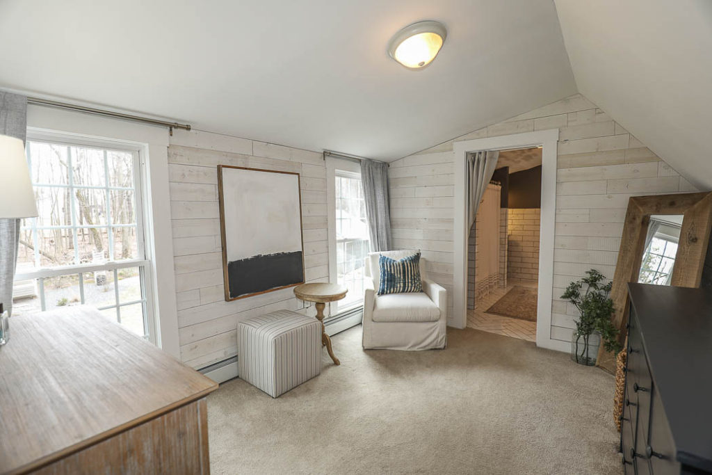
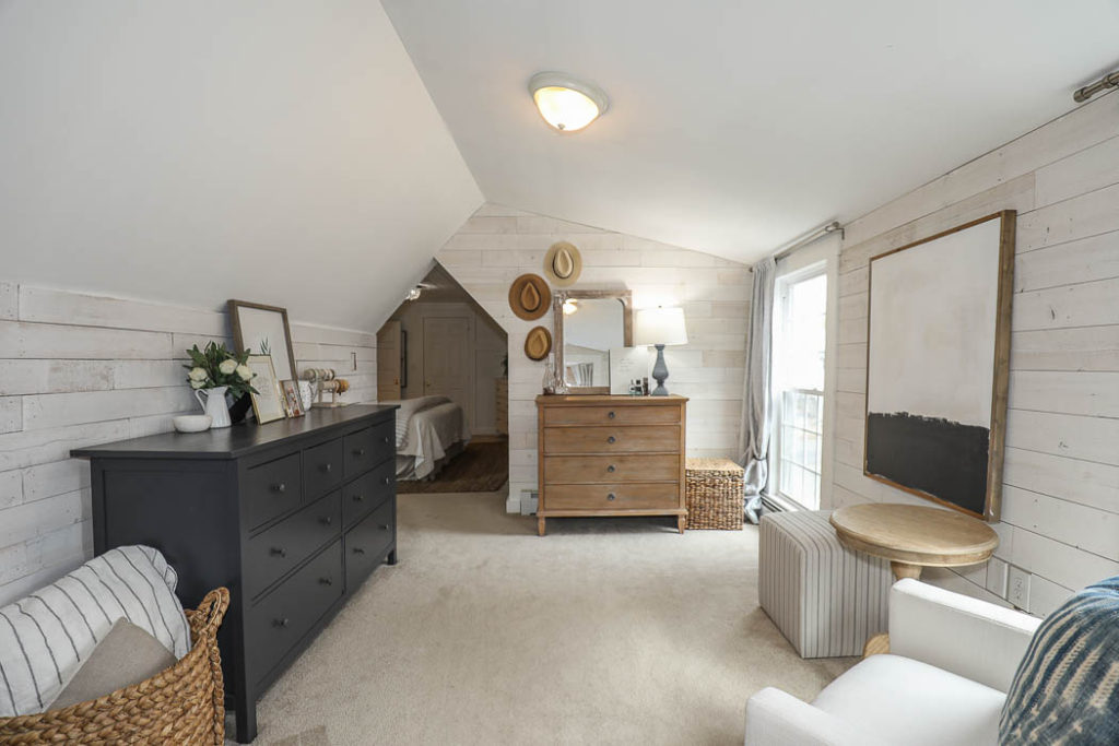
My Photo ~
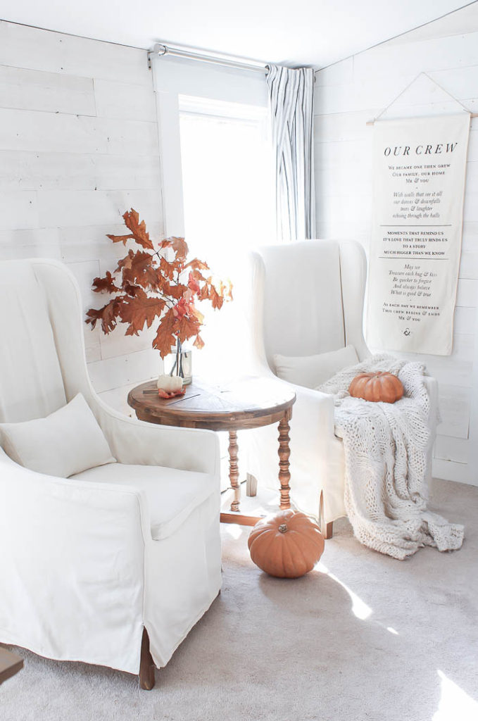
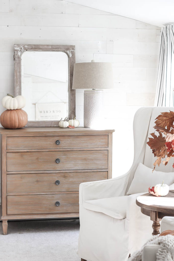
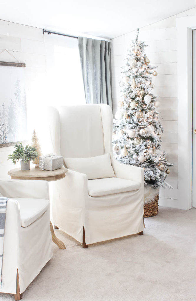
Even though this space made its’ debut HERE, I typically only shared it when it was decorated for the holidays. It’s a tiny room attached to our master bedroom that you walk through to get to the master bath. And honestly most of the time would end up being the collect all room in our house because it was the furthest space tucked away that no one could see. But I loved this space, no matter how it was used. It was such a nice quiet retreat from the rest of the house with a beautiful birds eye view looking over our yard and flower beds.
Master Bath
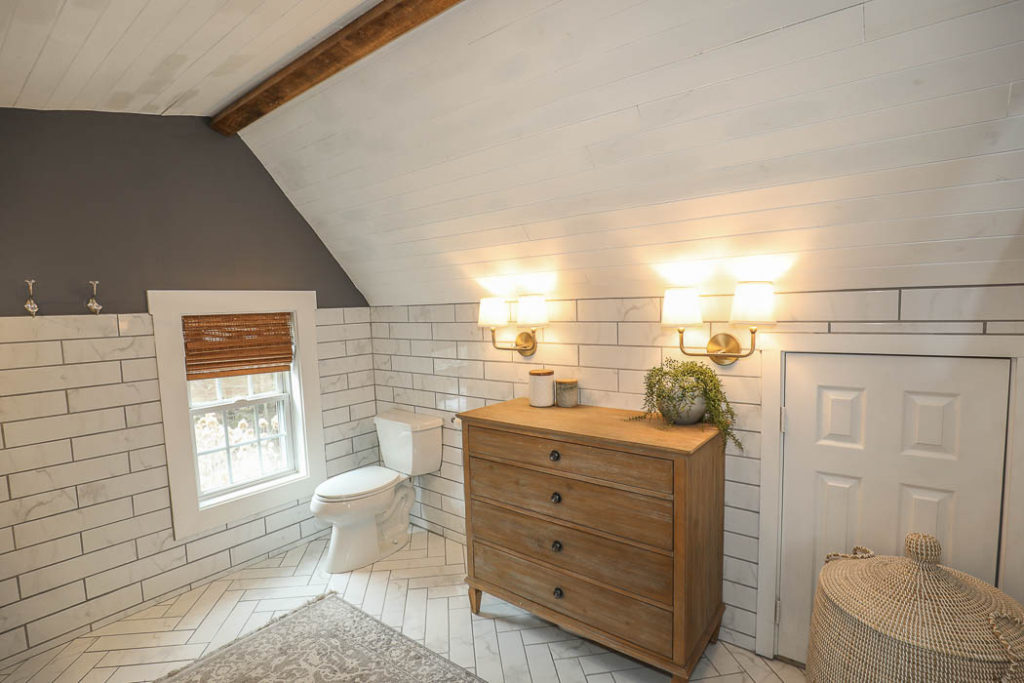
Above you can see the real estate listing photo compared to my angle below. One obvious thing – besides the paint color, is you can see how warm and yellow toned having interior lights on makes the shot different vs. my whiter and brighter view by only using natural light.
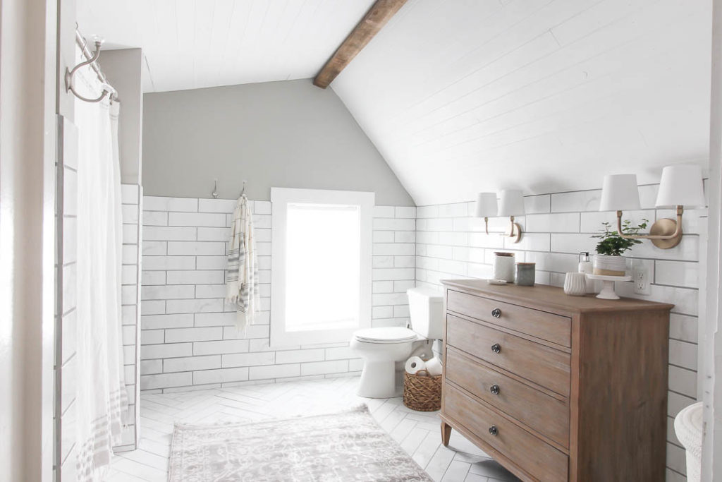
I painted our bathroom last fall, just before I took photos of it for my upcoming book, The Gift of Home – due out next year. We were obsessed with how much better we liked the darker color. It was the same paint color combo I came up with for our barn door in the kitchen.
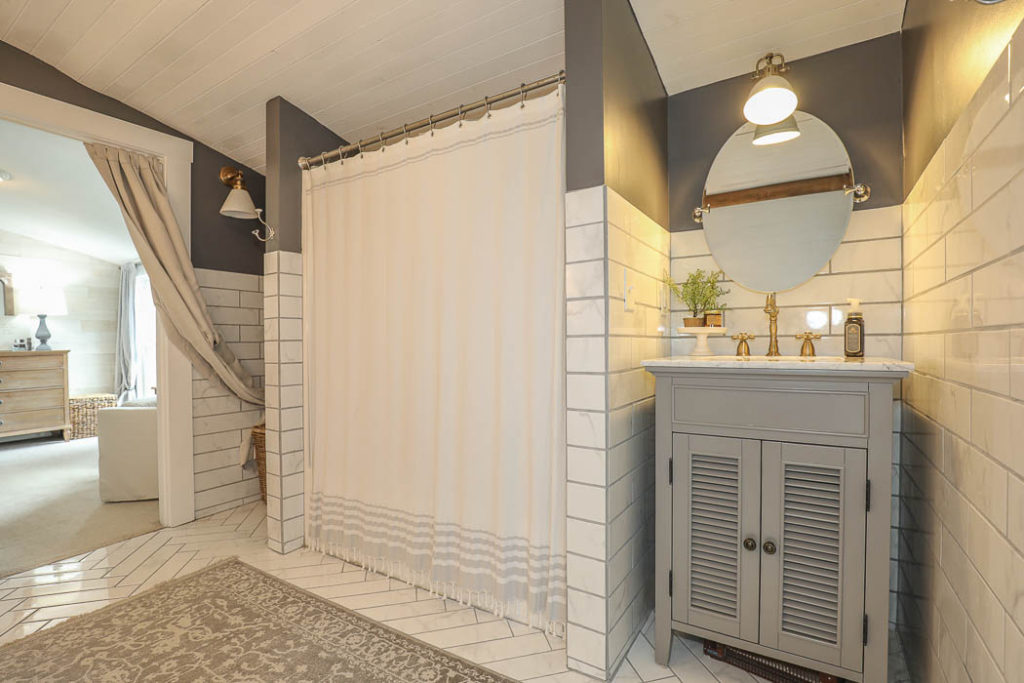
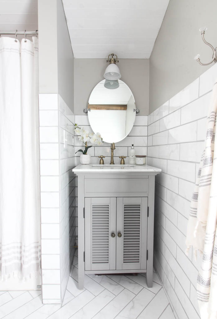
You can see our entire Master Bathroom Reveal HERE.
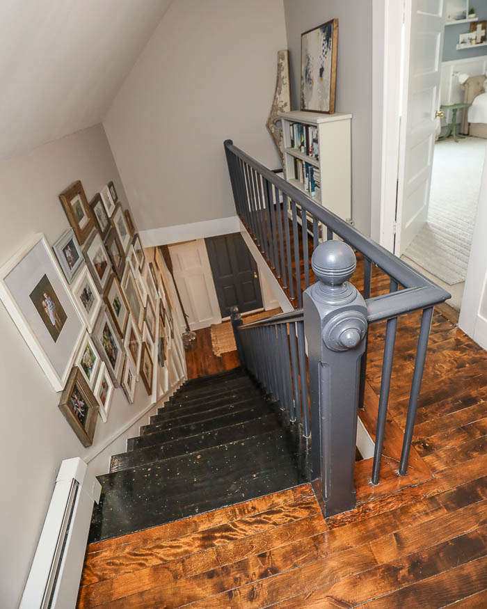
Staircase
I can honestly say I don’t think I’ve ever taken a shot of this part in our house, but in case you’ve ever wondered here’s what it looks like at the top of our staircase.
Exterior
All of these photos were taken in March, which is notoriously known as the “brown” month around here. The snow has melted but there is no sign of Spring yet, as we anxiously wait for April to come so spring bulbs can start popping up out of the ground.
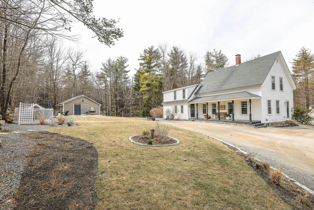
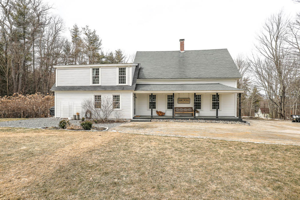
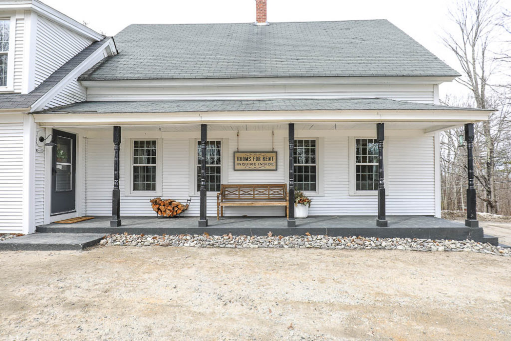
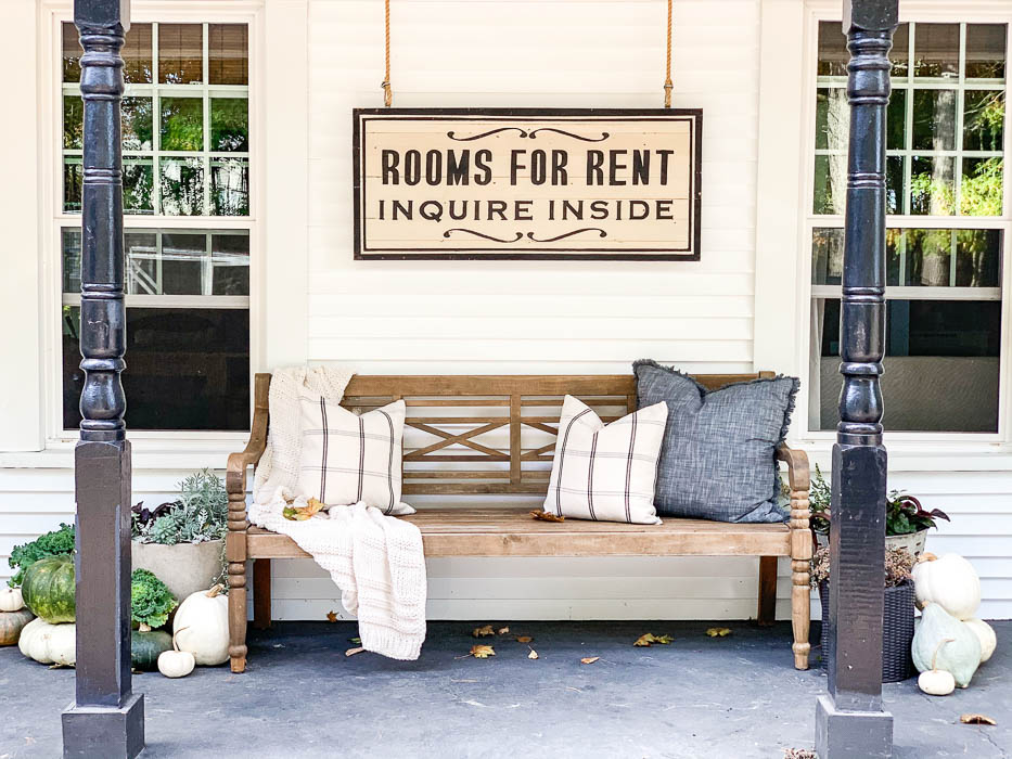
I tend to take tighter shots of our porch. Usually from one side or the other, angled in, because of how long our porch was. My favorite view though was looking down our entire porch at one end looking straight on to the door that led into our kitchen. It’s the photo below.
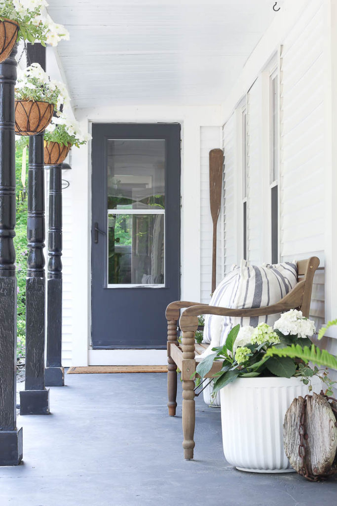
All in all I was so pleased with how our real estate listing turned out. We got so many compliments of people wondering if it was a “real” home, because of how well it showed in the photos. Our real estate agent and photographer did a fantastic job, and our house sold in a flash the first weekend it was on the market!
I can’t wait to share our new house with you! I promise it’s coming soon!! In the meantime – I’d love to know any questions you have about selling our home, or about buying our new home? So feel free to ask me any questions in the comments below ~

Loved seeing your “old” home in its entirety. It was lovely, but I know your new home will be also. Can’t wait to see pictures. Hope you are settling in well. My husband and I have moved many times, so I know how much work it is and how emotional it can be. Take care…
It was such a beautiful, cozy, welcoming HOME. I’m going to miss her charming personality 💕
YOU DID A GREAT JOB WITH THE PICTURES. YOU ARE GOING TO MISS THAT HOUSE WHEN YOU SELL ESPECIALLY THE KITCHEN.