Hello Friends!!
Today I’m sharing how I refreshed our guest bathroom. The plan was to give our guest bathroom some cosmetic updates to help refresh the space, and tone down the red tile. Knowing that eventually we plan to give this bathroom a complete makeover, I didn’t want to spend a lot of money on this refresh. Our main goal was to update this guest bathroom, all with budget friendly ways, to help get us by until we can give it the makeover it deserves.
Come and see ~
**Paint colors and sources are linked at the bottom of the post. **
I always believe in the power of paint, and sometimes a fresh coat of paint can transform a space more than you anticipate. That was certainly the case for our guest bathroom. New paint in a softer color to help tone down the red tile. Updating the light fixtures, and a few accessories was all this bathroom needed. I talked through the design plan HERE, and shared more of the before photos, in case you missed it. But just to recap, first a before photo.
Before
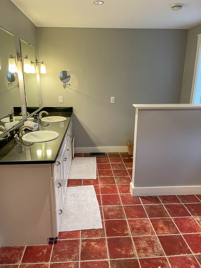
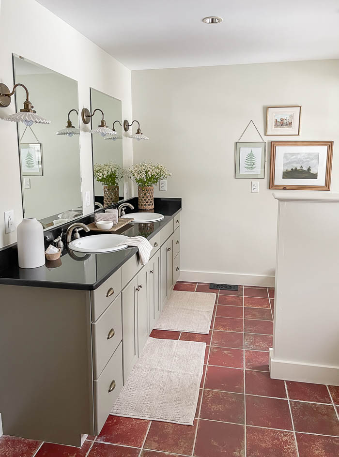
A fresh coat of paint for the walls did the trick. Knowing I needed more of a muted wall color with warm undertones to help soften the tone of red tile, I painted the walls and trim Halo by Benjamin Moore. It’s a soft off-white, beige color, that lends itself to more of an almond-white in certain daylight. It’s warm without being too beige, and can sometimes give off a subtle green undertone.
After
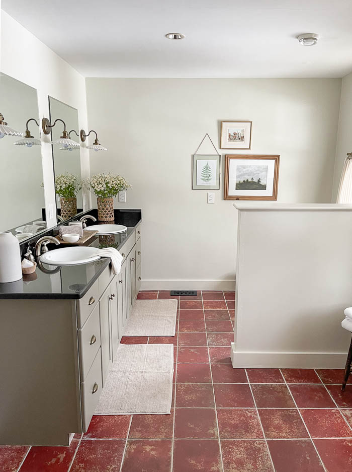
I knew I didn’t want to waste time or money painting, or installing peel ‘n stick tiles over the existing tiles in our guest bathroom, since we will replace them. For this bathroom refresh, I was going for the most cost effective way to update this space.
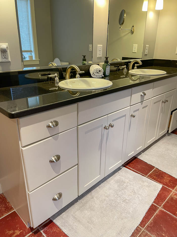
Before
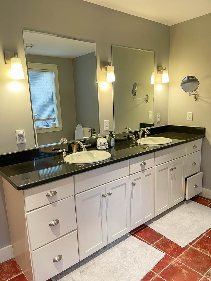
The double sink vanity is a great size, and offers a lot of storage. While it might not be my first choice in style, it is still in great condition, so I opted to give it a budget-friendly face lift as well.
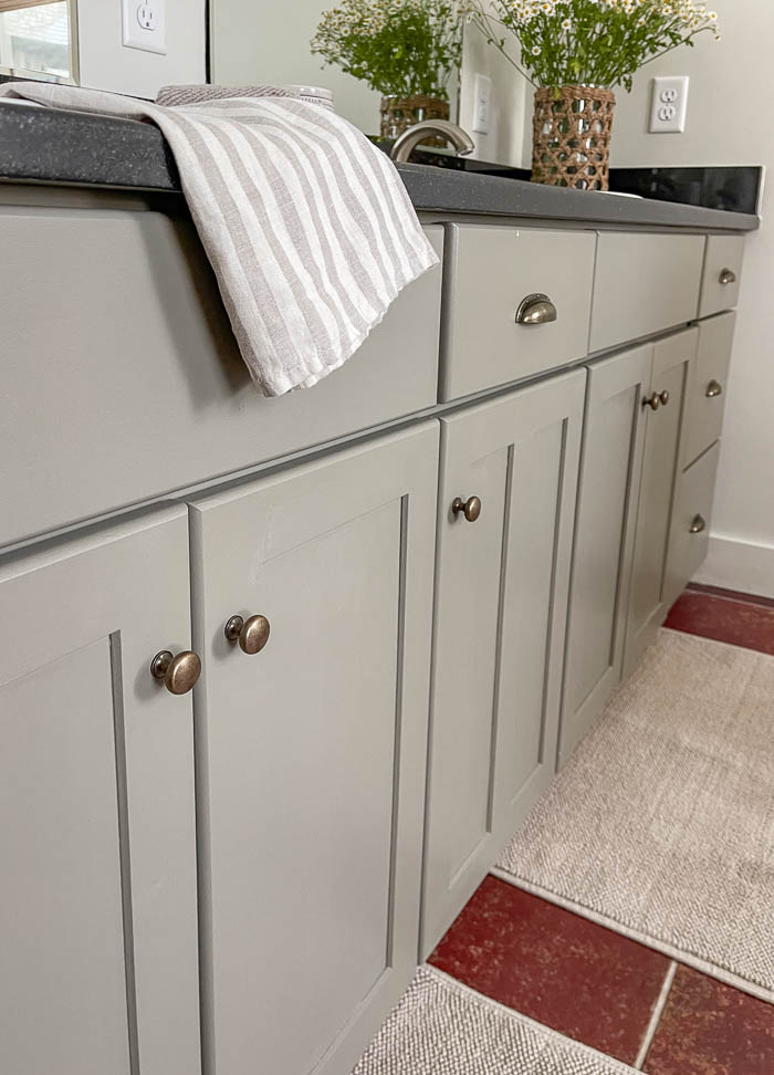
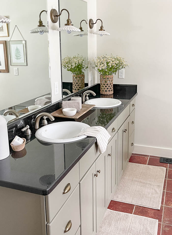
After
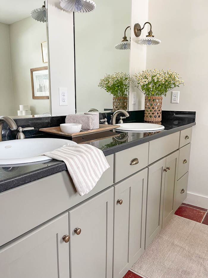
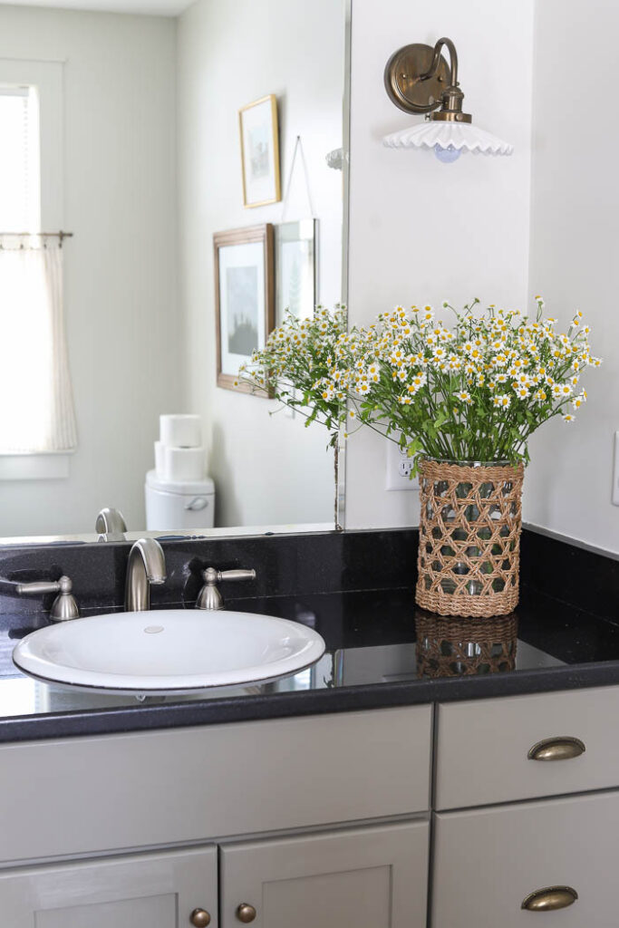
I painted the vanity Adaptive Shade by Sherwin Williams, and swapped out the brushed nickel hardware, for new knobs and pulls in an antique brass to add more of that English cottage feel.
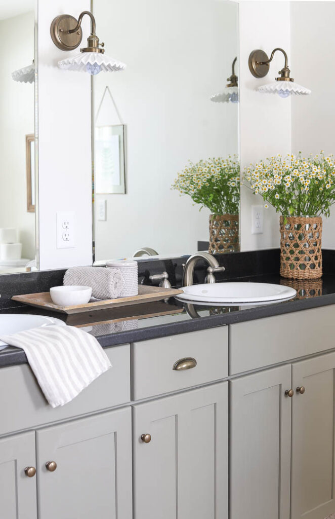
Next, I replaced the contemporary wall sconces for ones that had more of a vintage look to them. I loved the gooseneck style, with the ceramic “ruffled” shade of the new bathroom sconces. The perfect details to add more of a vintage charm in our guest bathroom.
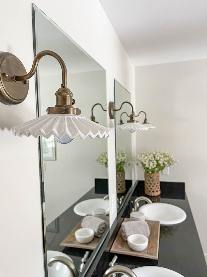
While these new vintage style light fixtures were the perfect budget friendly choice for this refresh, when they arrived their original color was off. The “antique brass” color they were listed as appeared much more orange in person. I tried a few different methods, and will share what I did to get them to be a closer match to the finish as the new hardware I ordered for the vanity.
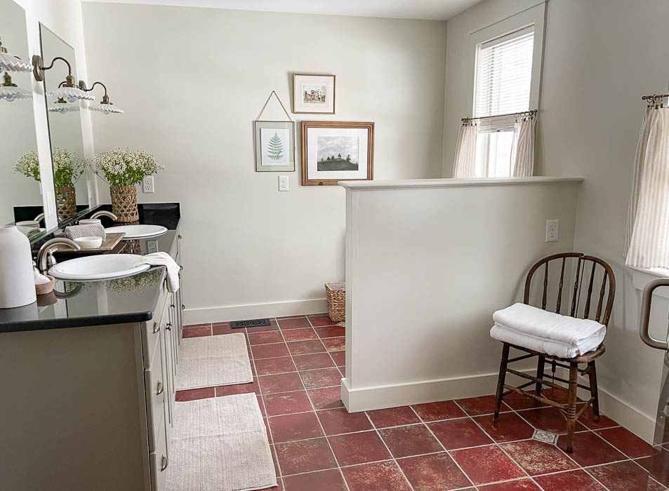
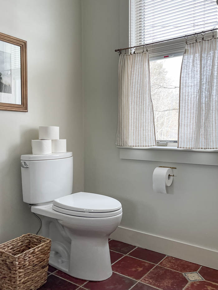
Opposite the vanity wall is the toilet, along with two full size windows. While I didn’t want to hang full length curtains, I did want to hang something that would help soften the look of the blinds that were already there. I thought about replacing the blinds altogether with bamboo shades, or a solid roman shade. But the current blinds are very practical for this bathroom, being on the main floor. They allow the perfect amount of daylight in, while also keeping the privacy.
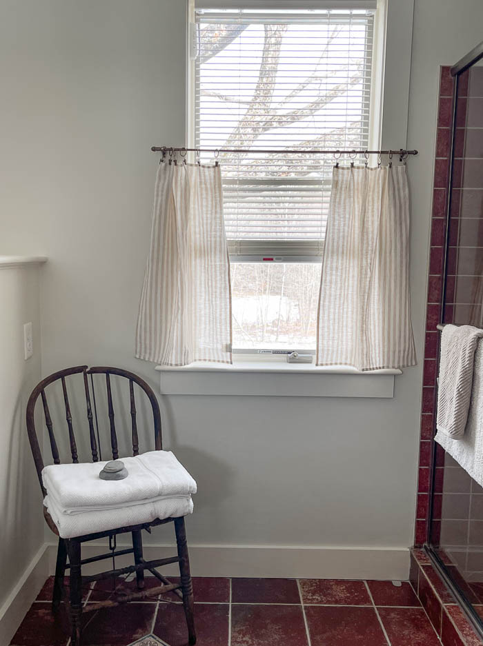
To help soften the look, I chose to hang cafe curtains, and used linen dish towels hung by curtain rings with clips. Hanging the cafe curtains instantly softened the look in the bathroom, while also adding some additional privacy for our guests.
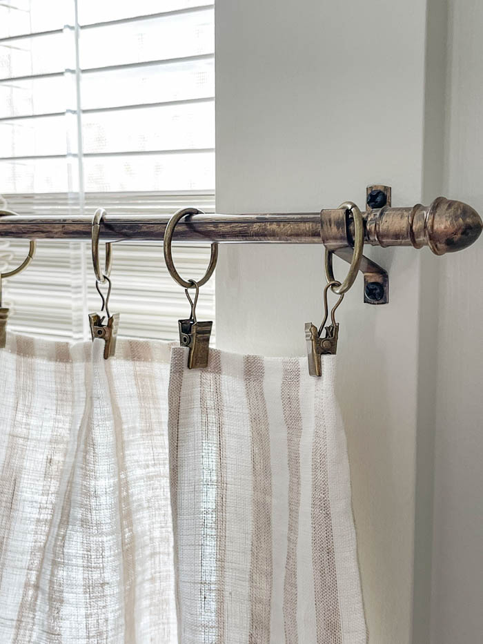
The curtain rings came in the antique brass color you see in the pictures. But I could not find a budget friendly cafe curtain rod in antique brass. Instead I purchased this one off of Amazon, and used Rub ‘n Buff to help give it more of an antique brass look, that also matches the other finishes I used in the room.
Change What You Can
For this budget friendly makeover, I relied on new paint colors – an inexpensive way to make a big impact – to do make the biggest transformation in the space. Next, I focused my attention on the smaller details. Making budget friendly swap-outs on things like hardware and new light fixtures, saved me money instead of trying to replace the entire vanity.
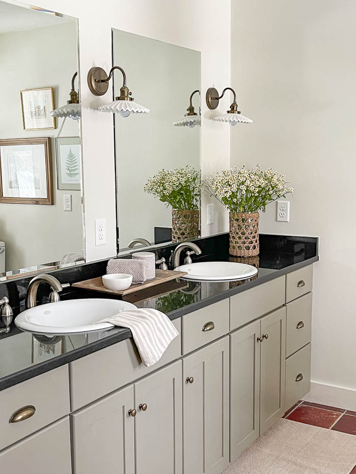
Again the goal wasn’t to try and go for a completely different look, but simply make improvements where I could that worked within my budget, and would help refresh the space in the meantime. There are lots of ways you can update a space, so if you are wanting to update a space, but don’t have all the funds yet for a total overhaul. Focus on the areas that will give you the biggest bang for your buck, or where you can make tiny changes that reflect more of the look and style you are after.
One more side by side of the Before & After ~


Paint & Sources listed below ~
- Wall & Trim Paint Color – Halo by Benjamin Moore
- Vanity Paint Color – Adaptive Shade by Sherwin Williams
- Vanity Hardware Pulls (yellow bronze) – Amazon
- Vanity Hardware Knobs (antique brass) – Amazon
- Sconces – Amazon
- Seagrass Woven Vase – Purple Rose Home
- Cafe Curtain Rods – Amazon
- Curtain Rings with clips (bronze) – Amazon
- Linen Curtains (Linen Dish Towel) – Tuesday Made
- Antique Brass Toilet Paper Holder – Shoppe Amber Interiors
Total Refresh Cost – $424

Love the colors
Bre,
This is beautiful!! I love it all!!
Wow! The power of paint. It looks amazing, Bre – love your changes. I am looking forward to seeing what you end up using for new faucets. Thank you for sharing
Thanks Kimberley!! I have my eye on some antique brass gooseneck faucets. Can’t wait to make that switch 🙂
Very nice work I have been planning on painting the vanity and mirror frame in my husband’s bathroom you have inspired me to get started Thank You
Have you considered getting a picture or something that ties in that floor color with the other colors in the room you could gift it to someone after you get new tile
Love this! Paint colors soften the look so much you almost don’t notice the floor! Brilliant!
What you did was perfect. I especially loved the sconces. Great job. I like the cafe curtains too!
Really nice job. I like the comment about using a runner instead of two rugs at the vanity. I am going to try that myself on an upcoming refresh at my place. Your choices really gave the room a lovely refresh. Thanks for all the great tips.
Genius! Love all your updates. The changes you made completely take your eye from the floor color. Have you thought about an antique looking runner in front of the vanity? I’m thinking along the lines of a ruggable washable rug. And i admire how you use accessories.
Thank you Mary!
Beautiful!