Hello Friends!
Today I’m sharing a space in our home with you that has never been seen before on the blog. Is the suspense killing you yet? Are you wondering “How in the world could I be holding out from you like this”? When we moved into our home, almost two years ago, pretty much the entire house and been renovated or updated by the previous owner, except for this room. Our guest room bathroom! Yep, our guest room off the living room as a full en suite bathroom which is amazing for guests, especially when our parents come to stay. However, it still has all of its’ original fixtures from when it was put in back in the 90’s – including some very red tile. Are you ready to check it out.
Who is ready to come and see the Before?! ~
I actually got the itch to finally start tackling this space just after Thanksgiving. Knowing that we were going to have a few different overnight guests staying with us in around the holiday season was enough motivation to get this space refreshed. I have big plans for this guest bathroom, but for now I am only focusing on the cosmetic fixes I can make to help make this space a little better.
Before
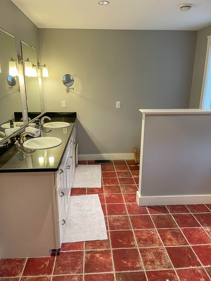
One of the biggest things that feels “off” when you are physically in the space is the paint color. The blue undertones in the current paint color clash with the red tile, so my first order of business is to paint the entire space hoping to tone down the tile a bit, and soften the overall look of the guest bathroom.
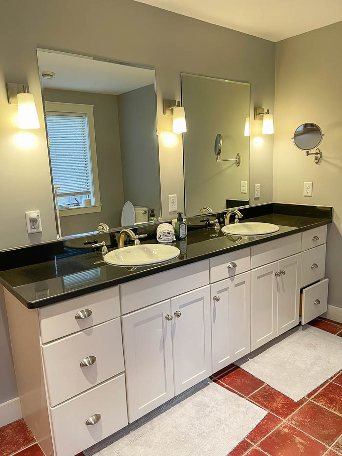
We do have plans to someday fully renovate this space, especially the tile, but for now we are doing a very budget friendly refresh. I always say you don’t have to wait to update your spaces until you can afford to do a major renovations. Do a little bit at a time, that will help you wait until the bigger items on your to-do list can be tackled. You will be surprise at how far a can of paint will transform a space. So I’m ready to put those words into action.
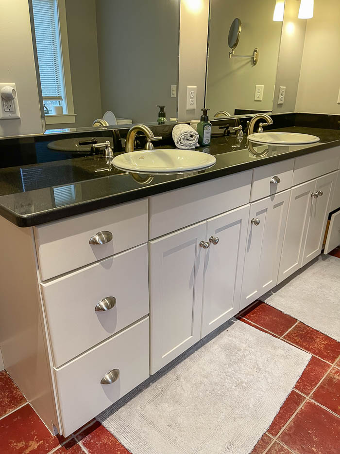
It has a very large double vanity, with two sinks and plenty of cabinet storage, which makes this guest bathroom feel very spacious. Coming from our previous home, with no double sinks, we know how much of a luxury this is.
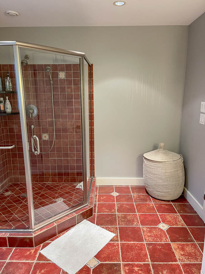
Facing the opposite direction you see the door to enter the bathroom on the right, and a walk in shower to the left.
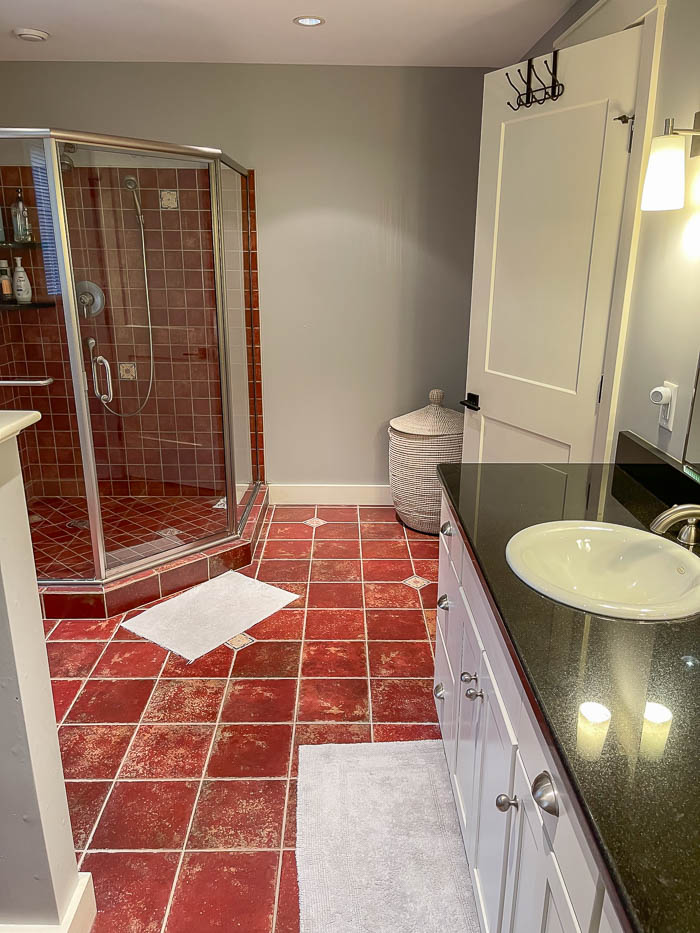
The shower is the first thing you see when you walk into the bathroom. And while it’s quite large for a quest bathroom, the dated red tile makes quite a statement. I’ve done quite a bit of research on painting bathroom tile, and even painting the tile in the shower, but the amount of work that it would require is just not something I am wanting to tackle for two reasons.
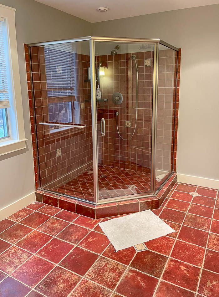
For one – painting the tile is only a temporary fix, especially for a shower floor it isn’t guaranteed to last. And second, we have full intentions of changing all the tile in this bathroom, including the shower, so going through all that extra work for a “quick fix” of painting it – which will is quite an extensive process, is not the best use of my time. For some, they might be willing to go through the hassle of painting it, but knowing that we are going to replace, keeps the urge to paint it at bay for me. After all, it is our guest bathroom, not our primary bathroom, so it’s not a room I have to see everyday.
The Design Plan
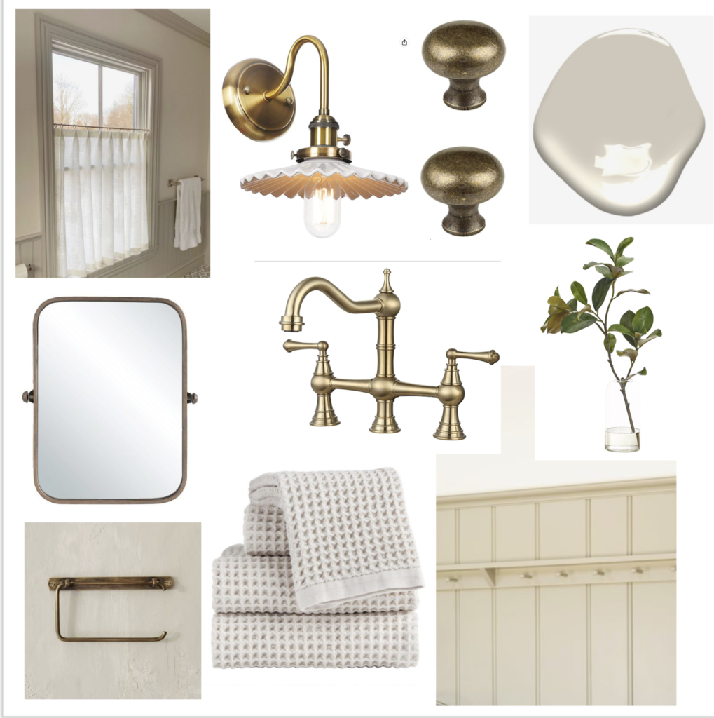
Eventually we will re-tile the entire bathroom. I also want to add some type of architectural moldings to the wall – like beadboard or a variation of it. Replace the sinks and faucets, and I would love to replace the current glass door situation for the shower. While we wait until we can tackle those things, in the meantime these are the cosmetic updates I plan to do. And in doing so I’m hoping it will help tone down the current red tile, and freshen up the space. Sometimes the only option in the budget is to paint, but it’s still an option.
To-Do :
- Paint the walls
- Paint the vanity cabinet
- Switch out hardware on vanity cabinet
- Swap out sconce light fixtures
- Get rid of gray bath mats and towels, bring in warmer toned towels and linens.
- Add in cottage details
I added all my thoughts and ideas to a mood board, so visually you could see what I’m thinking.
To see other Bathroom remodels we have done, check out the posts below ~
Primary Bathroom Makeover
Primary Bathroom Design Details
Bathroom Reno Under $1000
