I’m so glad you guys have been enjoying these recap posts. If you are stopping by today for the first time, we’ve been celebrating a little milestone this week! Six years ago we bought our first home, and we are taking a look back at how far things have come. To see our Dining Room Progression click HERE, and to see how our Living Room has progressed, click HERE. Today I’m sharing our kitchen progression with you. While we haven’t replaced any cabinets or countertops I think you will be amazed at the transformation this space has undergone.
When we moved in the kitchen had just recently been upgraded. I had always wanted white cabinets, and while these were just builder grade, I was so happy to finally have white cabinets. Our countertops are still the same as well. I get a lot of questions about them, they are laminate and have a faux granite look to them. Since we didn’t install them I’m not sure exactly which brand they are, but I do know they came from Lowes.
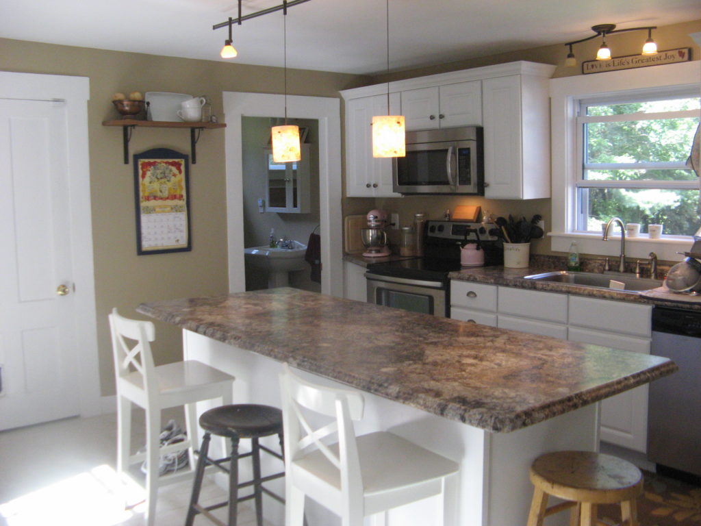
The one thing I was thankful for is that the walls in here weren’t painted yellow! The were a neutral tan and stayed that way for the first year while I put my attention towards other rooms in our house. Even though the house itself had lots of character the kitchen itself felt a little lackluster.
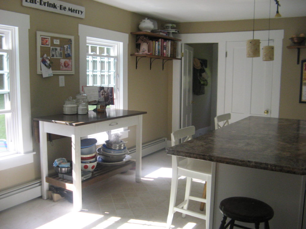
That was my first goal when I started transforming this space. I wanted to take it from blah-beige to farmhouse charm. I wanted the kitchen to feel like it was very much apart of the original 1846 farmhouse era, but still feel fresh and updated.
I tackled this first by addressing this little bump out wall we have with the doorway that leads into our dining room. Below is what it looked like before:
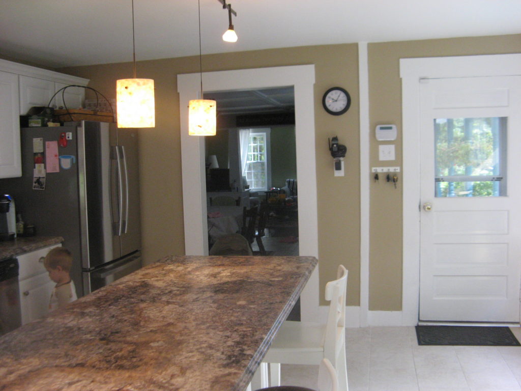
I repainted our kitchen a light gray, and then for the bump out wall created my own chalkboard paint color. You can read all about it HERE, but I used left over paint I had from other rooms I had painted in our house, and mixed it together with some unsanded grout. Here is the After: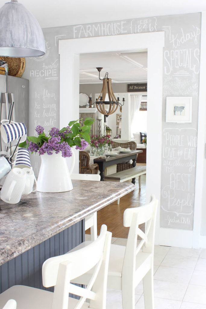
Another wall that got a major transformation in our kitchen, was this tiny section in between our basement and bathroom doors. It really was the culprit of what began the entire kitchen transformation process.
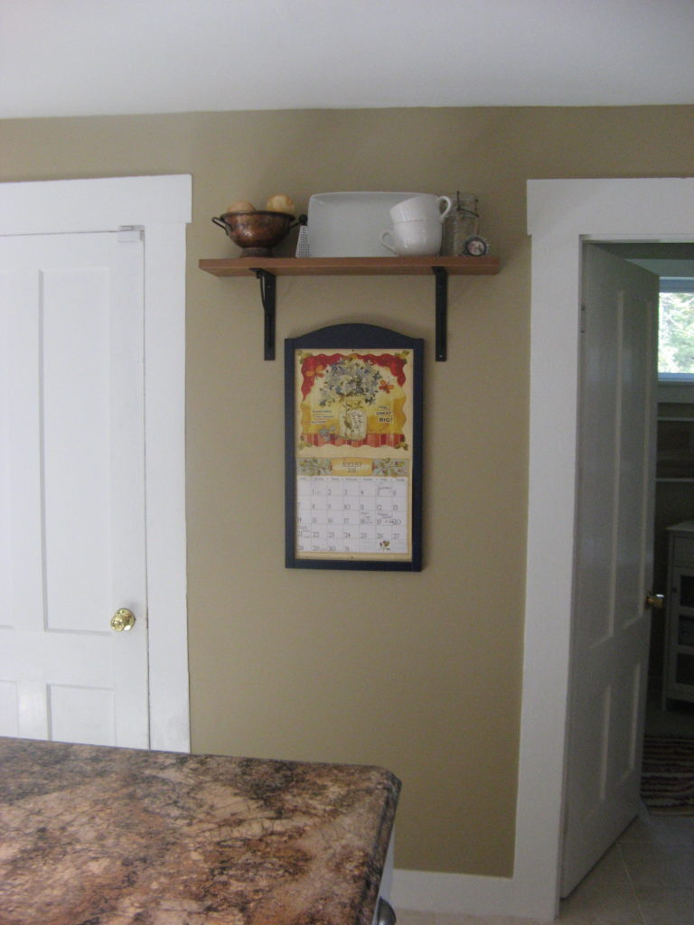
Day after day I would sit at my island and just stare at this wall. It drove me crazy because it just seemed so wonky to me. We have 3 doors on this back wall, and this section of wall that wasn’t big enough to put anything on or in front of it. I shared in a post about this dilemma before that sometimes our greatest obstacles in design make way for our best accomplishments. As part of my birthday request the hubby installed a plate rack wall that is now inset between the 2 doors.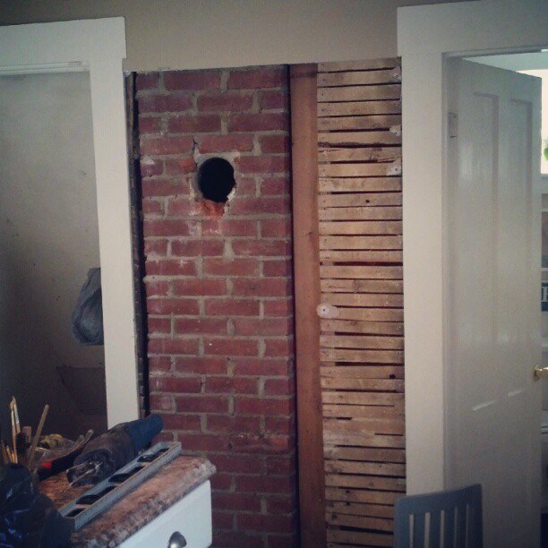
First he removed all the sheetrock. Next He had to cut out that one side of the chimney and the lathe in order for the plate rack to be installed properly. We used a sheet of bead board for the back, framed it out with 1×3’s and then used thin straps of wood to create the shelves. After about 5 coats of white paint we were done, and it looks like it’s always belonged in this space. 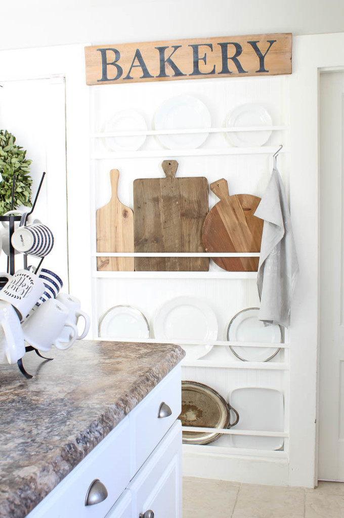
The last area that got an upgrade was another dilemma area. I first hung these shelves with the idea of putting a jelly cupboard underneath them, but with a doorway to the right, any cupboard would stick out too far.
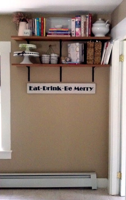
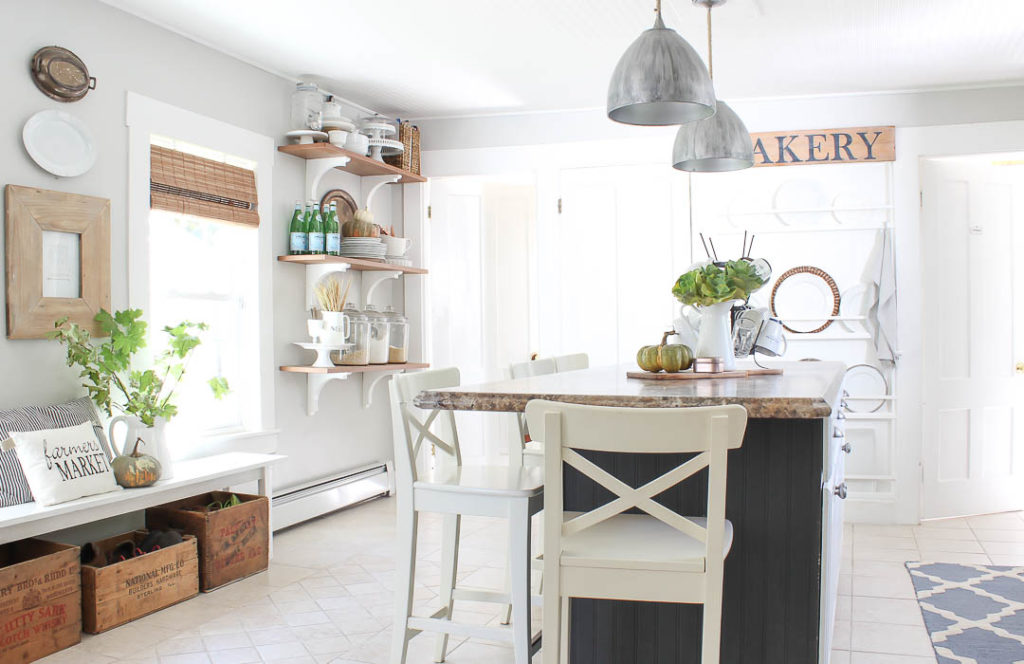
I loved open shelves, but if I was going to have them they needed to be practical in our space. Since we don’t have a pantry I need every amount of storage I can get. The same birthday we installed the plate rack wall, I saved birthday money and bought wood corbels from Home Depot to beef up our open shelves into what you see today. 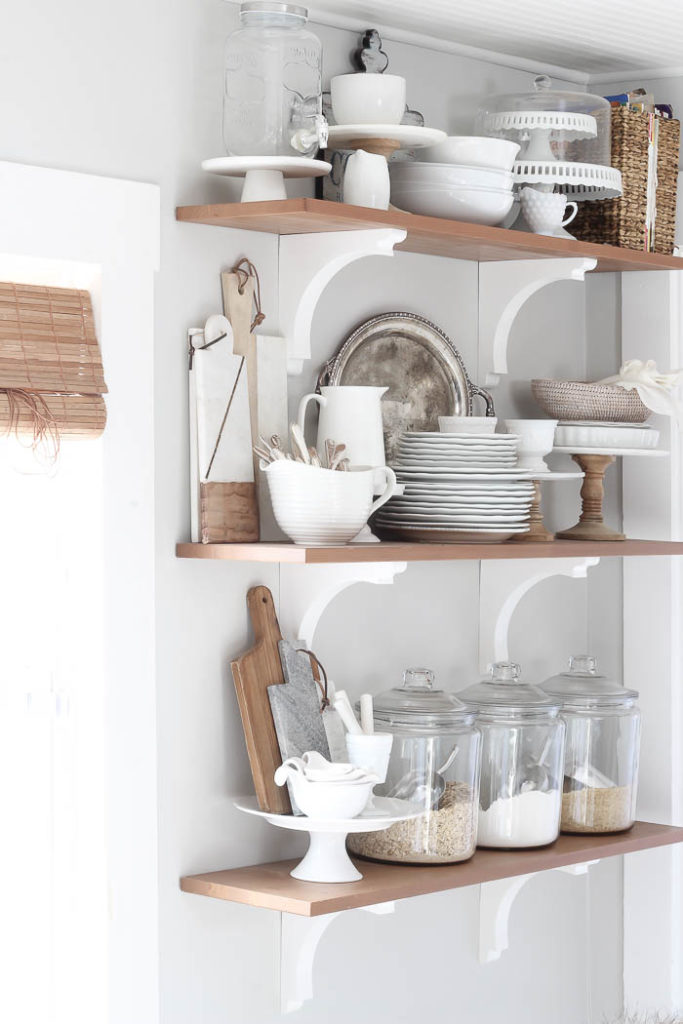
I painted our kitchen Gray Owl by Benjamin Moore and it’s the perfect shade of light gray, without feeling too warm or too blue. We get great light in our kitchen, so the light colored paint and white trim just help emphasize the brightness, and keep it from feeling anything like blah-beige. Here are a few more Before & Afters.
Before: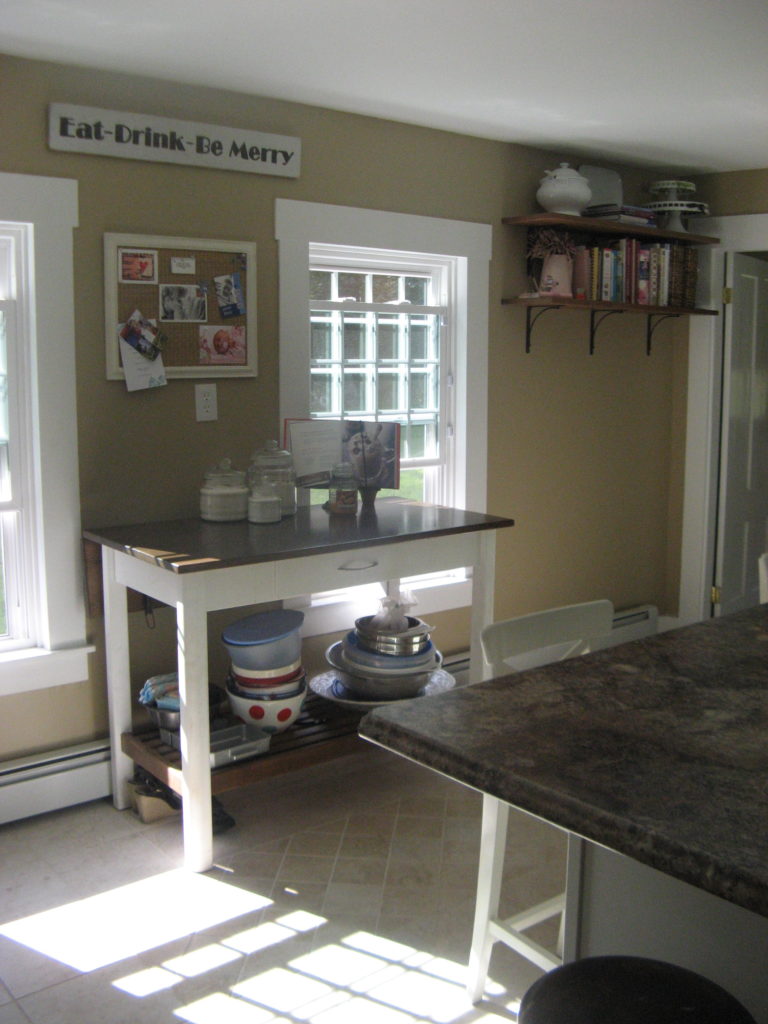
After: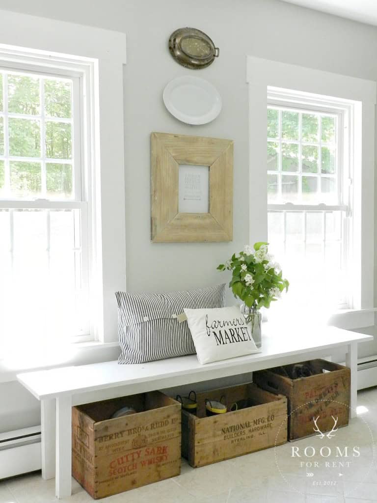
Before:
After:
Before:
After: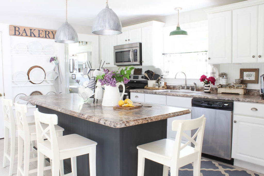
The last thing I had done to give our kitchen some personality was paint our island Graphite by Annie Sloan. It appears darker in photos but has a deep hint of navy blue in it. 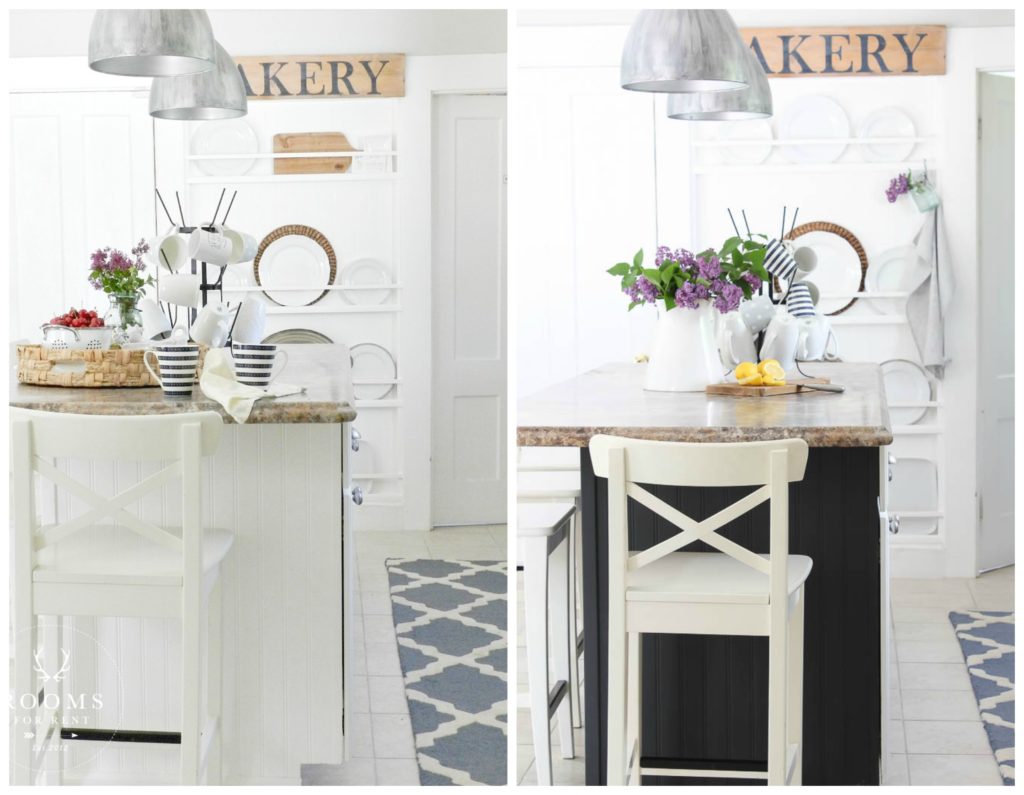 The best part is it’s only paint, so I can always paint it white again if the mood strikes. I shared HERE how I did a lot of the transformations you see. I feel like the majority of the makeover our kitchen has received it by the power of paint! We did swap out light fixtures, but most of the tweaks we did were to better suite our needs as a family. Which is one of the best design wins if you ask me!
Stay in touch!
Instagram / Pinterest / Facebook
Have a design question? Visit Doucette Design Co. for all your design needs!

You certainly did what you wanted to do. It now has a vintage farmhouse look. You injected lots of character with that wonderful plate rack! Wonderful job and wonderful kitchen!!
What a transformation! You rock!
L O V E everything you did!
AND, all with your OWN needs in mind.
Wow! Talk about a succession of good decisions. It looks terrific. You emphasized the positives, altered the negatives and give it all so much style.
You have quite the gift.
I really like the bench with pillows and the crates underneath the windows. I’ve seen it in other pictures but I always assumed that it was in a mud room.
Oh wow!! Love your home! I love looking at houses, and seeing what everyone has done, it gives me ideas of what I can do. Everything is just beautiful …. thank you for sharing!!
Absolutely one of my favorite kitchen transformations and love that it was accomplished this way!!! It totally is a part of your home now!!!
I loved it when you painted your island, even though some did not like the dark color. It appears that the drawer side is still white and I like that! It gives me courage to try that with our island as it is set up the same way. Hmmmm…..
Yes! I never ended up painting the drawer side. Which honestly made painting it that much easier, and I can paint it back to white much quicker too if the mood strikes!
The shelves holding plates and cutting boards is such a perfect wall accent. Functional, appropriate to the kitchen, and unique.
Nice kitchen, I love it!
It does look amazino, wonderful ideas.
hey girl- love your kitchen!
You did a really good job! It is beautiful now and I love how you used creativity to turn the blahs into wows! Love it all.
Hello Brie,
I just had to tell you how much I enjoy these before and afters. You are incredibly talented and your house is a real pleasure to look at.
Keep up the good work! I love it. 🙂
Luba
Thank you so much!!! I’m so glad you enjoyed them! And thanks again for your sweet comment 🙂
Love it all! That plate rack is genius, and I have to say kudos to Hubs for persisting in finding a way to give you that dream, despite having to tear out, and figure out a way to hang it. That could cause some serious eye-rolling in many relationships? So enjoyed seeing the process over time in this post, as many times we want it DONE! Seeing this beautiful end result (for now) will inspire many to persist, and persevere.
Thanks for sharing!