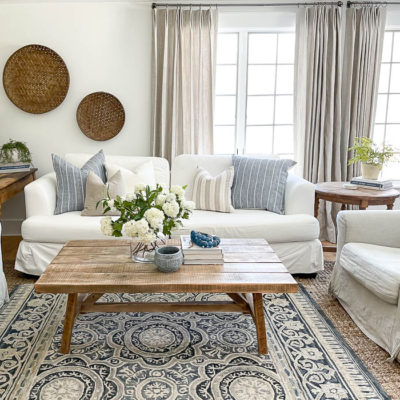
aring today. If you missed Day 1, you can see it HERE, and remember each blogger who is sharing in this blog hop is also giving away a copy of my NEW book!! You can enter for a chance to win on each blog, so be sure to stop by and visit! I debated on whether I should share something I loved most about our previous home, or if I should share something I love most about our new home. Of course there is much to love about our new home, but I will be honest, none of the rooms feel quite finished yet. But I am a big believer in progress. Small tiny changes that make an impact over time, and new living room is getting so close! So today I’m sharing our living room progress, and the steps I’ve taken along the way.
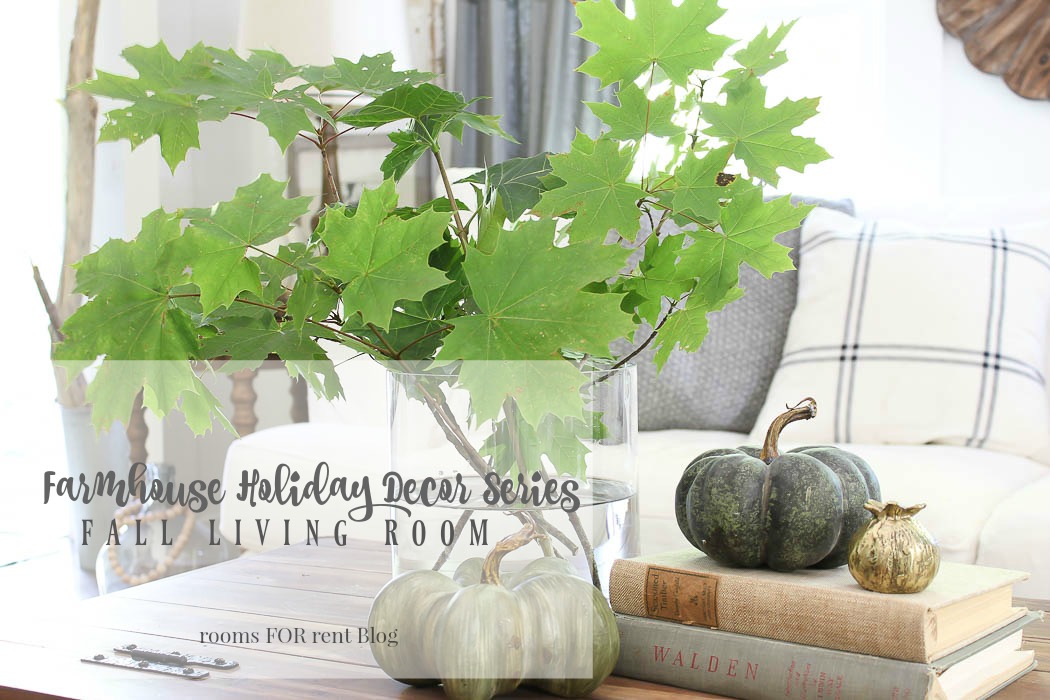
Farmhouse Fall Living Room
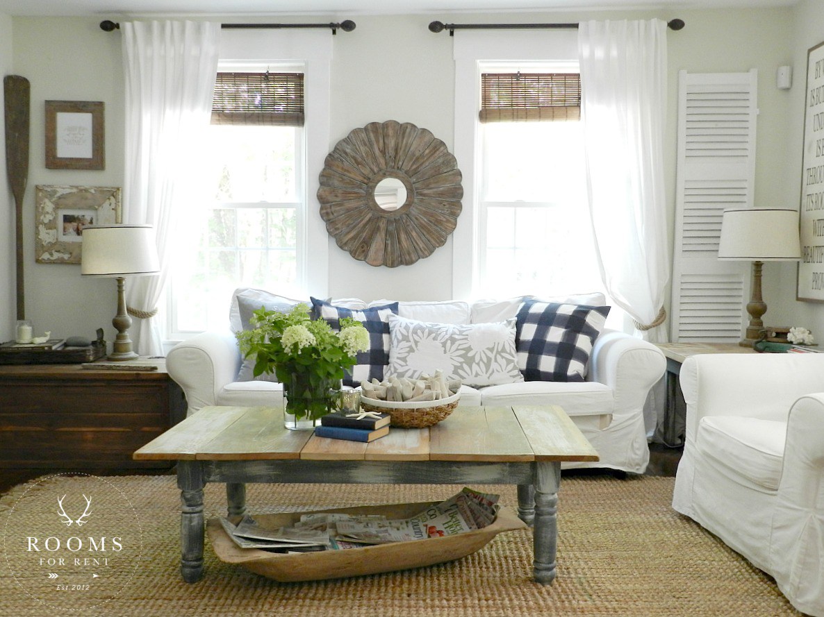
This year has been about simplifying. Not adding more, but really emphasizing on special details. It’s easy to feel the need to add a ton to your decor when decorating for new seasons, however I chose to make subtle transitions to gradually add fall into our living room. We are back for another round of Farmhouse Holiday Decor Series. Today we are sharing our Living Rooms decorated for fall.
New Sweet little Farmhouse table
There is something truly restful about being comfortable in a home and allowing it to refresh you as well. For me it goes so much deeper than attaining that “magazine perfect” look. It’s how it makes you feel. And when it impacts the lives of others who don’t even live there, you gain a sense of accomplishment. I have done my job, in making home inviting and welcoming to all, even the smallest …
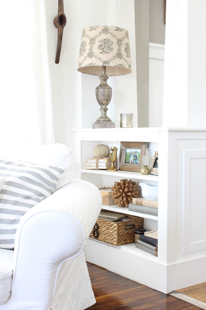
Simplifying our Built-Ins
If you are new here, or visiting for the first time, I started the process of Simplifying our Living Room in the beginning of the year. I had shared how lots of elements in the space just started to make it feel like the walls were closing in, and I was craving a simpler feel. It’s a hard balance to find when you aren’t quite a minimalist but don’t want to be the queen of “collectives” either 🙂 I made some fun DIY Abstract Art to help calm the walls down, and today I’m going to show you more of the built-ins between our living room and dining room…..
Living Room Refresh
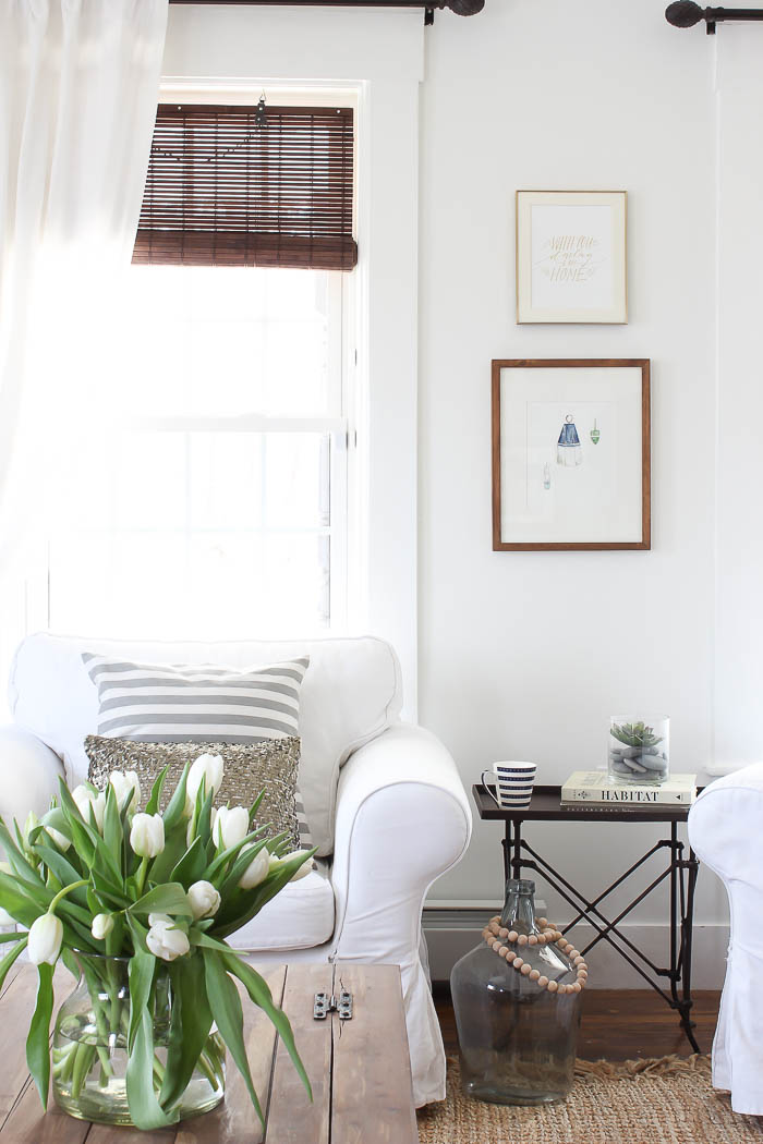
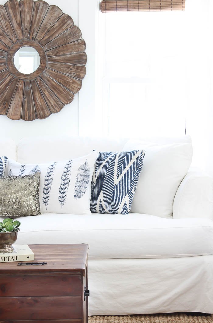
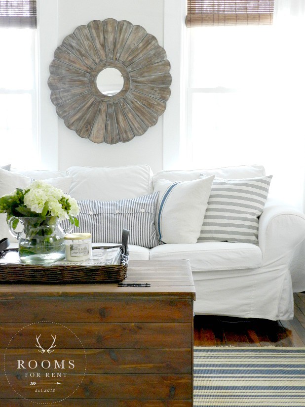
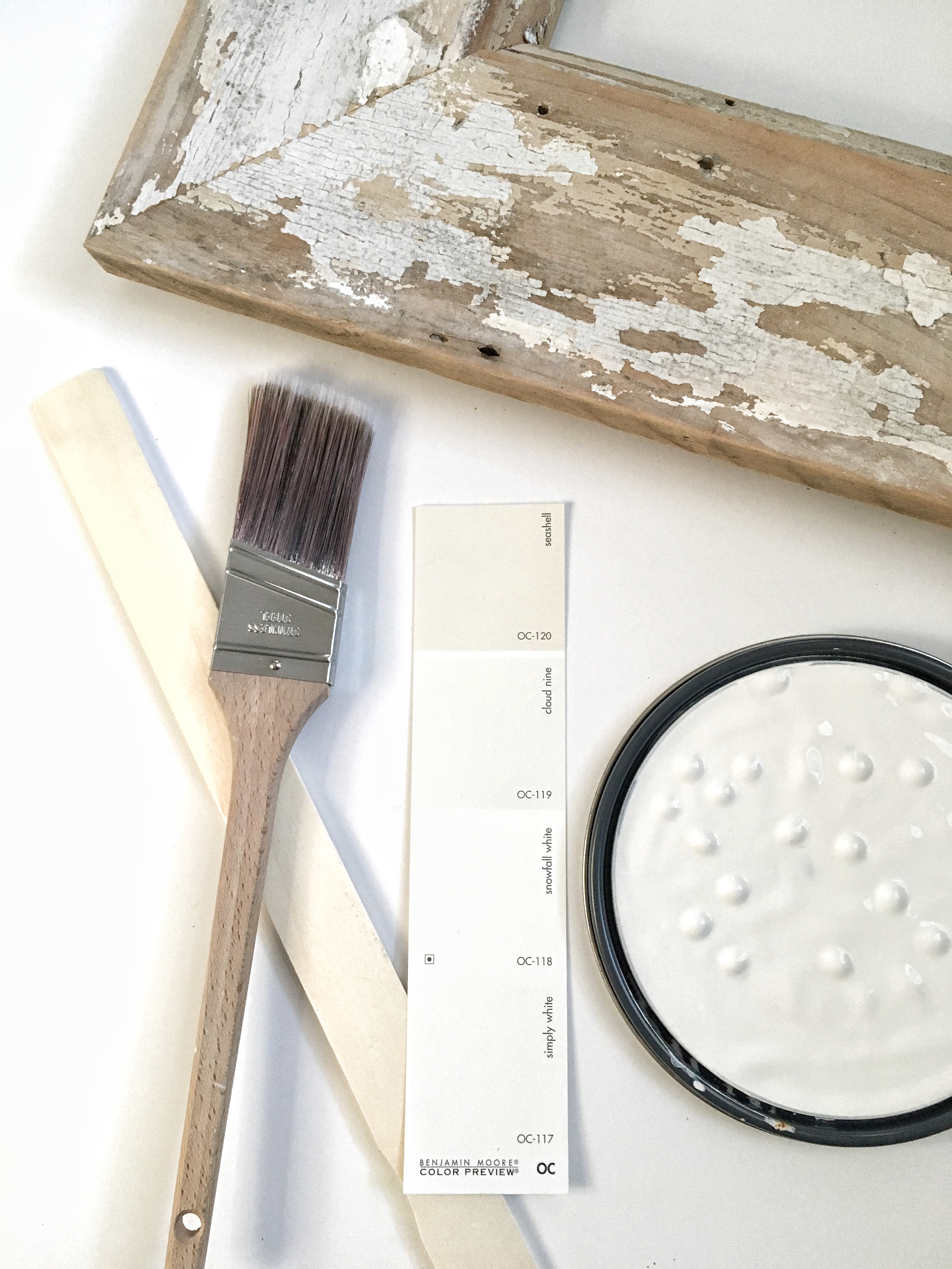
It feels so good to refresh a space. I’m so glad I let our living room have some breathing room. I was craving a little change, which I talked about HERE, so when I simplified our living room, it allowed me to bring back only what I absolutely wanted in the space. Of course finding the right shade of bright white paint helped me not rush the process, and really added some impact to the refresh.
Embracing the Process
Why can trying to finish the decor in a space be so frustrating?! You have an idea, a plan, a vision, but sometimes seeing the completed vision of that space come to fruition takes a while. I know I’ve shared before about taking risks, and being ok with making mistakes when decorating your spaces before, and it’s all apart of this thing called “process”. We don’t talk a lot about the process, or always show what that process looks like.
Adding a Focal Point
One of the main pieces that can ground a room, and make it feel complete, can also be the most over looked – Adding a Focal Point. When we don’t add a focal point in our design, we miss out on a big chance to share our uniqueness with everyone who comes into that space. Think of it as a free pass to share your creative style with those around you. Not only is adding a focal point a great way to share your style with everyone, it’s also a great way to complete a space. I remember when I was in the process of re-vamping our living room the first time, and as I looked around our space I thought a lot about what kind of accessories I wanted to bring into the space that would truly reflect me, and my style. Other than loving white, I love anything with distressed wood. So as I was working on my living room I knew that was something I wanted to make sure I incorporated into the space. Just to re-cap a focal point is the thing in your space that grabs your attention. It’s usually the thing that grabs your eye first. It adds “WOW” to your room, and character to any space. It could be a piece of artwork, an architectural piece, a bold accent wall, even a fun piece of furniture. Remember this is your free pass to add a little pizazz to your space without throwing your room completely off. It usually involves taking a risk, but one that is most rewarding.
How to Style a Coffee Table
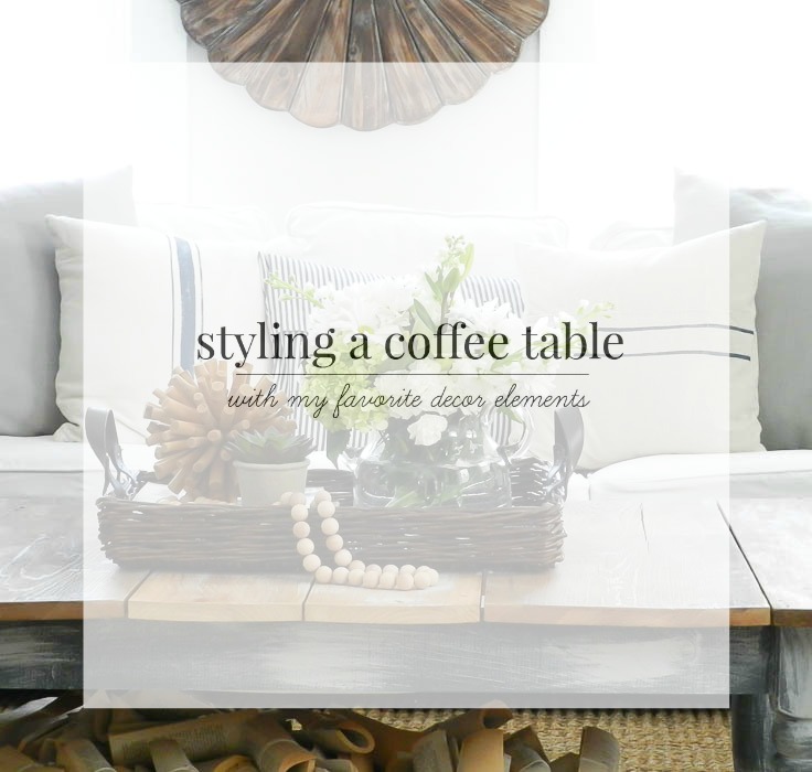
It’s no secret around here that I love to create tablescapes. I create a new one for each season, and sometimes multiple ones in between. I even hosted a thanksgiving tablescape tour this past fall, and had a bunch of my friends join in with me on the fun and share their tablescapes. While creating tablescapes are fun, and truly a way I express my creative art, styling a coffee table is much different. When I create a tablescape, I’m envisioning a space that is inviting and interesting for my guests. A place that is elegant and beautiful for all to sit and enjoy. However, for most of them they are temporary. So their design can be a bit more elaborate because it doesn’t need to withstand everyday life. Coffee tables on the other hand, aren’t meant to be grand or inviting, but we don’t want them to be boring either? So where do we draw the line on what’s too much, and what’s enough when it comes to styling a coffee table? Today I’m going to share with you my go-to’s for styling a coffee table, that I hope with help you as well. When I’m not decorating for a holiday, primarily christmas, I have some hands down accessories I go to every time I style our coffee table. Some items could be considered seasonal, but for the most part theses pieces will last year round.
My White Paint Fail
If you’ve been following along lately, than you know this month I’ve been all about simplifying our home, and refreshing…
Read More
