Hi friends!! I shared a similar post to this over on City Farmhouse a few months ago, but I thought it would be good to share here too! I get asked a lot of times what the paint colors are in our house, or how I picked them, and this post answers a lot of those questions.
When it comes to picking out paint colors, it’s one of my favorite things to do. I know some cringe and shutter at the thought of picking out paint colors, but one of my favorite things to do is head to the paint stores and look through all the swatches. I love comparing colors against one another, seeing which ones have more of a yellow undertone vs. a red one. I’ve been known to repaint a room a time or two just because I wasn’t a fan of the undertone, the right shade makes all the difference in the world.
Last time I shared with you how our living room transformed. The before, the progress, and the after. After looking through my collection of favorite rooms, and noticing the all white walls, I knew what had to be done. Except no matter how much I loved white walls, I was a bit of a scaredy cat when it came to making the commitment. So I went for the closest shade of almost white I could find. I painted our living room Halo by: Benjamin Moore. 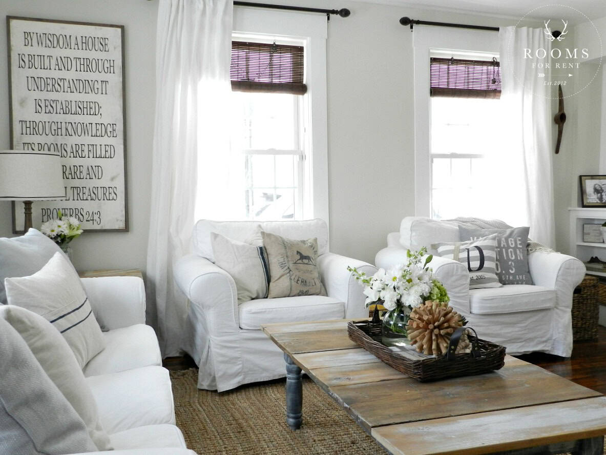 Our living room is open to our dining room, so I had to make sure it was a color that would coordinate with the warm gray I have in our dining room.
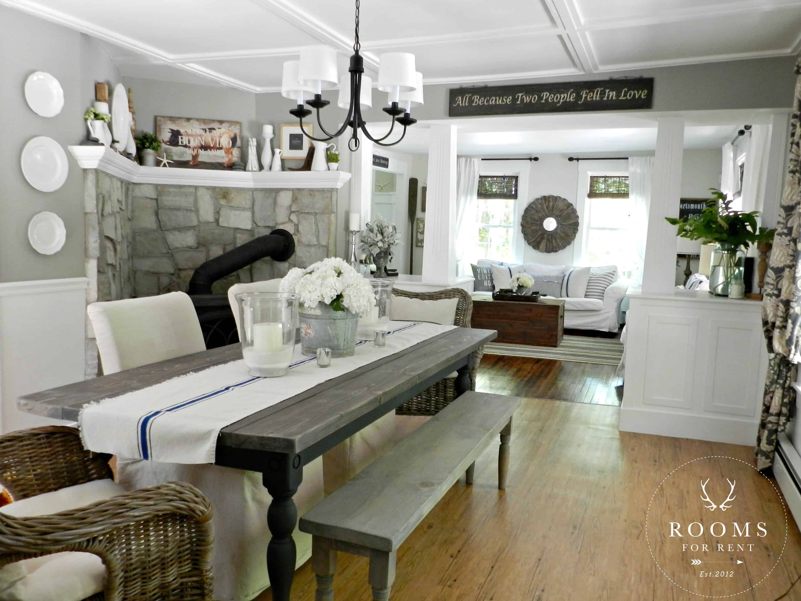
Our dining room color is Woodsmoke by: Glidden. It was the 2011 Top paint choice by Better Homes & Gardens and I still love it! It’s the top paint color I get asked to source on Instagram, so I’d say it has a good reputation! Since it’s a warmer shade of gray I wanted to make sure that the color I chose for my living room matched the undertones in the dining room paint. Even though they are different paint colors, I still want the house to feel unison, and flow from one room to the next.
Earlier this year I shared our front hallway as well, with our gallery wall, and talked about how in the end repainting it was a must, because we have no sources of natural light in the front section of our house. The transformation was so dramatic and afterwards you could clearly see it was just what was needed. I lightened things up by painting our hallway Hazy Skies by: Benjamin Moore.
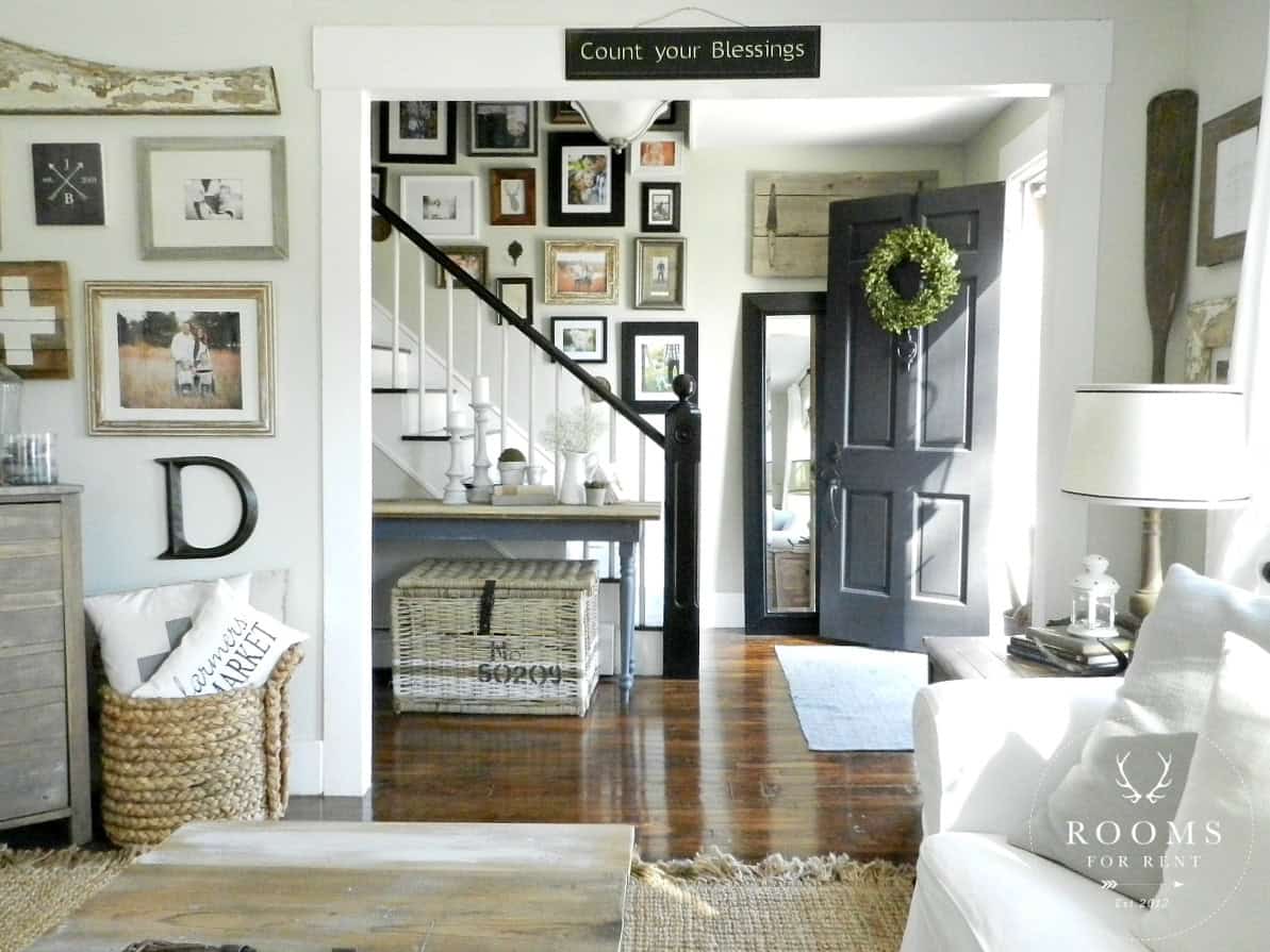 Hazy Skies is about 2 shades darker then the Halo color in our living room, so without painting our entire house the same color, it transitions nicely into the next space, but keeps things feeling cohesive throughout our house. Picking out paint colors doesn’t always have to be tricky, I always compare shades next to each other to be sure I’m loving the color I’ve selected. Buy the sample first, because getting it home and painting it in the lighting in your house is totally different that in the paint store. And don’t be afraid to re-paint if the color isn’t sitting right with you. When I was repainting our hallway, I actually painted it a different lighter tan first, but I just wasn’t happy with it because it didn’t have enough gray undertones. So I painted again, the newer color was the exact same shade, except it had gray undertones instead of yellow. It made all the difference in the world, well to me at least.
Another wall in our house that get a lot of buzz is our DIY chalkboard wall in our kitchen! 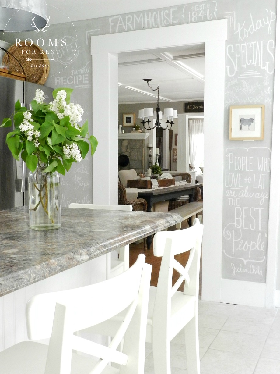 This wall came to life, because I was longing for an accent wall but I didn’t want to do the traditional black chalkboard paint. Our kitchen is light and bright and mostly white, and while I love a bold, black accent wall, it just wasn’t the look I was going for in the kitchen. I used Martha Stewarts recipe (1cup of paint + 2TBls unsanded grout) and sanded in-between in each coat. To get this magic gray color I used left over paint from our dining room, Woodsmoke by Glidden, and Horizon by Benjamin Moore. I mixed the two colors together starting with Horizon, and mixing in Woodsmoke until I got the shade I desired. Unfortunately there was no exact measurements, I went off the cuff, and just stirred until I liked what I saw. So lets say for those of you who like number is was about 65% Horizon and 35% Woodsmoke 🙂
To see the rest of the paint colors in our house, you can check out this post, I share a lot of the paint colors we had before, and what we have now for a more cohesive feel throughout the house.

Also don’t forget, **early registration** is going on now for the Art of Home online course. You can read all about the class here and to sign up! I hope you will join me to be refreshed and inspired in your own home!
Stay in touch!
Instagram / Pinterest / Facebook
Have a design question? Visit Doucette Design Co. for all your design needs!

Its really nice color in your room what i like most..
Can I ask what white color/brand you use for your trim and Kitchen cabinets?
Thanks, Jen.
Hi Jen! The cabinets aren’t actually painted. They are from Lowes and are standard cabinets. The trim paint is just white paint off the shelf in a gloss finish that you would normally select for trim 🙂
Your home is beautiful and this post couldn’t have come at a better time… I was wondering if you have a preference on the BRAND of paint that you use and have them tint it to your colors from different companies, or if it’s the paint from the actual companies? Or does it matter? Also, do you have a preference on the finish that you use, ie: flat, satin, eggshell? I’m heading to the paint store today… So excited to get going!!! Thank you for sharing!!!!
Sorry we were on vacation last week. I tend to stick to the cashmere line at sherwin williams because I like the silkiness of the paint. But I usually wait until they are having one of their big sales to go and buy it, because it can be a bit pricey. I think it’s really just personal preference. I usually stick with a flat finish, unless it’s for a bathroom or trim. Hope your project came out great!
Thanks so much! Still in the throes of it!?
Last night I painted my small master bath in Halo. It still has dingy crown, which I will be painting bright white. Could I get away with painting stripes in Hazy Skies ? I’m longing to paint the vanity mop board black by BM, however it’s a small space, so maybe just the door:) my style is your style, and I am passionate about decor! Love your blog! Please don’t stop ?
my only concern is that there won’t be enough of a difference between the two colors. I love the idea of subtle stripes, but I don’t think you would really even notice it with those two colors next to each other, and that is a lot of work for little or no reward 🙂 Instead of the hazy skies, I would go with a soft white with the halo. Since they are both light colors it will have the subtle effect I think you are looking for. I remember Young House Love painted subtle stripes in their downstairs bath at their first house (I think?), and it still takes my breath away!! Good luck!! And thanks for the encouragement 🙂 XO
?
How about doing the stripes the same color but a different sheen. Flat and gloss. It looks great!
sounds lovely 🙂
Love the colors and I love your house!! You go girl!
Your post came at the perfect time! I will be painting my entryway, stairway to bsmt, LR and Hallway Revere Pewter. But I was at a loss to find nice comperable colors for the bathrooms and kitchen. I know Ive said it before, but your decorating style is amazing! Its like youre in my brain! Ive replaced my LR furniture with the white Ikea slipcover chair and same style sectional sofa but got that in the gray. Gpt the white curtains and black rods at Ikea.
Thank you for sharing!
Perfectly beautiful ?